Gutenberg: Iterations on block library: add icons and different style for child blocks
I took a little trip into imagining some minimal iterations to the block library that hopefully solve a few issues.
The first issue is that right now we have a limited selection of icons to choose from for blocks, and it's causing the block library to lose clarity very rapidly once the user starts installing plugins that offer new blocks. The solution here employs custom icons (pulling from Material icons) into the mix along with Dashicons, we can work out which are used where. This has a huge benefit for those that are making blocks, you now can draw on a far wider range of options for your block on top of supplying your own SVG.
In addition to adding icons I also looked at adding more space to the experience. This brings in easier understanding and over all just makes it all feel a bit comfier to interact with.
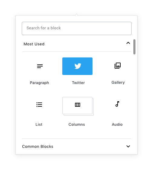
The final fix in this suggestion is to bring in a different style for child blocks. This stacking visual I think works in the context of these changes.
I am interested in what people think.
 karmatosed
All 11 comments
I really love how much more comfortable this feels with that extra whitespace. Subtle changes like that will go a long way towards lightening up Gutenberg, and making it into a more relaxed writing environment.
Also a +1 to the Material icons from me. While I'd like to see them in place in more of the UI before being 100% sold on the idea, I certainly feel that having a larger library of icons for developers to draw from will result in drastically better visual consistency amongst 3rd party blocks.
Regarding the stacking, I think this definitely works, and feels lighter than my earlier suggestion (#8053) for the current block library UI. I'd be curious to see how that works with blocks that use a custom color though.
 kjellr
on 8 Aug 2018
kjellr
on 8 Aug 2018
This looks nice, and I like the idea of having Material icons available, but I have a feeling that this is going to annoy people who don't like UI with a lot of what they would consider to be wasted space.
 ZebulanStanphill
on 8 Aug 2018
ZebulanStanphill
on 8 Aug 2018
Also, for consistency, the option groups in the inspector and the groups in the inserter should look the same, shouldn't they?
ZebulanStanphill
on 8 Aug 2018
Great stuff! I'm a huge fan of the extra whitespace overall (and it does feel warmer), but I'm not sure how I feel about removing the block button backgrounds. Things sort of feel like they're "floating" here.
+1 for pulling the search input inward 😍
In terms of icons: While I have no real gripes with the Material icons, I'm of the opinion that we should utilize Gridicons primarily, then use Material icons as a fallback when an icon doesn't exist in our library. I might be in the minority there, but I feel that Gridicons work really well with our products especially on mobile because they work well between dotorg and dotcom.
 iamthomasbishop
on 8 Aug 2018
iamthomasbishop
on 8 Aug 2018
I agree on keeping an icon background, even if it's super subtle.
Maybe there could be a way that icon could be tweaked to allow specifying an icon set, so new sets could be easily registered? e.g. icon: { set: 'dashicons', value: 'icon-name' }
 chrisvanpatten
on 8 Aug 2018
chrisvanpatten
on 8 Aug 2018
One point that's important to highlight here is that we really need block icons to move away from using dashicons as soon as possible. We are already seeing plugins adding blocks where the icon overlap is very high just because of the limited icons set, which reduces clarity for users very drastically.
Our core blocks should most likely specify custom SVGs here for now, which also has the benefit of promoting uniqueness for each block icon. We'll retain the ability to specify a dashicon slug in the block API, but would encourage people to supply custom SVGs (or draw from the material icon pool) as much as possible.
 mtias
on 9 Aug 2018
mtias
on 9 Aug 2018
Regarding the background, I feel strongly we should test this visual first that I mocked. Let's feel it in the code and take from there. There are a lot of visual reasons to open up the experience like this which we should allow exploration into.
karmatosed
on 9 Aug 2018
Digging this.
Does this iteration make #7141 moot? I personally think the lighter appearance and added whitespace kinda does, and moreover I'm worried that a larger block library will simply look more overwhelming.
 jasmussen
on 10 Aug 2018
jasmussen
on 10 Aug 2018
+1,083,012 to moving away from the existing iconset to something more robust. Even within the core blocks there's a lot of overlap and potential for confusion with the existing block icons (pullquote and quote; image and inline image; preformatted and subhead; categories, latest comments, and latest posts) which can end up being particularly notable when they both appear in the inserter shortcuts:

I dig the nixed background here visually—the rounded rectangles always felt a bit awkward. Have we considered squaring the boxes off a bit for the selected and child block states?
It might be worth pulling the text labels a bit closer to the icons so that it's clear which corresponds to which. Right now they feel a bit like they're floating, and it may help to anchor them more closely to the corresponding label, and increase the whitespace around the icon + label pair.
How would this work at mobile and tablet breakpoints?
 sarahmonster
on 10 Aug 2018
sarahmonster
on 10 Aug 2018
@jasmussen This does kind of feel like the opposite of #7141. :stuck_out_tongue:
@sarahmonster
It might be worth pulling the text labels a bit closer to the icons so that it's clear which corresponds to which. Right now they feel a bit like they're floating, and it may help to anchor them more closely to the corresponding label, and increase the whitespace around the icon + label pair.
I agree.
ZebulanStanphill
on 10 Aug 2018
It might be worth pulling the text labels a bit closer to the icons so that it's clear which corresponds to which. Right now they feel a bit like they're floating, and it may help to anchor them more closely to the corresponding label, and increase the whitespace around the icon + label pair.
Yeah this was the only reason I mentioned the background color; I thought the Twitter example had the clearest relationship between label and icon, because of the background. But adjusting the spacing could have the same result!
chrisvanpatten
on 10 Aug 2018
Related issues
 mhenrylucero
·
3Comments
mhenrylucero
·
3Comments
 cr101
·
3Comments
cr101
·
3Comments
 franz-josef-kaiser
·
3Comments
franz-josef-kaiser
·
3Comments
 maddisondesigns
·
3Comments
maddisondesigns
·
3Comments
maddisondesigns
·
3Comments
maddisondesigns
·
3Comments
Most helpful comment
One point that's important to highlight here is that we really need block icons to move away from using dashicons as soon as possible. We are already seeing plugins adding blocks where the icon overlap is very high just because of the limited icons set, which reduces clarity for users very drastically.
Our core blocks should most likely specify custom SVGs here for now, which also has the benefit of promoting uniqueness for each block icon. We'll retain the ability to specify a
dashiconslug in the block API, but would encourage people to supply custom SVGs (or draw from the material icon pool) as much as possible.