Gutenberg: [3.1] on mobile device, not possible to fix toolbar to top...
Describe the bug
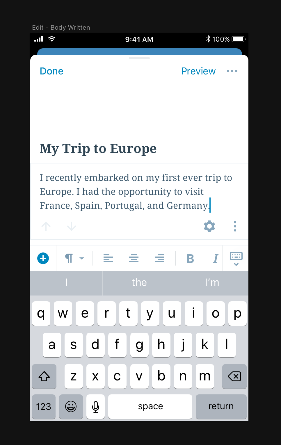
On a mobile device, it's not possible to fix the toolbar to the top.
To Reproduce
On a mobile device, click the ellipses on the top-right corner. The option "Fix toolbar to top" is missing.
Expected behavior
I'd expect that the toolbar should be able to be fixed to the top, same as on a desktop.
 GlennMartin1
All 12 comments
I am pretty sure this is intentional, since on mobile devices there is not much space available for the block toolbar.
 ZebulanStanphill
on 22 Jun 2018
ZebulanStanphill
on 22 Jun 2018
@SuperGeniusZeb
My impression was exactly the opposite. :-) Whether it's docked or not, the toolbar will be displayed.
On mobile it's especially needs to be docked: it would be much nicer to get it out of the way so I can have a less cluttered environment to type.
GlennMartin1
on 22 Jun 2018
@GlennMartin1 Perhaps when Fix Toolbar to Top is enabled, the toolbar could be shown at the top on mobile, but rather than in the same top bar like on desktop (which would not work for some blocks due to a lack of space), it would be shown directly below the top bar.
Pinging @karmatosed since this seems like a good design idea.
ZebulanStanphill
on 22 Jun 2018
Agreed @SuperGeniusZeb
Separately:
I don't know where you folks live, but Fix Toolbar to Top sounds strange. What are you fixing? :-)
The word Fix should be replaced with the word Dock, i.e. Dock Toolbar to Top. Thoughts?
GlennMartin1
on 22 Jun 2018
@GlennMartin1
From Wiktionary, alternative meanings of the word “fixed”:
- Not changing, not able to be changed, staying the same.
- Stationary.
- Attached; affixed.
In CSS, you can make something stay stuck in one spot using position: fixed. MDN reference.
All that said, “dock” seems like it would make the purpose of the setting more clear. Perhaps a separate issue should be made for renaming that setting?
ZebulanStanphill
on 22 Jun 2018
I'm a bit late to the game here, but I have some thoughts on toolbar placement based on some recent usability testing with mobile web Gutenberg.
We found that one of the biggest concerns with the mobile experience was a perceived "inconsistent" toolbar placement. Folks found it disorienting that the toolbar "jumped around" on the screen.
As I've been working on the _native_ mobile Gutenberg, a stationary toolbar docked to the top of the keyboard has proven to be both consistent and reachable, so I'd actually recommend we make the toolbar fixed by default. Here's a quick mock of what that looks like right now on native:
My assumption is that docking the toolbar atop the keyboard would be nearly impossible on the web. If that's a correct assumption, perhaps it's worth docking the toolbar under the editor bar by default, same place as where the toolbar sits when "fixed to top" on larger screens.
Wins would be:
- Consistent/predictable toolbar placement
- Would add flexibility, solve #7473
Downsides:
- Not as reachable
- Not as "connected" visually to the block itself
I'd love to hear thoughts from @karmatosed @mtias @jasmussen, as y'all have much more insight into the history here.
 iamthomasbishop
on 6 Aug 2018
iamthomasbishop
on 6 Aug 2018
It's worth stating unequivocally for anyone reading this:
If we can fix the toolbar to the top of the keyboard, or at the top of the screen, this is absolutely the best solution.
Any PR that does this in a solid way that works on both Android and iOS will not only get their PR fast-tracked, but they will get this emoji medal for their work as well: 🥇
The subtext of the above is also the reason why toolbars are not docked in master today. We really want to, but we haven't found a way to make this work in Mobile Safari. And it's not for lack of trying, some of the ugly details are here.
To summarize as simply as possible, on Android this would be trivial to do. Because on Android, when the soft-keyboard shows, and/or when the text caret is in text, the viewport resizes to fit the available area. This means any element with position: fixed; or position: sticky; applied will adjust to the resized viewport.
On Mobile Safari, when the soft keyboard shows and/or when the text caret is in text, the viewport moves upwards but is not resized. Additionally, the scroll bounce effect messes with fixed and sticky positionings, meaning that we can't rely on any fixed or sticky element to retain its intended position.
Here's an animation:

Notice how the viewport of Android grows smaller vertically when the keyboard shows, whereas on iOS, the viewport height stays the same but is just pushed upwards and (obviously) hidden outside the screen.
As far as my investigations go, the only way we could make Mobile Safari behave would be through nasty hacks:
- We'd need to reliably calculate the available screen real estate when the soft keyboard is showing, considering different iPhones, different display DPIs, different soft keyboards, different keyboard options.
- We'd need to disable
onTouchStartandonTouchEndand re-create our own scrolling, otherwise even if we could position the initial state of a resized screen correctly, we couldn't let the user scroll it, because the _viewport_ is still the same hight, we can only affect the height of thehtmlelement. So without our own custom scrolling, you could just swipe the resized HTML element off the screen. - We'd need to disable overscroll bounce, for the same reason as above.
All this is doable, but it's not easy, and it's not clean, and it's very difficult to do.
Hopefully this answers the question as to why things are the way they are in master, and we would deeply welcome alternative solutions. But these solutions need to be in code form, and tested on an iPhone, because as far as I'm concerned, the design part is settled, and the fixed toolbar has won by a mile :)
 jasmussen
on 7 Aug 2018
jasmussen
on 7 Aug 2018
@jasmussen Yikes. Have you reported these issues to Apple? It seems like a bug on their end to me.
ZebulanStanphill
on 7 Aug 2018
Sadly it's been like this for a while, and because it's been like this for so long I imagine the fact that this is still the behavior means it's intentional. Here's another bit of frustration written up: https://gist.github.com/avesus/957889b4941239490c6c441adbe32398#gistcomment-2193547
jasmussen
on 7 Aug 2018
We really want to, but we haven't found a way to make this work in Mobile Safari. And it's not for lack of trying, some of the ugly details are here.
@jasmussen I should've known you would have a perfect description of the decisions that've been made :) That's crystal clear, and I had forgotten about the mobile safari shift – a huge pain in the bum. :(
iamthomasbishop
on 7 Aug 2018
We will keep hawks eyes on Mobile Safari, and as soon as it becomes possible, we'll have a PR ready!
jasmussen
on 7 Aug 2018
Because of the inability of us to move on this due to the reasons outlined in https://github.com/WordPress/gutenberg/issues/7479#issuecomment-410988762, I'm going to close this one for now. It is with a heavy heart I do so, because a fixed-to-top toolbar _would_ be superior.
Let's keep looking at Mobile Safari development, and open a new issue as soon as it becomes fesible.
jasmussen
on 11 Oct 2018
Related issues
 aaronjorbin
·
3Comments
aaronjorbin
·
3Comments
 maddisondesigns
·
3Comments
maddisondesigns
·
3Comments
 spocke
·
3Comments
spocke
·
3Comments
 moorscode
·
3Comments
maddisondesigns
·
3Comments
moorscode
·
3Comments
maddisondesigns
·
3Comments
Most helpful comment
@jasmussen I should've known you would have a perfect description of the decisions that've been made :) That's crystal clear, and I had forgotten about the mobile safari shift – a huge pain in the bum. :(