Gutenberg: Reduce the amount of ways to insert blocks from 4 to three
There are four ways to add blocks currently.
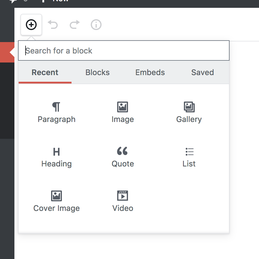
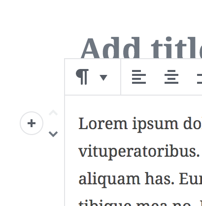
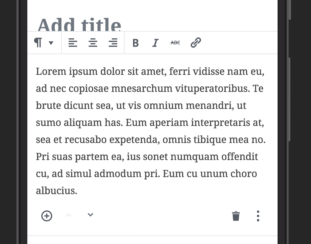
- You can use the inserter in the Editor Bar:
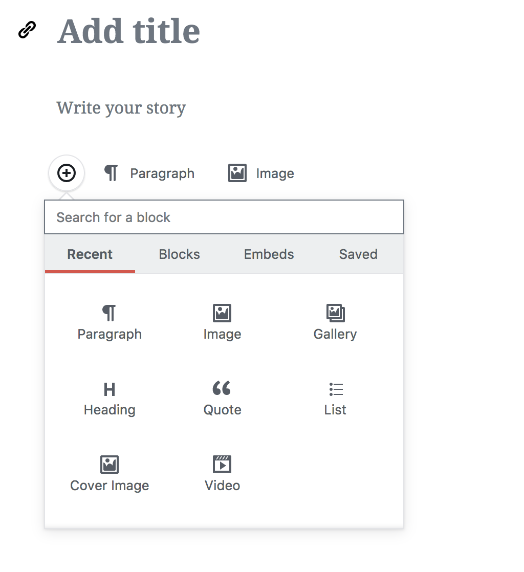
- You can use the trailing inserter:
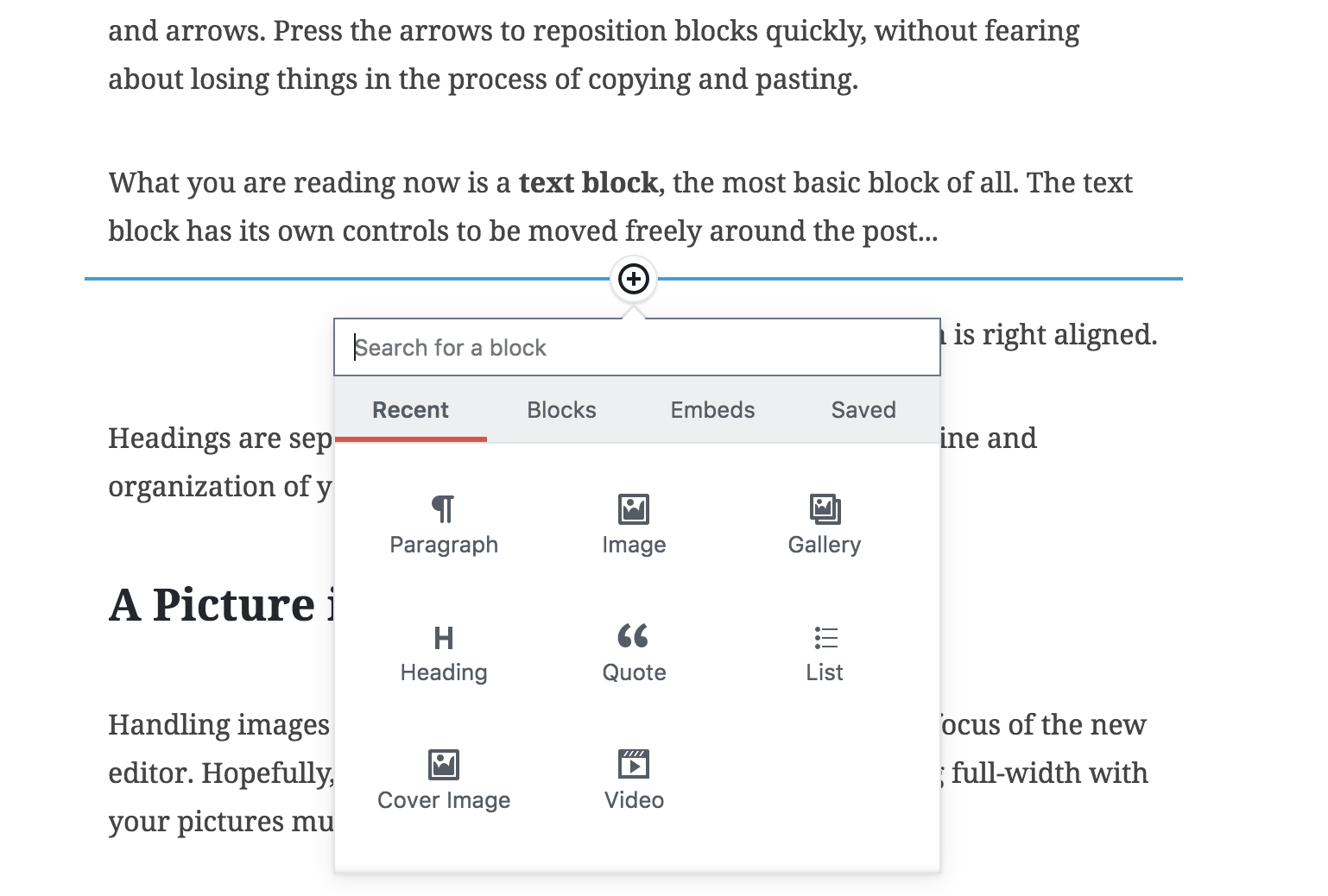
- You can use the sibling inserter:
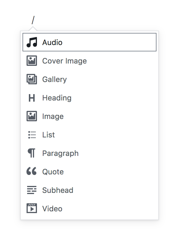
- You can use the slash command:
The inserter in the Editor Bar (1) is important because it sits in a toolbar where "insert" actions sit in almost every app that allows you to insert things. Word, Google Docs, Pages, Sketch, Keynote, Excel ... it's a very common pattern, and with the fixed toolbar and permanent visibility it's always accessible.
The slash command is invisible (4) from a UI perspective, but is extremely useful both for power users, and for keyboard users. It relies on the same standard pattern as messenger apps like IRC have used for a decade. Because it is invisible, it does not add cognitive weight.
The trailing inserter (2) and the sibling inserter (3) both try and solve the same problem, inserting content in the context of the content itself. However the trailing inserter can only insert content at the end, whereas the sibling inserter solves a problem of letting you insert content between two blocks.
Additionally, as ticketed in #3078, the trailing inserter breaks a pattern that is common for traditional text editors: being able to set the caret at the end of your content first, then insert after the fact, because it requires you first pick a block. The solution so far — showing recent blocks — still required you to pick a "paragraph block" first, not only requiring extra clicks but adding a huge cognitive load to what should be as simple as _click, then insert_.
Next step, a cagematch
This PR started by @youknowriad which I gave some polish, is ready to go. It removes the trailing inserter and instead puts it on the side. This recuces the cognitive weight of the trailing inserter, because you can easily click the end of the blocklist to insert content there, and you can easily hover a block, click on the side inserter, to insert a block right after. As such, with this PR merged, we could retire the sibling inserter, as it solves the same problem.
But concerns have been raised that the inserter on the left makes it a little confusing where a block will be inserted, whereas the sibling inserter makes it obvious.
Proposal: We put them both to the test, and keep only one of them:
- We merge in #4539 and keep it in master for at least 1 release. If, after having used the side-inserter for a while, we decide that this is the superior interface to the sibling inserter, we retire the sibling inserter.
- If, on the other hand, we decide that the side-inserter is still unobvious after having used it for a bit, we remove the side-inserter and keep only the sibling inserter — including the one at the end (closing #3433).
 jasmussen
All 9 comments
CC: @aduth @karmatosed @mtias
jasmussen
on 25 Jan 2018
Is this plus icon not best candidate for nested blocks ?
 StaggerLeee
on 25 Jan 2018
StaggerLeee
on 25 Jan 2018
Is this plus icon not best candidate for nested blocks ?
In #4539 the plus icon remains, just on the side. For phones, and for nested blocks, the UI adjusts.
Desktop & non nested:
Mobile & nested:
In case we decide this UI is _not_ the one we want, then we should keep the sibling inserter (3).
jasmussen
on 25 Jan 2018
I think keeping both can create confusion for users: Why there are two inserters doing the same thing? And it might play against the side inserter. Why can't we remove the sibling inserter for a release, and if the side inserter is not playing well, we revert it.
 youknowriad
on 25 Jan 2018
youknowriad
on 25 Jan 2018
Why can't we remove the sibling inserter for a release, and if the side inserter is not playing well, we revert it.
Much better idea. 👌
jasmussen
on 25 Jan 2018
Why can't we remove the sibling inserter for a release, and if the side inserter is not playing well, we revert it.
👍
 karmatosed
on 26 Jan 2018
karmatosed
on 26 Jan 2018
@youknowriad I know you're busy, but when you get time perhaps next week, can you help me ship #4539? It needs a rebase, a sanity check, and it needs to remove the sibling inserter per discussion in this ticket. Visually and experience wise, it's good to go.
jasmussen
on 26 Jan 2018
Phase 1 of this is now underway.
In master, the sibling and trailing inserters are gone. You can now insert using:
- The inserter in the editor bar
- The side inserter
- The slash inserter
Once we've had this in a Gutenberg plugin release for at least one version, let's revisit this ticket and decide whether we love this enough to keep it as is, or whether we should try the alternative.
The alternative would be removing the side inserter, and restoring the sibling inserter.
jasmussen
on 29 Jan 2018
Closing this, as although there's been some hiccups along the way, this is technically addressed.
jasmussen
on 22 Feb 2018
Related issues
youknowriad
·
3Comments
jasmussen
·
3Comments
jasmussen
·
3Comments
 JohnPixle
·
3Comments
JohnPixle
·
3Comments
 maddisondesigns
·
3Comments
maddisondesigns
·
3Comments