Gutenberg: Calendar date/time picker shows 'offscreen' on smaller screens
Issue Overview
The date/time picker shows 'above' the click link on smaller screens, 50% of the time, which makes it unusable as you can't navigate.
Steps to Reproduce (for bugs)
- Make a small screen
- Try to edit the post date
Expected Behavior
The box would always be below the link so a user can scroll
Current Behavior
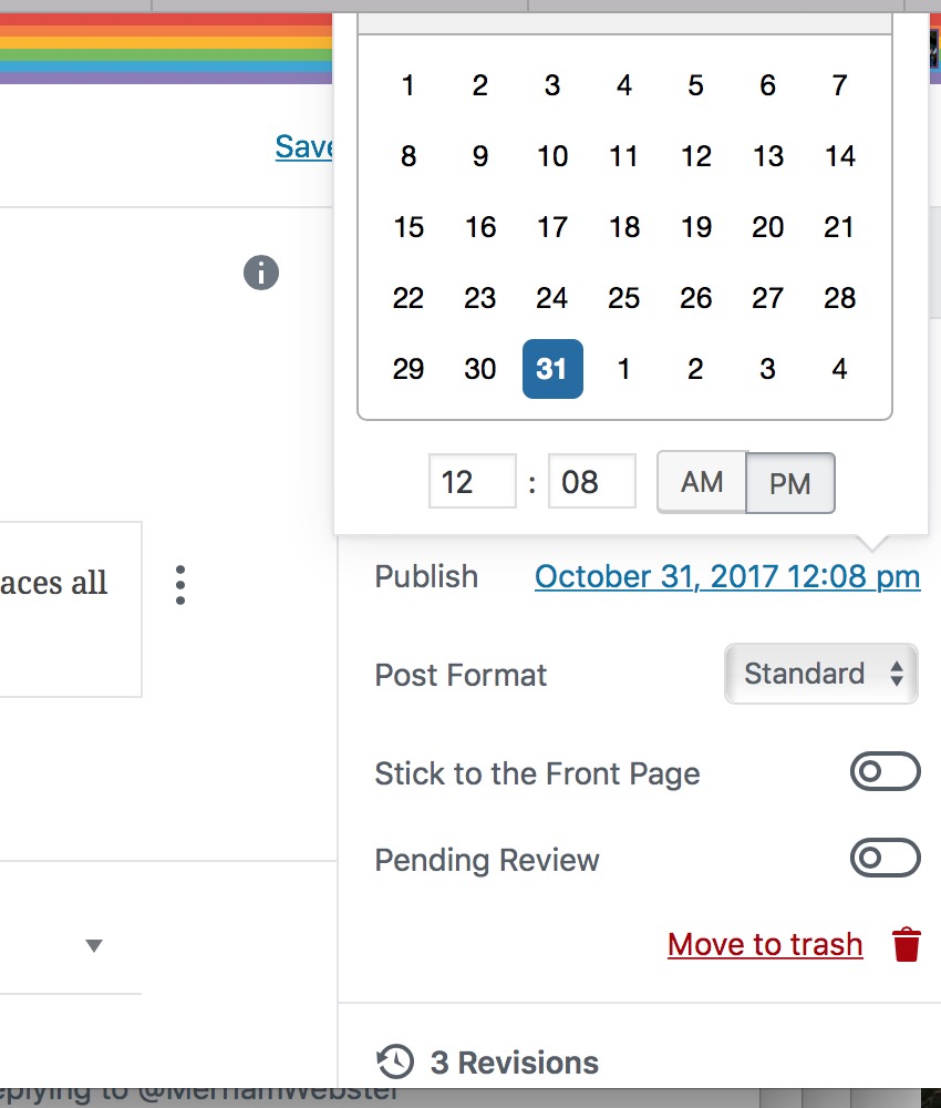
Every OTHER click will have the box ABOVE the link:
 Ipstenu
All 7 comments
As of Gutenberg 3.6.2, it looks like the date/time picker just gets a scrollbar when it is close to the top of the screen, so it looks like this issue is fixed.
However, I noticed another issue, which I have reported separately: #9130.
 ZebulanStanphill
on 18 Aug 2018
ZebulanStanphill
on 18 Aug 2018
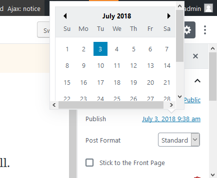
I can confirm that. This is how it looks with Gutenberg 3.6.2 (WordPress 5.0-alpha-43570) in Firefox 63.0a1 (2018-08-29) on Windows 10:
And a GIF of how it behaves when the viewport shrinks and grows:
 florianbrinkmann
on 30 Aug 2018
florianbrinkmann
on 30 Aug 2018
The calendar always renders on the screen when in desktop mode, though the experience isn't amazing for super low height screens that are still at desktop widths. I don't think this needs iteration for 5.0
 aaronjorbin
on 8 Oct 2018
aaronjorbin
on 8 Oct 2018
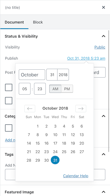
I think this might also have been resolved with the new date picker?
 mtias
on 23 Oct 2018
mtias
on 23 Oct 2018
It's not GREAT for small screens, but I think it's as good as it;'s getting with javascript and screen sizes :/
Ipstenu
on 23 Oct 2018
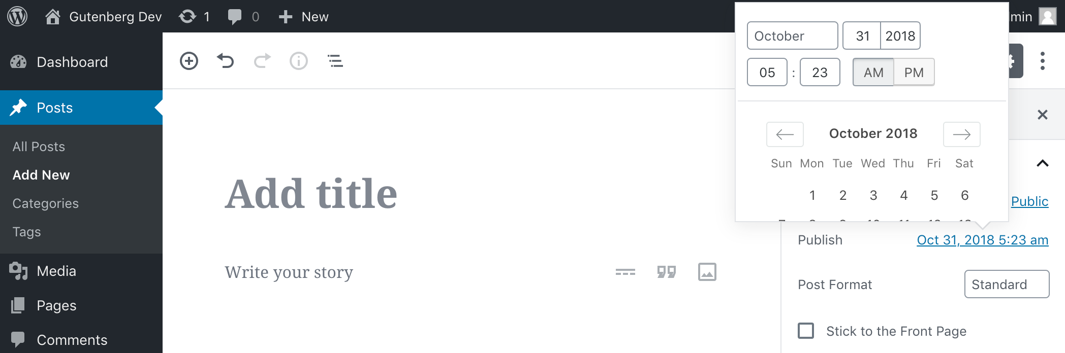
@mtias I mentioned in a comment above that this has been fixed since at least 3.6.2.
ZebulanStanphill
on 23 Oct 2018
On mobile, things look pretty good:
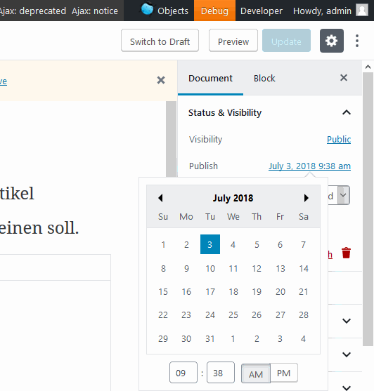
On very short desktop screens, it looks odd, but is totally functional because the popover can be scrolled:
 noisysocks
on 25 Oct 2018
noisysocks
on 25 Oct 2018
Related issues
 pfefferle
·
3Comments
pfefferle
·
3Comments
 davidsword
·
3Comments
davidsword
·
3Comments
 JohnPixle
·
3Comments
JohnPixle
·
3Comments
 BE-Webdesign
·
3Comments
BE-Webdesign
·
3Comments
 jasmussen
·
3Comments
jasmussen
·
3Comments