Gutenberg: Does document make sense to users in a post/pages model?
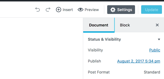
We currently have 'Document' and 'Block' as titles for sections. I wonder if this will cause confusion for users. Whilst some testing may determine this, it struck me as something we should at least be wary of. In a sense we are introducing maybe some un-needed new language. Could for example this just change to post or page, depending on the type?
 karmatosed
All 6 comments
@karmatosed I wonder if we need two tabs, as they seem mutually exclusive, i.e.
- If we have nothing selected, then we are looking at the the properties for the document/page/post
- If we have a block selected, then we are looking at the properties for the block
- If multiple blocks are selected, then I would expect to see the intersection of properties that are common to the selected blocks
Could it make sense to display these on a single tab?
 anna-harrison
on 3 Aug 2017
anna-harrison
on 3 Aug 2017
I think we do need two personally. One tackles the content as a whole, one for a block. I don't think we should move from having these two. I think you could have an instance where you wanted to interact with either and that's ok for users. Of course we can find out more if this is just a hunch during testing after v1.
karmatosed
on 3 Aug 2017
Word "Doucment" is a bit strange and not saying anything logical. But not so big problem. User will first time click around and get familiar with it for less than minute. Only once for rest of time and future.
What I just became aware yesterday is all this grey empty space in right sidebar when "Block" tab is clicked. Huge and waisted free space.
I can suggest one feature:
- Ditch "Block" tab at whole.
- When a block is clicked/selected insert "Block" tab content right under "Status & Visibility" "metabox".
Style "Block" metabox inside "Document" just slightly different. To say to Users, you see it is something extra added, not ordinary Document metabox.
I know some "Block" properties, say a plugin, will get very long in height. But as I said below, right sidebar is familiar teritory for any beginner, and I believe they will not have problem with a bit scrolling. Specially as they set all properties in Document only once, when they start new Post.
Do not know how it would look alike in mobile devices.
Rest of "Document" tab below is in some meaning "safe" for Users. They know what they are, they can find it with closed eyes, there are very few clicks on them, once per Post only. So not so big deal if you suddenly insert "Block" "metabox" under first "Document" "metabox".
 StaggerLeee
on 3 Aug 2017
StaggerLeee
on 3 Aug 2017
More I use Gutenberg I see need to switch to Block tab anytime a block is clicked/selected.
Dont know why.
- When a block is selected, switch to Block tab
- When a block is deselected, clicked outside, switch to Document tab.
That way You could eliminate Cog icon too. And move Trash icon to Block tab.
I see for some reason those 2 are not your preferable choice inside blocks.
Problem with me personally, and I admit it. I never edit WP Post in smartphones. And never use those small devices inside backend. So it is your task to explain to Us as to kids, if some request does not fit, tend to make problems, in smartphones.
StaggerLeee
on 3 Aug 2017
As I was going through version 0.6 yesterday my thoughts also went to when nothing is selected the document settings (page or post is a better word) is automatically selected.
When block/object is selected then block settings would automatically be selected.
The question is should there be no tabs just having the selected area (document or block settings) visible?
Or should there be tabs so the user independent of what is selected can choose from page/post or block settings?
We can leave both in now and as Tammie is saying do user tests and see what kinds of feedback show up that can give us some extra thoughts on this matter.
 paaljoachim
on 4 Aug 2017
paaljoachim
on 4 Aug 2017
Closing as this hasn't come up in user test, if it does we can reopen.
karmatosed
on 10 Nov 2017
Related issues
 nylen
·
3Comments
nylen
·
3Comments
 jasmussen
·
3Comments
jasmussen
·
3Comments
 aaronjorbin
·
3Comments
jasmussen
·
3Comments
aaronjorbin
·
3Comments
jasmussen
·
3Comments
 pfefferle
·
3Comments
pfefferle
·
3Comments