Gutenberg-mobile: Media & Text block design review
As we get ready to ship the first version of the Media & Text block to production, I wanted to take some time to point out some issues I found while doing a design review. This issue is meant to act as a master issue, but feel free to break into separate issues.
@pinarol @hypest would you be able to triage these? I'm not sure who should work on each of these. I wanted to document so we aren't losing the points somewhere.
- [x] Alignment options not working (existing issue)
- [x] Paragraph block has additional left/right padding (example – related to InnerBlocks work?)
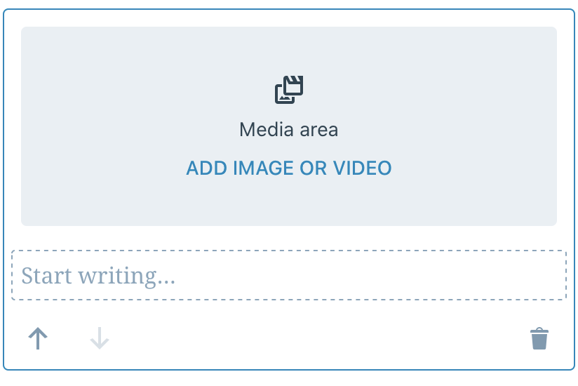
- [x] Change paragrph placeholder text label to "Start writing..." to match other placeholder labels
- [ ] When media block has media, we should add a blue highlight/border on media (related) – this would be solved by the following issue ⬇️
- [ ] Allow media within media & text block to be selected (issue)
- [x] "Add new block here" indicator not showing inside non-media side when using Inserter (example)
- [x] Icon for "replace media" should be updated to use updated icon (being used in updated Image block toolbar)
Fixed by InnerBlocks work? // cc @pinarol
- Selection highlighting, parent/child relationships aren't clear
- Add floating toolbar UI to help with nesting navigation
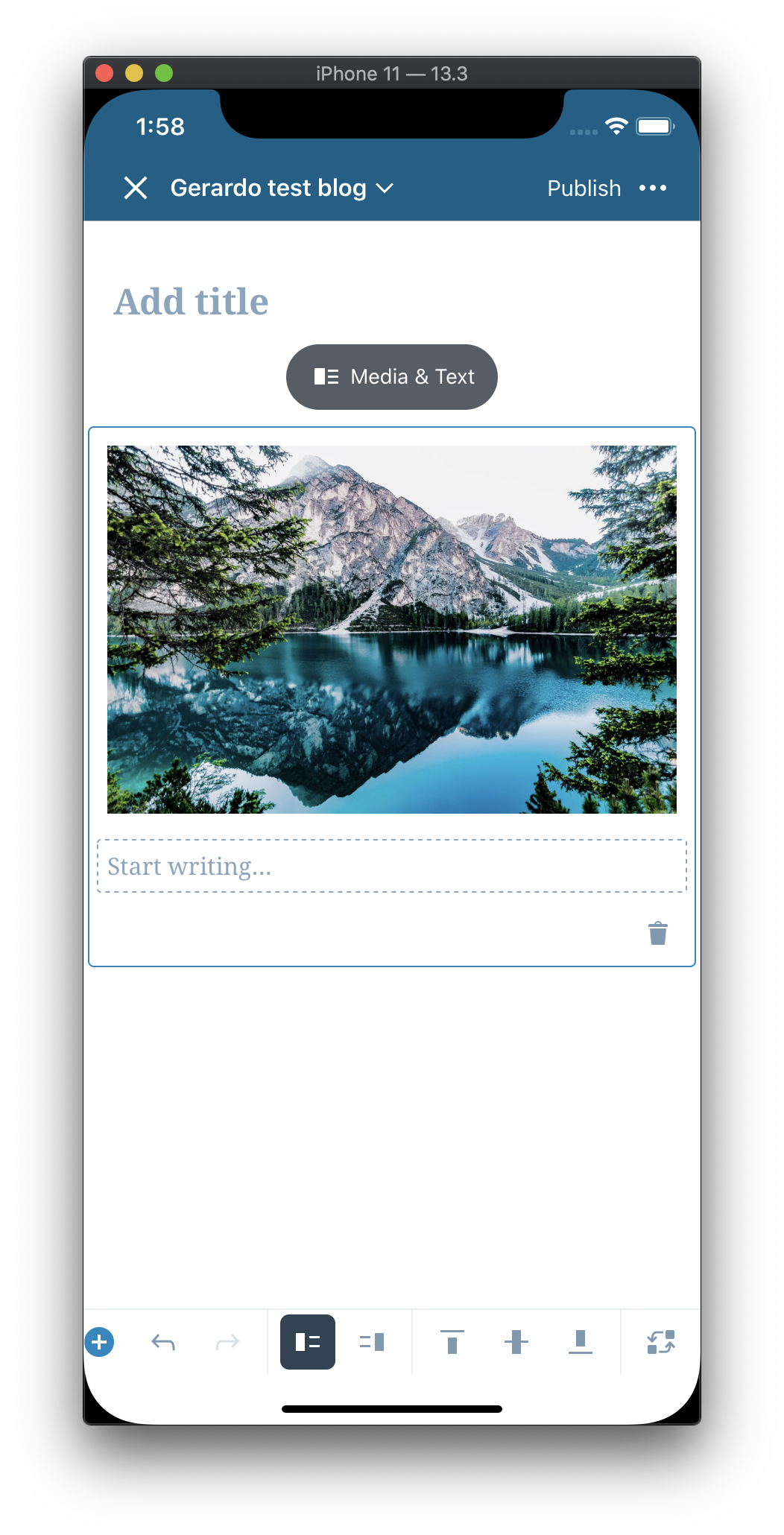
Note: all tested on WPiOS 13.5. iOS 13.1.3 on iPhone 11 Pro, and iPadOS 13.2b3 on iPad Pro 10.5".
 iamthomasbishop
All 6 comments
I am expecting that these will be fixed by the ongoing InnerBlocks work:
Paragraph block has additional left/right padding
Selection highlighting, parent/child relationships aren't clear
Add floating toolbar UI to help with nesting navigation
 pinarol
on 22 Oct 2019
pinarol
on 22 Oct 2019
Updated the original tasks to reflect the current progress, and added an additional issue.
iamthomasbishop
on 21 Nov 2019
Paragraph block has additional left/right padding (example – related to InnerBlocks work?)
Checked this item of the list since it is properly aligned now:
 geriux
on 12 Mar 2020
geriux
on 12 Mar 2020
Icon for "replace media" should be updated to use updated icon (being used in updated Image block toolbar)
I've checked this one too since I merged the icon PR:
geriux
on 13 Mar 2020
Regarding:
- When media block has media, we should add a blue highlight/border on media (related) – this would be solved by the following issue ⬇️
- Allow media within media & text block to be selected (issue)
I think those could be handled in this issue.
Maybe this one could be closed since the rest of the items are done and continue working on the other one.
geriux
on 13 Mar 2020
Closing this in favor of this issue as that's the only one left in the list.
pinarol
on 26 Mar 2020
Related issues
 hypest
·
4Comments
iamthomasbishop
·
3Comments
hypest
·
4Comments
iamthomasbishop
·
3Comments
 mkevins
·
3Comments
mkevins
·
3Comments
 etoledom
·
4Comments
etoledom
·
4Comments
 Tug
·
3Comments
Tug
·
3Comments