Group-income-simple: Notification system [UX / UI Discussion]
Problem
At the moment, there is no notification system in the app. We need this in order to alert users about a variety of events, like a new proposal that needs to be voted on or a new member that has joined or left the group (among others).
Solution
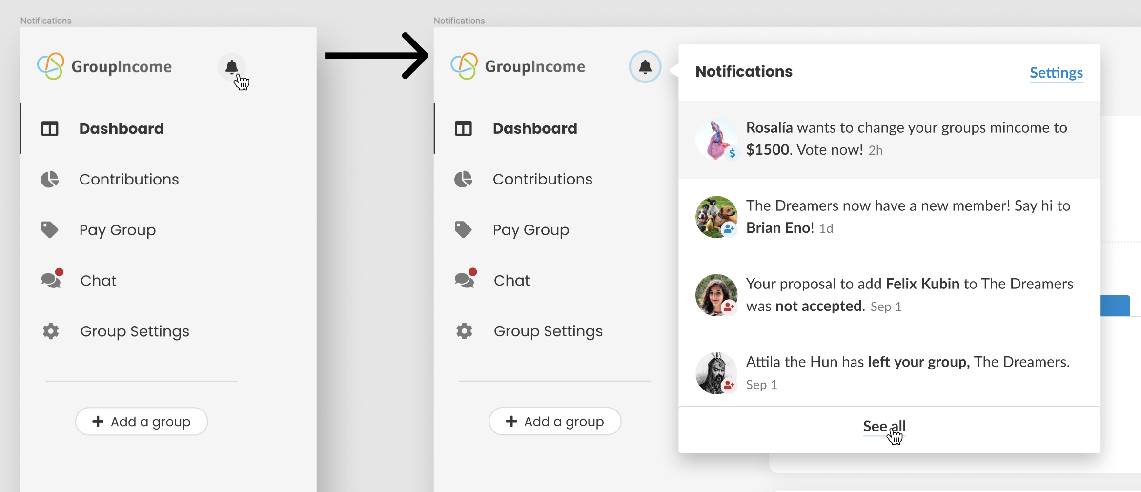
Create a notification system, that users can easily access by clicking on the notification bell 🔔 on the upper left side of the sidebar.
1. What is a notification?
A notification belongs in the notification bell if all the following statements are true:
- The notification can be linked to a place in the app where the user can take action or read more about it;
- Time is relevant to the information provided, either because the date when it happened is relevant OR because there's a time limit to act. _E.g.: when a new proposal is open, being notified in time is very important, so that the user can vote on it before it expires._
- There is an Agent (either a user, the group itself or the app), an Event and an Action. These can be implicit or explicit, depending on the context. _E.g.: "Margarida (agent) wants to add Sandrina to your group (Event). Vote now! (Action)"_
2. What states can a notification have?
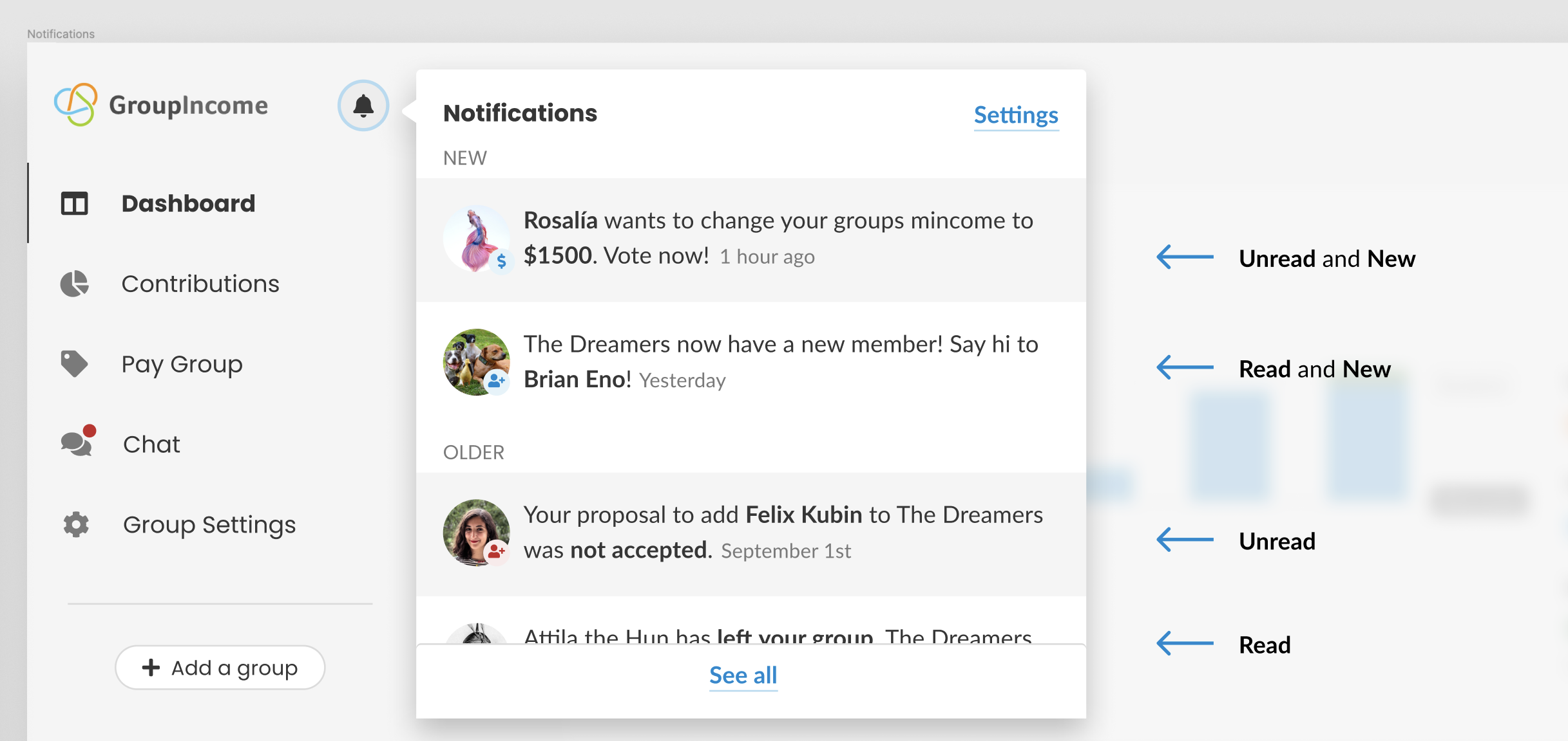
A notification can have the following states:
- New - means that the user was first aware of them less than one hour ago. Note that this does not mean that the notification was created less than one hour ago. Being "aware" of the notification means that they clicked on the bell icon 🔔;
- Unread - means that the user has not clicked on the notification itself (not the notification bell) yet;
- Read - means that the user has clicked on the notification.
A notification can have the following state combinations:
- Unread and New;
- Read and New;
- Unread;
- Read.
Here's an example of how this looks on the interface:
Here's an example of read and unread notifications (without the new and older separation):
3. When should the notification bell have a red badge?
Whenever there are one or more than one New AND Unread notifications, the bell icon will have a red badge with the number of notifications.
Clicking the 🔔 should remove the red badge immediately, as shown below. If there are more notifications than vertical space to read then, the user needs to scroll through all of them for the red badge to disappear.
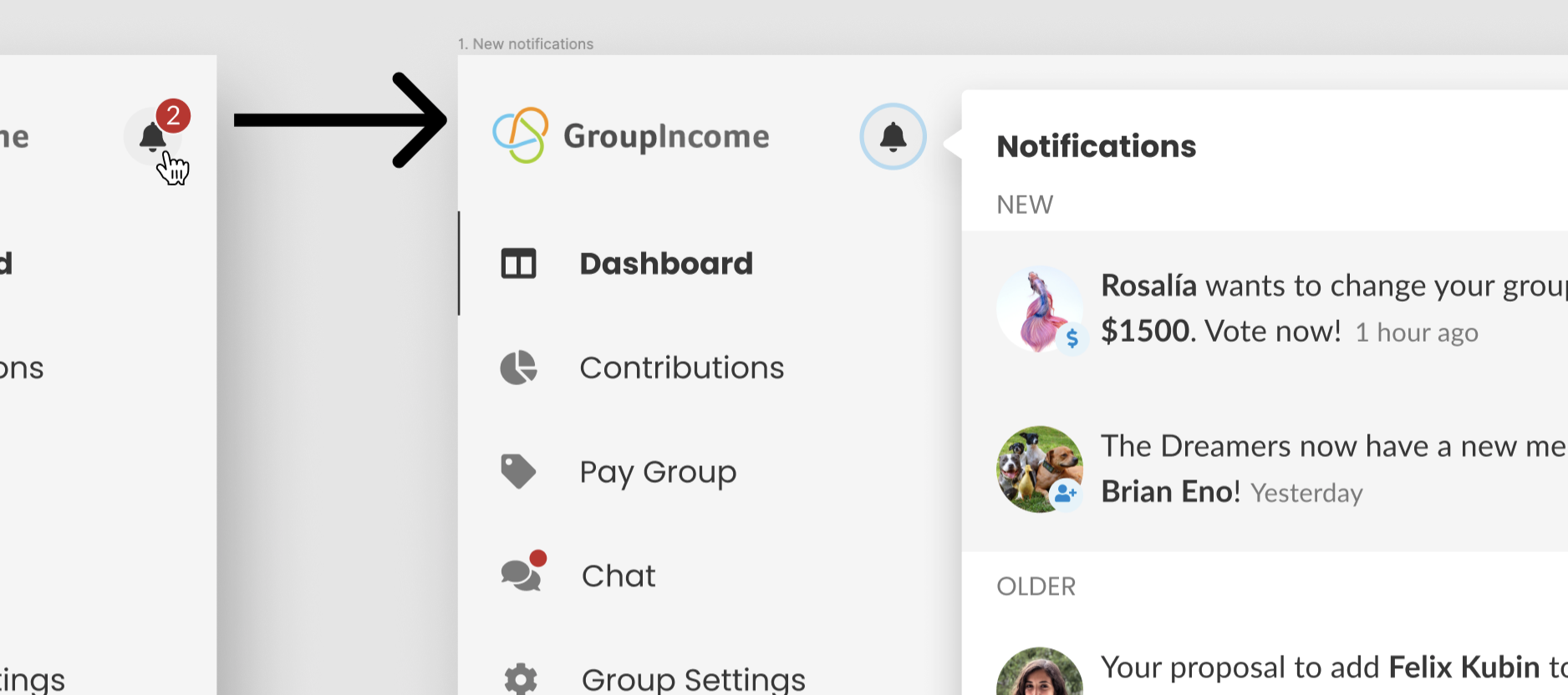
Note that clicking on the 🔔does not remove the New state from notifications.
4. How many notifications are displayed on the floating card and how are they loaded?
- All notifications should be loaded in chronological order - newer notifications show up on top;
- All the NEW AND UNREAD notifications need to be loaded when we click on the 🔔. If there are technical limitations here let me know, so we can reach a compromise on this rule. _Note: If a notification is UNREAD but is not NEW, this rule does not apply. Same thing if it is only NEW_;
- On the remaining scenarios (there are no NEW AND UNREAD notifications to display), we load the last 10. The floating card is scrollable and features an infinite scroll - this means that when the user scrolls to the bottom of the div, 10 more notifications are loaded. If this infinite scroll turns out to be very time consuming to develop, we can do it in future iterations (not a high priority feature).
5. That's nice, but how does it work on mobile screens?
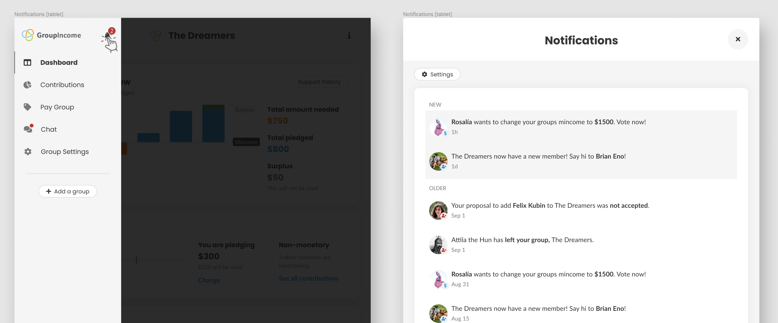
When we have less space in our screens, the hamburger menu will have a red badge, as you can see on the image below:
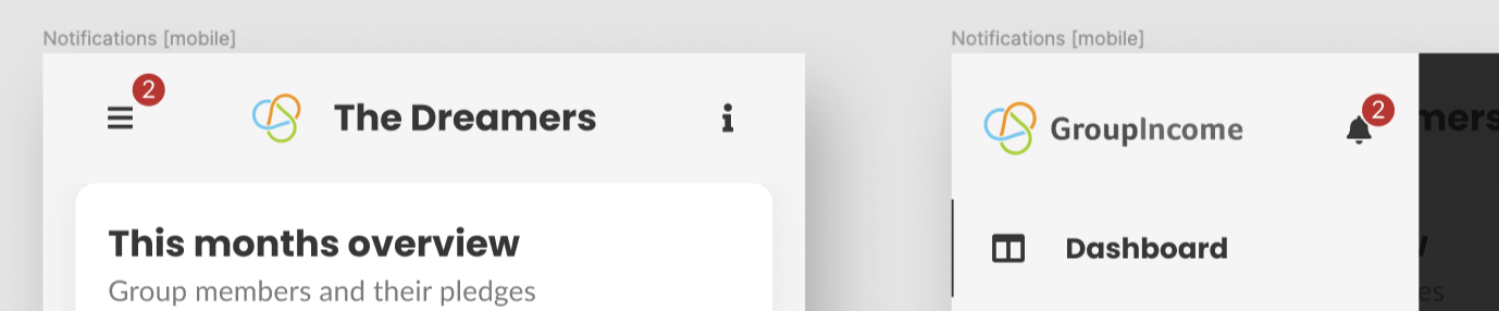
Instead of opening a floating card, clicking the notification bell 🔔 on smaller screens opens a fullscreen modal directly, as so:
6. Now... what is the actual content of these notifications? Or, in other words, which events will create a notification?
_Note: The chat system will have notifications as well, but these will not be displayed on the notification bell. That whole system will be designed soon._
Event: what the user is being notified about;
Copy: the actual text that is displayed in the notification;
Links to: where the user goes when they click on that notification.
| Event | Copy |Links to |
| ------------- | ------------- | ------------- |
| Member added | _Your group has a new member! Say hi to [new_member_name]!_ | General group chat channel |
| Members added[1] | _Your group has [#] new members! Say hi!_ | General group chat channel |
| Member removed (via proposal)| _[member_name] was kicked out of the group. Contributions were updated accordingly_ | Contributions page |
| Members removed (via proposal)[1] | _[member_name] and [#] others were kicked out of the group. Contributions were updated accordingly_ | Contributions page |
| Member left (by their initiative)| _[member_name] has left your group. Contributions were updated accordingly_ | Contributions page |
| Members left (by their initiative)[1] | _[member_name] and [#] others left your group. Contributions were updated accordingly_ | Contributions page |
| Income details are 6 months old or more | _You haven't updated your income details in [amout_of_months]. Would you like to review them now?_ | Income details modal |
| 1 week to send monthly contributions | _Don't forget to send your [month_name] contributions!_ | Contributions page |
| Pending payment confirmations[1] | _You have [#] pending payment confirmations._ | Pay group page |
| New proposal open | _[member_name] wants to [proposal_type_description][2]. Vote now!_ | Dashboard proposals (anchor link) |
| Proposal closed verdict | _[member_name]'s proposal to [proposal_type_description] was approved / not approved by your group._ | Archived proposals |
[1] These notifications are "grouped" events of the same type. We only group notifications of the same type if all of them are New AND Unread.
[2] Possible values for [proposal_type_description]:
- change your groups mincome to [value];
- add members to your group;
- remove members to your group;
- change your groups voting rules.
7. What about users that are in more than one group?
For these users, we use a very similar solution to Slack - we add a badge to the other groups avatar.
I believe handling groups as 2 separate "boxes" is very important. If we mix up all the notifications from different groups into one giant mess, users can very easily (and understandably) lose track of what they are doing.
Here's how it looks:

Figma mockups
https://www.figma.com/file/mxGadAHfkWH6qApebQvcdN/Group-Income-2.0?node-id=4107%3A0
 mmbotelho
All 9 comments
Excellent job @mmbotelho! Really thorough. 👍
I think you've thought through everything really well, and I do think as this is being implemented there might be some changes and more discussion going on, but right now the only thing that jumped out to me was how clearing the notification badge works:
Clicking the 🔔 should remove the red badge immediately, as shown below:
I think there should be some more logic to it than that. I have a few concerns about clearing it immediately:
- What happens if there are more notifications than space available to read them? Clearing the notification badge will give a false sense of being informed.
- In some apps, like Mail.app, the notification counter is directly tied to the unread count. I personally like this approach, because it gives me (the user) direct control over what the notification count should be (I can increase it or decrease it at will). I'm not saying we should do that for Group Income, but I do think it's something to think about. The main concern, again, is clearing notifications before the user has really had a chance to feel like they've been informed and able to adequately respond to all of them.
 taoeffect
on 13 Sep 2019
taoeffect
on 13 Sep 2019
Well done @mmbotelho.
It might be difficult to do infinite scroll on a floating card as at the bottom, the main content will start to scroll. But that's an edge case I might come back later on.
 pieer
on 13 Sep 2019
pieer
on 13 Sep 2019
@taoeffect thank you for the feedback!
What happens if there are more notifications than space available to read them? Clearing the notification badge will give a false sense of being informed.
In some apps, like Mail.app, the notification counter is directly tied to the unread count.
This is when the "New" and "Older", together with the "unread" distinctions come in handy.
With the mail app, for example, it's more likely that you will end up in a situation where having a red badge is not relevant anymore (e.g.: I always have it with 100+ messages there, so the badge is completely irrelevant for me at this point). Imagine that you forget one notification at the bottom of 300 others, and you would need to go all the way down there to make that red badge disappear. That's can be a stressful experience.
I used the same mechanic as Facebook and Twitter use (mainly because they are experts at grabbing users attention).
However, we just need to decide which mechanic we want to try out and tweak it when we launch the prototype. We just need to choose one - I will let that decision up to you!
@pieer thank you for the feedback as well!
It might be difficult to do infinite scroll on a floating card
Yes, I thought so... We can definitely postpone this - since we'll have a "see all" link to a page where users can see all notifications, this is not essential 😄
mmbotelho
on 13 Sep 2019
However, we just need to decide which mechanic we want to try out and tweak it when we launch the prototype. We just need to choose one - I will let that decision up to you!
I do like the way Twitter handles it, which is that it clears the notifications that you've scrolled past, so we can do something like that. 👍
taoeffect
on 13 Sep 2019
Edited the issue with your feedback, @taoeffect and @pieer !
mmbotelho
on 15 Sep 2019
👏 👏 for this amount of research @mmbotelho! I'll give some feedback on Figma, so it's easier to understand the context. Then, we can leave a summary here.
 sandrina-p
on 20 Sep 2019
sandrina-p
on 20 Sep 2019
Now that this flow is decided, I'd like to work on this next, starting with the layout.
Regarding the logic, @taoeffect do you have any approach in mind to tackle this? Is there anything in special I should have in mind?
sandrina-p
on 9 Jan 2020
Now that this flow is decided, I'd like to work on this next, starting with the layout.
Alright, give some thought though as to whether the chat might be worth your attention as well, since for the prototype it would be useful to have a built-in chat feature (though not necessary). If you're still gung ho on doing this first, by all means feel free to proceed, but keep in mind the still-open PRs will need your attention too as I finish up reviewing them all.
Regarding the logic, @taoeffect do you have any approach in mind to tackle this? Is there anything in special I should have in mind?
Yes — avoid cluttering the existing codebase as much as possible. Try to keep things neat and modular, and keep notification-stuff with notification-stuff, separate from everything else. state.js especially, should be left alone. In general, we want to avoid any single file from ballooning in size, and so a lot of attention should be given first to the structure of the files involved in implementing this. Next, I would recommend thinking in terms of an SBP API, and designing the selectors for that API before writing a single line of code. Thinking in terms of an SBP API will help you significantly in keeping your code self-contained and clean.
taoeffect
on 9 Jan 2020
Hum... I believe the chat isn't finished on the UX side yet, @mmbotelho still needs to work on it.
Regarding the current PR, I have kept an eye on each one of them as always.
Thanks, I'll have each advice in mind
sandrina-p
on 10 Jan 2020
Related issues
taoeffect
·
8Comments
taoeffect
·
5Comments
mmbotelho
·
7Comments
sandrina-p
·
8Comments
taoeffect
·
7Comments
Most helpful comment
👏 👏 for this amount of research @mmbotelho! I'll give some feedback on Figma, so it's easier to understand the context. Then, we can leave a summary here.