Godot: The selected node Gizmo in 3.1 can be very hard to see
Godot 3.1 stable, Win 10.
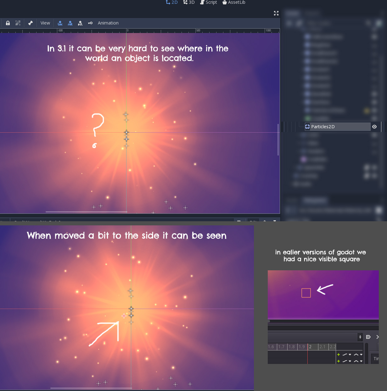
In some cases it can be hard to see where the selected node is placed in your scene, especially if you have a large scene with many nodes. In the example below the selected node is hidden behind other nodes.
In my perfect world it would actually be something similar to 3.0.6 where all nodes are invisible in the scene view except for the selected node.
 jesperkondrup
All 9 comments
In my perfect world it would actually be something similar to 3.0.6 where all nodes are invisible in the scene view except for the selected node.
This wont happen, as it would be impossible to select nodes that have no bounding boxes, like basic node2d. So the crosses are here to stay. Maybe we could add a view setting to hide them though, it can be useful in some cases.
However, I am surprised that the selected node cross is not drawn on top of the others. I'll have a look.
 groud
on 22 Mar 2019
groud
on 22 Mar 2019
And a lot of people complained a out the square making no sense with nodes without bounding boxes. So it won't come back too.
groud
on 22 Mar 2019
@groud I think it is fine that the cross stays and the square doesn't come back. I agree that the box didn't make sense, but I think the problem is that ALL nodes has the cross shown in the editor window, where in earlier versions you only got the box on the nodes you had selected.
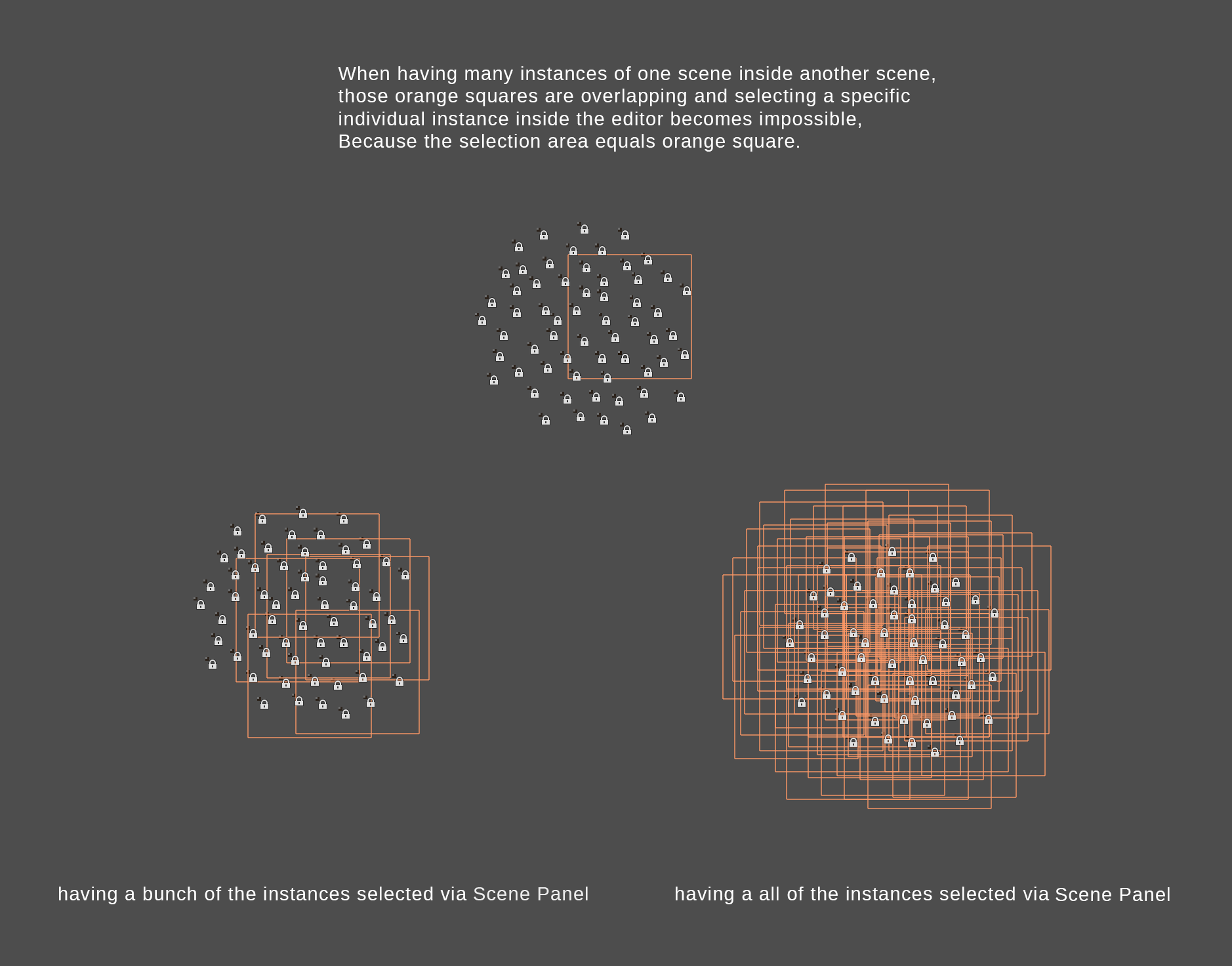
The problem with all nodes showing their cross is that the editor windows becomes extremely cluttered real easy.
 Keetz
on 22 Mar 2019
Keetz
on 22 Mar 2019
The problem with the square was that scenes smaller than this square were not able to be selected in the 2D view when they were so close enough together that they would overlap. Making the 2D view redundant. This is especially relevant in 2D pixel games.
To make the cross easier to see, maybe they should always be drawn on top of everything.
 golddotasksquestions
on 23 Mar 2019
golddotasksquestions
on 23 Mar 2019
I probalby shouldn't have mentioned the square :) All I wanted to point out with the square was that it was more visible in the scene than the current solution.
The cross is fine but right now it's hard to see because it's easily hidden under other nodes in the scene and if you have a big scene there's a lot of gizmos scattered all over. So I think it would be better to hide gizmos of objects not selected.
jesperkondrup
on 25 Mar 2019
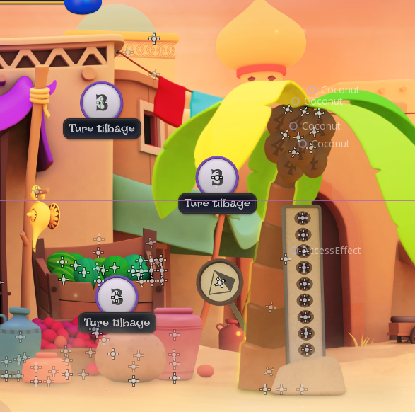
Just a quick post to show how it looks in a more complex scene. As a graphics artists all these gizmos makes it hard to view the scene proporly. Also the mouse hover text showing the Node Tree doesn't help, but that might be for another issue ;)
jesperkondrup
on 26 Mar 2019
Hmmm, I see two things we could do:
1) Always draw the selected gizmo on top of everything else.
2) Hide the crosses for nodes that are children of a "grouped" node
groud
on 26 Mar 2019
I think drawing the gizmo on top would be a good idea. But I also think it should be possible to hide all the gizmos, so you can get an "in game" view of the scene without having to play the scene.
jesperkondrup
on 26 Mar 2019
I think we all can agree drawing the gizmos on top is necessary.
Right now, when you hover over the gizmo, it gives you the name of the node it belongs to. Which is cool but I wonder if this could be emphasized more by giving each gizmo a unique color and when hovering over a gizmo, not only the name shows up, but the contents of the nodes are outlined visually, with the same color of the node. If you want to hide the nodes of a grouped node, please at least make that a toggle in the preferences, as it might be very useful for level designers to directly have access to the contents of grouped nodes.
golddotasksquestions
on 26 Mar 2019
Related issues
 ducdetronquito
·
3Comments
ducdetronquito
·
3Comments
 SleepProgger
·
3Comments
SleepProgger
·
3Comments
 Spooner
·
3Comments
Spooner
·
3Comments
 blurymind
·
3Comments
blurymind
·
3Comments
 n-pigeon
·
3Comments
n-pigeon
·
3Comments
Most helpful comment
I think drawing the gizmo on top would be a good idea. But I also think it should be possible to hide all the gizmos, so you can get an "in game" view of the scene without having to play the scene.