Godot: No visual feedback on selected curve and polygon edition buttons
Godot version:
Godot 3.0.2 stable
Issue description:
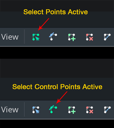
There is no feedback on the mode selected to edit a polygon or curve, all buttons are always the same.

These buttons should be grayed out except the selected one.
Steps to reproduce:
Create a Polygon2D or Curve2D, select a mode (new, edit, delete) and see that all looks the same.
 eon-s
eon-s
All 9 comments
In addition to coloring, we should consider a box outline and/or a backdrop.
 aaronfranke
on 14 Apr 2018
aaronfranke
on 14 Apr 2018
I see feedback on my macbook, not sure that OS would make a difference here,
It's pretty subtle since the non-active buttons have color, and when active it simply becomes green, but I do see it:
Not sure why the buttons I see are different, must be a different node type
 willvincent
on 15 Apr 2018
willvincent
on 15 Apr 2018
Wow, I have not noticed that, it should not require so much attention to see it, it must be easy for peripheral vision when editing a scene.
eon-s
on 15 Apr 2018
Agreed, it's far too subtle. The non-active buttons should probably be grayscale, or dimmed somehow. A box outline around the active tool as @aaronfranke mentioned would be a great improvement too
willvincent
on 15 Apr 2018
CC @djrm
 bojidar-bg
on 15 Apr 2018
bojidar-bg
on 15 Apr 2018
There should be a marker below tool buttons, like a little dot or a bar.
 djrm
on 16 Apr 2018
djrm
on 16 Apr 2018
Graying out seems like an easy solution, but conflicts with the concept that this is generally used to indicate controls are disabled and can't be used.
I like aaron's idea of including box outlines or backdrop highlights. Better highlights certainly will help, but it might hard to find a generally agreeable highlight color between all the hue choices for these buttons. With certain hue mixes, maybe there isn't exactly one highlight that won't be competing for emphasis.
 avencherus
on 28 Nov 2018
avencherus
on 28 Nov 2018
I think we have a general idea of what should be done to fix this issue, all we need is someone to propose and implement something, and make a PR. I won't, since I don't use Polygon2D myself.
Regardless, this won't be done for 3.2, so I suggest bumping to the 4.0 milestone.
aaronfranke
on 9 Nov 2019
The editor theme redesign I'm working on adds a transparent background behind active buttons (similar to Google Docs), so this should be fixed once it's merged.
 Calinou
on 9 Nov 2019
Calinou
on 9 Nov 2019
Related issues
 ndee85
·
3Comments
ndee85
·
3Comments
 rgrams
·
3Comments
rgrams
·
3Comments
 mefihl
·
3Comments
mefihl
·
3Comments
 Spooner
·
3Comments
Spooner
·
3Comments
 gonzo191
·
3Comments
gonzo191
·
3Comments