Godot: Color of the node emitting the signal in Connecting Signal dialog is confusing
Godot version:
v3.0.2
OS/device including version:
All
Usability Enhancement:
When connecting a signal in the Connecting Signal dialog. The node emitting the signal is bright red. This can lead to confusion as to whether or not a signal can be connected to it since red is generally used to indicate things that are bad. I suggest switching the color to a more friendly color or making it a bolded version of the normal color and add the word (Emitter).
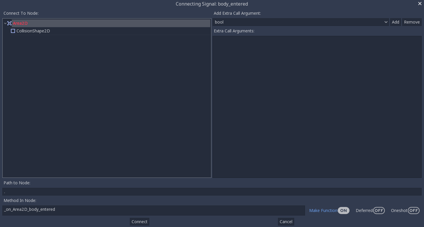
This is how it currently is. Note how it can be perceived as incorrect to connect a signal to that node.
Just an example color to show how it doesn't feel wrong to connect a signal to this node now.

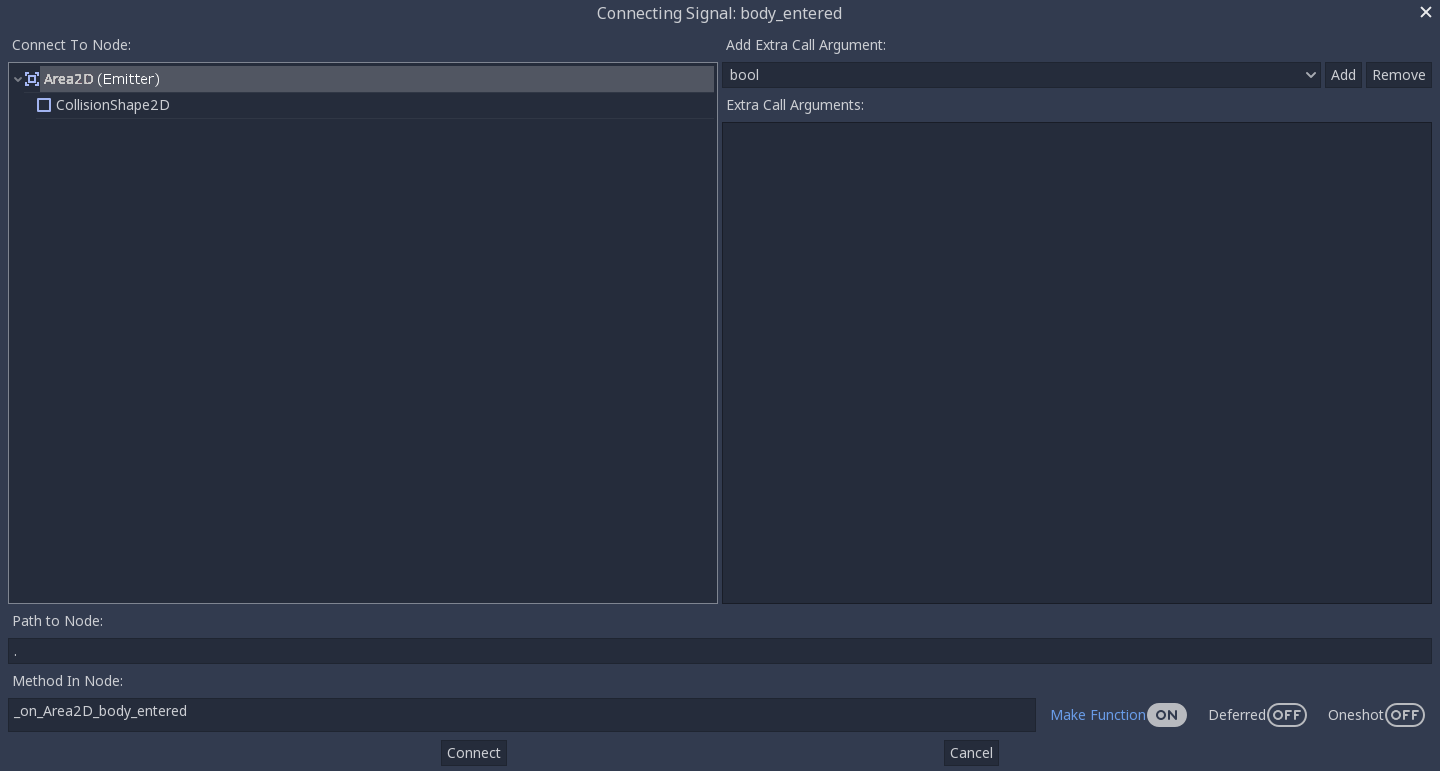
Last example to show it white with the added word (Emitter). This to me is the clearest and doesn't indicated that it should be connected or that it shouldn't be connected. Note: On discord it was also mention to possible add the emitter icon as well.
Steps to reproduce:
Minimal reproduction project:
 kenneth-leblanc
All 14 comments
Hm, I can't find where set color of this red item list :( I find NodeDock class and ConnectionsDock class. I saw editor color settings. Nothing. Need help.
 Mintormo
on 21 Apr 2018
Mintormo
on 21 Apr 2018
I was also interested in chasing this one down, I might start looking in connections_dialog.cpp. I'm not sure though, I literally just downloaded the source code.
kenneth-leblanc
on 21 Apr 2018
Same here. I think the actual list is created in another class. Look at lines 262-264 in connections_dialog.cpp.
 giladbau
on 21 Apr 2018
giladbau
on 21 Apr 2018
Look at lines 262-264 in connections_dialog.cpp
Nothing. :(
Mintormo
on 21 Apr 2018
I find where is it. Method SceneTreeEditor::_add_nodes. Lines 172, 207, 214 in editor/scene_tree_editor.cpp. What color (or title) should I choose? I think it's not worth adding an inscription "Emitter" to node title because this code is used in several places (Scene Tree dock and any place where is used SceneTreeEditor class).
Mintormo
on 22 Apr 2018
My personal preference is to leave the color the same as the rest of the text. Make the text Bold and add the word (Emitter)
Like: Area2D (Emitter)
Like the last demo picture.
kenneth-leblanc
on 22 Apr 2018
I suggest this:
It's used standard color "warning_color" and "success_color" of default editor theme. By my opinion, It's used custom hardcoded color is wrong because a user theme can't change color of marked item.
Mintormo
on 22 Apr 2018
My personal preference is to leave the color the same as the rest of the text. Make the text Bold
It's not contrast. I think the color should attract the eye.
Mintormo
on 22 Apr 2018
The contrast is too much. You don't want to draw the users attention so much. It is really only there for informational purposes. You need to save high contrasts color for when it is really important. This isn't important, there really is almost no reason to highlight the emitting node. So I think it should be subtle.
kenneth-leblanc
on 22 Apr 2018
I'm happy that a change is being made, and green is definitely an improvement over red. But I'm inclined to agree with @kenneth-leblanc that giving the emitting node a special color can mislead the user into believing that something important is happening.
Correct me if I'm wrong, but I believe the reason for trying to make the emitting node stand out is because it's common to want to connect a signal to the emitting node. So the current process for this is:
- Click "Connect..."
- Look for the special color to find the emitting node.
- Select the emitting node.
- Click "Connect".
My thought is, if this is common, why not simplify the process of connecting a signal to self:
- Click "Connect..."
- The Connect dialog selects the emitting node as the initial selection.
- Click "Connect".
This would remove the need to make the emitting node stand out so much, and the emitting node could be styled less conspicuously - maybe bold white. This would make the interface less confusing, and there would be one less step when connecting a signal to self.
Am I on the right track here, or is the emitting node colored for a reason other than what I mentioned?
 AlanLynn
on 2 May 2018
AlanLynn
on 2 May 2018
@AlanLynn I was actually thinking of the same thing, but then I realised that my signal connections went to the root node of the scene just about as often as to itself. Changing the behaviour would just move the extra click to when you want to select the root node, so I don't know if it would make a difference in the long run. Not that I would really mind the change.
From what I can gather, the emitting node was indicated in a different colour only so you could orient yourself a little better, pretty much. It should definitely be changed to something less conspicuous.
 ghost
on 3 May 2018
ghost
on 3 May 2018
There appear to be several proposed options for fixing this, including changing the color, adding text to mark the node, bolding the text, or some combination. I personally think changing the color is the best approach because it provides the least dramatic change while still fixing the problem, but I'd appreciate some input before I make a pull request.
This is my first time contributing to a project other than one of my own, so if I'm doing anything wrong, please let me know.
 sporklpony
on 14 Aug 2018
sporklpony
on 14 Aug 2018
I believe the clearest and best option is as follows.
Change the color to white. (Match the rest of the text)
Add the word "(Emitter)"
Make the text bold (If possible)
Why?
The only reason this was ever a different color was to show which node is the emitting node. This is informational in nature. Not an error (Red), not a warning (Yellow/Orange), and not something that is recommend (Green). So using a color doesn't make sense. So it still needs to match the rest of the text in color.
However, since it still needs to be clear which node is the emitting node a simple label "(Emitter)" will clearly indicate to the user which node is the emitter without the implications that the colors carry.
Lastly, making the text bold will make it stand out just a little bit more than the surrounding text drawing the users eyes and allowing them to quickly find the node labeled "(Emitter)"
kenneth-leblanc
on 14 Aug 2018
Fixed by 9f4b5a9.
 akien-mga
on 13 Apr 2019
akien-mga
on 13 Apr 2019
Related issues
 mooseyfaith
·
3Comments
mooseyfaith
·
3Comments
 RayKoopa
·
3Comments
RayKoopa
·
3Comments
 nunodonato
·
3Comments
nunodonato
·
3Comments
 RebelliousX
·
3Comments
RebelliousX
·
3Comments
 n-pigeon
·
3Comments
n-pigeon
·
3Comments
Most helpful comment
@AlanLynn I was actually thinking of the same thing, but then I realised that my signal connections went to the root node of the scene just about as often as to itself. Changing the behaviour would just move the extra click to when you want to select the root node, so I don't know if it would make a difference in the long run. Not that I would really mind the change.
From what I can gather, the emitting node was indicated in a different colour only so you could orient yourself a little better, pretty much. It should definitely be changed to something less conspicuous.