Godot: Default editor font a bit smaller?
I was thinking about changing default Editor and Source text font from 14 to 12.
Change is small but visually Editor looks much slicker and modern.
Probably there is some room for discussion. Any objections? :)
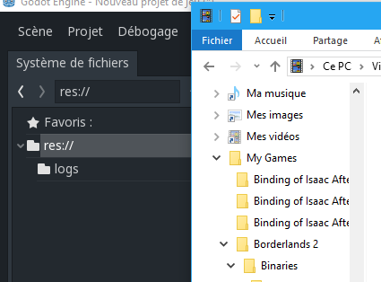
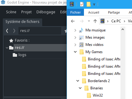
OLD
NEW
 n-pigeon
All 22 comments
Turns out it's been a while I reduced font size to 12 too^^ (I also set it to 13 in 2.1.x, instead of 14). I never thought of proposing it as default since it was easy to setup and the result it gives wasn't "broken" so far :D
I think the reason why I did it was that compared to the system's text, other dev apps and window titles, Godot's text looked bigger, and I felt reducing it would help gaining space while still being readable. Quite subjective though
 Zylann
on 24 Oct 2017
Zylann
on 24 Oct 2017
Is 12px still easy readable on 4K screens though? I think it's safer to have a slightly larger font size by default with the option to make it smaller (as it is now) than the other way around. I quickly checked a couple of websites and they generally seem to use 14px for the main text.
 zedutchgandalf
on 25 Oct 2017
zedutchgandalf
on 25 Oct 2017
@zedutchgandalf the proposal of 12px doesn't make sense if you think about upscaled modes that likely run in 4K. If it were to be ported here, that would just mean the font would be proportionally smaller (so still readable).
Zylann
on 25 Oct 2017
I prefer the current font, small fonts tend to be less readable on standard (loDPI) displays, also is there any benefit besides the opinion that it looks more modern?
 djrm
on 25 Oct 2017
djrm
on 25 Oct 2017
@djrm as I said, simply space gain, "homogeneity" towards font sizes on system apps and many other, and better subjective feeling regarding these :D My system is 1920x1080 though (which isn't loDPI I guess?), so I can't tell about these.
On my system:
Before:
After:
Zylann
on 25 Oct 2017
@Zylann funny but on the linux side it seems to be consistent already, i also have 1080p display, which godot considers LoDPI.
djrm
on 25 Oct 2017
¯_(ツ)_/¯
Baaaaaa Linux xD (no offense I like Linux) beware that not all apps are comparable (an IRC client might not have the same sizing policies as an IDE, file explorer or painting program^^ example: Discord font size xD) But you wanted a reason, I gave you one, even if that's local to Windows at 1080p here^^
Do you mean Godot wrongly detected my system as being midDPI?
As long as I'm not annoyed by something breaking my setup, I think it's not worth it worrying about the default value as long as it's decently choosen, unless many people agree that a change is needed.
Zylann
on 25 Oct 2017
@Zylann that IRC client uses GTK so it has the system settings, also about your settings it might be, maybe thats the reason why the icons for you look worse, since they are rendered to non power of 2 on those settings and they get distorted.
djrm
on 25 Oct 2017
@djrm I changed from Auto to LoDPI but it didn't have any effect. Detection might be working already, after all.
(if you were talking about the icons on the zoom bar on earlier issues, these were 16x16 which is power of two. Even at 24x24 they were rendered 1:1, the issue was actually non-integer drawing coords)
Zylann
on 25 Oct 2017
I use it at 12 too, that makes the minimum size of panels too wide, though.
Also, 14 looks big on small screens.
 eon-s
on 25 Oct 2017
eon-s
on 25 Oct 2017
As @Zylann said change will be more about proportions, not fixed size for all resolutions. :)
It is more about first impression look.
More voices? @groud @toger5 @volzhs @akien-mga @reduz (someone more?)
n-pigeon
on 25 Oct 2017
I've got no strong opinion on that, I like the current font size but I agree it's slightly bigger than other softwares.
 groud
on 25 Oct 2017
groud
on 25 Oct 2017
I like the smaller font size.
 27thLiz
on 25 Oct 2017
27thLiz
on 25 Oct 2017
@Zylann = cookie clicker player spotted.
groud
on 25 Oct 2017
I propose setting the default font size to 13 (which is small, but still readable on a loDPI display), and keeping the default script editor font size to 14 (12 is too small, and 13 doesn't make it save any vertical space compared to 14).
I'd also appreciate smoother font rendering (less strong hinting), but I'm not sure if this is possible.
Some screenshots follow, these were taken on a 32" 2560×1440 monitor (~92 dpi) on Windows 10:
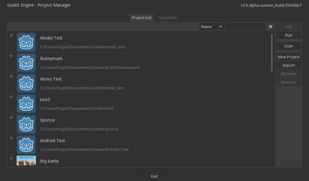
Gray project manager, font size 13:
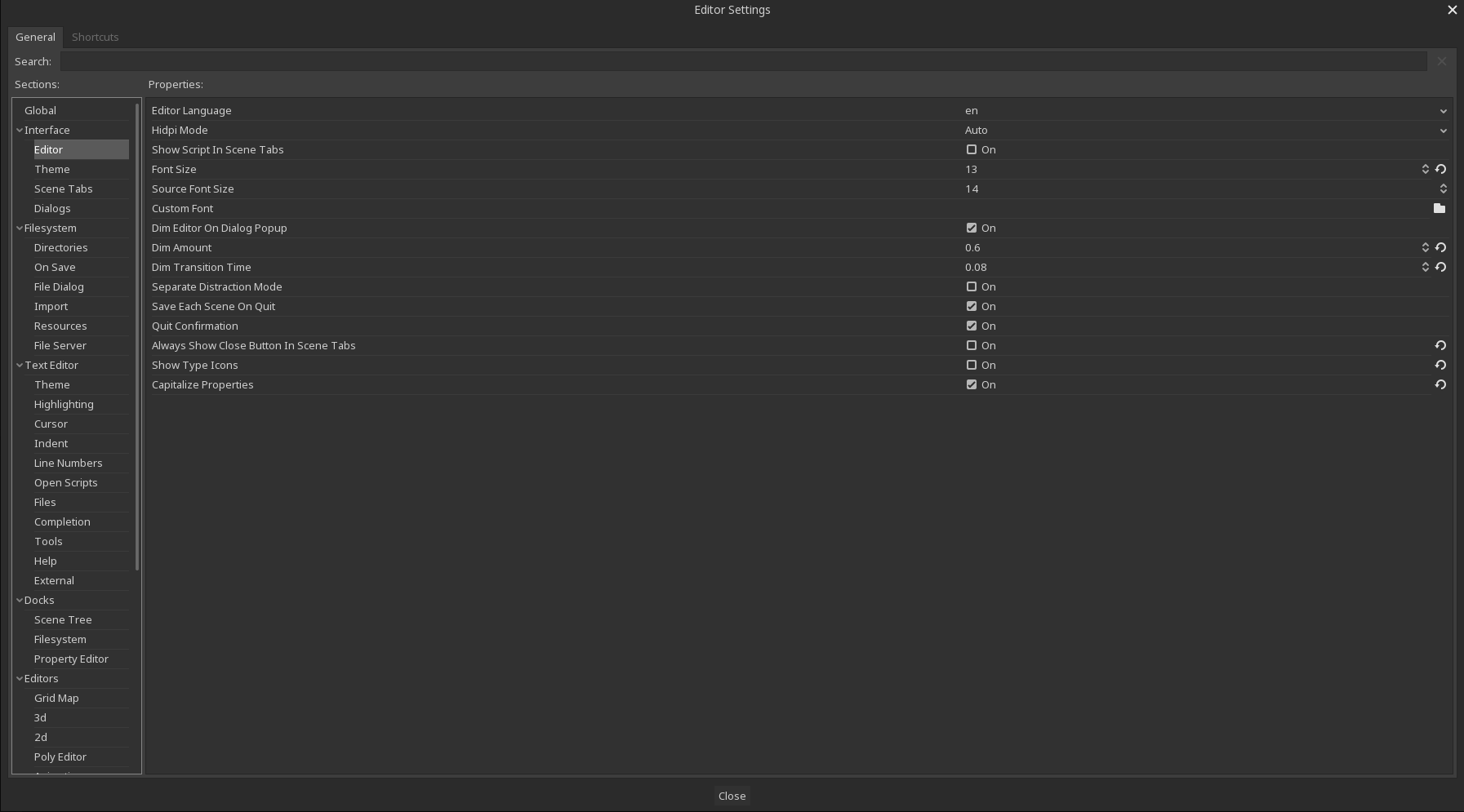
Gray editor settings, font size 13:
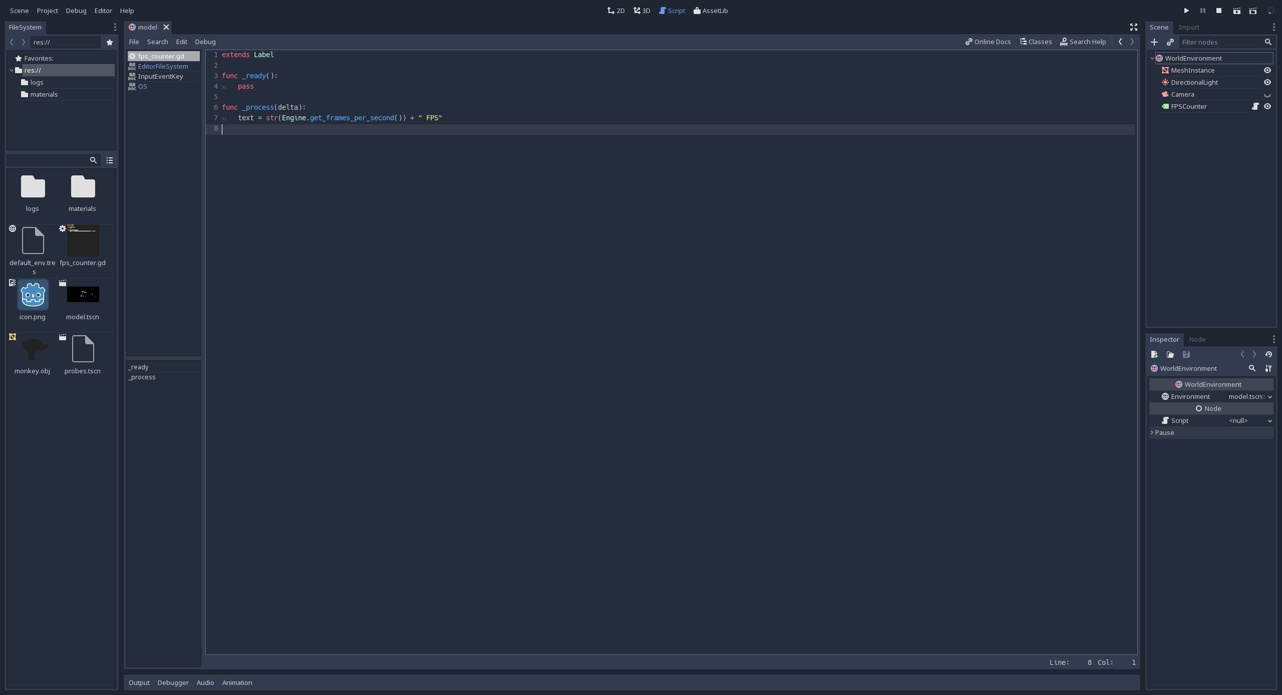
Default editor, font size 13:
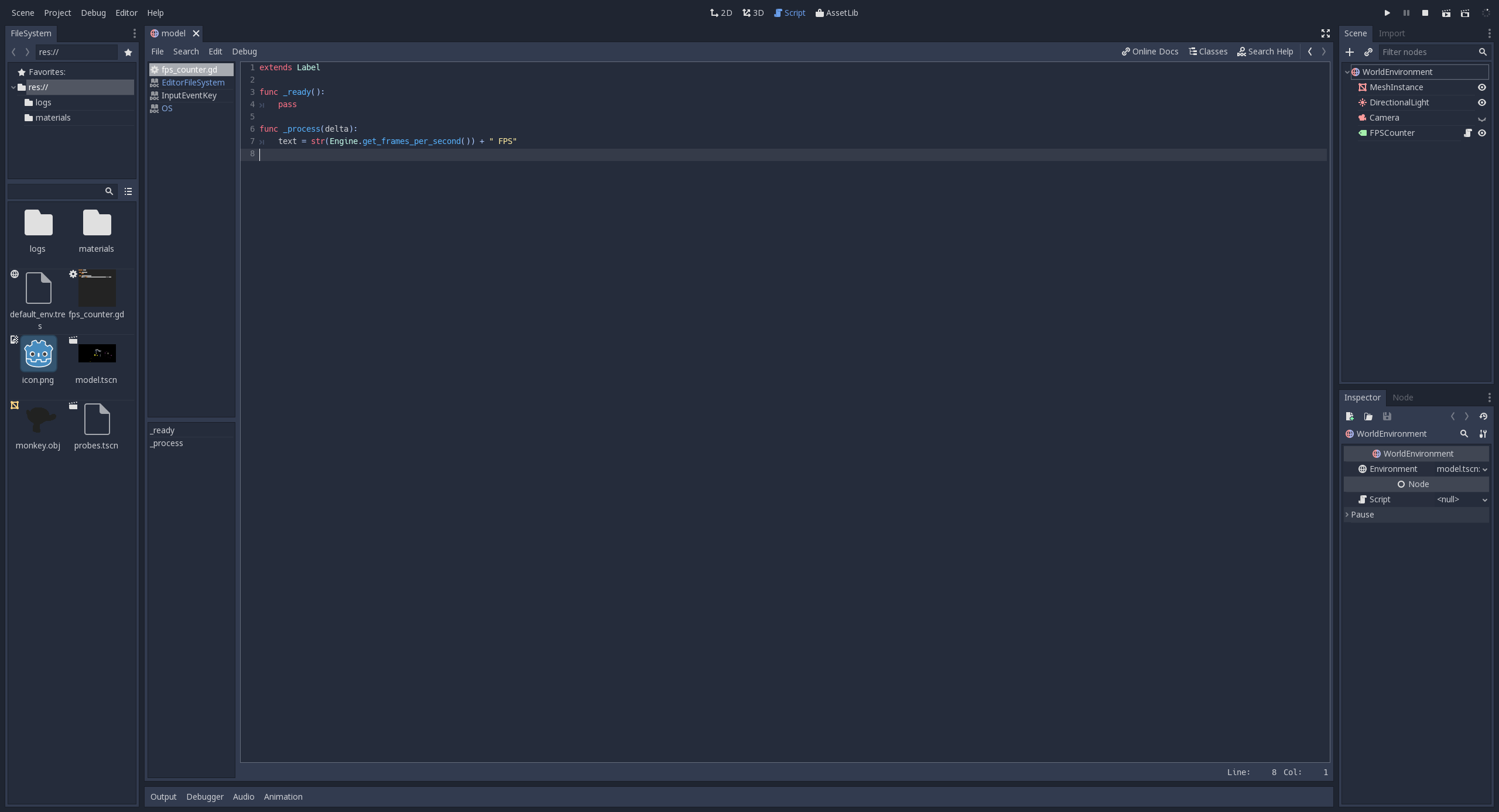
Default editor, font size 14:
Light editor, font size 13:
Light editor, font size 14:
 Calinou
on 25 Oct 2017
Calinou
on 25 Oct 2017
I vote for 13.
 volzhs
on 25 Oct 2017
volzhs
on 25 Oct 2017
i notice a worse font resolution on font 13. even with HiDPI (or medium i dont know what that is) i could say it will be worse on loDPI, but i mean 1px difference in my opinion this is pointless
djrm
on 26 Oct 2017
I also don't prefer one specific size. as long as it is readable. generally I prefer bigger fonts.
So my vote is to keep it. (but just I'm fine with everything. as you can see I also don't have good points...)
 toger5
on 26 Oct 2017
toger5
on 26 Oct 2017
Ultimately this is all just user preference. So imo the question should be about which font size is the most accessible for the largest amount of users (so they can at least see enough to be able to change the font size to one more appropriate for their monitor). And I think with that in mind it is safer to choose a default font size that might look slightly too big on certain monitors than one that might look too small, ie. might be unreadable.
I don't know if this is possible, but you might also be able to set the default based on the user's dpi to try to offer everyone the most optimal experience...
zedutchgandalf
on 26 Oct 2017
@zedutchgandalf yup, we already change GUI size based on auto-detected resolution. Fonts are automatically adjusted also.
n-pigeon
on 26 Oct 2017
I've been using with font size 13 for 2.1.4 for a couple of days.
and now I prefer 14.
volzhs
on 27 Oct 2017
Closing this, as the discussed seems to have reached its end half a year ago without a clear consensus and because this seems mostly be subjective.
 mhilbrunner
on 10 Apr 2018
mhilbrunner
on 10 Apr 2018
Related issues
Zylann
·
3Comments
n-pigeon
·
3Comments
 gonzo191
·
3Comments
gonzo191
·
3Comments
 ndee85
·
3Comments
ndee85
·
3Comments
 timoschwarzer
·
3Comments
timoschwarzer
·
3Comments
Most helpful comment
Turns out it's been a while I reduced font size to 12 too^^ (I also set it to 13 in 2.1.x, instead of 14). I never thought of proposing it as default since it was easy to setup and the result it gives wasn't "broken" so far :D
I think the reason why I did it was that compared to the system's text, other dev apps and window titles, Godot's text looked bigger, and I felt reducing it would help gaining space while still being readable. Quite subjective though