Godot-proposals: Improve unintuitive tab - content view behaviour
Describe the project you are working on:
None
Describe the problem or limitation you are having in your project:
I'm new to godot so i act based on my intuition and found quirks i stumple upon quite often.
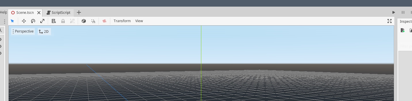
When i have a scene open and decide to click the assetlib button at the top, browse it and want to close it again i intuitively click the 'x' in the tab which unfortunately and unexpectedly closes the open scene because it replaces the tab's content view without actually replacing the tab.
Same with the script editor.
This confusion is shared with 2D/3D being 'global' buttons even though assetlib or scripteditor don't have those view modes.
Describe the feature / enhancement and how it helps to overcome the problem or limitation:
Either
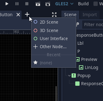
1- open the assetlib and script editor in a separate tab (see mockup below)
2- have the close action move the window back into the last scene view state (2D or 3D)
3- print a warning that this will not close the current view but the scene (suboptimal)
and move the 2D/3D buttons into some panel or block inside the scene view where they make more sense.
Describe how your proposal will work, with code, pseudocode, mockups, and/or diagrams:
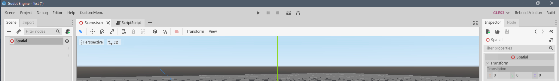
Here i reordered a few elements. The script editor is a separate tab (as the assetlib would be), 2D/3D are moved into the sceneview as toggle between both modes (works well in unity, plus it can even be hidden if only 2D is used (editor feature)). This makes the top mostly free space. The assetlib button can be moved into the editor menu as its functionality will likely not be need so frequently to warrant such a global presence (again same as unity, where their store is even existential for their business). Following this the upper space is free to be used by expanded content views.
This way closing the script/assetlib panel does not collide with the sceneview, context-dependent functionality is visually and functionally linked to its context and more space is available.
If this enhancement will not be used often, can it be worked around with a few lines of script?:
It most likely cannot be added with a few lines of script.
Is there a reason why this should be core and not an add-on in the asset library?:
It potentially provides more intuitive interactions, so it's a gain in usability for every new godot user and changing this via editor plugins most likely requires very hackish workarounds if even possible.
 Flavelius
All 4 comments
Oh a fresh take on the editor UX, I like how little space it wastes at the top, keeping things organised at the same time.
 lentsius-bark
on 30 May 2020
lentsius-bark
on 30 May 2020
This is very similar to #492. I think this proposal is a bit better since it seems to avoid requiring the user to click twice to switch between editors. However, it's much more difficult to implement.
Still, both proposals suffer from the downside that the left menu will barely have any free space. This is a problem when using translations whose text is longer than the English version. I don't know of a good way to solve this.
 Calinou
on 30 May 2020
Calinou
on 30 May 2020
One possibility i can imagine would be to not actually use the freed space but move the right menu instead partially back to the middle (as it once was judging from screenshots i found); as Play/Pause/Stop/Play-current-Scene is functionality accessed more often, so placing it more prominently would be a slight improvement even. The right part could keep build, GL-switch and get mono-rebuild added. This would balance it out visually, functionality is grouped thematically and space is available again for custom extensions and differences in translation.
Flavelius
on 30 May 2020
I see no reason AssetLib needs to be a "mode" at all. Two things;
First, if the theoretical target for this is 4.0, one thing to consider is that reduz mentioned there might be major changes to how the editor tabs are docked after multi-window support is implemented, to assist multi-monitor users. This means that the AssetLib, like other tabs, could be moved into its own separate window, and evoking it can be moved anywhere (like say, a button in the project plugins tab), instead of as a weird addition to the current scene editor context.
Second, switching contexts from 2d to 3d and vice-versa is rarely done outside of scenes which have both 2d and 3d elements (usually they're viewports to pipe between modes like for UI or 2.5d), so the idea of having it hidden by default seems reasonable. I would suggest having the "mode" text available as a right-click option at the very top of that particular context menu, with a separator below it before listing all of the other options available. The + button could show what's currently displayed in the Scene tab as a drop-down instead.
(The image below wouldn't work as a normal PopupMenu, so the top part might have to be 3 separate menu options instead. The advantage to this, though, is the F1/F2/F3 accelerators could be clearly seen. In addition, the New Scene option would be expanded to contain the same ones as the menu in the image above.)
 nobuyukinyuu
on 1 Jun 2020
nobuyukinyuu
on 1 Jun 2020
Related issues
 WizzardMaker
·
3Comments
WizzardMaker
·
3Comments
 davthedev
·
3Comments
davthedev
·
3Comments
 KoBeWi
·
3Comments
KoBeWi
·
3Comments
 arkology
·
3Comments
arkology
·
3Comments
 lupoDharkael
·
3Comments
lupoDharkael
·
3Comments
Most helpful comment
One possibility i can imagine would be to not actually use the freed space but move the right menu instead partially back to the middle (as it once was judging from screenshots i found); as Play/Pause/Stop/Play-current-Scene is functionality accessed more often, so placing it more prominently would be a slight improvement even. The right part could keep build, GL-switch and get mono-rebuild added. This would balance it out visually, functionality is grouped thematically and space is available again for custom extensions and differences in translation.
