Godot-proposals: Add a font size setting for the 2D editor ruler
Describe the project you are working on:
Any project on bigger screen
Describe the problem or limitation you are having in your project:
I have moved from 1080p to 1440p and while I enjoyed more real estate I am struggling to see certain elements of interface without being able to modify them directly. I can increase editor scaling but this increases size of everything completely negating the benefit of bigger resolution. My biggest problem is with 2D editor and a ruler settings. Those can't be affected directly and I have to either increase editor scaling or struggle with small font.
Describe how this feature / enhancement will help you overcome this problem or limitation:
Allow for finer fine tuning of each element of editor so user can choose which elements to increase in size and which not.
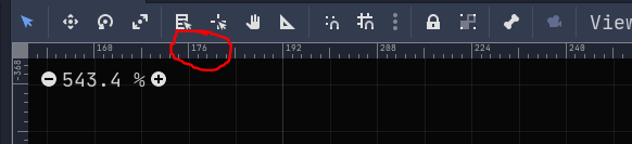
Show a mock up screenshots/video or a flow diagram explaining how your proposal will work:
As above just bigger :)
Describe implementation detail for your proposal (in code), if possible:
No idea how it would work.
If this enhancement will not be used often, can it be worked around with a few lines of script?:
All the time by people using editor on bigger screens or people with visual impairment it's a big accessibility feature.
Is there a reason why this should be core and not an add-on in the asset library?:
It's a part of editor.
 Feniks-Gaming
All 5 comments
Allow for finer fine tuning of each element of editor so user can choose which elements to increase in size and which not.
Each setting has a cost to it. It means we need to spend more time testing and documenting them. It also increases choice paralysis for users who have to tweak those settings. We'd like to keep the settings relatively simple, so we can't add a setting for every possible use case that an user might have.
Instead of adding more editor settings, please think about other solutions first:
- Increase the size of the ruler font slightly for everyone. Maybe we can do this while only losing a pixel or two of real estate.
- Use a dedicated pixel font for ruler text. Since it lacks antialiasing, it can be made more readable at lower sizes.
 Calinou
on 31 Jan 2020
Calinou
on 31 Jan 2020
I would be happy with solution 1 you proposed if Ruler increased slightly it would help. On 1440p it's tiny. I can only imagine that anyone running this in 4k can't even read it at all.
Feniks-Gaming
on 31 Jan 2020
@Feniks-Gaming You're typically supposed to use some form of scaling on 4K, unless you're using a really large monitor and have really good eyes :slightly_smiling_face:
Calinou
on 31 Jan 2020
I don't have this particular problem (yet) as I'm still on 1080p so I can't comment on this particular proposal, but I know for sure that choice paralysis is much less a problem in preference settings than it is in the general editor interface. As it is will all UI it usually comes down how intuitive and well structured is the interface design.
Godot sometimes has preference settings that have as little as three or two option items in them, sometimes even just one like
Project Settings > FilesSystem
and then
Project Settings > FilesSystem > Import
has again just one item.
And then others with an overwhelming amount of option items that mix various subcategories like 2D and 3D:
Project Settings > Rendering > Quality
As a user who creates a 2D game, figuring out which option items here are relevant for my 2D game is incredible hard, if you don't also know what all these 3D settings mean.
Even if you know exactly what you are looking for (like 2D pixel snap) it's super hard to find, because it's just structured so bad.
This is a problem that is evident in every settings category. It has nothing to do with choice paralysis, just bad organizational UI/UX design.
If the best idea for a solution for choice paralysis, is not providing any choice in the first place, you have not understood the problem.
That's like solving the problem of traffic or transport by not providing any mobility.
So I for one would definitely welcome more options to adjust the editor and therefore more settings, but as somepoint hopefully also a restructuring of the settings menu.
 golddotasksquestions
on 31 Jan 2020
golddotasksquestions
on 31 Jan 2020
@golddotasksquestions We can reorganize settings now that we can break compatibility :slightly_smiling_face:
Calinou
on 31 Jan 2020
Related issues
 wijat
·
3Comments
wijat
·
3Comments
 PLyczkowski
·
3Comments
PLyczkowski
·
3Comments
 WizzardMaker
·
3Comments
WizzardMaker
·
3Comments
 SleepProgger
·
3Comments
SleepProgger
·
3Comments
 SpyrexDE
·
3Comments
SpyrexDE
·
3Comments
Most helpful comment
I don't have this particular problem (yet) as I'm still on 1080p so I can't comment on this particular proposal, but I know for sure that choice paralysis is much less a problem in preference settings than it is in the general editor interface. As it is will all UI it usually comes down how intuitive and well structured is the interface design.
Godot sometimes has preference settings that have as little as three or two option items in them, sometimes even just one like
Project Settings > FilesSystem
and then
Project Settings > FilesSystem > Import
has again just one item.
And then others with an overwhelming amount of option items that mix various subcategories like 2D and 3D:
Project Settings > Rendering > Quality
As a user who creates a 2D game, figuring out which option items here are relevant for my 2D game is incredible hard, if you don't also know what all these 3D settings mean.
Even if you know exactly what you are looking for (like 2D pixel snap) it's super hard to find, because it's just structured so bad.
This is a problem that is evident in every settings category. It has nothing to do with choice paralysis, just bad organizational UI/UX design.
If the best idea for a solution for choice paralysis, is not providing any choice in the first place, you have not understood the problem.
That's like solving the problem of traffic or transport by not providing any mobility.
So I for one would definitely welcome more options to adjust the editor and therefore more settings, but as somepoint hopefully also a restructuring of the settings menu.