Godot-docs: Docs sidebar not wide enough
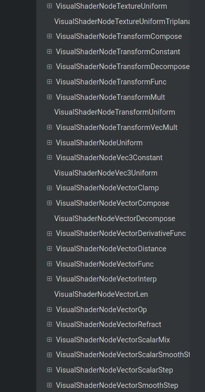
Right now a few of the class names are so long that the sidebar forces them onto a new line (e.g. VisualShaderNodeVectorScalarSmoothStep), separate from their "+" button, but they still run off the side of the sidebar. This looks incredibly odd, especially since the docs have open space on either side.
CC: @Calinou since you've been handling all the website updates recently :)

 clayjohn
All 4 comments
I think this was already an issue before I centered the documenation's main page. I'm not sure how difficult it'd be to enlarge the sidebar slightly. If enlarging the sidebar isn't possible, we could make overflowing text result in an ellipsis so it doesn't break into multiple lines.
 Calinou
on 22 Jan 2020
Calinou
on 22 Jan 2020
This is probably something that would be worth discussing with upstream at https://github.com/readthedocs/sphinx_rtd_theme. Implementing a ad hoc solution like widening the sidebar could be done, but eventually me might get an even longer name and the same issue again. A solution is likely necessary for better handling of long, unbreakable section names.
 akien-mga
on 22 Jan 2020
akien-mga
on 22 Jan 2020
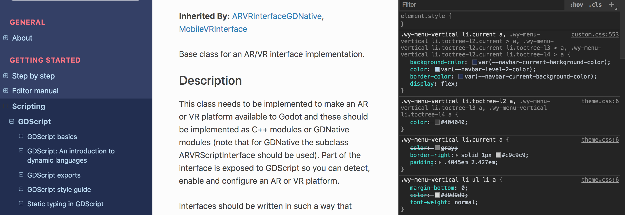
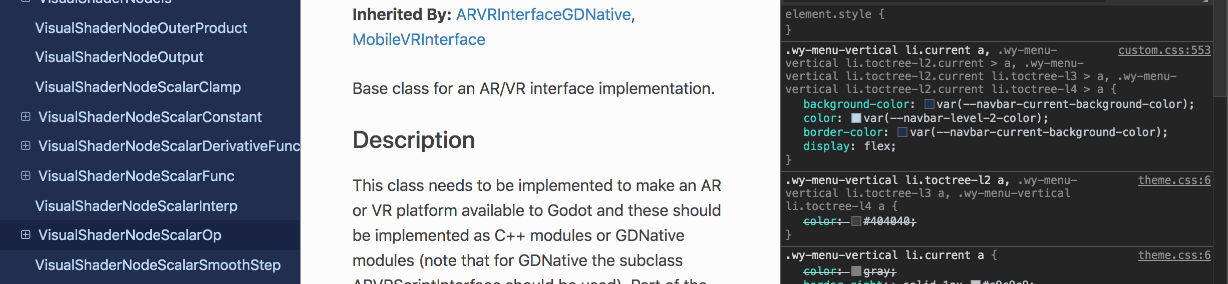
Adding the following CSS snippet leads to an acceptable solution for class reference headers, but it's not great in other sections:
.wy-menu-vertical li.current a {
    white-space: nowrap;
}
Class reference headers (OK)
Other headers (bad)

Unfortunately, I don't think it's possible to target only the class reference headers using CSS. I also tried to apply text ellipsis using text-overflow: ellipsis, but I didn't succeed.
Calinou
on 22 Jan 2020
@Calinou throwing display: flex on the same selector you did white-space: nowrap; should solve both problems.
 KieranCarden
on 29 Jan 2020
KieranCarden
on 29 Jan 2020
Related issues
 hubbyist
·
4Comments
hubbyist
·
4Comments
 golddotasksquestions
·
3Comments
golddotasksquestions
·
3Comments
 stsewd
·
3Comments
stsewd
·
3Comments
 eon-s
·
3Comments
eon-s
·
3Comments
 youreperfect
·
3Comments
youreperfect
·
3Comments