Gnome-shell-extension-gsconnect: Redesign Proposal
Proposed redesign annex
 b1thammer
All 17 comments
To be perhaps overly blunt — this isn't a design, it's a mockup.
A design needs to be undertaken within the context of either available or buildable functionality. Specifically, when it comes to the actions available through the top bar / user menu, that would be this: As part of registering their Gio.Actions to the service, the various GSConnect plugins can call GSConnect's device.addMenuAction() to create a device menu item for that action. addMenuAction() creates a Gio.MenuItem() object, populates it, associates it with the GioAction in question, and calls device.addMenuItem() to insert it into the device menu.
Pre-existing GMenu functionality includes facilities for displaying a set of menu actions as icons (which GSConnect places in a popover accessible via its top bar icon), as well as for displaying them as menu entries in the user menu.
It _doesn't_ provide facilities for mix-and-match displaying multiple icons as a single menu entry, and (IMHO) with good reason. It doesn't scale.
Look at it this way: The set of GSConnect actions that can be displayed in its device menu is only going to grow over time.
- That's fine (to a point) if the actions are menu items in the user menu, since it can always be extended vertically to show additional menu items.
- It's also fine (to a point) if they're icons in a popover from a top bar icon, since _that_ space can always grow horizontally (or even vertically, perhaps) to make room for additional icons.
- It's not so fine if the actions are constrained to being laid out horizontally as icons within a single user menu item, since that limits the number of actions that can be displayed pretty severely. (There are, AFAIK, no facilities for wrapping a single menu entry to contain _multiple_ rows of icons. Though in some ways that's admittedly a reductive statement, since — as mentioned — there are no facilities for creating a menu entry that holds even a _single_ row of icons.)
So, it seems problematic to me.
- Even if we set aside the fact that it would all have to be developed and maintained as custom extension code, because GMenu isn't built to do this.
- And even if we handwave the logistics of how interaction with those icons would even work (top bar icons can open popovers to display their submenu actions; but user menu items can't, they're supposed to either expand or [slide-]reveal submenus within the user menu tree hierarchy).
The question still becomes: What do you do when you don't have 5 actions, anymore, but now you have 7, or 8, or 10?
I'm not going to close this, I'll leave that to @andyholmes. But I see real issues with the proposal, in terms of functionality.
 ferdnyc
on 30 Oct 2019
ferdnyc
on 30 Oct 2019
@ferdnyc summed up the technical and usability reasons pretty well, but this design choice actually goes all the way back to #205. There's 2-3 reasons why it ended up this way:
Horizontal space in the User Menu is limited
This means to avoid a limit on the amount of actions, we need use a container box that can deal with overflow, like a flowbox. That does exist, but including (2) that starts to get really complicated and unintuitive.
Items in the menu can have sub-items (SFTP, Commands, etc)
With vertical text items a horizontal submenu is intuitive, even though we're already in a vertical submenu. With a horizontal row of icons the only intuitive choice is a vertical submenu. Since we're already in a vertical submenu, this means a submenu in a submenu.
If the menu has overflowed into two rows, it's likely that the submenu isn't directly below the icon button that opened it. It would just sort of be a magical floating submenu in a submenu in a menu.
Accessibility (screen readers, etc)
Ultimately this was the argument that convinced me that icons in the User Menu was a bad idea, including the fancy battery graphic. With no text-based option, any accessibility users have no good option. This is also why the text-based User Menu became the default option.
Fortunately, all of GSConnect's functionality is exported over DBus and the remote service and devices classes (remote.js) are written to be reusable. So if you wanted to write a fancy custom interface, all the hard work is done for you.
 andyholmes
on 30 Oct 2019
andyholmes
on 30 Oct 2019
Ultimately this was the argument that convinced me that icons in the User Menu was a bad idea, including the fancy battery graphic. With no text-based option, any accessibility users have no good option. This is also why the text-based User Menu became the default option.
Not arguing for or against the design but you can set what the screen reader says aloud for a menu even if no text is visible by setting it's accessible_name prop.
 JasonLG1979
on 31 Oct 2019
JasonLG1979
on 31 Oct 2019
You can even override what is said for menus with text and provide more descriptive text. I have not however figured out how to get the screen reader to read aloud accessible_name's for nested items. So for example if a menu item contains a bunch of buttons it will read aloud the accessible_name of the menu on mouse over but not the accessible_name's of any of the individual buttons on mouse over.
JasonLG1979
on 31 Oct 2019
(There are, AFAIK, no facilities for wrapping a single menu entry to contain _multiple_ rows of icons. Though in some ways that's admittedly a reductive statement, since — as mentioned — there are no facilities for creating a menu entry that holds even a _single_ row of icons.)
Again not saying it's a good idea in this case but menu items are just St.BoxLayout's you can put whatever you want in them. I use PopupBaseMenuItem as the base class for most of the items in this extension and have no problems in that regard. Each section is a separate menu item but most of them aren't the traditional "single icon short text" variety and it works just fine. You just got to think outside the BoxLayout,lol!!! (I know bad joke but I couldn't resist).
JasonLG1979
on 31 Oct 2019
So for example if a menu item contains a bunch of buttons it will read aloud the accessible_name of the menu on mouse over but not the accessible_name's of any of the individual buttons on mouse over.
Hmm, that is interesting. I've been using PopupMenuSection as a base for the icon menu, but I'm not sure how that behaves since it doesn't seem to be marked with Atk at all. Oops, and apparently I haven't marked my buttons as Atk menu items :S
Probably I should revisit this, but I think I'll do that after the next version when I plan on deprecating old versions of GNOME. I think that will make it simpler to look at a11y clearly.
You just got to think outside the BoxLayout,lol!!!
I made a worse pun earlier, when someone asked if there were any "glib" people around :stuck_out_tongue_closed_eyes:
There is also a flowbox layout manager to be used with ClutterActor, and it's worth noting that the main advantage to StWidget's is CSS support. Incidentally this is pretty much exactly how Gtk4 will work, so learning Clutter will give you a head start on that :)
andyholmes
on 31 Oct 2019
Hmm, that is interesting. I've been using PopupMenuSection as a base for the icon menu, but I'm not sure how that behaves since it doesn't seem to be marked with Atk at all. Oops, and apparently I haven't marked my buttons as Atk menu items :S
Some things will amend their name after themselves. For example I set the accessible_name of my indicator to "Mpris" so that when the indicator's menu opens the screen reader will say "Mpris Menu" aloud. Switches and sliders will also amend there name and value/state after what you set as the accessible_name so for example for I set the volume slider's accessible_name as "playerName" + "Volume" and it will say "Pithos Volume Slider 0.8" for example (if the player is Pithos ofc). Otherwise for PopupMenuSection it will either read aloud the text in the menu item if any or the accessible_name that you set. There is a gotcha though a bug really in my opinion, this._ornamentLabel in PopupMenuSection is used to indicate a "Checked" Item but they use a bullet unicode character so the screen reader actually reads that. It sounds really stupid when you hear "Bullet <the rest of the text>". That's why I destroy this._ornamentLabel and replace it with an icon.
I think that will make it simpler to look at a11y clearly.
Good luck with that the Atk docs kinda suck. And accessibility in GNOME Shell get's at best a D- in my opinion.
There is also a flowbox layout manager to be used with ClutterActor, and it's worth noting that the main advantage to StWidget's is CSS support. Incidentally this is pretty much exactly how Gtk4 will work, so learning Clutter will give you a head start on that :)
I kinda haven't kept up on that on purpose. It scares me a bit. Seems like every time something like that comes out they remove features people depend on.
JasonLG1979
on 31 Oct 2019
Hmm, that is interesting. I've been using PopupMenuSection as a base for the icon menu, but I'm not sure how that behaves since it doesn't seem to be marked with Atk at all. Oops, and apparently I haven't marked my buttons as Atk menu items :S
To expand on the whole nested widgets thing. I've tried everything, giving them names hooking up ATK parents setting relationships the whole shabang. Nothing seems to work.
JasonLG1979
on 31 Oct 2019
What we really need is for people that actually use the accessible features to help write and test them. I mean I really have no frame of reference as far as how a person with no or limited sight uses a computer or what the expected or desired behavior should be. I'm just stabbing in the dark making assumptions based on other assumptions that are probably wrong.
JasonLG1979
on 31 Oct 2019
That's why I destroy this._ornamentLabel and replace it with an icon.
Yeah, I'm not a fan of that either. It's also wonky if you try to replace it with a 16px icon, because it's a character width thing. I never thought of how it looked to a screen reader though.
Good luck with that the Atk docs kinda suck. And accessibility in GNOME Shell get's at best a D- in my opinion.
Yeah, they definitely do. Most of the docs boil down to a quip that gets re-used that claims "Everything should just work automatically, unless you use custom widgets". That is very much not true. Accerciser helps a lot, but doesn't work with GNOME Shell.
I kinda haven't kept up on that on purpose. It scares me a bit. Seems like every time something like that comes out they remove features people depend on.
Now's a really good time to complain actually :) Ben Otte (Company on IRC, #gnome-hackers and #gtk) has been actively soliciting opinions about whether people like it, but not many people are using it yet - catch22.
What we really need is for people that actually use the accessible features to help write and test them. I mean I really have no frame of reference as far as how a person with no or limited sight uses a computer or what the expected or desired behavior should be. I'm just stabbing in the dark making assumptions based on other assumptions that are probably wrong.
I agree completely. Last time some one put serious work into this, I think Mozilla dumped about ~50k into a project to fix a11y on Linux, but that was probably Gnome2 era. I've come to realize that no one who knows anything about a11y is really around anymore, and since users are obviously a minority we don't really get feedback on any project ;/
andyholmes
on 2 Nov 2019
Yeah, I'm not a fan of that either. It's also wonky if you try to replace it with a 16px icon, because it's a character width thing. I never thought of how it looked to a screen reader though.
I replace it with an icon with the style class of "popup-menu-arrow" and an opacity of zero if I need a spacer, because with the default theme at least it's the same size. I try to not use px's I'd rather use em's to stay font relative. I never understood why themes use px at all, em's scale so much better. Set the font scale factor and see what the Shell does. Since somethings are in px and others em it totally messes up size, spacing, margins and padding. Another accessibility issue really IMHO. If you need larger fonts it messes up how the shell looks.
Yeah, they definitely do. Most of the docs boil down to a quip that gets re-used that claims "Everything _should_ just work automatically, unless you use custom widgets". That is very much not true. Accerciser helps a lot, but doesn't work with GNOME Shell.
Thanks I'll have to give Accerciser a try.
Now's a really good time to complain actually :) Ben Otte (
Companyon IRC, #gnome-hackers and #gtk) has been actively soliciting opinions about whether people like it, but not many people are using it yet - catch22.
My advice is to make the 1st release 1 for 1 with GTK3 plus whatever new stuff they want to add and then deprecate things over the course of a couple releases. They have the habit of pulling the rug out from under devs.
I agree completely. Last time some one put serious work into this, I think Mozilla dumped about ~50k into a project to fix a11y on Linux, but that was probably Gnome2 era. I've come to realize that no one who knows anything about a11y is really around anymore, and since users are obviously a minority we don't really get feedback on any project ;/
It's sad because I actually do care about making my projects accessible.
JasonLG1979
on 2 Nov 2019
@andyholmes If you're feeling charitable and/or would like to experiment with accessibility in extensions but don't want to actually break this extension or introduce experimental stuff. You can always play with my extension it's much simpler and I've already done some accessibility work on it still trying to iron that and translations out.
JasonLG1979
on 3 Nov 2019
My advice is to make the 1st release 1 for 1 with GTK3 plus whatever new stuff they want to add and then deprecate things over the course of a couple releases.
I don't think they'll make that mistake again :) There have been APIs deprecated in Gtk3 for over a decade but devs just kept using them, so we just got stuck with them. Widely adopted uses like AppIndicator still just dump serialized GtkMenu XML over DBus, and now we're just stuck supporting that API because 3rd part apps use it.
Anyways, I'm going to close down this issue, because we're not going to make the proposed changes to the User Menu for orignally listed reasons.
andyholmes
on 10 Nov 2019
AppIndicator still just dump serialized GtkMenu XML over DBus, and now we're just stuck supporting that API because 3rd part apps use it.
AppIndicator is garbage so is libnotify speaking of widely used bits used by 3rd party apps and not just to pick on non-gtk stuff,lol!!!
Anyways, I'm going to close down this issue, because we're not going to make the proposed changes to the User Menu for orignally listed reasons.
Right on. Later days.
JasonLG1979
on 10 Nov 2019
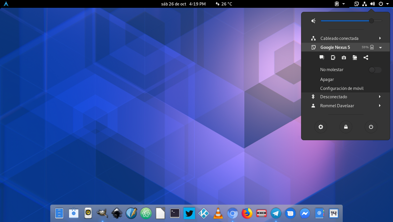
Just to place it somewhere, since I'm currently not running last GNOME (mandatory to file a bug)
Some icons like org.gnome.Shell.Extensions.GSConnect-symbolic.svg may look great on top menu, but just with default Ubuntu theme is almost indistinguishable from the background:
 pabloab
on 7 Sep 2020
pabloab
on 7 Sep 2020
@pabloab It's up to the theme to decide the color of the icons with the -symbolic postfix. Generally speaking dark panel = light icons, light panel = dark icons. Transparent panels (what it looks like you're using) are a bit of a wildcard that's why GNOME stopped using them. You can very easily end up with icons that blend into the background.
JasonLG1979
on 7 Sep 2020
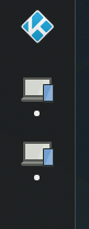
Seems like the full-color icon is used in versions later than the one you're using in any case:
andyholmes
on 7 Sep 2020
Related issues
 amivaleo
·
3Comments
amivaleo
·
3Comments
 jeetsrs
·
4Comments
jeetsrs
·
4Comments
 rugk
·
4Comments
amivaleo
·
4Comments
rugk
·
4Comments
amivaleo
·
4Comments
 jorgecodecom
·
6Comments
jorgecodecom
·
6Comments
Most helpful comment
@pabloab It's up to the theme to decide the color of the icons with the
-symbolicpostfix. Generally speaking dark panel = light icons, light panel = dark icons. Transparent panels (what it looks like you're using) are a bit of a wildcard that's why GNOME stopped using them. You can very easily end up with icons that blend into the background.