Givewp: Give Totals block presentation should be polished
User Story
As a admin, I want the Give Totals block frontend and admin appearance polished so that it fits nicely alongside other GiveWP elements.
Details
The Give Totals block contains the entire feature set necessary to ship. Now there are only a few areas of polish necessary to finish out development.
Additional Context
The Give Totals block started as the Milestone block, which had a set of design needs that was larger in scope than an a simple Give Totals block would require.
Acceptance Criteria
- [x] Default message is updated to be more generic
- [x] Admin controls all work/look cohesive in the block editor interface
- [x] Users can control block colors
 henryholtgeerts
All 8 comments
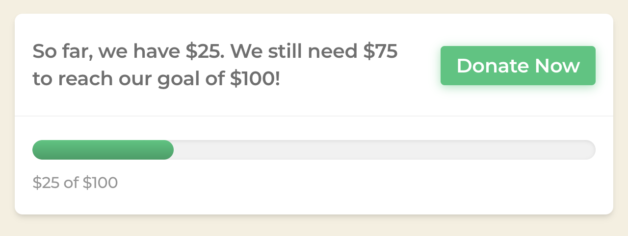
Here's a look at my initial pass restyling the Totals block's frontend appearance so that it is inline with other design elements (especially influenced by the multi-step form):
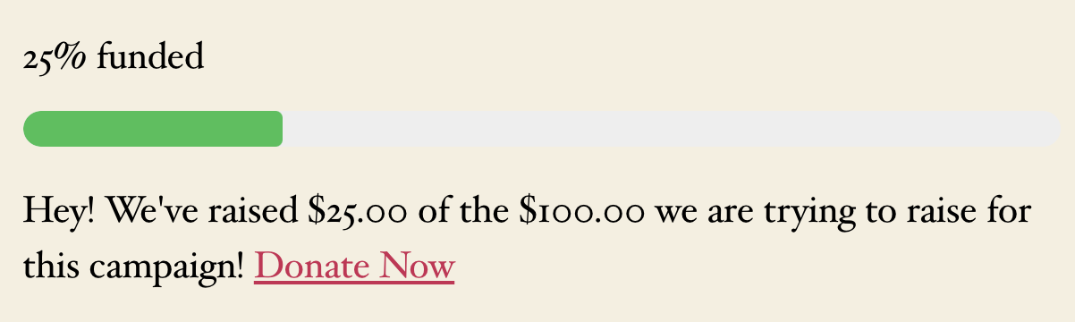
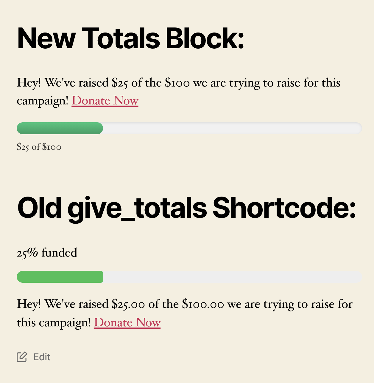
For comparison, here is an implementation of the existing give_totals shortcode on the same theme:
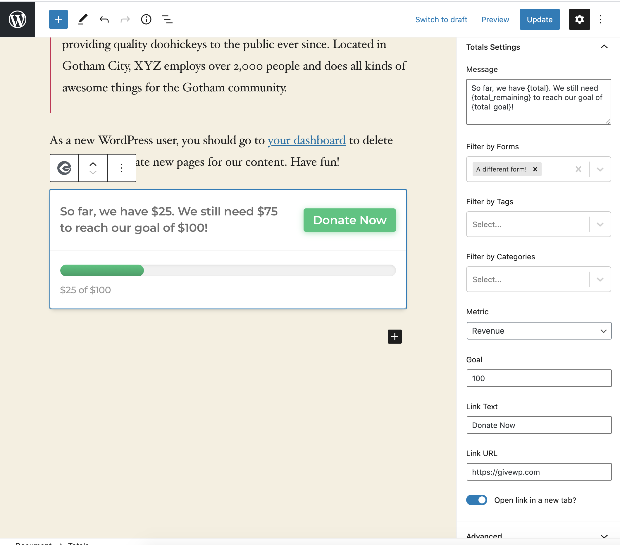
For complete editing context, here's the block as seen from the block editor with the inspector open:
I'm left wondering about two things:
- Should users be able to set a primary color (like they can with form templates)
- Should the user be able to toggle-off these givewp styles, if they'd prefer to style it themselves?
@kevinwhoffman @kjohnson I'd love your thoughts both on the designs seen here, and what direction you lean regarding my two questions.
henryholtgeerts
on 15 Sep 2020
Call Summary: 9/15/20
On call: @kevinwhoffman, @henryholtgeerts
_Discussed tweaks to the block's frontend appearance, so that it is more closely in line with the original Give Totals shortcode._
- Styling the link as an inline a tag (not as a button)
- Inherit the font styles from theme
- Remove card styling
- Ability to remove message entirely (and see no additional spacing left over where it was)
henryholtgeerts
on 15 Sep 2020
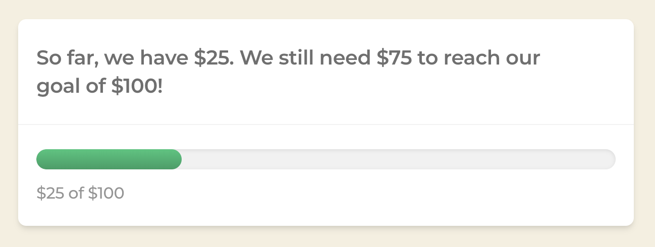
Here's an image of the Totals block, now styled more closely to the original give_totals block:
henryholtgeerts
on 15 Sep 2020
Thanks @henryholtgeerts! I think this is a good balance between maintaining the give_totals functionality while adding a bit of polish to the presentation.
 kevinwhoffman
on 15 Sep 2020
kevinwhoffman
on 15 Sep 2020
@henryholtgeerts re: primary color setting: I definitely see the importance to theme-ability with a WordPress product, like the Primary Color on the Form Template - that is probably just as important here.
That said, I think we should consider how to best organize the available options, without bloating the overhead of available options.
 kjohnson
on 15 Sep 2020
kjohnson
on 15 Sep 2020
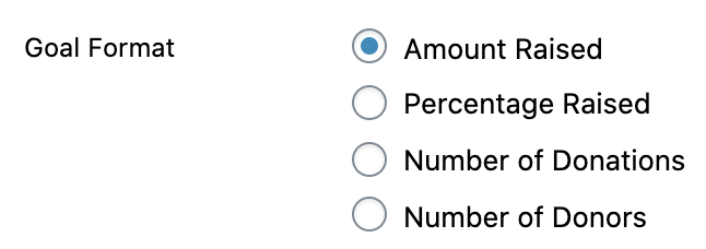
@henryholtgeerts Regarding the Metric option, I realized that this is essentially what we refer to as Goal Format in the donation form editor. Do you think it makes sense to use the same terminology here for consistency?
kevinwhoffman
on 15 Sep 2020
@kevinwhoffman Hmm...I suppose it does makes sense, although honestly I'm not sure that Goal Format is actually an kinda of improvement (regarding clarity). That said - I'm happy to make the change 👍
henryholtgeerts
on 15 Sep 2020
@henryholtgeerts Let's call it Goal Format so that we're using consistent terminology wherever we are displaying goals and progress bars. I don't have a strong preference between Metric and Goal Format, but I'd rather err on the side of consistency and familiarity for our existing users.
kevinwhoffman
on 15 Sep 2020
Related issues
 ravinderk
·
3Comments
ravinderk
·
3Comments
 DevinWalker
·
3Comments
DevinWalker
·
3Comments
 marutim
·
4Comments
marutim
·
4Comments
 mathetos
·
3Comments
ravinderk
·
4Comments
mathetos
·
3Comments
ravinderk
·
4Comments