Gdevelop: Create a new game dialog: important configuration is offscreen
Describe the bug
When you create a new game - important UI is buried at the bottom of the dialog offscreen.
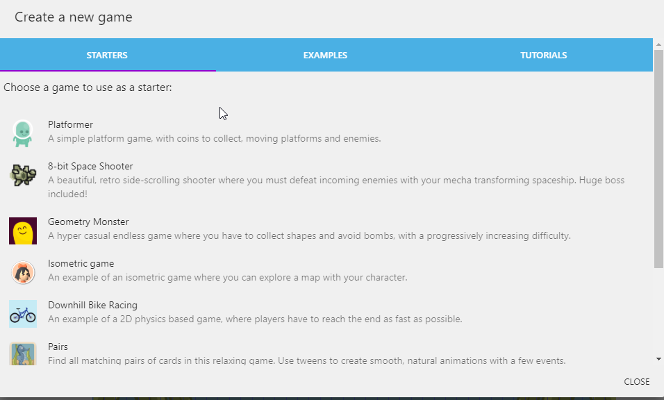
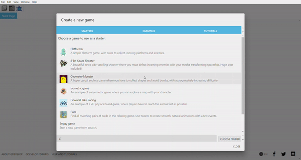
For instance when you create a new game you see this :
but, if you don't scroll down all the way you will never see important configuration information about your new game:
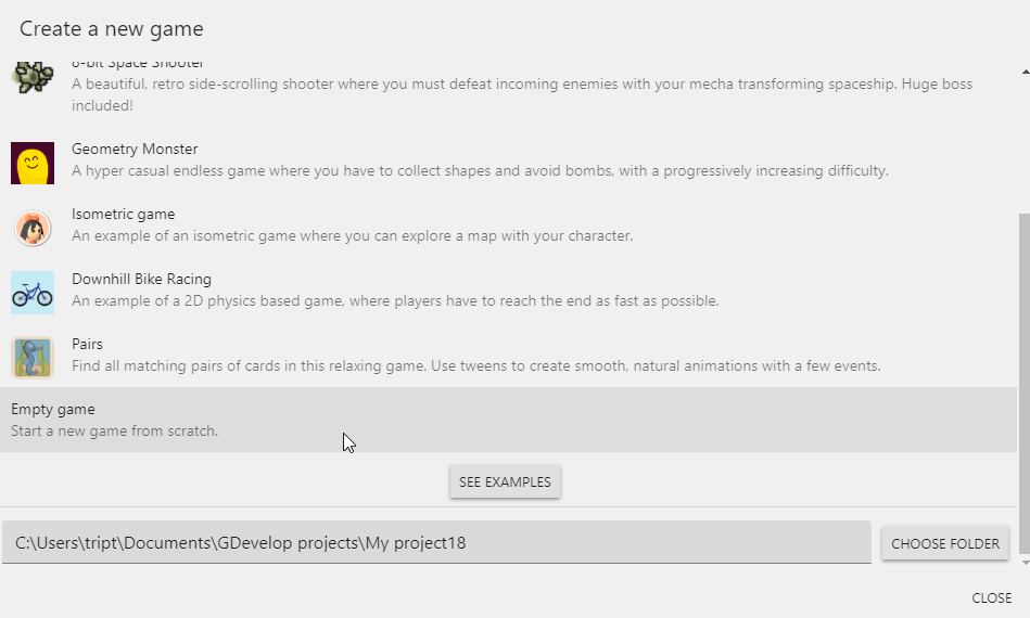
This is the PATH where your game is going to be stored. I didn't even know this existed for a long time until I accidentally scrolled all the way down.
That path panel should be fixed to the bottom of the dialog, and the rest of the content scroll above it. Meaning, it should "always" be there - in a fixed position at the bottom of the dialog. This is important information that the user should see upon opening the new game dialog - the content above it should not push it down to the bottom of the dialog offscreen.
To Reproduce
Steps to reproduce the behavior:
- click file > create a new project
- observe that the path information is not on screen.
- scroll to the bottom of the dialog
- observe the project path panel.
expected result:
should see the project path panel always onscreen, and content above is is scrollable.
 triptych
All 5 comments
The dialog conponent need a depth rework, this is also the case for sprite editor.
And in general everywhere where is used dialog component.
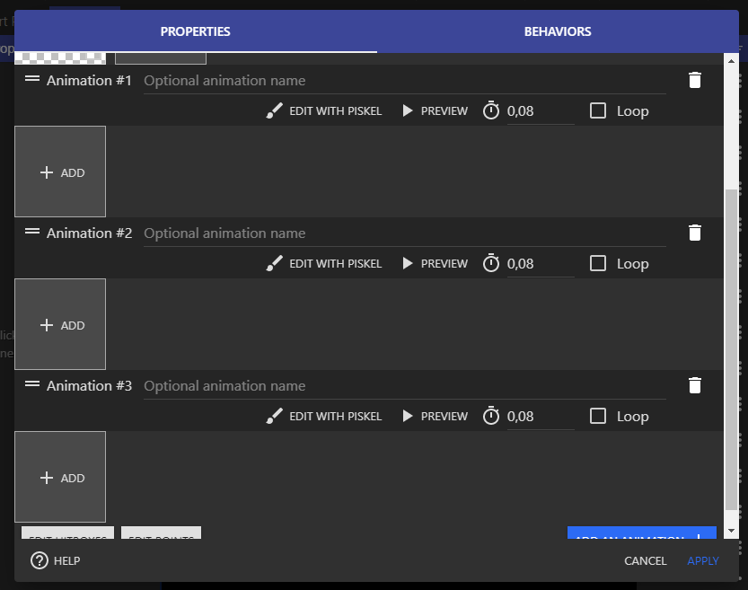
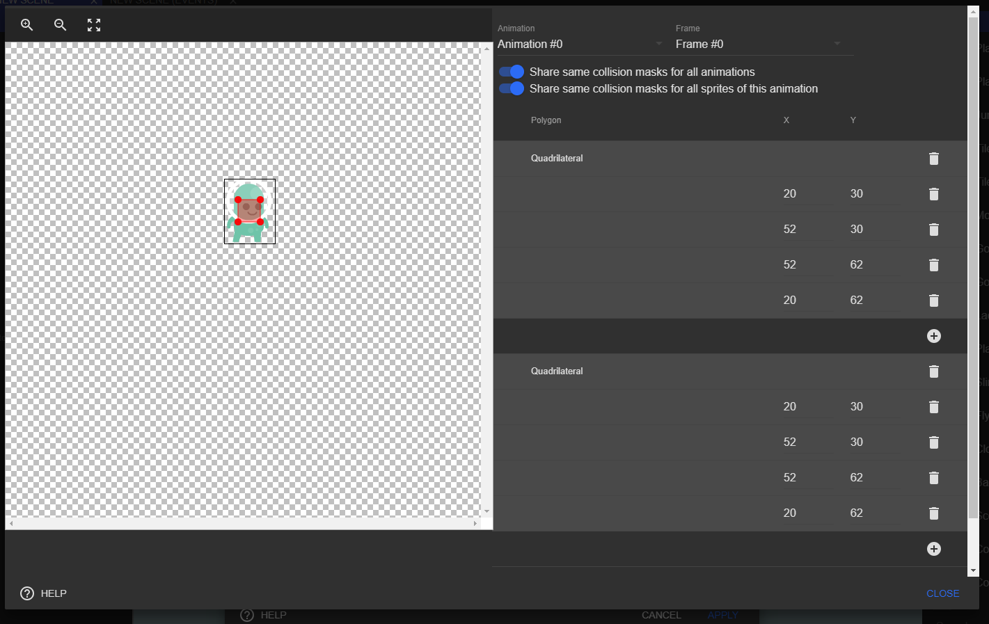
Here hitbox and editor points and Add animation should be fixed at the bottom.
Sometime we need buttons on top, like in behavior list for example.

These are two example, but we should take a look in whole app.
Maybe create a new component is less risky, and replace the current dialog by the new one step by step. End finnaly remove the dialog component.
I've other idea for dialog:
- Support on two column
- Responsive
- Add component in header
- Add component in footer
Support for column for rework the point/hitbox editor like this for example, card on Roadmap:
 Bouh
on 7 Mar 2020
Bouh
on 7 Mar 2020
I agree that these dialogs not showing the important stuff is really sub optimal.
We should investigate if using ScrollView in these dialogs for the content that must scroll - and put the rest before the ScrollView (for the "header") or after (for the "footer") would work.
Ideally that how it would work.
Maybe create a new component is less risky, and replace the current dialog by the new one step by step. End finnaly remove the dialog component
That's a way to do it. I actually think we can also have two components:
Dialog(the existing one)DialogWithHeaderFooter(maybe find a better name) that use Dialog but add a scrolling content and a not scrolling header and footer.
then gradually mix the components using Dialog to DialogWithHeaderFooter.
For now we could at least validate if using a ScrollView works?
Support for column for rework the point/hitbox editor like this for example, card on Roadmap:
Yep. We could create a component called TwoColumns that uses ResponsiveWidthMeasurer. If the width reported by ResponsiveWidthMeasurer is too small, we only show them stacked... also look at ResponsiveLineStackLayout which does that already (it's more designed for text field/controls).
 4ian
on 7 Mar 2020
4ian
on 7 Mar 2020
I think issue #1214 will also be resolved if this issue is resolved.
 geetesh-gupta
on 9 Mar 2020
geetesh-gupta
on 9 Mar 2020
I tried using the following changes, initially, no header and footer components were there. Passing header and footer component as a prop and using ScrollView for main content. :
{header && (
    <DialogContent
        style={{
        ...(noMargin ? styles.noMarginBody : styles.defaultBody),
        ...(flexRowBody ? styles.flexRowBody : {}),
        ...(flexBody ? styles.flexBody : {}),
        }}
    >
        {header}
    </DialogContent>
)}
<ScrollView>
    <DialogContent
        style={{
        ...(noMargin ? styles.noMarginBody : styles.defaultBody),
        ...(flexRowBody ? styles.flexRowBody : {}),
        ...(flexBody ? styles.flexBody : {}),
        }}
    >
        {children}
    </DialogContent>
</ScrollView>
{footer && (
    <DialogContent
        style={{
        ...(noMargin ? styles.noMarginBody : styles.defaultBody),
        ...(flexRowBody ? styles.flexRowBody : {}),
        ...(flexBody ? styles.flexBody : {}),
        }}
    >
        {footer}
    </DialogContent>
)}
The results can be seen here.
This is working but this will require updating all the current dialog components to accommodate the changes. What are your opinions?
geetesh-gupta
on 9 Mar 2020
The result is mostly what I had in mind, but I have concerns on the implementation.
I tried using the following changes, initially, no header and footer components were there. Passing header and footer component as a prop and using ScrollView for main content.
While this might kind-of-work, it seems hacky as it's using multiple DialogContent. This will probably break assumptions in material-ui and create us headache in the future when upgrading material-ui.
At least I'm not seeing any demo in https://material-ui.com/components/dialogs/ with multiple DialogContent?
Instead, I think the hierarchy should one DialogContent, that contains the optional header, the ScrollView, and the optional footer.
Also, there should not be any scrollbar on the right of the footer and the header.
This is working but this will require updating all the current dialog components to accommodate the changes. What are your opinions?
I would rather have a separate component if needed ("DialogWithHeaderFooter") if there are too much changes. It's fine to progressively update to this new component as needed.
4ian
on 9 Mar 2020
Related issues
 PascalLadalle
·
3Comments
PascalLadalle
·
3Comments
 Wend1go
·
3Comments
Wend1go
·
3Comments
 Phenomena3
·
5Comments
4ian
·
4Comments
Bouh
·
4Comments
Phenomena3
·
5Comments
4ian
·
4Comments
Bouh
·
4Comments
Most helpful comment
I agree that these dialogs not showing the important stuff is really sub optimal.
We should investigate if using
ScrollViewin these dialogs for the content that must scroll - and put the rest before theScrollView(for the "header") or after (for the "footer") would work.Ideally that how it would work.
That's a way to do it. I actually think we can also have two components:
Dialog(the existing one)DialogWithHeaderFooter(maybe find a better name) that use Dialog but add a scrolling content and a not scrolling header and footer.then gradually mix the components using
DialogtoDialogWithHeaderFooter.For now we could at least validate if using a ScrollView works?
Yep. We could create a component called
TwoColumnsthat usesResponsiveWidthMeasurer. If the width reported byResponsiveWidthMeasureris too small, we only show them stacked... also look atResponsiveLineStackLayoutwhich does that already (it's more designed for text field/controls).