Gatsby: How do I deal with iOS Safari's 100vh bug? (It's happening in iOS Chrome as well now!)
Hi everybody,
I'm trying to fix the bug in iOS Safari that their team claims is a feature, which is that the mobile browser hijacks the viewport unit VH to render it's UI as well. Here is a gatsby app in safari, chrome and then firefox...notice the difference???

You will notice that Safari and Chrome both crop the layout at the bottom, but Firefox does not. The css of 100vh on the Layout component is respected in Firefox, but not in Safari or Chrome.
At first i tried to use this component to solve the issue:
https://github.com/mvasin/react-div-100vh
in the gatsby-browser.js file like so:
import React from 'react'
import Div100vh from 'react-div-100vh'

export const wrapPageElement = ({ element }) => {
  return <Div100vh>{element}</Div100vh>
}
but the entire app just went blank.
So I'm basically trying to fix the iOS Safari/Chrome bug where both browsers hijack the vh unit so that 100vh is not actually 100vh, which is INSANE!!!!! but they think it is a good idea, for some reason...many articles out there about it, including this one, where I found out about the issue.
https://medium.com/@susiekim9/how-to-compensate-for-the-ios-viewport-unit-bug-46e78d54af0d
My Thought
It would be super chill if the gatsby community were to come up with a plugin or browser API or some sort of official workflow that could fix this and make it work right, right out of the box. Maybe adding a fix and an option to gatsby-plugin-layout could be the way to go, not sure. This just needs a gatsby solution, as nothing else I'm trying to do seems to be working.
 rchrdnsh
All 7 comments
Hi Richard! :wave:
You'll want to use wrapPageElement in gatsby-browser.js. This will allow you to wrap all pages in a component (in this case the react-div-100vh component) in the _browser_.
This should do the trick, but please reply or re-open if we can help further. Thanks!
 DSchau
on 6 Jun 2019
DSchau
on 6 Jun 2019
Hi @DSchau , I'm doing this:
const React = require('react')
const Div100vh = require('react-div-100vh')
exports.wrapPageElement = ({ element }) => {
return <Div100vh>{element}</Div100vh>
}
but it's giving me the following error:
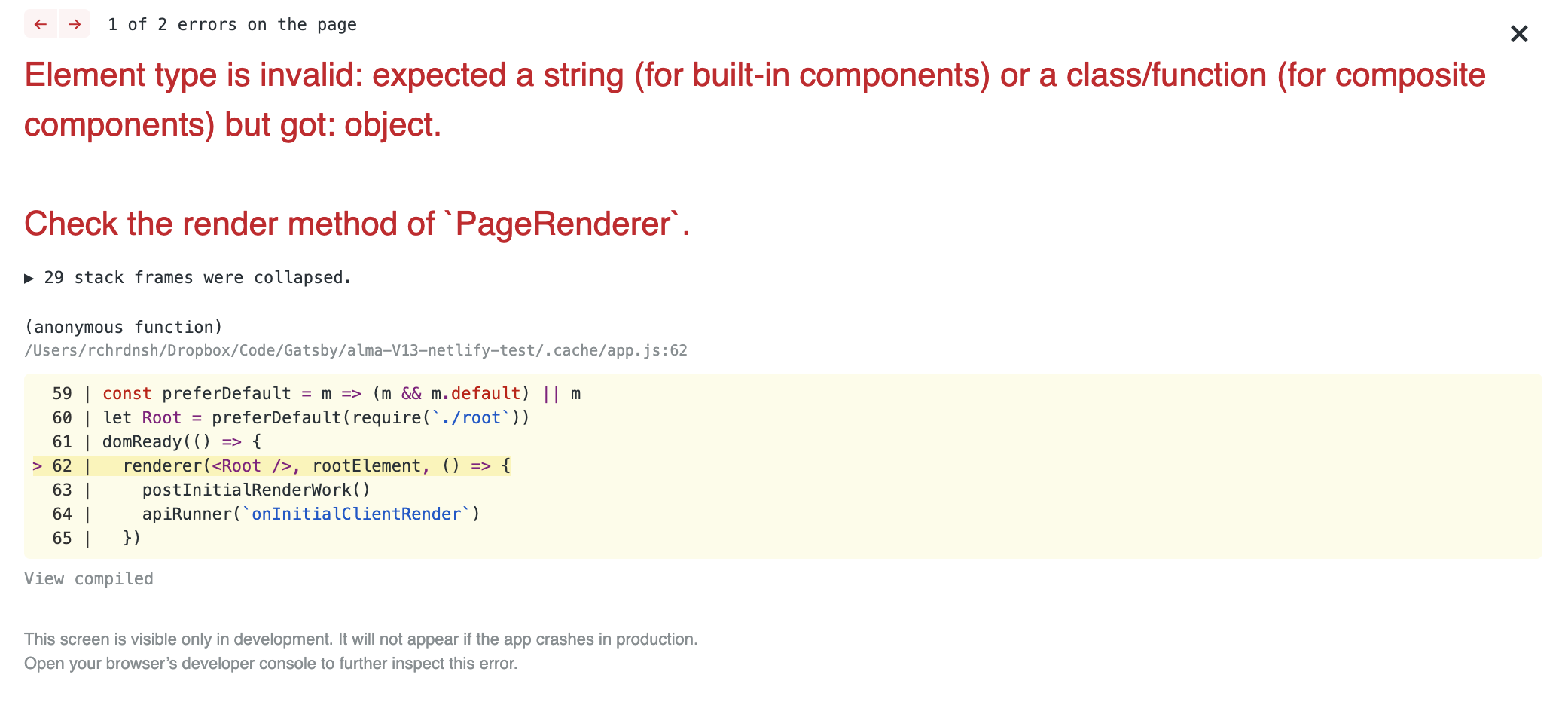
the syntax is new to me here as well...does the regular import statement not work here?
rchrdnsh
on 6 Jun 2019
I'm not exactly sure, but you should definitely use ES Modules for gatsby-browser.js.
import React from 'react'
import Div100vh from 'react-div-100vh'
export const wrapPageElement = ({ element }) => {
return <Div100vh>{element}</Div100vh>
}
should we update that in the docs? Currently the docs look like this:
but changing it to what you showed me ended up working and the error went away.
Dunno if it actually fixed the issue yet, but at least it did not break the development build.
rchrdnsh
on 6 Jun 2019
ugh...the component is totally not working...the screen is now just blank on mobile devices...
can i do something like this in gatsby-browser?
window.onresize = function() {
    document.body.height = window.innerHeight;
}
window.onresize(); // called to initially set the height.
This was another solution proposed in one of the articles I have read about the subject.
rchrdnsh
on 6 Jun 2019
I've put together a component which may work for those who are running into this issue.
https://gist.github.com/ptb/9ace4534d67393683bf7191370a16089
It uses window.visualViewport to resize a div to the dimensions of the currently available viewport which takes into account the keyboard.
Reference: https://tkte.ch/2019/09/23/iOS-VisualViewport.html
I'm thinking it would primarily be used for position: fixed modals which have a child with overflow-y: auto, but it could be used for anything. I figured I'd put it out there.
 ptb
on 5 Jun 2020
ptb
on 5 Jun 2020
@rchrdnsh I was with the same problem as you and fix with this:
gatsby-browser.js
import React from 'react';
import Div100vh from 'react-div-100vh';

export { wrapRootElement } from "./gatsby/wrapRootElement"; // i dont know if this can help with some, but its just a theme provider from `styled-components`

export const wrapPageElement = ({ element }) => {
  return <Div100vh style={{minHeight: '100rvh'}}>{element}</Div100vh>
}
In the react-div-100vh docs, i saw this rvh ( real viewport height ), and i think this can solve your problem too.
 Vini98br
on 18 Aug 2020
Vini98br
on 18 Aug 2020
Related issues
 magicly
·
3Comments
magicly
·
3Comments
 ferMartz
·
3Comments
ferMartz
·
3Comments
 totsteps
·
3Comments
totsteps
·
3Comments
 dustinhorton
·
3Comments
dustinhorton
·
3Comments
 kalinchernev
·
3Comments
kalinchernev
·
3Comments
Most helpful comment
ugh...the component is totally not working...the screen is now just blank on mobile devices...
can i do something like this in gatsby-browser?
This was another solution proposed in one of the articles I have read about the subject.