gatsby-plugin-sharp responsiveSizes maxWidth resizes to larger than the original
When using the responsiveSizes function, in my opinion maxWidth shouldn't make an image that's 400px wide into an image that is 600px wide if a maxWidth of 600px is set.
The highest maxWidth should be bound to the width of the image. I don't see the benefit of making an image larger.
Thoughts? If agreed, I'll add fixing this to my list.
 chiedo
All 57 comments
Is it making larger images or is your css stretching it? I thought gatsby-plugin-sharp sharp doesn't resize upwards by default.
 KyleAMathews
on 14 Jul 2017
KyleAMathews
on 14 Jul 2017
I just took a (quick) look and can't reproduce what @chiedo is describing. I have a source image that is 400x300px, and using responsiveSizes either directly with maxWidth: 756 or through gatsby-remark-images (where IIRC the default maxWidth should be 800) results in three generated images: 189x142px, 378x284px, and 400x300px.
 fk
on 14 Jul 2017
fk
on 14 Jul 2017
Yes @KyleAMathews I'm pretty sure. It made an image that was 300 x 250 into an image that is 1920 x 1600. I'm getting that from src.
chiedo
on 14 Jul 2017
This happened when using the following Graphql query
    allMarkdownRemark(
      sort: { order: DESC, fields: [frontmatter___date] }
      filter: {
        fileAbsolutePath: { regex: "/case-studies/" }
      }
    ) {
      edges {
        node {
          excerpt
          fields {
            slug
          }
          frontmatter {
            thumbnail {
              childImageSharp {
                responsiveSizes(quality: 50){
                  src
                  srcSet
                }
              }
            }
            title
            services
            date
          }
        }
      }
    }
:/ … weird. Does the 1920x1600px image exist in public/static?
fk
on 14 Jul 2017
@fk I assume so since the browser was rendering it and I was able to check what size it was.
chiedo
on 14 Jul 2017
Does that not happen for you?
chiedo
on 14 Jul 2017
(Sorry, AFK for a while) No, at least not with the one 400x300 JPG I tried. Is yours a JPG, too?
Also, at least Chrome should show you the rendered (and possibly blown up like Kyle supposed in his answer) as well as the original size of the image. Please take a look at the generated file name in your browser and then find it in public/static - is there an actual image that has the size you are seeing?
Am 14.07.2017 um 20:26 schrieb Chiedo notifications@github.com:
Does that not happen for you?
—
You are receiving this because you were mentioned.
Reply to this email directly, view it on GitHub, or mute the thread.
fk
on 14 Jul 2017
No worries @fk
You were right. It was blown up some how. It's very weird though. Chrome shows it as being 1920 by 1600... Maybe something is wrong with how some of the meta is generated? Unsure...

The actual image is the right size though. The browser just thinks it's the wrong size?
chiedo
on 14 Jul 2017
(still AFK) Hmm, actually "Natural" should be the original size of the image :/
Btw., forgot that selecting the image in Chrome dev tools and then going to the "Properties" tab, "currentSrc" shows you the rendered src from srcset. Is 381px the "maxWidth" that you need for your image?
fk
on 15 Jul 2017
That makes sense! 381px is the maxWidth I need for that image. All the images on this page are generated dynamically. I worked around the issue for what its worth though
chiedo
on 15 Jul 2017
I am running into the same issue and I was able to identify the difference between the images before and after Gatsby's automatic image optimization: The resolution information is getting lost.
Here is a before/after screenshot of a test image file:

144 pixels/inch is the input and 72 pixels/inch is the output. Can we reopen this issue or would you prefer to have a new one to track this issue? I believe that the resolution information should not be lost as it is important to handle retina/non-retina difference.
 bripkens
on 30 Aug 2017
bripkens
on 30 Aug 2017
btw.: tested this in the using-remark example app. Only changes:

bripkens
on 30 Aug 2017
Hi @bripkens! Interesting 😄 (as the original issue) … I will take a look in a few minutes and try to reproduce this locally. Til then: I believed that the resolution information embedded in the image is irrelevant for HiDPI/retina. Eager to understand how the resolution info affects dealing with retina/non-retina – could you maybe elaborate a little on that?
fk
on 30 Aug 2017
Possibly related. In the example app, sharp is still at 0.17.2:
bripkens
on 30 Aug 2017
@fk: I don't know exactly how the browser uses the resolution fields, but at least OX's preview feature takes the resolution into account when displaying the image. It could be that image resizing needs to take this into account too, especially when generating the srcset definition on the image.
This being set, I have actually never used srcset. Just suspecting.
bripkens
on 30 Aug 2017
Updating sharp is definitely on the agenda, see https://github.com/gatsbyjs/gatsby/pull/1920#issuecomment-325472767 for a little more info.
I just finished compiling using-remark with one of the images saved at 144dpi (using Photoshop –
the important part here is to not use "Save for web" because that will update the resolution info to 72dpi). Will report back ASAP.
fk
on 30 Aug 2017
FWIW I also noticed the vips warning: VipsJpeg: error reading resolution (that https://github.com/lovell/sharp/issues/657 is about( when working on using-remark and also a private project. While it did creep me out a little, I couldn't see any problems with the generated images, and when I eventually found the aforementioned issue and felt validated by . However the Gatsby examples should probably be warning-free … ;-)
fk
on 30 Aug 2017
OK, here we go … what I did was to take this source image from using-remark and resize it to 400px width (at 72dpi):

With the maxWidth option for gatsby-remark-images left unchanged (at 740px), this results in three generated images –

…the largest of them being 400px wide, which matches the desired behavior of "do not scale larger than the size of the original image source":

Again, I hope I did things right to reproduce the problem you guys run into.
I think the confusion might result from looking at the Chrome dev console, where both rendered and "Natural Size" are reported to be 740px wide:

However, if you inspect the "Properties" for img.gatsby-resp-image-image, you will find the currentSrc to be the largest of the three images that sharp produces, namely the 400xp wide image http://localhost:9000/static/aecbf616d7be11aad0cb65ba8638500e-d4d1e.jpg. Also, the generated values for srcset make sense in terms of the src images they reference.
fk
on 30 Aug 2017
Based on what I have read now, I believe the problem to be the following:
- The browser ignores image DPI when rendering images (validated by just rendering two different DPI images in a dummy HTML page).
- An image with twice the web DPI (72) is supposed to be rendered at half the image dimensions. Example: An image with dimensions 200x200 and DPI 144 is supposed to render at 100x100 for the web.
gatsby-transformer-sharpandgatsby-plugin-sharpdo not take the DPI into account when handling the image [1], [2].- The default image width used by
gatsby-remark-imagesis 100%. This will be too much for images smaller thanmaxWidth[3].
Based on this, I think that this is definitely a bug within Gatsby that needs to be resolved. Unfortunately, there is one obstacle to resolving it: We need a reliable way to identify image DPI. Anyone come across a Node module which can do this? A quick Google search didn't bring up any results :(.
bripkens
on 30 Aug 2017
wow, parallel posting :)
bripkens
on 30 Aug 2017
@bripkens Will do a "bonus round" with the DPI for the 400px source image set to 144, then get back to your comment.
fk
on 30 Aug 2017

… as expected and observed already, sharp generates three images, the biggest at 400px width, all at 72dpi.
fk
on 30 Aug 2017
Which is exactly the issue imho. The image of 400x267px and 144 DPI should display as an image of 200x133.5px in the browser.
bripkens
on 30 Aug 2017
Ah I see now where you're coming from.
I'm gonna be AFK in a few minutes, so let continue with a few questions first:
- An image with twice the web DPI (72) is supposed to be rendered at half the image dimensions. Example: An image with dimensions 200x200 and DPI 144 is supposed to render at 100x100 for the web.
As you state in 1., the browser does not care about the DPI/resolution information of the image, only about the actual pixel size. Am I correct to assume that in 2. when you write "supposed to be rendered" you are talking about sharp/gatsby-remark-images?
fk
on 30 Aug 2017
Am I correct to assume that in 2. when you write "supposed to be rendered" you are talking about sharp/gatsby-remark-images?
Yes, right. You can try this, when available, by taking a screenshot from a retina screen on your Macbook. Opening that image within MacOS's preview app will look just fine as it respects the DPI. Open the image on the other hand within Google Chrome and it will look blurry as it will have twice the size.
bripkens
on 30 Aug 2017
👍 Thank you! (and yes I'm aware of HiDPI screens/devices and on a MBP with a retina screen ;-) – I didn't know however that Preview.app takes the DPI into account when displaying images – nice!) I won't manage to post a thorough answer/reasoning during the next few hours, but basically my take is this:
- DPI information is irrelevant as long as you are not resizing and/or providing images for print (and even there it mostly mattered for on-screen display/preview, but it's been a few years since I last dealt with print stuff and this would lead too far, anyway).
- DPI information embedded in the image is irrelevant in the browser.
- Tools processing images for the browser thus should not take DPI into account when doing their thing.
Here are some good links on the topic of "the 72 DPI myth" …
- https://praegnanz.de/weblog/72dpi
- http://t3n.de/news/72-dpi-mythos-luege-518017/ (both in German, explaining the misconception about 72dpi in terms of screens)
https://daraskolnick.com/image-dpi-web/
… and some info on
srcsetandsizes:https://css-tricks.com/responsive-images-youre-just-changing-resolutions-use-srcset/
- https://css-tricks.com/responsive-images-css/
If you peep the "sizes" section, you will find out that gatsby-remark-images actually does quite well in providing the right information to let the browser pick the right image for the current layout width _and_ the device DPI by providing both srcset and sizes:
The information in the markup above gives the browser what it needs to figure out the best image for it. The browser knows 1) it's own viewport size and 2) it's own pixel density.
Perhaps the browser viewport is 320px wide and it's a 1x display. It now also knows it will be displaying this image at 100vw. So it has to pick between the two images provided. It does some math.
375 (size of image #1) / 320 (pixels available to show image) = 1.17
1500 (size of image #2) / 320 (pixels available to show image) = 4.691.17 is closer to 1 (it's a 1x display), so the 375w image wins. It'll try to not go under, so 1.3 would beat 0.99, as far as I understand it.
Now say it was a 2x display. That doubles the amount of pixels needed to show the images, so the math is:
375 / 640 = 0.59
1500 / 640 = 2.342.34 wins here, and it'll show the 1500w image. How about a 1x display with a 1200px viewport?
375 / (80% of 1200) = 0.39
1500 / (80% of 1200) = 1.56The 1500w image wins here.
On a 72dpi screen, the 740px wide image will be used:

Now if I move that browser window to my HiDPI screen and load the page again, a 1480px wide image will be used:

fk
on 30 Aug 2017
PS: FWIW I also see "one maxWidth for all images in remark/Markdown"/100% width for all markdown images as a limitation; however I can also see the thinking/reasoning behind this given the common usage of Markdown.
fk
on 30 Aug 2017
Tools processing images for the browser thus should not take DPI into account when doing their thing.
And this is where I (kindly) disagree. Let me show you why by uploading a 144 DPI image to this thread (markdown):
(source: https://www.dropbox.com/s/vlq3y8e4f8u2fo5/144-resolution.png?dl=0)
Notice the image dimensions of 274x132 pixels embedded within this thread. It is not stretched to 100% of the available content width. Instead, GitHub automatically sizes it to width / (image dpi / 72). For reference, pixels and DPI values of that image:
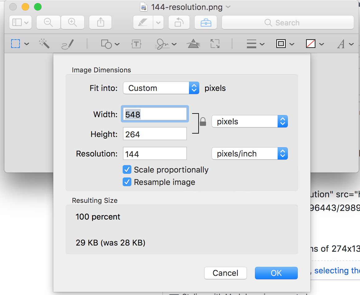
Notice how also GitHub understands that it is a high DPI image. When opening the image in a new tab, it is twice as large (144 DPI image displayed as 72 DPI).
Let me also provide some context why I think that this is important to support: We are trying to establish Gatsby as a documentation tool within our company. People using Gatsby expect it to behave similarly to other markdown based systems. This behavior is totally unexpected for anyone running a high DPI screen within our company. This effectively makes it very hard to these people to write documentation and adding screenshots to the documentation without outside help (and really ugly hacks in the documents).
bripkens
on 30 Aug 2017
[…] (kindly) disagree
Hey of course! I'm totally unbiased about this and happy to discuss and learn new things/perspectives! 🤗
It is not stretched to 100% of the available content width.
As previously stated I can totally follow you there, and given the context you provided I see the confusion this particular behavior results in. (It however is the intended behavior of gatsby-remark-images ;-) … but I guess the documentation needs to be clearer on that!)
Now let me take a look at that GitHub-flavored Markdown! 😄
fk
on 30 Aug 2017
Wheee, magic. :-D 🎉 Thanks for the heads up! I guess I never would have found out about that (probably because the images I upload here at Github always are larger than the comment container).
Curiously asking (and not trying to use your potential answer as a base for argumenting against your usecase 😉): Do you know any other (Markdown-related or not) tools that provide that kind of functionality?
fk
on 30 Aug 2017
Wrapping things up for tonight, I found one more (excellent, and english) resource hidden in a browser tab: https://gist.github.com/anotheruiguy/8626483 – also comes with a nice example page: http://www.anotheruiguy.com/hidpi-images/index.html
And while I'm writing things again, I might as well add/clarify that:
- (Obviously) On "72dpi" screens, the Github-Markdown-processed image is twice the size it needs to be. The HiDPI screens are clearly taking over though, so not a real argument I guess. Missing srcset, sizes, and support for responsive scenarios serve that purpose a little better.
- Thinking about this more, I'm tending to see the Github implementation as a workaround to provide an easy way for authors to feed those HiDPI devices (rightfully so, but also "merely a workaround"). I didn't search thoroughly, but I couldn't find any documentation on "upload at 144dpi, and we will take care of resizing – is that mentioned somewhere in their docs?
- Quick shot, I might edit this :-D ;-): Defining the desired "presentational" size of the image while "authoring", throwing a high-quality image on things and letting tooling take care of the rest (including srcset and sizes) might be the golden mean IMO. That size definition is a 1:1 match for
gatsby-remark-image's optionmaxWidth– and based on what I currently understand, from that point on the plugin handles things nicely.
fk
on 30 Aug 2017
throwing a high-quality image on things and letting tooling take care of the rest
Yeah that was my goal. Stop worrying about image size. Just add the biggest version you have and then size down from that with graphql queries.
KyleAMathews
on 31 Aug 2017
Do you know any other (Markdown-related or not) tools that provide that kind of functionality?
Nope, I don't. I tried it with Atlassian Confluence and Google docs real quickly: They don't automatically resize based on DPI (but of course they are WYSIWYG editors). This being said, I think that Github's solution to this is quite elegant and resolves a bunch of problems when one wants to provide retina ready images/screenshots and what @KyleAMathews has mentioned:
throwing a high-quality image on things and letting tooling take care of the rest
Yeah that was my goal. Stop worrying about image size. Just add the biggest version you have and then size down from that with graphql queries.
Defining retina-ready screenshots and images is often a pita. Github's markdown makes this effortless. I think this ticket alone is a good indicator that the current implementation does not yet fully satisfy the stop worrying about image size goal (if one reduces our messages down to a "what the heck is happening with the images"-time).
I believe that we understand this problem fairly well now and I outlined possible improvements to the respective packages in [1]. TL;DR; for that: Do not stretch images with width<maxWidth to maxWidth and take DPI into account when deciding whether the image is <maxWidth. If you think that this would improve Gatsby, then I am willing to look into this and to provide a PR.
bripkens
on 31 Aug 2017
Hey @bripkens, good to have you back! 😄 I gave all my blather 🤐 from yesterday a little more thought this morning (so more blather! ;-)), and almost immediately started thinking that the name gatsby-remark-images might be quite misleading. Thanks to our conversation here I think I was able to shake the "works for me" bias a little – so with my "objective user" googles on, I can easily imagine my journey to be along the lines of:
- I add
gatsby-transformer-remarkand I get a _Markdown parser_ - Ahh, it doesn't copy images … ok, I see there's lots of
gatsby-remark-*…-imagesthen! - Hold on,
gatsby-remark-imagesdoes some kind of responsive thing in the demos. - I'd be happy if it just linked images at the sizes I provide!
At some point I also remembered this name change, and in retrospect I find that to be a little unlucky. I can see how people would expect gatsby-remark-images to provide a functionality that matches the baseline of all the Markdown flavors – "just display the images I linked". While I think the current functionality of remark-images is great, users shouldn't be forced to opt-in to that very specific feature "just to have images showing up in markdown". But I might lack behind things and that might already work somehow? What do you think @KyleAMathews?
In regards to @bripkens suggested change, I must say I really like the "Do not stretch images with width<maxWidth to maxWidth" part. That would change remark-images behavior from a width: 100% to max-width: 100% equivalent essentially … which, thinking about it a little more, then really makes my previous paragraph obsolete (we don't blow up images anymore = "just copying", with all the benefits of srcset and sizes = "intelligent responsiveness")! Or am I missing something now? :-P
Implementation-wise, basically if the image is < plugin options maxWidth, the container .gatsby-resp-image-link/.gatsby-resp-image-wrapper would get a max-width: ${imageWidth}, and we'd output srcset/sizes according to that max-width … 🤔
Still haven't made up my mind about HiDPI though – just came as far as wondering about stuff like:
- User knowledge about "resolution information" embedded in an image.
- Implying 72dpi = standard, 144dpi = HiDPI, while the landscape of HiDPI devices is much more fragmented and things not being just about 1x or 2x anymore.
- A bunch more that I don't have time for to write down right now … lucky you! ;-)
fk
on 31 Aug 2017
Hey @bripkens, good to have you back! 😄 I gave all my blather 🤐 from yesterday a little more thought this morning (so more blather! ;-)),
All good 🖐
Thanks for explaining the history around these packages. And yes, this is exactly how I interpret gatsby-remark-images! I understand it as the package for managing images with Gatsby and markdown.
User knowledge about "resolution information" embedded in an image.
They probably don't know about it and neither should they have to IMHO. This means to me a behavior similar to GitHub and MacOS's preview app.
Implying 72dpi = standard, 144dpi = HiDPI, while the landscape of HiDPI devices is much more fragmented and things not being just about 1x or 2x anymore.
I am not saying that 144dpi is high dpi. I think we should properly account for various DPIs by defining render sizes as rendered image width = actual image width / (horizontal pixel density / 72).
Let me extend my arguments by asking an open question: Suppose I have an image <maxWidth and I want to provide a retina version of that image. How would I do this?
bripkens
on 31 Aug 2017
In between things, so only a few random thoughts and things I missed earlier…
(https://github.com/gatsbyjs/gatsby/issues/1509#issuecomment-326072712) We need a reliable way to identify image DPI. Anyone come across a Node module which can do this?
sharp provides metadata.density
They probably don't know about it and neither should they have to IMHO.
So the content authors are provided with these images, and the image authors take care of setting the "correct" DPI? Wondering about this also in the context of what you wrote earlier:
(https://github.com/gatsbyjs/gatsby/issues/1509#issuecomment-326094124) We are trying to establish Gatsby as a documentation tool within our company. People using Gatsby expect it to behave similarly to other markdown based systems. This behavior is totally unexpected for anyone running a high DPI screen within our company. This effectively makes it very hard to these people to write documentation and adding screenshots to the documentation without outside help (and really ugly hacks in the documents).
Ah damn it. I just re-read the quote another time, and now things are getting clear for me finally: So the people writing your docs are using retina Apple machines, and when they take screenshots with the built-in Apple tool, those get saved as 144dpi PNGs per default (you can change that to JPG, PDF and even GIF AFAIR) … Apparently they are using GitHub to author, which treats those images in a special way. Phew! Sorry it took me so long to get there. 😆
This means to me a behavior similar to GitHub and MacOS's preview app.
Ah, I forgot about _that behavior_. ;-) So when checking that yesterday, I gotta admit both of those began to creep me out a little. Not trying to be ignorant, and I might be wrong, but let me see if I still have my source images from last night … yes, at least a few!
So your example image was a PNG at 548 × 264 at 144px/inch (and a DELL P2715Q color profile), this gets turned into an HTML-tag by GitHub magic:

<img width="274" alt="144-resolution 1" src="https://user-images.githubusercontent.com/21834/29932198-e4828f82-8e73-11e7-8afd-e59746848655.png">
fk
on 31 Aug 2017
Why no magic anymore if I upload a 144dpi JPG version of that image? :-P ;-)

Now that I just got the gist of your workflow, I can see how Github supports _exactly that_ – a Mac Retina screenshot; I guess that's quite a common thing to happen.😉 It also makes me wonder if they take care of other common HiDPI values(/filetype combinations) e. g. for Windows machines with HiDPI displays, too?
fk
on 31 Aug 2017
@bripkins the whole point of gatsby-remark-images is to provide the right sized image to different devices with varying sizes and screen capabilities :-) look at all the screenshots in tutorials, etc. on different devices. I take screenshots on my Mac and then they get resized and then browsers use srcSet to pick the right image file to download.
Check out this article https://developer.mozilla.org/en-US/docs/Learn/HTML/Multimedia_and_embedding/Responsive_images
GitHub isn't doing anything this sophesticated. It just takes whatever image you give it and shows it to everyone which is far less efficient than what we do.
KyleAMathews
on 31 Aug 2017
Also, no special treatment for 145dpi PNGs (neither in Preview.app btw.):

Anyway, moving on to the important question:
Let me extend my arguments by asking an open question: Suppose I have an image
Good one! ❤️ 🗡 😃
I won't state the obvious, my take on this issue currently is this though: "Github magic" (I see its point, not picking on it) solves a specific problem ("2x") for a specific user/an image that meets certain conditions. It works, but also leaves us with a bunch of open questions in terms of optimizing for performance, displays > 2x, responsive issues.
srcset and sizes do answer a lot of those. For them to work, they require a media condition and a width (at least one), which remark-images derives from its maxWidth option. It only can work by assuming that all images in Markdown should be as wide as the Markdown container.
This is fine for that specific use case. IMHO it this should not be the "default" behavior for images in Markdown though.
To take advantage of srcset/sizes for individually sized images in Markdown, we would have to to provide the possibility to define that "maxWidth", and probably more than that, for each image.
I quickly gave "srcset sizes markdown" a shot on google:
- https://github.com/jekyll/jekyll-assets/issues/172
- https://github.com/jekyll/jekyll-assets/issues/157
- https://github.com/wildlyinaccurate/jekyll-responsive-image
- https://github.com/robwierzbowski/jekyll-picture-tag
Oh, also forgot those, and to explicitly mention <picture>:
fk
on 31 Aug 2017
@KyleAMathews In https://github.com/gatsbyjs/gatsby/issues/1286#issuecomment-311709926 you wrote:
Creating responsive versions should always be the default. If someone really cares enough to make an option for just copying images over then we could take a PR for that or they could make their own plugin.
So I think the main Gatsby "markdown images" plugin should only copy images. What's your take on that? Do you see the plugin renaming in a different light given the discussion here?
Would you add a "just copying" option to remark-images still or rather make it a new plugin?
fk
on 31 Aug 2017
What's a use case for just copying?
KyleAMathews
on 31 Aug 2017
Also there's an open PR that adds support for copying that needs finished https://github.com/gatsbyjs/gatsby/pull/1571
KyleAMathews
on 31 Aug 2017
Not sure if I understand you correctly. "Just copying" as in "showing the unchanged image in the HTML rendered from Markdown".
fk
on 31 Aug 2017
Ah yeah right, I remember that PR now! :D
fk
on 31 Aug 2017
I take screenshots on my Mac and then they get resized and then browsers use srcSet to pick the right image file to download.
Not arguing against this. In fact, I see this to work perfectly fine in combination with my proposal. Only change would be the desired width of the img HTML tag which I am arguing can be identified automatically.
So your example image was a PNG at 548 × 264 at 144px/inch (and a DELL P2715Q color profile), this gets turned into an HTML-tag by GitHub magic:
This needs to happen via an HTML tag as the web is 72ppi. Forcing an image to be 144ppi requires you to use an image of size x and restrict its dimensions to x/2.
Also, no special treatment for 145dpi PNGs (neither in Preview.app btw.):
That is a very interesting effect indeed! Wondering what their actual algorithm is? 🤔
So, to summarize for me: Either the behavior we see at work is intended or I just didn't articulate it well enough. Going forward, I see three options for me:
remark-images: Will take ppi into account and size the img tag automatically.remark-images: Gets a configuration optiongetSize(imagePath: String): {width: number, height: number}- I just fork
remark-imagesand do whatever I see fit.
I can live with all of these options, but I figured that this behavior cannot be the desired behavior as it is confusing the heck out of everyone trying to use our new docs (when I say our I mean the new docs of the company I work for).
bripkens
on 31 Aug 2017
Use case for "just copying" is "default Markdown behavior".
fk
on 31 Aug 2017
Use case for "just copying" is "default Markdown behavior".
It's a crappy default :-) driven entirely by the lack of image processing capabilities in most markdown processing tool chains.
KyleAMathews
on 31 Aug 2017
@bripkens so is the problem that images are getting stretched really wide?
KyleAMathews
on 31 Aug 2017
@KyleAMathews Two things I guess, please correct me if wrong @bripkens:
- default solution for getting images into Markdown blows all images up to 100% container size
- images with 144dpi should get written out with a
widthattribute referencing half their natural width – that's what GitHub does for PNG images at 144dpi uploaded through their interface (Retina Mac saves screenshots at 144dpi and as PNG per default)
fk
on 31 Aug 2017
Exactly right @KyleAMathews and @fk! Also, good summary @fk.
To make this even clearer: A video to show the problem. I hope this will resolve any remaining confusion 😂.
https://www.youtube.com/watch?v=EQYrXhXzmmU&feature=youtu.be
bripkens
on 31 Aug 2017
Ahhh! It's becoming clear!! Thanks for the summary @fk and video @bripkens! Yeah these seem like very reasonable changes to make to the plugin. Constrain the width of images in the generated html if the "natural" width of the image is less than the "maxWidth".
KyleAMathews
on 31 Aug 2017
👍
fk
on 31 Aug 2017
Plus an option to check for the image resolution and downsize the <img> tags width attr based on the 72ppi default (sorry for the dpi all the time btw., print legacy ;-)).
fk
on 31 Aug 2017
Shall we start by reopening this issue? And, how do we proceed? :)
bripkens
on 31 Aug 2017
Eh this thread is super long. Could you create a new thread summarizing the current bug? Then someone (maybe you??? :-)) can create a PR that detects when the "natural width" of an image is less than the container width and changes CSS to constrain the width.
KyleAMathews
on 31 Aug 2017
Sounds great. Will do! Thank you for your patience :)
bripkens
on 31 Aug 2017
Related issues
 totsteps
·
3Comments
totsteps
·
3Comments
 dustinhorton
·
3Comments
dustinhorton
·
3Comments
 timbrandin
·
3Comments
timbrandin
·
3Comments
 theduke
·
3Comments
theduke
·
3Comments
 brandonmp
·
3Comments
brandonmp
·
3Comments
Most helpful comment
Sounds great. Will do! Thank you for your patience :)