Galaxy: Galaxy UI Change Proposal Part 1: Unified tool panels and search
This UI reshuffling proposes to address the following issues:
- Some operators may only need access to workflows, and therefore, workflow navigation should be a first-class option
- Make the UI more tablet and mobile friendly
- Reduce on-screen content to both maximize space and reduce clutter
- Unify search
- Improve consistency
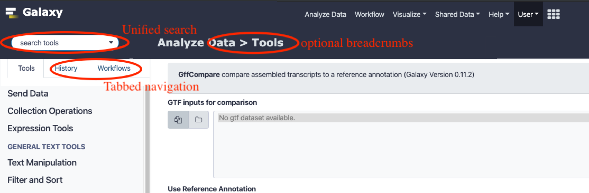
Mockup
User role driven navigation
When new users logs into the system, they will typically look for a navigation bar on the left. However, what they look for will depend on their specific role.
For example, for workflow operators who are only interested in running pre-made workflows, the tool panel is of little relevance. Currently, such users will have to scan for their starting point, which is actually on the top menu bar under the “workflows” menu. They will have to click the workflows menu, click the dropdown to view the menu, and then finally click “run“, requiring at least 3 clicks before a desired workflow can be run. This can be reduced to a single click if the navigation panel shows the workflow tab straight away, which can be determined based on the user’s role/personalization settings.
Therefore, the proposed tabbed navigation layout allows for user specific tuning, where a workflow designer could have a different starting tab from a workflow operator, while still keeping the overall navigation design consistent for users who span multiple roles.
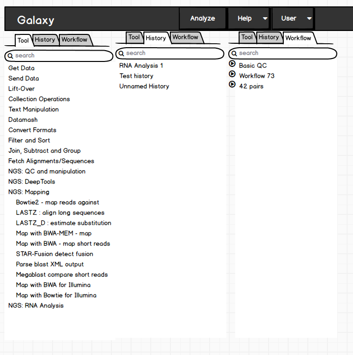
Tabbed navigation
The history and tool panels can be merged into a single, tabbed panel. This has the following advantages:
- Recovers the space that’s constantly used to display both panels.
- A low cost way to make the UI layout tablet and mobile friendly: a tablet layout typically has space to display one navigation pane, but not two. On a mobile layout, the navigation is typically displayed as a slide-out panel, with an icon that can be used to make it slide out. Most users are familiar with these affordances.
- Once a tool is selected, there is no further use in continuing to display the tool navigation panel, as the user has already decided to move on with a specific tool, and only the content panel and history panel have relevance.
- With the large number of tools currently available on usegalaxy.*, using the navigation menu is typically impractical for most users. The search box is more useful. Therefore, this space can be recovered and we can dynamically activate the tool panel only when a tool is searched for. However, new users need navigation cues, which would be lost with a hidden tool panel. To mitigate this, we can make the tool panel visible on first time load or for first time users, as well as when the search box is clicked.
- Additional tabs can be added for a consistent navigation interface. (e.g. workflows)
- If users so desire, we can add a pin button as shown below to keep a panel continuously displayed.

Unified search
A unified, always visible search bar has the following advantages
- Allows the users to search for an item of interest without necessarily knowing where in the navigation hierarchy it is located.
- Recovers the space spent on repeatedly displaying search bars (e.g. tool search bar and history search bar)
- Provides a consistent anchoring point for users who want to perform a search.
- Allows for future extensibility to allow other types of search (e.g. search through help, admin menu etc)
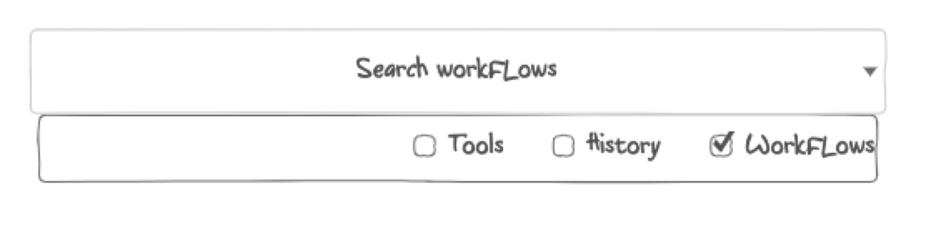
- The search box can be automatically contextualized based on the active tab, so that searches are conducted in the current context (e.g. if the history tab is active, only search histories), but an advanced dropdown menu (as shown below) would allow searching across other categories if so desired.
Disadvantages
- Users may have to click to switch between tool and history tabs. This can be mitigated by intelligently showing the relevant tab. E.g. selecting a tool will hide the tool panel and activate the history panel, saving a click.
- The unified search may be clumsy - especially if it isn't smart about identifying the correct search context.
- Slight departure from traditional layout. However, since this proposed layout is very close to the old one, it can in fact be made to look almost identical by using the “pin tab” feature so that the history and tool panels are always displayed, albeit on the same side of the screen. A more advanced implementation could allow tabs to be split and anchored to different sides of the screen to recreate the existing layout.
Additional Notes
- The proposed layout does not involve extensive implementation, and is mostly a matter of reshuffling elements. The universal search could present somewhat of an implementation challenge but could be omitted in favour of the existing search bars.
- There is an additional proposal that has some complementary suggestions for the masthead navigation menu here: https://github.com/galaxyproject/galaxy/issues/9037
Would be great to hear feedback on the merits and demerits of this proposal.
 nuwang
All 10 comments
@nuwang thanks for a nice proposal. My notes:
- Making the masthead more than double the height is problematic. Top edge is the prime space of any webpage, it should be filled with the most important things.
- "The unified search may be clumsy - especially if it isn't smart about identifying the correct search context." - I've spent good time on all search APIs and UIs of Galaxy and this can't be understated. We already have a strong need to be more precise and performant, this increases complexity of all such tasks significantly.
- If deemed a priority (we have very few mobile users atm) mobile layout is something that should be tackled independently of our standard design I believe, since our 'standard' will never fit mobile without a significant investment.
- "A unified, always visible search bar has the following advantages" - Have you seen/tried the unified search webhook? Is it close to what you imagine?
- Last but not least - there are many assumptions here about what is better for our users and what is the common path of usage. I'd like to see some cases based on data supporting that these are important concern to big chunk of our users (e.g. workflow usage comes to mind, this is very underused Galaxy functionality - at least on Main). I'd be happy to give you access to the Main's analytics if you'd like.
 martenson
on 26 Nov 2019
martenson
on 26 Nov 2019
Unified tool/history panel is not a good idea. Often you need to see both and therefore history should be readily accessible at all times. In addition the history itself is a moving target - we are getting (hopefully) closer to having a graph-based history view. I think we really need developers to use Galaxy more in real world situations (not just the cut tool).
 nekrut
on 26 Nov 2019
nekrut
on 26 Nov 2019
I do need to see the the tool form and the history at the same time, but the tool panel on the left and the history panel on the right I don't think I need to see at the same time and I can imagine that this could work out fine ?
 mvdbeek
on 26 Nov 2019
mvdbeek
on 26 Nov 2019
@nuwang re:masthead, maybe moving the respective search inside of the tab would help that
martenson
on 26 Nov 2019
We developed a long time ago a similar concept as a webhook. We called this overlay-search. We have chosen to go for a webhook to be optional and gather feedback for such a radical change.
https://github.com/galaxyproject/galaxy/tree/dev/config/plugins/webhooks/demo/search
What this is doing is a lot like what @nuwang proposes just as a webhook. You have a tab-based search, you can search for all the things in parallel and you can pin- tools/workflows, manage your favorites and so on.
One reason we went for a full-screen overlay search is to show more tools/workflows but also more metadata associated with an object.
Here is the PR https://github.com/galaxyproject/galaxy/pull/3460
There is a similar concept called Gnome-shell if people are interested in it: https://en.wikipedia.org/wiki/GNOME_Shell
I'm very much in favor of such change as findability is really not great in Galaxy at the moment.
 bgruening
on 26 Nov 2019
bgruening
on 26 Nov 2019
I'd like to clarify that unified search was not the main goal. The goal was to collapse the tool and history panels into a tabbed view, for a number of benefits as outlined above. As @martenson proposed, this can be easily worked around by keeping individual search boxes as is. My own view of unified search is not to have global search results, but to have contextual search. That is, if the tool panel is active, only tools would be searched. If the history pane is active, that would be searched. Optionally, users could select multiple items to search (which would then make the search "unified"). However, to avoid this confusion, perhaps the proper term is "contextual search". All for the marginal benefit of saving some screen real-estate and providing a single constant search location, so it's not that important IMO.
nuwang
on 26 Nov 2019
@martenson
Making the masthead more than double the height is problematic. Top edge is the prime space of any webpage, it should be filled with the most important things.
I agree. It could partially be mitigated in combination with this: https://github.com/galaxyproject/galaxy/issues/9037
but the better option sounds like simply dropping the single search box as in your screenshot.
our 'standard' will never fit mobile without a significant investment.
True. The tabbed design better supports mobile as a pleasant side-effect, but overall, I agree that it need not be a concern. Tablets seemed to be used though.
Have you seen/tried the unified search webhook? Is it close to what you imagine?
I have seen this before, but as mentioned in the previous comment, was thinking more of a contextual search.
I'd be happy to give you access to the Main's analytics if you'd like.
It would be great to discuss this more. In a certain sense, perhaps this could be a low-cost opportunity to promote workflows more and drive adoption. But yes, I do agree with your concern.
nuwang
on 26 Nov 2019
@nekrut For users that need to see both, would the "pin" option not suffice?
nuwang
on 26 Nov 2019
Perhaps. As @mvdbeek noted it would be nice to see a prototype of some sort
nekrut
on 26 Nov 2019
i have a problem with search tool, is that the the searched tool not appear in the list
 hishamaltayb
on 10 May 2020
hishamaltayb
on 10 May 2020
Related issues
 hexylena
·
5Comments
hexylena
·
5Comments
 jennaj
·
4Comments
jennaj
·
4Comments
 katbeaulieu
·
3Comments
katbeaulieu
·
3Comments
 beatrizserrano
·
4Comments
beatrizserrano
·
4Comments
 afgane
·
4Comments
afgane
·
4Comments