I'm not sure what the limitations are with opengl but is there a way to get the open file dialog?
 pbarnum
All 33 comments
This will come from a file selector widget or similar that needs to be added to Fyne.
 okratitan
on 12 Apr 2019
okratitan
on 12 Apr 2019
In Fyne we have avoided using system components and I think that @okratitan is right we should provide our own file handling dialog.
Does anyone else have strong opinions on this before we start work on it?
 andydotxyz
on 16 Apr 2019
andydotxyz
on 16 Apr 2019
I agree with this.
pbarnum
on 23 Apr 2019
We will need to add mime type handling in with this. I've got some plans for that.
okratitan
on 23 Jun 2019
Probably goes hand in hand with FyneDesk and building a file manager ;)
andydotxyz
on 29 Jun 2019
Just to ask: Why not the system ones? They are actually quite feature rich and offer stuff like folder bookmarks, recently visited folders etc..
 philiplb
on 22 Jul 2019
philiplb
on 22 Jul 2019
It's a good question I suppose. I was thinking about the cross platform angle - a consistent user experience. Perhaps on this level the system integration is more important.
On Linux I think a Fyne one would be required but on mac/windows maybe not...
On Android and iOS what should we do? :)
andydotxyz
on 23 Jul 2019
Having something defined is a good approach in the event that there is no defined default on the os you're using. Linux and others can have defaults defined but may not always be the case and fyne would need something to catch that case.
pbarnum
on 23 Jul 2019
I think it would look pretty ugly to have a Fyne app with a certain look call a platform native UI for such a thing - you either should have total platform/OS UI consistency or total app UI consistency. The alternative, having a mix, is worse.
 garfunkel
on 1 Aug 2019
garfunkel
on 1 Aug 2019
It's tough - there is an argument for consistency but also there is an argument for system dialogs for certain things. For example macOS has hooks into dropbox and iCloud drive which a Fyne dialog would struggle to replicate... a tricky decision!
andydotxyz
on 12 Aug 2019
good suggestion.
 catsalt
on 9 Sep 2019
catsalt
on 9 Sep 2019
Just my two cents here, why not implement a really simple file dialog for those who like to keep consistency or for platform which does not have a native one and point those who wants a full featured/native one to a dedicated package.
For the implementation I saw one quite simple implemented with existing widgets in raygui examples
 hfabre
on 10 Sep 2019
hfabre
on 10 Sep 2019
This is really tough. @hfabre i agree with you. Consistency is important, but i doubt we'll always avoid system components in all scenarios and i think this is one of them.
 spatocode
on 12 Sep 2019
spatocode
on 12 Sep 2019
OK, I am making some progress on designs for this and thought I would leave them here for comment before implementing fully. Plan basically is as follows: provide a list of shortcuts (on the left), a breadcrumb trail (along the top) to parent directories and in the main area a simple grid of files (with names - this mockup was just done quickly). This is just single tap stuff - no double clicks. Tapping a directory descends into it, tapping a file will highlight it. Once an item is highlighted the Open button will be enabled. The top left file icon could be an "up" or "parent" directory icon for conveniene.
Nice to have would be a search field of course, but that's a little much for now.
The shortcut list will be platform specific but should be somewhat standardised.
Any feedback or thoughts?

andydotxyz
on 1 Mar 2020
Will it support a table-based style?
My personal experience is that a table-based style listing the filenames (along with other metadata like modified dates and sizes, for example) would be more useful than the icon-based style. It's especially convenient when a directory contains a lot of files and is sortable by clicking the column headers.
 typeless
on 2 Mar 2020
typeless
on 2 Mar 2020
At some point that could be added. Unfortunately as we don't have a table widget yet it might have to wait.
In terms of which is more popular the opinion seems to be divided, some OSs go with the icon layout and others with the list. It would be good to be able to switch them later on but for now I'll just be implementing what's above, unless there are reasons people have to consider this the wrong direction.
andydotxyz
on 2 Mar 2020
I worked with gotk3 and the GTK+ 3 dialog is terrible in macOS, Windows. So, GTK+ 3 has made native dialog and I make contribution to the gotk3 with native dialog support.
So, I guess that native file dialog is the best choice. Even GTK+ 3 came to this.
 jhekasoft
on 7 Mar 2020
jhekasoft
on 7 Mar 2020
Some of the platform supported by fyne do not have a native one. So a fallback is mandatory and as an optimization the native one can be exposed.
 Bluebugs
on 7 Mar 2020
Bluebugs
on 7 Mar 2020
Agreed, I think it would be nice to have the native dialog as a fallback. Or better yet, as suggested by @hfabre, implement a way for a developer to choose (fyne is default but can be swapped with native). Either way the mock up looks good @andydotxyz
pbarnum
on 7 Mar 2020
OK, here is the first version that's now on feature/filedialog

andydotxyz
on 8 Mar 2020
how is the file dialog going
 suifengqjn
on 10 Mar 2020
suifengqjn
on 10 Mar 2020
OK, here is the first version that's now on feature/filedialog
Is it done?
suifengqjn
on 10 Mar 2020
It is not yet complete, it is in development on the feature branch mentioned above.
Feel free to test, we could do with feedback. At this stage it struggles with huge directories and layout is not ideal with long file names - it needs polish, and it also needs mobile support.
Once it is complete this ticket will be closed.
andydotxyz
on 10 Mar 2020
thanks, waiting for your good news
suifengqjn
on 12 Mar 2020
I'm just working on the iOS and Android support then will start the PullRequest process.
andydotxyz
on 13 Mar 2020
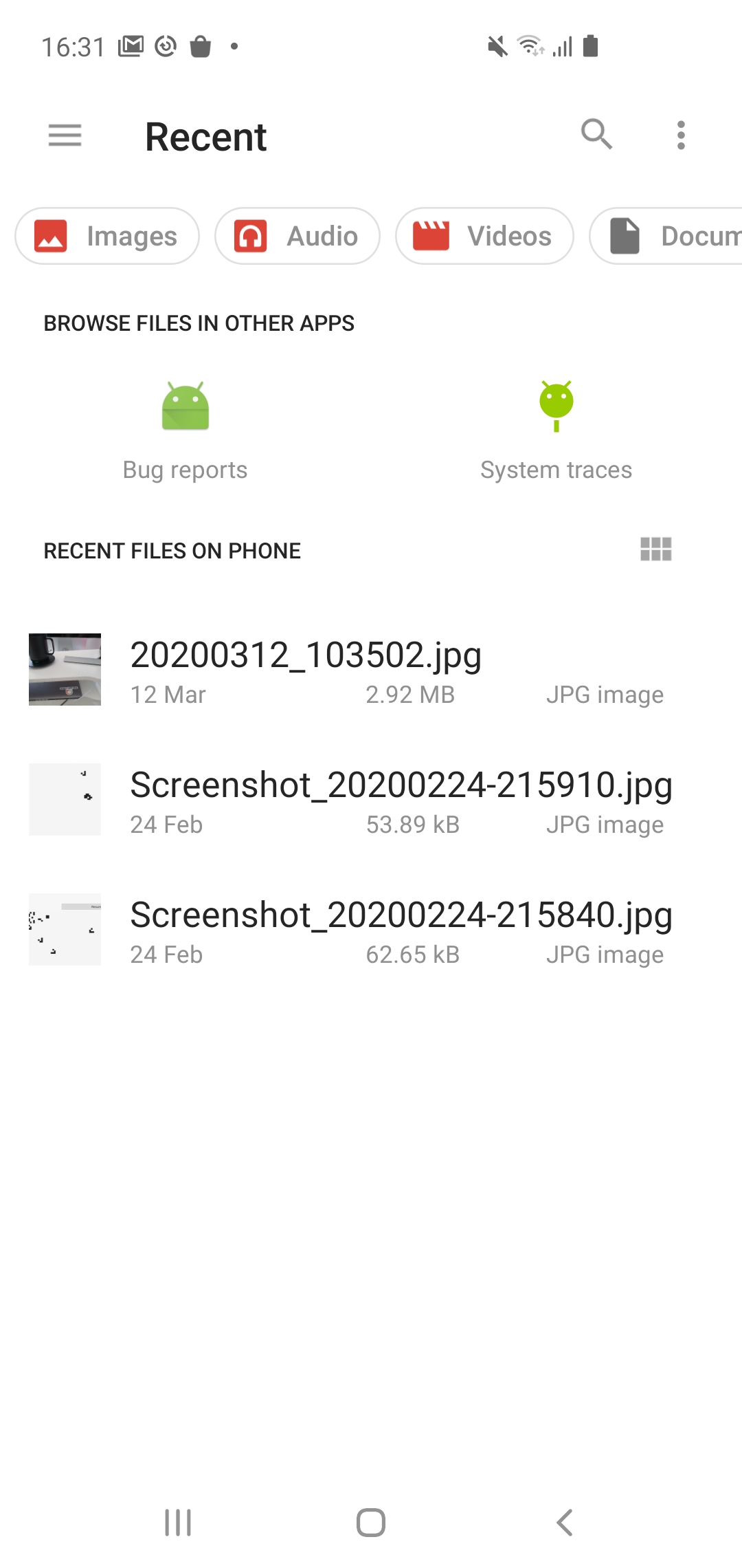
Due to the architecture and security model of iOS and Android we have to open their native pickers, those look like this:

andydotxyz
on 13 Mar 2020
Any testing or feedback on #745 would be appreciated :)
andydotxyz
on 13 Mar 2020
I would be interested in hearing opinions about the following ideas:
- The icons would be smaller
- Each line would consist of the icon on the left and the filename on the right (one icon and one filename per line)
 tataDan
on 22 Mar 2020
tataDan
on 22 Mar 2020
I second the icon size, perhaps based on the window size? As for the list view; we need the table widget before we can implement feature.
pbarnum
on 22 Mar 2020
The icon to text size ratio is between macOS and Windows, it seemed like a good place to start.
If there is a specific reason that the size is too large we can look into it, but if it's preference then i'll leave it as-is for now.
Listview might be an option in the future, after table widget exists.
andydotxyz
on 22 Mar 2020
The idea would be to save screen space within the dialog to mitigate overlapping text with long file names.
Another poster under #745 posted the following:
It doesn't really appreciate long folder and file names (needs some sort of text wrapping and I know that it is work in progress).
The poster also provided a screenshot that illustrates the overlapping text.
Perhaps making the icons smaller would not address this issue.
tataDan
on 22 Mar 2020
Indeed, smaller icons probably makes the issue worse - unless you want lots more space around smaller items?
As discussed on that thread I was waiting for the incoming text wrap/truncate work coming in rather than implementing it manually...
andydotxyz
on 22 Mar 2020
This is now on develop for testing.
Currently we have issues that files opened on mobile may not be readable, and that the save dialog is not available for mobile.
That is a complex topic that I will start to tackle today.
andydotxyz
on 25 Mar 2020
Related issues
 HeyDon-Lee
·
9Comments
pbarnum
·
6Comments
andydotxyz
·
9Comments
andydotxyz
·
3Comments
HeyDon-Lee
·
9Comments
pbarnum
·
6Comments
andydotxyz
·
9Comments
andydotxyz
·
3Comments
 Jacalz
·
4Comments
Jacalz
·
4Comments
Most helpful comment
Just my two cents here, why not implement a really simple file dialog for those who like to keep consistency or for platform which does not have a native one and point those who wants a full featured/native one to a dedicated package.
For the implementation I saw one quite simple implemented with existing widgets in raygui examples