Fsnotes: [REQ] Indication of current folder
At the end of closed issue #323, @jeff-h wrote as follows:
"I reckon it could be cool to have the sidebar folders listed in a dropdown at the top of the notes column when you hide the sidebar."
Because I normally use FSNotes with the sidebar closed, it would be helpful to have some indication of the currently-selected folder. A dropdown list, as suggested by @jeff-h, would be great. Another option might be an unobtrusive popover that provides pertinent information about a note including its folder.
I don't know enough about interface design to offer something specific, but just wanted to raise this as a possible enhancement.
 peavine
All 24 comments
What about something with this kind of information on the search bar:
perhaps there could be two search options and related labels:
- Search in _Current Folder Name_
- Search All Notes (could show if you hold down option?)
 gingerbeardman
on 5 Aug 2018
gingerbeardman
on 5 Aug 2018
Great idea! Though I've realised you wouldn't want to obscure the very topmost matching notes while you enter search words — after all, the notes at the top of the list are the ones you most likely want to open. Tricky one though — I can't think of a nicer solution.
 jeff-h
on 5 Aug 2018
jeff-h
on 5 Aug 2018
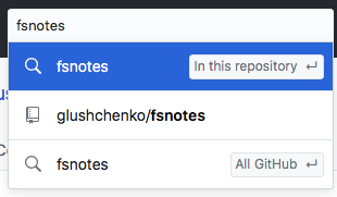
Yes, I don't want the drop down either. I just included the image for reference that GitHub has solved a similar problem
gingerbeardman
on 6 Aug 2018
Apparently I misunderstood what @jeff-h was proposing or perhaps I don't understand what @gingerbeardman is proposing.
My thought was a simple one--that FSNotes should show in some way the currently-selected folder (or item) when the sidebar is closed. A very basic example of this would be to show both the name of the folder and the note name at the top of the editor window when the sidebar is not visible. Thus, if the selected folder is "Addresses" and the note name is "Peavine", the following would be shown at the top of the editor window:
Addresses/Peavine
I didn't understand what @jeff-h was proposing and shouldn't have quoted him. Sorry about that.
peavine
on 6 Aug 2018
Not all, you had it right, we're just thrashing out alternatives to how this change could be approached.
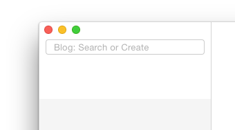
Here's a _mockup_ of my suggestion:
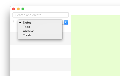
and with Alt held down:

gingerbeardman
on 6 Aug 2018

I think this mockup is the approach @peavine is suggesting?
and if there was no notes list:

gingerbeardman
on 6 Aug 2018
@gingerbeardman. Thanks for clarifying that and for the mockups, which are very helpful.
I like your suggestion. It provides the folder information and enhances search.
Your first mockup of my approach is exactly what I had in mind. I hadn't give any thought to what would be shown if there was no notes list.
peavine
on 6 Aug 2018
@gingerbeardman do you think there'd be any implication that if you hold down alt then the note search/creation will happen in the folder but if you don't hold it down it will go somewhere else?
FWIW this pic hopefully illustrates my previous suggestion. I don't hold strongly to it though.
jeff-h
on 7 Aug 2018
Alt is the key that changes the behaviour of lots of commands from Finder onwards. It would have to be in the documentation along with Cmd+Enter etc.
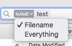
Maybe there could be a lozenge in the search field like Finder?
gingerbeardman
on 7 Aug 2018
how about showing the current project in the title but only when the mouse cursor is over it?
 buddax2
on 26 Oct 2018
buddax2
on 26 Oct 2018
Since I like simplicity in UI I would suggest to leave visible only the title and put all additional elements into a hidable view. Please see the example below:
I would also put here tags from the current note. Maybe not all tags but at least a few first tags. What do you think?
buddax2
on 27 Oct 2018
Looks good, but here not enough space for tags IMO
 glushchenko
on 27 Oct 2018
glushchenko
on 27 Oct 2018
@glushchenko I do not insist. Maby you're right and this may look too messy. But I would like to see here is some preview mode indicator. Just for example:

buddax2
on 27 Oct 2018
I never use what I believe is called the share menu and placing this menu in a hidable view as suggested by @buddax2 would sure be nice. I agree that "simplicity in UI" is a good thing.
On a different topic, probably the only annoyance I encounter with FSNotes is changing folders. If I have the sidebar open, everything looks cluttered. However, if I have the sidebar closed, there's no way to change folders. As a result, I'm constantly opening and closing the sidebar. I don't know how to fix this or even if it needs fixing, but it's an issue for me.
peavine
on 28 Oct 2018
@peavine it can be something like this:

buddax2
on 28 Oct 2018
@buddax2. That's excellent--especially combined with the hidable view to have the clean UI.
peavine
on 28 Oct 2018
Aside: I'm currently transitioning to a flat,single folder structure. Using only tags to navigate.
gingerbeardman
on 28 Oct 2018
@gingerbeardman I also like the idea of using just tags. That's why I think we need to add filtering by tags. Type into the search field: #tag1, #tag2 will show only notes with such tags and notes with such text inside.
buddax2
on 28 Oct 2018
@buddax2 i think title height should be equal search height and sidebar top margin. After last merge it's not equal.
Before:

After:

glushchenko
on 29 Oct 2018
@glushchenko I will fix that
buddax2
on 29 Oct 2018
Thank you for contribution.
glushchenko
on 29 Oct 2018
does it look OK?


Please see this screenshot. Here the title bar has the same height as the search bar.

buddax2
on 29 Oct 2018
Excellent 👍🏻
glushchenko
on 29 Oct 2018
btw, I had an idea to set editor view's appearance to Light when we are in preview mode. And then switch back to the current appearance in edit mode. What do you thing?

buddax2
on 29 Oct 2018
Related issues
 erikrose
·
4Comments
erikrose
·
4Comments
 dmattera
·
3Comments
dmattera
·
3Comments
 sepich
·
3Comments
sepich
·
3Comments
 pvinis
·
4Comments
pvinis
·
4Comments
 yene
·
3Comments
yene
·
3Comments
Most helpful comment
@glushchenko I do not insist. Maby you're right and this may look too messy. But I would like to see here is some preview mode indicator. Just for example: