Frontend: Weather card icons inconsistent and hard to distinguish
Checklist
- [x] I have updated to the latest available Home Assistant version.
- [x] I have cleared the cache of my browser.
- [x] I have tried a different browser to see if it is related to my browser.
The problem
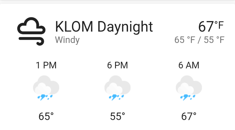
Windy state uses the mdi icon with black lines which doesn't match the default color scheme. It also doesn't match the other icons on the weather card.
Also, the new icons are impossible to tell what the state is. Are the forecast states pouring or lightning? I can't tell. Only sunny is easy to distinguish in my view. This partially overlaps with #5676, but I'd like to give a very concrete example of the ambiguity in the new icons.
Expected behavior
Use a thematically consistent icon set.
Steps to reproduce
Add a forecast weather card that has an entity with windy condition
Environment
- Home Assistant release with the issue: 0.109
- Last working Home Assistant release (if known): 0.108
- Browser and browser version: Chrome
- Operating system: Android
Javascript errors shown in your browser console/inspector
Unknown
Additional information
 MatthewFlamm
All 4 comments
hmm can you send the State and Attributes for that entity?
I can't reproduce
 zsarnett
on 30 Apr 2020
zsarnett
on 30 Apr 2020
It is no longer reporting as windy, so I cannot provide, but it looks like it was "windy-variant" by the icon.
The forecast conditions are "lightning-rainy", but it is a bad sign for the legibility of the icons if I have to go to the attributes to know.
MatthewFlamm
on 30 Apr 2020
https://github.com/home-assistant/frontend/blob/dev/src/data/weather.ts#L3-L22
I see the issue. I changed this to be only images... Not sure how it gotreverted. I will make the change again. Windy-variant should be the same as windy.
zsarnett
on 30 Apr 2020
5692
zsarnett
on 5 May 2020
Related issues
 deluxestyle
·
25Comments
deluxestyle
·
25Comments
![move[bot] picture](https://avatars1.githubusercontent.com/in/6673?v=4&s=40) move[bot]
·
29Comments
move[bot]
·
29Comments
 OkhammahkO
·
80Comments
OkhammahkO
·
80Comments
 andriej
·
64Comments
andriej
·
64Comments
 TheJulianJES
·
28Comments
TheJulianJES
·
28Comments
Most helpful comment
It is no longer reporting as windy, so I cannot provide, but it looks like it was "windy-variant" by the icon.
The forecast conditions are "lightning-rainy", but it is a bad sign for the legibility of the icons if I have to go to the attributes to know.