Frontend: Condensed UI for Integrations
The request
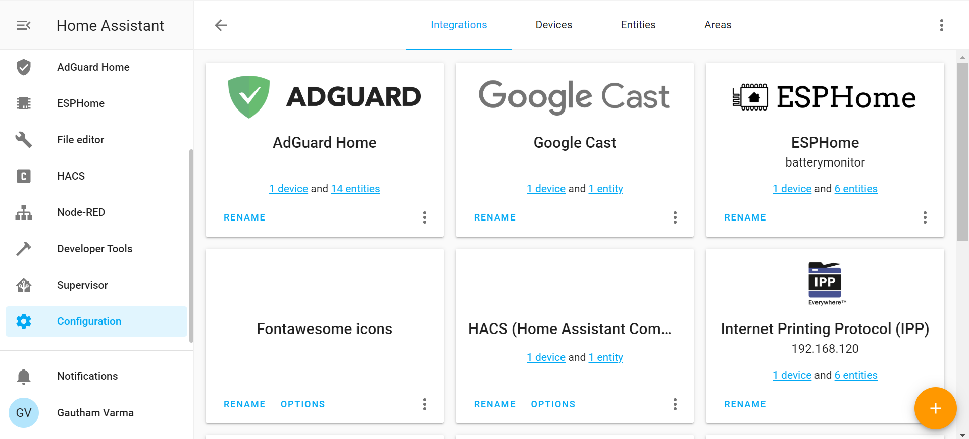
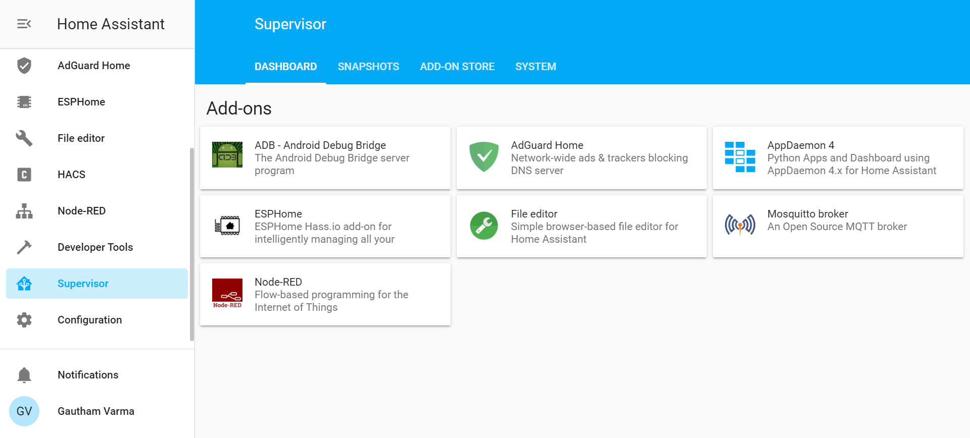
The new integrations page is well designed, kudos on that. But it is taking up a lot of space, not ideal with many integrations. Hence it would be great if we can have a more condensed UI on the integrations page, (with icon to the left and text to the right as in Supervisor>Addons Page).
The alternatives
Maybe having an option to toggle between condensed and regular UI in case people are not happy with the new UI
Additional information
Thank you, home assistant devs and community for making Home Assistant what it is.
 GauthamVarmaK
All 3 comments
A redesign is not really something we would look to do. a lot of work for no real benefit. Adding a search bar instead would be a beneficial addition
 zsarnett
on 24 Sep 2020
zsarnett
on 24 Sep 2020
I explored this idea before and made some mockups, but came to the conclusion it was not worth it. You can't really do a compact mode in a clean way without dropping features.
The cards on the Integrations page have five different tap targets - Rename, Options, X devices, X entities, Overflow menu. Cramming all this into a much smaller card is challenging especially if you're trying to be finger friendly on mobile. You'd have to move most things inside the overflow (3 dots) menu, but that overflow menu already has a bunch of things inside it.
Main challenge though would be trying to implement the grouping of config entries. It's just not possible to do in a nice way IMO. You can't really have a scrollable list because there's no room for that in such a tiny card height. You'd only be able to see like one thing at a time.
In the end the user experience would suffer too much IMO. Pretty much every action would take at least one more tap/click, and it would be so cramped and cluttered.
 SeanPM5
on 24 Sep 2020
SeanPM5
on 24 Sep 2020
A redesign is not really something we would look to do. a lot of work for no real benefit. Adding a search bar instead would be a beneficial addition
We have a search bar? 😄
 bramkragten
on 24 Sep 2020
bramkragten
on 24 Sep 2020
Related issues
 aaron9060
·
3Comments
SeanPM5
·
3Comments
aaron9060
·
3Comments
SeanPM5
·
3Comments
 Fusseldieb
·
4Comments
Fusseldieb
·
4Comments
 TheZoker
·
3Comments
SeanPM5
·
3Comments
TheZoker
·
3Comments
SeanPM5
·
3Comments
Most helpful comment
I explored this idea before and made some mockups, but came to the conclusion it was not worth it. You can't really do a compact mode in a clean way without dropping features.
The cards on the Integrations page have five different tap targets - Rename, Options, X devices, X entities, Overflow menu. Cramming all this into a much smaller card is challenging especially if you're trying to be finger friendly on mobile. You'd have to move most things inside the overflow (3 dots) menu, but that overflow menu already has a bunch of things inside it.
Main challenge though would be trying to implement the grouping of config entries. It's just not possible to do in a nice way IMO. You can't really have a scrollable list because there's no room for that in such a tiny card height. You'd only be able to see like one thing at a time.
In the end the user experience would suffer too much IMO. Pretty much every action would take at least one more tap/click, and it would be so cramped and cluttered.