Frontend: Weather map does not show current state nicely (0.109.0b1)
Checklist
- [x] I have updated to the latest available Home Assistant version.
- [x] I have cleared the cache of my browser.
- [x] I have tried a different browser to see if it is related to my browser.
The problem
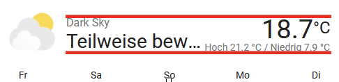
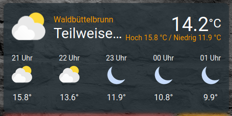
The current state does not fit onto the new weather card.
It's even worse on mobile.
The state Teilweise bewölkt (partially cloudy) gets reduces to Teilwe... which means something like partia... in english.
PC:

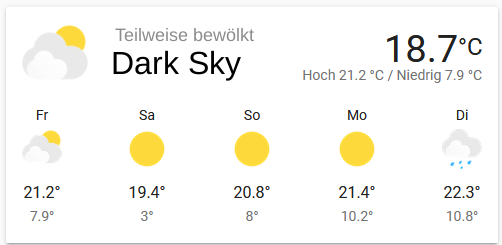
Mobile:

Expected behavior
Things move until at least most of the state fit onto the card.
 Santobert
All 15 comments
We should also align the right and left:
 bramkragten
on 24 Apr 2020
bramkragten
on 24 Apr 2020
The state is the least important information here. You have the icon for that.
 zsarnett
on 24 Apr 2020
zsarnett
on 24 Apr 2020
@zsarnett I strongly disagree. You need to know most of the symbols to interpret them correctly.
Personally I think the state and the temperature are the most important information there.
If the state is not important, why is it the largest text?
To be consistent, it should be much smaller or get the space it needs. I do not like the solution of cutting off parts of the state. And I don't think that this is a good user experience.
Santobert
on 24 Apr 2020
So do why do you have the forecast if you can't interpret the symbols?
zsarnett
on 24 Apr 2020
I think there can be some improvements. Visually speaking I don't know what is best..
Probably making the name of the card larger and the state smaller. As a user can shorten the name. Problem is there will always be issues with this if the name or state is long enough
zsarnett
on 24 Apr 2020
Because it's the only weather card that's available, I guess.
Don't get me wrong, I like the new card. I just think the ux can be improved.
Santobert
on 24 Apr 2020
You can take the forecast off in the settings of the card 😉
I will see what I can do
zsarnett
on 24 Apr 2020
What if we swap the name and the state?
The name is big and below the smaller state?
Santobert
on 24 Apr 2020

Right thats what I was mentioning above. Quickly came up with this
zsarnett
on 24 Apr 2020
I like it
bramkragten
on 24 Apr 2020
I thought about something like that. But it's almost the same :smile:
Santobert
on 24 Apr 2020
Have both the big ones on top looks better
bramkragten
on 24 Apr 2020
I do not think that for this it is necessary to create a new issue, so I will write here. Openweathermap reports the weather from the current time until the end of the day. If the time is nearing the end of the day, and at this time warming is expected, we can see this:
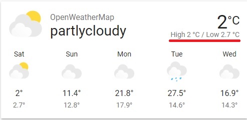
I think something like this would look better: 2° ... 2.7°C
It will also add more space for state.
 Yevgenium
on 25 Apr 2020
Yevgenium
on 25 Apr 2020
Another issue on this card:
One time it shows:
another time
The size (and also the browser window size) is exactly the same.
If this needs a new issue, please tell me and i'll do.
 VDRainer
on 27 Apr 2020
VDRainer
on 27 Apr 2020
I think, this can be closed, since the original issue was resolved. @VDRainer I see this behavior as well. It may be worth to create a new issue for it
Santobert
on 1 May 2020
Related issues
 SeanPM5
·
3Comments
SeanPM5
·
3Comments
 aaron9060
·
3Comments
aaron9060
·
3Comments
 TheZoker
·
3Comments
TheZoker
·
3Comments
![move[bot] picture](https://avatars1.githubusercontent.com/in/6673?v=4&s=40) move[bot]
·
3Comments
move[bot]
·
3Comments
 Depechie
·
3Comments
Depechie
·
3Comments
Most helpful comment
Right thats what I was mentioning above. Quickly came up with this