Frontend: Navigation pane doesn't respect chosen theme
Checklist
- [ ] I have updated to the latest available Home Assistant version. -
Yes. This version has the problem - [ ] I have cleared the cache of my browser.
Yes...annoyingly I had to sign back into most of my other websites and reconfigure youtube etc etc. - [ ] I have tried a different browser to see if it is related to my browser.
Tested in firefox and chrome. According to a new post I made on reddit /r/homeassistant I'm not the only one either
The problem
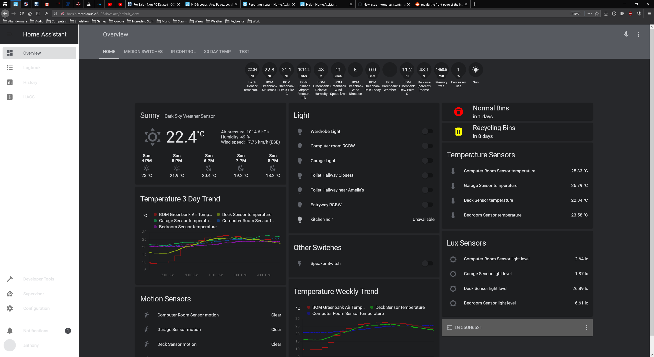
The navigation pane since 0.108.03 is no longer respecting the chosen theme.
I use a dark theme, and the background etc of the navigation pane is white, whilst the lovelace cards etc are using the dark theme background (dark grey in colour)
Expected behavior
Navigation pane is the same colour as the lovelace card pages
Steps to reproduce
- Update from 0.108.02 to 0.108.03
- Refresh the page and the navigation page will turn white rather than dark grey using any of the below themes configured in my front end yaml. Attached screenshot of the issue.
Config listed below in the config section.
Environment
- Home Assistant release with the issue: 0.108.03
- Last working Home Assistant release (if known): 0.108.02
- Browser and browser version: Firefox 75.0 and Google Chrome 81.0.4044.92 (both x64)
- Operating system: Server 2016 build 14393.3595 and Windows 10 Enterprise build 18363.752
Problem-relevant configuration
themes:
solarized_dark:
primary-color: "#586e75"
accent-color: "#002b36"
dark-primary-color: "#93a1a1"
light-primary-color: "var(--accent-color)"
primary-text-color: "#839496"
text-primary-color: "var(--primary-text-color)"
secondary-text-color: "#586e75"
disabled-text-color: "#7F848E"
label-badge-border-color: "green"
primary-background-color: "#002b36"
secondary-background-color: "#073642"
divider-color: "rgba(0, 0, 0, .12)"
table-row-background-color: "#002b36"
table-row-alternative-background-color: "#073642"
paper-listbox-color: "var(--primary-color)"
paper-listbox-background-color: "var(--accent-color)"
paper-grey-50: "var(--primary-text-color)"
paper-grey-200: "var(--accent-color)"
paper-card-header-color: "var(--dark-primary-color)"
paper-card-background-color: "var(--accent-color)"
paper-dialog-background-color: "#002b36"
paper-item-icon-color: "var(--primary-text-color)"
paper-item-icon-active-color: "#b58900"
paper-item-icon_-_color: "#859900"
paper-item-selected_-_color: "var(--accent-color)"
paper-item-selected_-_background-color: "#cb4b16"
paper-tabs-selection-bar-color: "#859900"
label-badge-red: "#93a1a1"
label-badge-text-color: "var(--primary-text-color)"
label-badge-background-color: "var(--accent-color)"
paper-toggle-button-checked-button-color: "#268bd2"
paper-toggle-button-checked-bar-color: "var(--primary-color)"
paper-toggle-button-checked-ink-color: "#268bd2"
paper-toggle-button-unchecked-button-color: "var(--secondary-background-color)"
paper-toggle-button-unchecked-bar-color: "var(--secondary-text-color)"
paper-toggle-button-unchecked-ink-color: "var(--secondary-background-color)"
paper-slider-knob-color: "var(--secondary-text-color)"
paper-slider-knob-start-color: "var(--secondary-text-color)"
paper-slider-pin-color: "var(--secondary-text-color)"
paper-slider-active-color: "var(--secondary-text-color)"
paper-slider-container-color: "linear-gradient(var(--primary-background-color), var(--secondary-background-color)) no-repeat"
paper-slider-secondary-color: "var(--secondary-background-color)"
paper-slider-disabled-active-color: "var(--disabled-text-color)"
paper-slider-disabled-secondary-color: "var(--disabled-text-color)"
sidebar-selected-icon-color: 'var(--secondary-text-color)'
sidebar-icon-color: 'var(--primary-text-color)'
google-red-500: "#dc322f"
google-green-500: "#859900"
darkred:
  # Main colors that can be changed
  dark-primary-color: "#c66900"
  disabled-text-color: "#545454"
  divider-color: "rgba(255, 255, 255, 0.12)"
  light-primary-color: "#e06c6c"
  paper-card-background-color: "#1d1d1d"
  paper-grey-200: "#191919"
  paper-item-icon-color: "#d3d3d3"
  paper-listbox-background-color: "#202020"
  primary-background-color: "#303030"
  primary-color: "#d32f2f"
  primary-text-color: "#cfcfcf"
  secondary-background-color: "#131313"
  sidebar-text_-_background: "#62717b"
  # Colors based on variables, see above
  paper-card-header-color: "var(--paper-item-icon-color)"
  paper-item-icon-active-color: "var(--primary-color)"
  paper-item-icon_-_color: "var(--primary-text-color)"
  paper-listbox-color: "var(--primary-text-color)"
  paper-grey-50: "var(--primary-text-color)"
  paper-slider-active-color: "var(--primary-color)"
  paper-slider-knob-color: "var(--primary-color)"
  paper-slider-knob-start-color: "var(--primary-color)"
  paper-slider-pin-color: "var(--primary-color)"
  paper-slider-secondary-color: "var(--light-primary-color)"
  paper-toggle-button-checked-ink-color: "var(--dark-primary-color)"
  paper-toggle-button-checked-button-color: "var(--primary-color)"
  paper-toggle-button-checked-bar-color: "var(--light-primary-color)"
  paper-toggle-button-unchecked-bar-color: "var(--primary-text-color)"
  secondary-text-color: "var(--primary-color)"
  table-row-background-color: "var(--paper-card-background-color)"
  table-row-alternative-background-color: "var(--sidebar-text_-_background)"

Night:
  # MyVariables
  base-hue: '220' #Controls the base (and accent) color hue (0-360) | 0=Red 60=Yellow 120=Green 180=Cyan 240=Blue 300=Magenta 360=Red
  base-sat: '5%' #Controls the saturation of the theme (0%-100%) | 0%=Grey 100%=Full Saturation
  # MyVar
  huesat: 'var(--base-hue), var(--base-sat),'
  # Primary Color
  primary-color: 'hsl(var(--huesat) 36%)' #header colors and some text colors
  dark-primary-color: 'hsl(var(--huesat) 60%)'
  light-primary-color: 'hsl(var(--huesat) 90%)'
  accent-color: 'hsl(var(--huesat) 30%)'
  # Backgrounds
  primary-background-color: 'hsl(var(--huesat) 16%)'
  secondary-background-color: 'hsl(var(--huesat) 16%)' # background behind cards
  paper-listbox-background-color: 'hsl(var(--huesat) 16%)'
  paper-card-background-color: 'hsl(var(--huesat) 12%)'
  paper-dialog-background-color: 'var(--paper-card-background-color)'
  table-row-background-color: 'hsl(var(--huesat) 12%)'
  table-row-alternative-background-color: 'hsl(var(--huesat) 10%)'
  # Divider
  divider-color: 'hsla(0, 0%, 0%, 0)'
  dark-divider-opacity: '0'
  light-divider-opacity: '0'
  dark-secondary-opacity: '1'
  # Text colors
  primary-text-color: 'hsl(var(--huesat) 90%)'
  text-primary-color: 'hsl(var(--huesat) 80%)'
  secondary-text-color: 'hsl(var(--huesat) 80%)'
  disabled-text-color: 'hsl(var(--huesat) 70%)'
  sidebar-text_-_color: 'hsl(var(--huesat) 90%)'
  sidebar-text-color: 'hsl(var(--huesat) 90%)'
  paper-card-header-color: 'hsl(var(--huesat) 90%)'
  paper-button-ink-color: 'hsl(var(--huesat) 50%)'
  # Text Adjustments
  paper-font-headline_-_letter-spacing: '-0.5px'
  paper-font-headline_-_font-weight: '400'
  paper-font-body1_-_font-weight: '300'
  # Nav Menu
  paper-listbox-color: 'hsl(var(--huesat) 50%)'
  paper-grey-50: 'hsl(var(--huesat) 50%)'
  paper-grey-200: 'hsl(var(--huesat) 10%)' #active menu item
  # Paper card
  paper-item-icon-color: 'hsl(var(--huesat) 40%)'
  paper-item-icon-active-color: 'var(--paper-item-icon-color)'
  paper-item-icon_-_color: 'var(--paper-item-icon-color)'
  paper-item-selected_-_background-color: 'hsla(0, 0%, 0%, 0.2)'
  paper-item-selected_-_color: 'hsl(var(--huesat) 20%)' #?
  paper-tabs-selection-bar-color: 'hsla(0, 0%, 0%, 0.2)'
  paper-tab-ink: 'hsl(var(--huesat) 70%)'
  paper-input-container-color: 'hsl(var(--huesat) 60%)'
  # Labels
  label-badge-red: 'var(--paper-card-background-color)'
  label-badge-border-color: 'var(--label-badge-red)'
  label-badge-background-color: 'var(--paper-card-background-color)'
  label-badge-text-color: 'var(--primary-text-color)'
  # Shadows
  shadow-elevation-2dp_-_box-shadow: '0px 0px 0px 0px hsl(var(--huesat) 10%)'
  shadow-elevation-16dp_-_box-shadow: '0px 0px 0px 0px hsl(var(--huesat) 25%)'
  # Switches
  paper-toggle-button-checked-button-color: 'hsl(var(--base-hue), 90%, 50%)'
  paper-toggle-button-checked-bar-color: 'hsl(var(--huesat) 25%)'
  paper-toggle-button-unchecked-button-color: 'hsl(var(--huesat) 25%)'
  paper-toggle-button-unchecked-bar-color: 'hsl(var(--huesat) 5%)'
  # Sliders
  paper-slider-knob-color:  'hsl(var(--base-hue), 90%, 50%)'
  paper-slider-knob-start-color: 'hsl(var(--base-hue), 80%, 25%)'
  paper-slider-pin-color:  'hsl(var(--base-hue), 90%, 50%)'
  paper-slider-active-color:  'hsl(var(--base-hue), 90%, 50%)'
  paper-slider-container-color: 'hsl(var(--huesat) 28%)'
  paper-slider-secondary-color: 'hsl(var(--huesat) 90%)'
  paper-slider-disabled-active-color: 'hsl(var(--base-hue), 80%, 25%)'
  paper-slider-disabled-secondary-color: 'hsl(var(--base-hue), 80%, 25%)'
  paper-dialog-color: 'hsl(var(--base-hue), 20%, 80%)'

solarized-light:
  # Main colors
  primary-color: '#586e75'                                                        # Header
  accent-color: '#fdf6e3'                                                         # Accent color
  dark-primary-color: '#586e75'                                                   # Hyperlinks
  light-primary-color: 'var(--accent-color)'                                      # Horizontal line in about
  # Text colors
  primary-text-color: '#657b83'                                                   # Primary text colour, here is referencing dark-primary-color
  text-primary-color: 'var(--primary-text-color)'                                 # Primary text colour
  secondary-text-color: '#93a1a1'                                                 # For secondary titles in more info boxes etc.
  disabled-text-color: '#7F848E'                                                  # Disabled text colour
  label-badge-border-color: 'green'                                               # Label badge border, just a reference value
  # Background colors
  primary-background-color: '#fdf6e3'                                             # Settings background
  secondary-background-color: '#eee8d5'                                           # Main card UI background
  divider-color: 'rgba(0, 0, 0, .12)'                                             # Divider
  # Table rows
  table-row-background-color: '#fdf6e3'                                           # Table row
  table-row-alternative-background-color: '#eee8d5'                               # Table row alternative
  # Nav Menu
  paper-listbox-color: 'var(--primary-color)'                                     # Navigation menu selection hoover
  paper-listbox-background-color: 'var(--accent-color)'                           # Navigation menu background
  paper-grey-50: 'var(--primary-text-color)'
  paper-grey-200: 'var(--accent-color)'                                           # Navigation menu selection
  # Paper card
  paper-card-header-color: 'var(--dark-primary-color)'                            # Card header text colour
  paper-card-background-color: 'var(--accent-color)'                              # Card background colour
  paper-dialog-background-color: '#fdf6e3'                                        # Card dialog background colour
  paper-item-icon-color: 'var(--primary-text-color)'                              # Icon color
  paper-item-icon-active-color: '#b58900'                                         # Icon color active
  paper-item-icon_-_color: 'green'
  paper-item-selected_-_color: 'var(--accent-color)'
  paper-item-selected_-_background-color: '#cb4b16'                               # Popup item select
  paper-tabs-selection-bar-color: 'green'
  # Labels
  label-badge-red: '#586e75'                                                      # References the brand colour label badge border
  label-badge-text-color: 'var(--primary-text-color)'                             # Now same as label badge border but that's a matter of taste
  label-badge-background-color: 'var(--accent-color)'                             # Same, but can also be set to transparent here
  # Switches
  paper-toggle-button-checked-button-color: '#268bd2'
  paper-toggle-button-checked-bar-color: 'var(--primary-color)'
  paper-toggle-button-checked-ink-color: '#268bd2'
  paper-toggle-button-unchecked-button-color: 'var(--secondary-background-color)'
  paper-toggle-button-unchecked-bar-color: 'var(--secondary-text-color)'
  paper-toggle-button-unchecked-ink-color: 'var(--secondary-background-color)'
  # Sliders
  paper-slider-knob-color: 'var(--secondary-text-color)'
  paper-slider-knob-start-color: 'var(--secondary-text-color)'
  paper-slider-pin-color: 'var(--secondary-text-color)'
  paper-slider-active-color: 'var(--secondary-text-color)'
  paper-slider-container-color: 'linear-gradient(var(--primary-background-color), var(--secondary-background-color)) no-repeat'
  paper-slider-secondary-color: 'var(--secondary-background-color)'
  paper-slider-disabled-active-color: 'var(--disabled-text-color)'
  paper-slider-disabled-secondary-color: 'var(--disabled-text-color)'
  # Google colors
  google-red-500: '#dc322f'
  google-green-500: '#859900'

darkorange:
  primary-color: "#ff9800"
  light-primary-color: "#ffc947"
  dark-primary-color: "#c66900"
  text-primary-color: "#ffffff"
  primary-background-color: "#37464f"
  sidebar-text_-_background: "#62717b"
  paper-card-background-color: "#263137"
  paper-card-header-color: "var(--text-primary-color)"
  secondary-background-color: "var(--primary-background-color)"
  primary-text-color: "var(--text-primary-color)"
  secondary-text-color: "var(--primary-color)"
  paper-listbox-background-color: "var(--sidebar-text_-_background)"
  paper-toggle-button-checked-ink-color: "var(--dark-primary-color)"
  paper-toggle-button-checked-button-color: "var(--dark-primary-color)"
  paper-toggle-button-checked-bar-color: "var(--dark-primary-color)"
  paper-slider-knob-color: "var(--primary-color)"
  paper-slider-knob-start-color: "var(--primary-color)"
  paper-slider-pin-color: "var(--primary-color)"
  paper-slider-active-color: "var(--primary-color)"
  paper-slider-secondary-color: "var(--light-primary-color)"
  paper-slider-container-color: "var(--sidebar-text_-_background)"
  paper-progress-secondary-color: "var(--sidebar-text_-_background)"
  paper-item-selected_-_background-color: "var(--primary-color)"
  paper-item-icon_-_color: "var(--text-primary-color)"
  paper-item-icon-color: "var(--sidebar-text_-_background)"
  paper-item-icon-active-color: "var(--primary-color)"
  paper-grey-50: "var(--sidebar-text_-_background)"
  paper-grey-200: "var(--primary-background-color)"
  label-badge-background-color: "var(--sidebar-text_-_background)"
  label-badge-text-color: "var(--text-primary-color)"
  label-badge-red: "var(--primary-color)"
  label-badge-blue: "var(--light-primary-color)"
  label-badge-green: "var(--dark-primary-color)"
  label-badge-yellow: "var(--text-primary-color)"
  label-badge-grey: "var(--paper-grey-500)"
  table-row-background-color: "var(--paper-card-background-color)"
  table-row-alternative-background-color: "var(--sidebar-text_-_background)"
Javascript errors shown in your browser console/inspector
Additional information
 GoldilokZ
All 7 comments
The variable for that is sidebar-background-color which I believe defaults to card-background-color if nothing is specified. But the problem is you don't have either of those variables in any of your themes, so it's showing as the default (white) theme.
Quickest fix would probably be to add this line to your above themes:
sidebar-background-color: "var(--paper-listbox-background-color)"
 SeanPM5
on 12 Apr 2020
SeanPM5
on 12 Apr 2020
The variable for that is
sidebar-background-colorwhich I believe defaults tocard-background-colorif nothing is specified. But the problem is you don't have either of those variables in any of your themes, so it's showing as the default (white) theme.Quickest fix would probably be to add this line to your above themes:
sidebar-background-color: "var(--paper-listbox-background-color)"
That sorted it :) Thankyou.
I copied those themes from elsewhere as I'm not knowledgeable enough to make my own.
Why did it break in a dot release though...it was working fine in all the 0.108.02 and below releases...dating back to at least 0.88.
I did see a breaking change for themes in the 0.108 breaking changes, but didn't occur before 0.108.03
GoldilokZ
on 12 Apr 2020
The variable for that is
sidebar-background-colorwhich I believe defaults tocard-background-colorif nothing is specified. But the problem is you don't have either of those variables in any of your themes, so it's showing as the default (white) theme.Quickest fix would probably be to add this line to your above themes:
sidebar-background-color: "var(--paper-listbox-background-color)"
Hi Sean,
that works, thanks a bunch!
would you know the name for the variable responsible for the dropdown background on the services page too please?
 Mariusthvdb
on 13 Apr 2020
Mariusthvdb
on 13 Apr 2020
@GoldilokZ There has been an ongoing effort to clean up and reduce the amount of theme variables necessary. Seems that this change was made during a bugfix to the sidebar which is why it happened during a point update.
My understanding is that theme variables prefixed with "paper" are getting phased out. In the short term this might break some things in some older / outdated community themes, but these are usually easy to fix. And in the long run it will make themes much easier to create, modify, and maintain. For example here's how much simpler Bram's darkorange theme you posted is now, from nearly four dozen lines down to just ten:
darkorange:
  primary-color: "#ff9800"
  light-primary-color: "#ffc947"
  dark-primary-color: "#c66900"
  text-primary-color: "#ffffff"
  primary-background-color: "#37464f"
  card-background-color: "#263137"
  secondary-background-color: "#263137"
  primary-text-color: "#ffffff"
  secondary-text-color: "#ff9800"
@Mariusthvdb I'm pretty sure the variable for those dropdowns use card-background-color. Going forward it will be important to have card-background-color in your themes as it's used in a lot of places (data tables etc).
In older themes the variable was paper-card-background-color so just rename that to card-background-color and everything should be good.
SeanPM5
on 14 Apr 2020
Once again, thankyou SeanPM5 :)
How did you come across the theme settings? I've been googling all of those things like "paper-card-background-color" to find a reference to what can be used, but the results are not particularly helpful.
GoldilokZ
on 14 Apr 2020
Theme variables aren't really well documented currently. The most accurate and up-to-date variables would probably be found in these files:
SeanPM5
on 15 Apr 2020
This should be fixed by now.
 bramkragten
on 2 May 2020
bramkragten
on 2 May 2020
Related issues
 balloob
·
43Comments
balloob
·
43Comments
 tomlut
·
28Comments
Mariusthvdb
·
27Comments
tomlut
·
28Comments
Mariusthvdb
·
27Comments
 jer78
·
29Comments
jer78
·
29Comments
 emlove
·
30Comments
emlove
·
30Comments