Frontend: Integration settings dialog should be scrollable (option are displayed below dialog)
The request
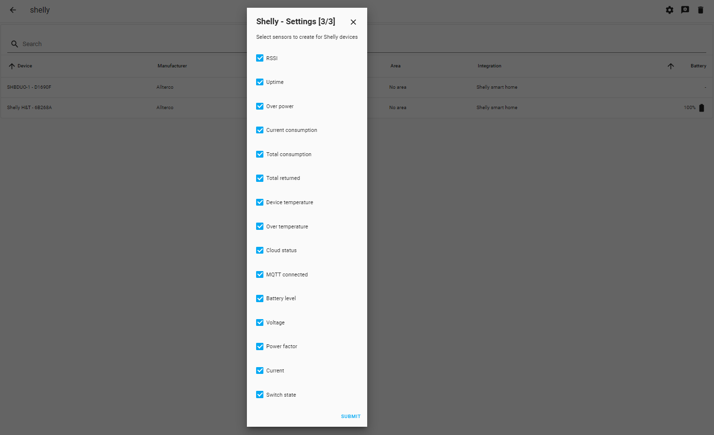
Currently when changing integration settings (via gear icon), when there are a lot of options some of them are not visible and displayed below the dialog:
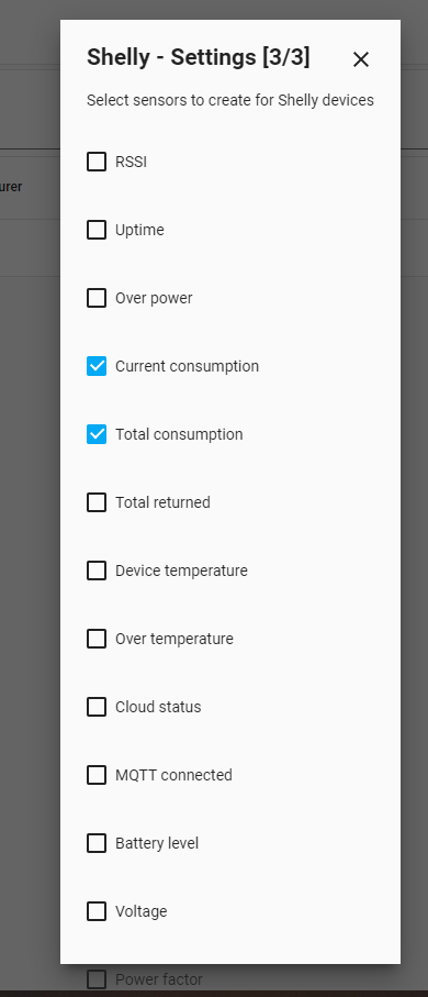
As you can see some options are not visible, same with the save button.
I'd like to ask for adding a scrollbar if options don't fit on the screen so that we always have the SUMBIT button visible.
The alternatives
I must change the zoom to 80% in Chrome to see all the options:
Additional information
This is easy to reproduce in ShellyForHass 0.1.7-beta.2
 Misiu
Misiu
All 7 comments
Would it also be possible to compact the dialog, now there is a lot of extra space between rows?
 hakana
on 18 Mar 2020
hakana
on 18 Mar 2020
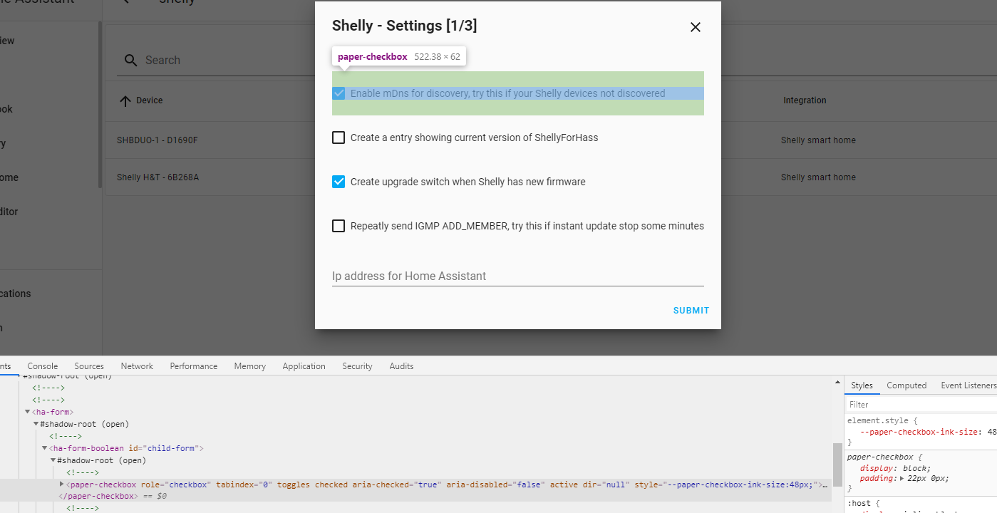
each paper-checkbox has fixed padding:
https://github.com/home-assistant/frontend/blob/9c407caf2ce6179448a3633e59a3d058b4a5db53/src/components/ha-form/ha-form-boolean.ts#L55
that's the reason for extra space. I can remove it, but not sure where it is used (don't want to break anything.) A quick search showed only single usage: https://github.com/home-assistant/frontend/search?q=ha-form-boolean&unscoped_q=ha-form-boolean
view editor dialog is using paper-dialog-scrollable. Is should be used here to allow scrollbar when needed
Misiu
on 18 Mar 2020
@hakana you locked the other issue, so I could not respond. But HA does have multi select for settings. Check for example plex: https://github.com/home-assistant/core/blob/dev/homeassistant/components/plex/config_flow.py#L287 or Unifi https://github.com/home-assistant/core/blob/dev/homeassistant/components/unifi/config_flow.py#L210
 bramkragten
on 18 Mar 2020
bramkragten
on 18 Mar 2020
@chemelli74 could you reopen https://github.com/StyraHem/ShellyForHASS/issues/209?
Misiu
on 18 Mar 2020
 chemelli74
on 18 Mar 2020
chemelli74
on 18 Mar 2020
I will check!
hakana
on 18 Mar 2020
bramkragten
on 19 Mar 2020
Related issues
 SeLLeRoNe
·
39Comments
SeLLeRoNe
·
39Comments
 VDRainer
·
26Comments
VDRainer
·
26Comments
![move[bot] picture](https://avatars1.githubusercontent.com/in/6673?v=4&s=40) move[bot]
·
29Comments
move[bot]
·
29Comments
 OkhammahkO
·
80Comments
OkhammahkO
·
80Comments
 jer78
·
29Comments
jer78
·
29Comments