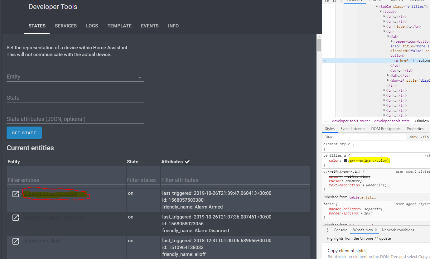
Frontend: .entities a{} Follows --primary-color which can conflict
Checklist:
- [ x ] I updated to the latest version available
- [ x ] I cleared the cache of my browser
Home Assistant release with the issue:
Last working Home Assistant release (if known):
Unkown
UI (States or Lovelace UI?):
States
Browser and Operating System:
w10 x64
Description of problem:
After adding new (dark) theme within lovelace i can't read the entities text clearly within Developer Tools -> States. Theme code:
    dark:
      # Background image
      background-image: 'center / cover no-repeat url("/local/night.jpg") fixed'

      # Colors
      text-color: '#DADADB'                                                           # Grey text
      text-medium-light-color: '#A0A2A8'                                              # Medium-light grey text
      text-medium-color: '#80828A'                                                    # Medium grey text
      text-dark-color: '#6A6B74'                                                      # Dark grey text
      accent-color: '#008bef'                                                         # Blue
      accent-medium-color: '#2686c1'                                                  # Decent blue
      background-color: '#3b4049'                                                     # Dark grey background
      background-color-2: '#484E59'                                                   # Light grey background
      background-card-color: '#434952'                                                # Grey background
      border-color: '#383C46'

      # Header
      # primary-color: '#f3f3f3'                                                        # Background
      primary-color: '#363941'                                                        # Background
      text-primary-color: 'var(--text-color)'                                         # Text

      # Left Menu
      paper-listbox-background-color: 'var(--background-color)'                       # Background
      sidebar-icon-color: 'var(--text-medium-color)'                                  # icons
      sidebar-selected-icon-color: 'var(--text-medium-light-color)'                   # Selected row icon and background (15%)
      sidebar-selected-text-color: 'var(--text-color)'                                # Selected row label

      # UI
      paper-card-header-color: 'var(--text-color)'                                    # Title in settings
      primary-background-color: 'var(--background-color)'                             # Background (also title background in left menu)
      mdc-theme-primary: 'var(--accent-medium-color)'                                 # Action Buttons (save, restart etc.)

      # Card
      paper-card-background-color: 'var(--background-card-color)'                     # Background
      dark-primary-color: 'var(--text-color)'
      primary-text-color: 'var(--text-color)'
      paper-listbox-color: 'var(--text-color)'
      light-primary-color: 'var(--text-dark-color)'
      secondary-text-color: 'var(--text-medium-color)'
      disabled-text-color: 'var(--text-dark-color)'
      paper-dialog-button-color: 'var(--text-color)'
      secondary-background-color: 'var(--background-color-2)'                         # Background more info title

      # Icons
      paper-item-icon-color: 'var(--text-dark-color)'                                 # Off
      paper-item-icon-active-color: 'var(--accent-color)'                             # On

      # Switches
      paper-toggle-button-checked-button-color: 'var(--text-medium-light-color)'      # Knob On
      paper-toggle-button-checked-bar-color: '#009FFF'                                # Background On
      paper-toggle-button-unchecked-button-color: 'var(--text-medium-light-color)'    # Knob Off
      paper-toggle-button-unchecked-bar-color: '#767682'                              # Background Off

      # Shadows
      shadow-elevation-2dp_-_box-shadow: 'inset 0px 0px 0px 1px var(--border-color)'
      shadow-elevation-4dp_-_box-shadow: 'var(--shadow-elevation-2dp_-_box-shadow)'
      shadow-elevation-6dp_-_box-shadow: 'var(--shadow-elevation-2dp_-_box-shadow)'
      shadow-elevation-8dp_-_box-shadow: 'var(--shadow-elevation-2dp_-_box-shadow)'
      shadow-elevation-10dp_-_box-shadow: 'var(--shadow-elevation-2dp_-_box-shadow)'
      shadow-elevation-12dp_-_box-shadow: 'var(--shadow-elevation-2dp_-_box-shadow)'
      shadow-elevation-14dp_-_box-shadow: 'var(--shadow-elevation-2dp_-_box-shadow)'
      shadow-elevation-16dp_-_box-shadow: '0px 0px 0px 3px var(--text-dark-color)'
Also tried to overrule with a custom css but was unable. Screenshot:
Javascript errors shown in the web inspector (if applicable):
Additional information:
 djansen1987
All 7 comments
I got the same problem using another theme ("Google - Light" by @liri).
Should this property be using --primary-text-color?
 bendikrb
on 22 Nov 2019
bendikrb
on 22 Nov 2019
This seems to be a duplicate of https://github.com/home-assistant/home-assistant-polymer/issues/2709.
It's partially resolved by https://github.com/home-assistant/home-assistant-polymer/pull/4269 where a new variable for the toolbar header was introduced. Themes like "Google - Light" used primary-color: white to get rid of the colorful header.
 mammuth
on 12 Dec 2019
mammuth
on 12 Dec 2019
Hi, thanks for tagging me!
I'll update HA to test the new variable (--app-header-background-color). in seems like a similar solution to one I requested in past and was rejected.
Will update soon.
 liri
on 12 Dec 2019
liri
on 12 Dec 2019
I already wanted to create a PR at your repo @liri, however the current implementation seems to have an issue (see #4348).
mammuth
on 12 Dec 2019
Thanks all for responding.
i applied the (temp) fix like this:
      primary-color: '#363941'
      text-primary-color: 'var(--text-color)'

       ### Main Interface Colors ###
      primary-color: "#ffffff"
      app-header-background-color: "#434952"
      app-header-text-color: "#ffffff"
      light-primary-color: "#c1c1c1"
      primary-background-color: "#F7F9FB"
      secondary-background-color: "#ffffff"
      divider-color: "#e7e7e7"
      ### Text ###
      primary-text-color: "#ffffff"
      secondary-text-color: "#757575"
      text-primary-color: "#061014"
      disabled-text-color: "#a1a1a1"
Hello again, latest version of the theme uses the new variable for the header color which solves the above issue.
I'm facing a different issue now for toolbar element under ha-config-server-control which uses it's own styling for some reason. will open a bug on this.
liri
on 7 Jan 2020
That is changed in 0.104.
 bramkragten
on 7 Jan 2020
bramkragten
on 7 Jan 2020
Related issues
 OnFreund
·
26Comments
OnFreund
·
26Comments
 VDRainer
·
26Comments
VDRainer
·
26Comments
 TheJulianJES
·
28Comments
TheJulianJES
·
28Comments
 SeLLeRoNe
·
39Comments
SeLLeRoNe
·
39Comments
 OkhammahkO
·
80Comments
OkhammahkO
·
80Comments