Frontend: "State timeline" is very hard to read with short lived state changes
Home Assistant release with the issue:
0.66.1
Last working Home Assistant release (if known):
First release with the new graphing library.
Browser and Operating System:
Windows and OSX, Chrome.
Description of problem:
After the graphing library change, if I look at the timeline of devices that have short state changes (door opening, sump pump, etc), the view is mostly unreadable.
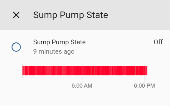
(~135 state changes to "on")
Old look:
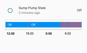
Prior to the graphing library change, this would look _much_ better. I think that there is some sort of color blending happening?
Javascript errors shown in the web inspector (if applicable):
Additional information:
 kylehendricks
All 21 comments
what about you install an older release and show us the difference?
 c727
on 17 Apr 2018
c727
on 17 Apr 2018
Here you go.

kylehendricks
on 17 Apr 2018
Agree that it doesn't look nice, this appears to be caused by limiting the amount of state changes rendered by the width of the chart
The old look was slightly better as it would indeed blend but it's not really designed for fast paced state switches like that.
This would be a really awesome approach: http://www.iftekhar.me/ibm/ibm-project-timeline/#about
Or we could allow to force binary sensors history to be rendered as a line-chart showing a moving average of some sort.
 NovapaX
on 17 Apr 2018
NovapaX
on 17 Apr 2018
I think this is canvas related issue. Google using svg element for chart and it rendered by browser, so the mixed of color shows better than canvas in Chart.js.
 fanthos
on 21 Apr 2018
fanthos
on 21 Apr 2018
Not sure limit the minimal width to 0.5 will make it works better or not.
fanthos
on 21 Apr 2018
@kylehendricks could you upload the chart data, so I can look into the chart library.
fanthos
on 22 Apr 2018
I think a good first step would just to be able to see a single, quick state change. Ex: a door opening briefly.
kylehendricks
on 23 Apr 2018
I have some work on the rect drawing code might make the chart looks better.
https://github.com/fanthos/chartjs-chart-timeline/commit/1cd5fed40b37bc6d95f39901c6fc1ed9268b14c3
Right now it just like this:
fanthos
on 24 Apr 2018
Can I propose another solution ?
- Make it possible to configure the colours :)
 dgomes
on 24 Apr 2018
dgomes
on 24 Apr 2018
@dgomes That wouldn't solve this problem.
kylehendricks
on 24 Apr 2018
@fanthos That definitely looks much better.
kylehendricks
on 24 Apr 2018
Sorry, but the events are there, you just can't notice because of the color contrast used (just look how much better the old style was)
To make small events larger is not a solution, its a new bug!
I expect bars to be proportional to the time elapsed in each state.
dgomes
on 24 Apr 2018
Technically the state colors in my example are red and green.
In order to represent short state changes (less than one minute) we will we need to do one of two things. Have a minimum state change pixel width (I think the old way did this) or show less history.
Even to represent things at one minute granularity we would need 24*60=1440 pixels.
kylehendricks
on 24 Apr 2018
You just need to trick your eyes, thats what goes on when you resize a large image (you blend pixel colours)
If your sensor changes state every minute, and you have a minimum of 1pixel per event just to make sure it shows up, what do you think will happen ?
dgomes
on 24 Apr 2018

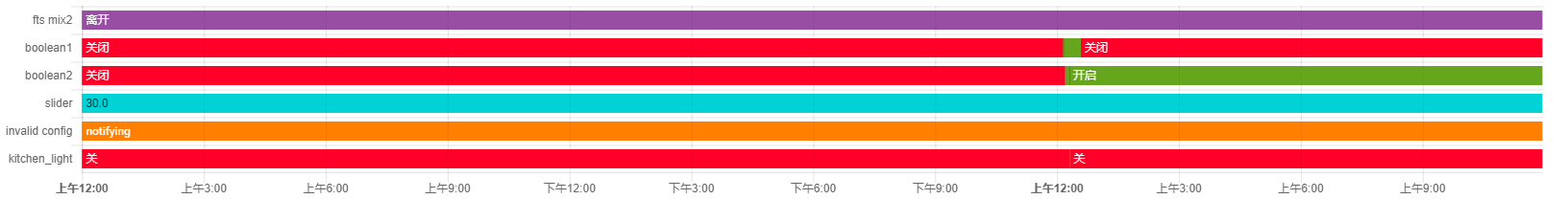
FWIW, this is how it is shown in Grafana (Discrete Panel) and that is for the last week. I agree with @dgomes, changing the colors so that the on state is highlighted may be the way to go.
 arsaboo
on 24 Apr 2018
arsaboo
on 24 Apr 2018
You're right, there is a problem if we have many quick state changes. Unfortunately we can't just solve that by having more contrast. In home assistant we can technically have state changes at the millisecond level.
I think the best way to handle this is to exaggerate quick state changes until we can't anymore, then start combining them when there are too many.
How will higher contrast help if we have a state change that lasts 5ms on a 24 hour chart? You have to have a minimum pixel width or else it won't show up at all.
@arsaboo I'm specifically referring to the "quick view" when you click an item in home assistant. That chart is much narrower than what you posted.
kylehendricks
on 24 Apr 2018
I think the problem here is trying to display 'events' (that's what these quick state changes are basically) on a timeline chart that is not designed for it.
The right way to display that (imo) is shown in the link I posted earlier: http://www.iftekhar.me/ibm/ibm-project-timeline/#about
NovapaX
on 24 Apr 2018
@NovapaX agreed. That would be ideal.
I was just curious to see if we could get somewhat close to how the old charting library had it without any big changes.
kylehendricks
on 24 Apr 2018
Included chart just give user a "usable" version to check past status. If the status text width small than 1px, it might not draw on canvas at all before the 0.1.5 update. I think drawing a not-so-accumulate bar is better than not drawing it.
Also, HA supports logging to InfluxDB and Datadog for data analysis.
fanthos
on 25 Apr 2018
Filtering some data out from the chart data in timeline chart could result a graph like arsaboo , but hard to find a general way to make it work.
fanthos
on 25 Apr 2018
This was closed, but the short-lived state changes are still hard to read. What exactly was the attempted fix?
 melyux
on 5 Jan 2020
melyux
on 5 Jan 2020
Related issues
 bmf7777
·
3Comments
bmf7777
·
3Comments
 andriej
·
3Comments
andriej
·
3Comments
 SeanPM5
·
3Comments
SeanPM5
·
3Comments
 casperklein
·
4Comments
casperklein
·
4Comments
 Lopton
·
4Comments
Lopton
·
4Comments
Most helpful comment
I have some work on the rect drawing code might make the chart looks better.

https://github.com/fanthos/chartjs-chart-timeline/commit/1cd5fed40b37bc6d95f39901c6fc1ed9268b14c3
Right now it just like this: