Freecodecamp: Issue with answers on How Neural Networks Work - How Deep Neural Networks Work
Describe your problem and how to reproduce it:
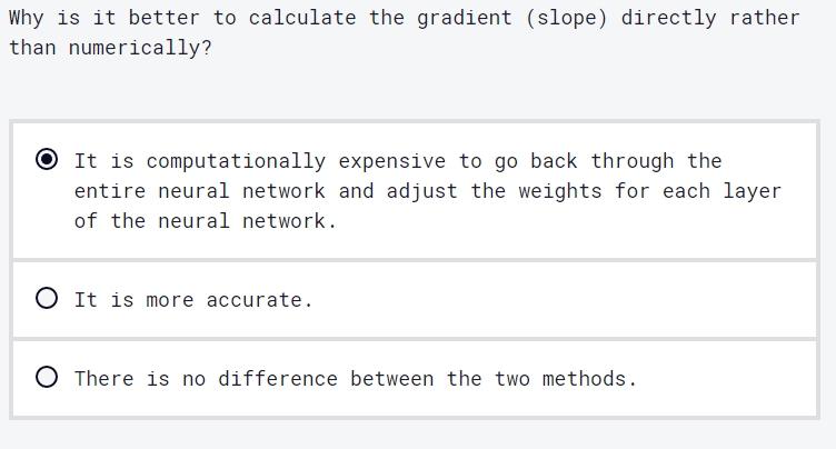
On this Python curriculum challenge, the correct answer is already selected. Just so we're having the learner do something, I guess either rearranging the options or at the very least not having the correct option already selected should be made.
If possible, add a screenshot here (you can drag and drop, png, jpg, gif, etc. in this box):
 thecodingaviator
All 12 comments
I assume this applies to all of the Video Challenges with a solution of 1?
 Sky020
on 11 Jun 2020
Sky020
on 11 Jun 2020
It should be that case, even though I haven't personally verified it
thecodingaviator
on 11 Jun 2020
Could we avoid the problem by leaving the radio buttons unselected at the start? It's slightly weird UX, since people expect radio buttons to always have one selected, but it should not be too confusing in the context of a multiple choice question.
 ojeytonwilliams
on 12 Jun 2020
ojeytonwilliams
on 12 Jun 2020
Could we avoid the problem by leaving the radio buttons unselected at the start? It's slightly weird UX, since people expect radio buttons to always have one selected, but it should not be too confusing in the context of a multiple choice question.
It is a valid workaround
thecodingaviator
on 13 Jun 2020
/cc @ahmadabdolsaheb
 raisedadead
on 17 Jun 2020
raisedadead
on 17 Jun 2020
Could we avoid the problem by leaving the radio buttons unselected at the start? It's slightly weird UX, since people expect radio buttons to always have one selected, but it should not be too confusing in the context of a multiple choice question.
That works. Unselected radio buttons seems to be a convention for multiple choice questions.
Additionally, we could display the multiple choice questions as a button group and avoid having the users select the multiple choice question and click on the Check Your Answer.
 ahmadabdolsaheb
on 18 Jun 2020
ahmadabdolsaheb
on 18 Jun 2020
we could display the multiple choice questions as a button group and avoid having the users select the multiple choice question and click on the Check Your Answer.
Just to check, do you mean: remove Check Your Answer and have the modal pop up as soon as the user clicks on the correct answer?
Also, since we're discussing UX, keyboard navigation is a bit tricky. There's no visible indicator when you have the answers selected.
ojeytonwilliams
on 18 Jun 2020
Just to check, do you mean: remove Check Your Answer and have the modal pop up as soon as the user clicks on the correct answer?
Yes, what do you think?
ahmadabdolsaheb
on 22 Jun 2020
Sounds good. The only concern I have is that we don't want to encourage people to just guess. However, forcing them click back and forth between the radio buttons and 'Check your answer' probably does not solve that and it's definitely irritating.
ojeytonwilliams
on 22 Jun 2020
For now, let us unselect radio buttons and we take it from there.
ahmadabdolsaheb
on 23 Jun 2020
@ojeytonwilliams w.r.t https://github.com/freeCodeCamp/freeCodeCamp/issues/39048#issuecomment-647338171 , should we leave this issue open?
thecodingaviator
on 24 Jun 2020
@thecodingaviator since it's already been moved to 'done' on the project board, I'll create a new feature request to track the remaining points.
ojeytonwilliams
on 24 Jun 2020
Related issues
raisedadead
·
3Comments
 bagrounds
·
3Comments
bagrounds
·
3Comments
 imhuyqn
·
3Comments
imhuyqn
·
3Comments
 Tzahile
·
3Comments
Tzahile
·
3Comments
 MelissaManning
·
3Comments
MelissaManning
·
3Comments