Freecodecamp: Slight tweak to settings style
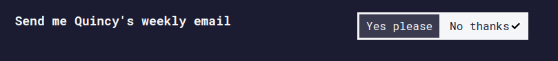
With the new command line chic changes, the text in the toggle buttons is aligned a bit strangely. For example, for Quincy's email:

might look nicer as follows:
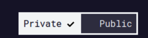
For the privacy settings:
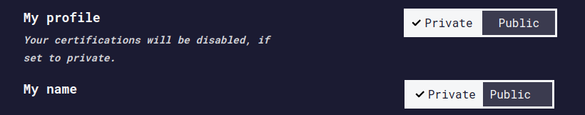
My changes are to the top button.
Specifically, I would make both sides of the toggle button the same width and centre the text inside them.
I'd be happy to take this on, if people think it's a good change.
 ojeytonwilliams
All 8 comments
I noticed this as well - I do like your suggestions better I think.
I guess the downside would be that - when you toggle a setting, the text has to move around to make room for the check mark
 moT01
on 20 Aug 2019
moT01
on 20 Aug 2019
@ojeytonwilliams I agree with your proposal. the challenge is that as @moT01 mentioned, the text will be moving around.
we could make the button bigger so it has enough space on the sides of the word that accommodates centering the text; however, we need to account for small screens and customize our css accordingly.
That being said. if you have a solution that accounts for the above challenges, please go for it.
 ahmadabdolsaheb
on 20 Aug 2019
ahmadabdolsaheb
on 20 Aug 2019
@moT01 good point about the text moving!
@ahmadabdolsaheb just to go through the possibilities we can:
- Centre the text including the tick, resulting in the text moving when the button is toggled.
- Centre the text only, requiring larger buttons.
- Leave it as it currently is (smaller buttons, stationary text)
Am I right in thinking that we don't want the text moving, so 1. is no good? If so, I could try and implement 2. What do you think should happen on smaller screens? Maybe stack the toggle button vertically? Something like this, perhaps:
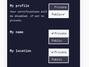
That's just a quick mockup, the finished product would have the same text alignment as for larger screens.
ojeytonwilliams
on 20 Aug 2019
If you go with a stack look on mobile, I think the checkmark should be on the same side of the text.
 RandellDawson
on 20 Aug 2019
RandellDawson
on 20 Aug 2019
Couple more options...
A:
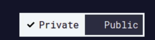
B:
moT01
on 20 Aug 2019
That's just a quick mockup, the finished product would have the same text alignment as for larger screens.
thanks for listing our options. we could have moving text. I personally preferred having still text when implementing the button. we can definitely change that.
we could always move the toggles under each option's title and descriptions for instance:
Title
description on mobile
[ toggle | button ]
ahmadabdolsaheb
on 20 Aug 2019
Okay, then. I'll put something together and then we can see what we like most in practice.
ojeytonwilliams
on 20 Aug 2019
I've added a PR, reviews welcome!
ojeytonwilliams
on 21 Aug 2019
Related issues
 MelissaManning
·
3Comments
MelissaManning
·
3Comments
 Tzahile
·
3Comments
Tzahile
·
3Comments
 DaphnisM
·
3Comments
DaphnisM
·
3Comments
 robwelan
·
3Comments
robwelan
·
3Comments
 bagrounds
·
3Comments
bagrounds
·
3Comments
Most helpful comment
If you go with a stack look on mobile, I think the checkmark should be on the same side of the text.