Freecodecamp: Navigating to /map should show just the map - no expanded challenges
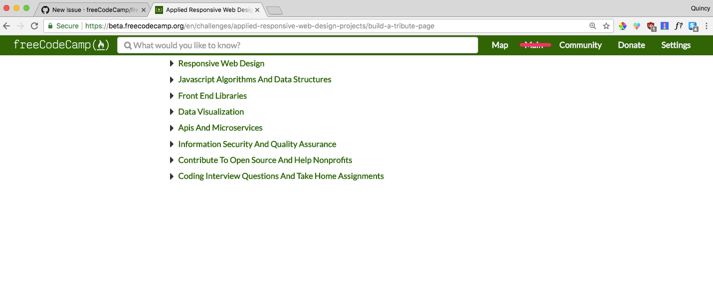
Currently when navigating to https://beta.freecodecamp.org/map, the behavior is it will show your current challenge (or the first challenge if you aren't authenticated).
Since a lot of people link directly to the map, we should create a view that is just the fully-expanded map - no challenge.
The navbar would only have the "map" option in it, since there wouldn't be any other tabs on this page.
 QuincyLarson
All 11 comments
@QuincyLarson I think this is will look awkward. We should think of another solution. Like for example, we should create a static learning map showing all the topics and certificates and all. What do you say?
 vkWeb
on 15 Jan 2018
vkWeb
on 15 Jan 2018
@vkWeb We want a single source of truth for our map, so we wouldn't want this map to be different from the other ones.
QuincyLarson
on 15 Jan 2018
@QuincyLarson No - Like when a camper clicks on the map, we shouldn't show him our original map. Instead, we should present a graphical overview of our curriculum (a better term is 'learning-path'). This will be valid only when a user has not signed in.
Something similar to this:
vkWeb
on 15 Jan 2018
This is not trivial, with the current client side implementation. Static view is also no longer possible.
 raisedadead
on 16 Jan 2018
raisedadead
on 16 Jan 2018
@vkWeb As long as it's centered better than in the OP's screenshot, the proposed /map page would look very similar to the way freecodecamp.org/map looks now. Not too awkward.... though I do like the visual look you suggest for something that's intended to be the full width of the browser.
Has there been a thread discussing the lack of visual cues in the new map as compared to the old one? The new map lacks the difference in font-size and the shaded background that helps distinguish the different levels of hierarchy from one another. It was actually the first thing I noticed about the beta.
 bennett-elder
on 30 Jan 2018
bennett-elder
on 30 Jan 2018
@bennett-elder We modeled it after DevDoc's side navigation. Would you be interested in mocking up what you'd like it to look like in terms of having more visual queues?
QuincyLarson
on 30 Jan 2018
@bennett-elder
As long as it's centered better than in the OP's screenshot, the proposed /map page would look...
Ya, If we center the map and make some UI adjustments, we can make it look better.
Has there been a thread discussing the lack of visual cues in the new map as compared to the old one?...
Yes - I raised an issue about this a while ago that we should implement the map functionality as we have in production. In production's map, we have a 'collapse all' button, we can search challenges and the curriculum is divided into different sections and UI looks better there.
vkWeb
on 30 Jan 2018
I'm thinking something like this that uses font family, font size, font style, and a bit of graphics and color to make the map sections more distinct.
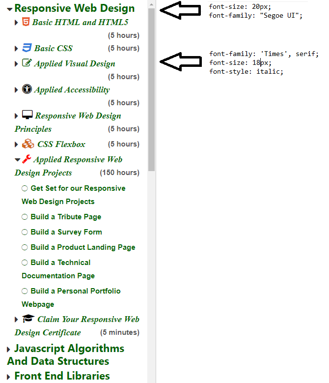
Edit: Those are still Font Awesome icons. I used Instant Eyedropper to grab the color.
bennett-elder
on 30 Jan 2018
@bennett-elder The different levels of font-size looks great 👍 but I don't think we should apply different font-families to the different hierarchical levels of our map. Also, adding icons isn't a good idea.
vkWeb
on 30 Jan 2018
@bennett-elder I agree with @vkWeb - we want to keep everything Lato. We could potentially change the font size to give the map a more clear hierarchy.
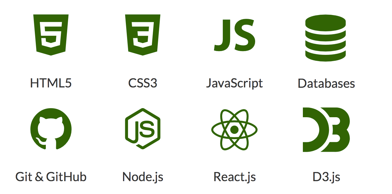
As for items, we'd want to use .svg files and have them be monochromatic, like the ones located on our landing page:
QuincyLarson
on 3 Feb 2018
I'm closing this issue as stale since it hasn't been active lately. If you think this is still relevant to the newly updated platform, please explain why, then reopen it.
QuincyLarson
on 3 Jun 2018
Related issues
 cmal
·
3Comments
cmal
·
3Comments
 trashtalka3000
·
3Comments
trashtalka3000
·
3Comments
 jurijuri
·
3Comments
jurijuri
·
3Comments
 EthanDavis
·
3Comments
EthanDavis
·
3Comments
 vaibsharma
·
3Comments
vaibsharma
·
3Comments