Foundation-sites: Drilldown in Responsive Menu cuts off contents of submenu
The Drilldown submenus are positioned in the wrong place due to a relative parent (no pun intended).
How to reproduce this bug:
Create a Responsive Menu where the smallest screen style is Drilldown and subsequent menu items have quite a few items
Load the page in small screen mode
Open the subsequent menu items in Drilldown mode
What should happen:
The opened submenu with its Back link should be all the way at the top, so that all of its items in the will be visible
What happened instead:
The position of the opened submenu is absolutely-positioned relative to its parent's menu position, rather than the top of the menu. That causes some items at the bottom to "disappear" because the height of the submenu doesn't take into account the offset from the top.
Therefore, the last n - 1 items are not visible, where n is the top-menu item's index, i.e. for top-menu 2 there is 1 missing item in the submenu, for top-menu 3 there are 2 missing items, for top-menu 4 there are 3 missing items, etc.
It looks to me like the problem is that the is-drilldown element that is added has a position:relative, making the submenu opened inside it, rather than inside its parent.
Browser(s) and Device(s) tested on:
Chrome, Edge, Firfox on Windows 10, as well as Chrome on Android
Foundation Version(s) you are using:
6.4.1
Test case link:
You must load the page in Small Screen -- Loading in Large screen and scaling down, or enlarging the screen and scaling down again "fixes" the problem.
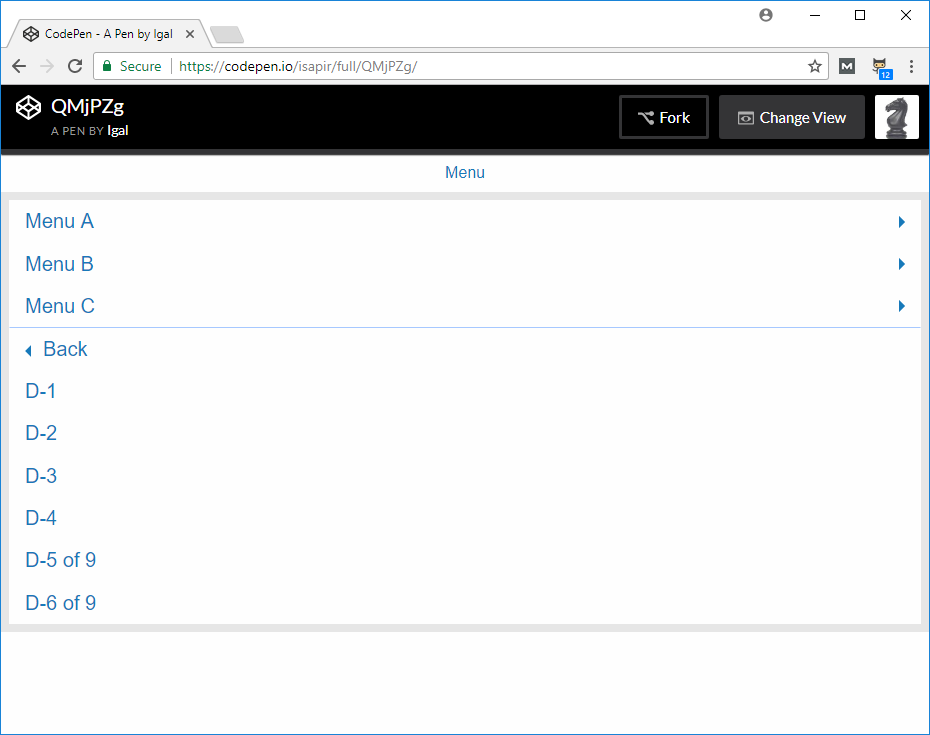
https://codepen.io/isapir/pen/QMjPZg
See how Menu B is missing 1 item, Menu C is missing 2 items, Menu D is missing 3 items, and Menu E is missing 4 items.
 isapir
All 4 comments
Screenshot that shows the problem (missing "D-7 of 9", "D-8 of 9", and "D-9 of 9":
isapir
on 28 Jul 2017
The problem with this bug is that it makes the ResponsiveMenu with Drilldown unusable.
In the tutorial videos you don't see the issue because it always starts with a large screen that is then resized smaller which causes the issue to "go away", but in the real world when someone opens the page with a small screen the issue is there and parts of the menu are not visible.
isapir
on 31 Jul 2017
I've traced the issue to the addition of is-dropdown-submenu-parent on the submenu items' parents. I have added that to show the dropdown-arrow and prevent a FOUC, but it sets position:relative; to the menu item, which then makes the opened submenu positioned absolutely relative to it, instead of to the top menu element.
If there is a better way to show the dropdown arrows and prevent the FOUC then this ticket can be closed.
isapir
on 4 Aug 2017
In case anyone else suffers from this issue, this is how I patched it for my project:
$(function(){
  if (!Foundation.MediaQuery.atLeast("medium")){
    // workaround for https://github.com/zurb/foundation-sites/issues/10478
    $(".is-dropdown-submenu-parent").removeClass("is-dropdown-submenu-parent");
  }
});
That keeps the class for medium and large screens so that the dropdown triangle is in place, avoiding a FOUC, but removes it for smaller screens to avoid the issue created here.
A better solution would be to limit the position: relative; of .is-dropdown-submenu-parent to affect dropdown only.
isapir
on 5 Aug 2017
Related issues
 ncoden
·
3Comments
ncoden
·
3Comments
 barrywoolgar
·
3Comments
barrywoolgar
·
3Comments
 coachie
·
4Comments
coachie
·
4Comments
 Yanchek99
·
4Comments
Yanchek99
·
4Comments
 CGTS
·
3Comments
CGTS
·
3Comments
Most helpful comment
In case anyone else suffers from this issue, this is how I patched it for my project:
That keeps the class for medium and large screens so that the dropdown triangle is in place, avoiding a FOUC, but removes it for smaller screens to avoid the issue created here.
A better solution would be to limit the
position: relative;of.is-dropdown-submenu-parentto affect dropdown only.