Foundation-sites: 6.4.1 – Flex items break printing, i.e. lost paragraphs, wrong page breaks, empty pages
I’m doing a very minimalistic lyrics & stories page right now, using Foundation 6.4.1/SASS with the XY-Grid (on Ubuntu 14.04.5, foundation-cli 2.2.3, Node 6.11.0, npm 5.0.4).
Kudos to ZURB for remembering @media print and all the good stuff in there, which comes in very handy!
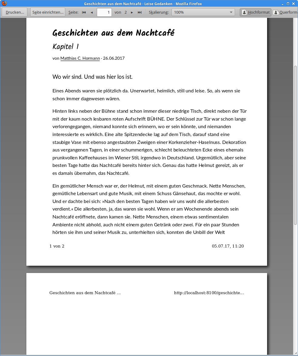
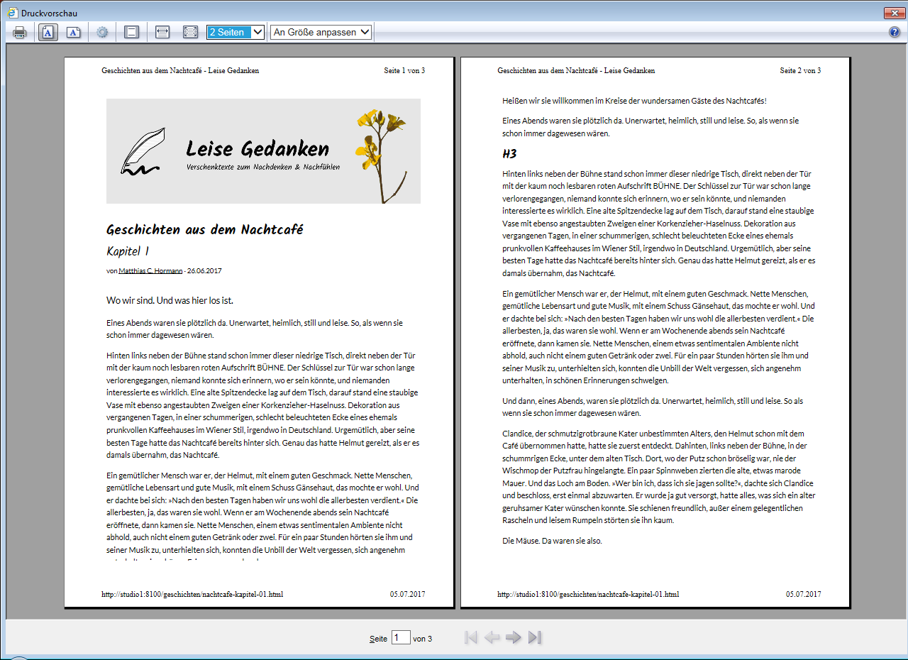
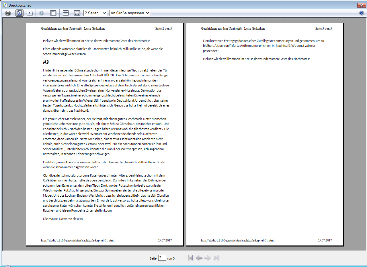
BUT … either I make a stupid mistake or pagebreaks (within a cell consisting of mainly <p> with text) don’t work out correctly: The browser’s print preview calculates the number of pages correctly but the text is cut off at the end of the first page and the next pages are blank (see attached screenshot, using Firefox 54)!
Helpful feedback much appreciated—I’m hoping it’s just a simple thing to fix!
EDIT: Possible solution here → https://github.com/zurb/foundation-sites/issues/10346#issuecomment-313235909
(More info below the screenshot.)
Here’s what I do:
In _settings.scss I have:
$print-transparent-backgrounds: true;
$print-hrefs: false;
…
$print-breakpoint: small;
The relevant part of my custom.scss looks like this:
/*
  Page for printing (usually A4)
*/
@media print {
  @page {
    margin-left: 20mm;
    margin-right: 15mm;
    margin-top: 20mm;
    margin-bottom: 25mm;
  }
  body {
    font-size: 87.06%; // 1 step down
  }
}
The actual text content is simple Markdown and resolves to a lot of <p>…</p>s:
---
title: Geschichten aus dem Nachtcafé
subtitle: Kapitel 1
article-type: story
layout: article
hero-image: "assets/img/site/header-website.xl.png"
author: Matthias C. Hormann
date: 26.06.2017
tags:
  - Geschichten
  - Nachtcafé
teaser:
  Wo wir sind. Und was hier los ist.
---
{{#markdown}}
… lots of text here …
{{/markdown}}
To help nail it down, here’s the src/layouts/article.html file (Warning: Long!)
{{!-- This is the base layout for an article --}}

{{> htmlheader}}

<div class="pagewrapper grid-container">

  {{> pageheader}}

  <main id="main" class="main grid-x grid-padding-x grid-padding-y">

    <article class="article cell">
      <!-- wrap sub-cells into a sub-grid -->
      <div class="subgrid grid-x grid-padding-x grid-padding-y align-center">

        <!-- article header (introductory content, i.e. hero image, headline, byline) -->
        <header class="article__header cell">
          <div class="subgrid grid-x grid-padding-x grid-padding-y align-center">
            {{#if hero-image}}
            <!-- article hero image -->
            <div class="article__hero-image medium-9 cell">
              <img src="{{root}}{{hero-image}}" alt="">
            </div>

            {{/if}}
            <!-- article headline, byline, date, tags -->
            <div class="article__info medium-9 cell">
              <h1>{{title}}</h1>
              <h2 class="subheader">{{subtitle}}</h2>
              <p>von <a href="#">{{author}}</a> · {{date}}</p>
            </div>
          </div>
        </header>

        {{#ifequal article-type "lyrics"}}
        <!-- These are Lyrics -->
        <!-- no lead or teaser -->

        <!-- article content (lyrics) -->
        <div class="article__content article--lyrics medium-9 cell">
          {{!-- Pages you create in the src/pages/ folder are inserted here when the flattened page is created. --}}
          {{> body}}
        </div>
        {{/ifequal}}
        {{#ifequal article-type "story"}}
        <!-- This is a story -->
        <!-- lead or teaser -->
        <div class="article__content article--lead medium-9 cell">
          {{teaser}}
        </div>

        <!-- article content (story) -->
        <div class="article__content article--story medium-9 cell">
          {{!-- Pages you create in the src/pages/ folder are inserted here when the flattened page is created. --}}
          {{> body}}
        </div>
        {{/ifequal}}

        <!-- visual separator - end of article -->
        <div class="article__end medium-9 cell">
          <hr>
        </div>

        <!-- article footer (share links etc.) -->
        <footer class="article__footer cell hide-for-print">

          <div class="subgrid grid-x grid-padding-x grid-padding-y align-center">

            <!-- More like this section -->
            <section class="article__footersection medium-6 cell">
              <!-- section header -->
              <header>
                <h4>Mehr zu diesen Themen</h4>
              </header>

              {{#each tags}}
              <a href="" class="tag">{{this}}</a>
              {{/each}}

              {{#ifequal article-type "lyrics"}}
              <p>Entdecke weitere Verschenktexte mit den gleichen Themen.</p>
              {{/ifequal}}
              {{#ifequal article-type "story"}}
              <p>Entdecke weitere Geschichten mit den gleichen Themen.</p>
              {{/ifequal}}
            </section>

            <!-- Share this article section -->
            <section class="article__footersection medium-3 cell">
              <!-- section header -->
              <header>
                <h4>Teilen</h4>
              </header>

              <!-- These share links work with and without Javascript -->
              <!-- For privacy and speed reasons, we don’t include vendor’s Javascript. -->
              <a href="#"
                class="js-social-share"
                target="_blank"
                title="Teile dies auf Facebook"><i class="fa fa-facebook-square" aria-hidden="true"></i></a>
              <a href="#"
                class="js-social-share"
                target="_blank"
                title="Teile dies auf Google+"><i class="fa fa-google-plus-square" aria-hidden="true"></i></a>
              <a href="#"
                class="js-social-share"
                target="_blank"
                title="Teile dies auf Twitter"><i class="fa fa-twitter-square" aria-hidden="true"></i></a>
              <a href="#"
                class="js-social-share"
                target="_blank"
                title="Teile dies auf Pinterest"><i class="fa fa-pinterest-square" aria-hidden="true"></i></a>

              <p>Teile dies mit deinen Freunden!</p>
            </section>
          </div><!-- subgrid -->
        </footer>
      </div><!-- subgrid -->
    </article>
  </main>

  {{> aside}}

  {{> pagefooter}}
</div><!-- pagewrapper -->

{{> htmlfooter}}
And if you really care to help me diagnose this, here’s even the complete custom.scss (imported at the end of app.scss):
/*
  custom.scss
*/

/* prevent FOUC */
.no-js {
  @include breakpoint(small only) {
    /*
    .headernav {
      display: none;
    }
    */
  }

  @include breakpoint(medium) {
    .headernav__mobile {
      display: none;
    }
  }
}

/*
  Typography.
  Foundation won’t let us specify heading sizes in em,
  so we must do it here.
  Pentatonic (classic) scale for medium and up (doubled all 5 steps),
  x 1.5 all 5 steps for small.
*/
h1 {
  font-size: 2.0000em;
  @include breakpoint (small only) {
    font-size: 1.5000em;
  }
}
h2 {
  font-size: 1.7411em;
  @include breakpoint (small only) {
    font-size: 1.3832em;
  }
}
h3 {
  font-size: 1.5157em;
  @include breakpoint (small only) {
    font-size: 1.2754em;
  }
}
h4 {
  font-size: 1.3195em;
  @include breakpoint (small only) {
    font-size: 1.1761em;
  }
}
h5 {
  font-size: 1.1487em;
  @include breakpoint (small only) {
    font-size: 1.0845em;
  }
}
h6 {
  font-size: 1.0000em;
  @include breakpoint (small only) {
    font-size: 1.0000em;
  }
}

/*
  Page for printing (usually A4)
*/
@media print {
  @page {
    margin-left: 20mm;
    margin-right: 15mm;
    margin-top: 20mm;
    margin-bottom: 25mm;
  }
  body {
    font-size: 87.06%; // 1 step down
  }
}

/*
  When header height changes due to responsive menu,
  ease-in-out the page content.
*/
.pageheader {
  transition: height 0.5s ease-in-out;
}

#headernav__bar, .headernav, .headernav__mobile {
  background-color: $medium-gray;
  @include flex-align(null, middle);
  &.is-stuck {
   width: 100%;
   box-shadow: 0px 4px 10px -2px rgba(128,128,128,0.68);
  }

  .input-group, button, .button {
    margin-bottom: 0;
  }
}

#headernav__bar {
  .menu-text {
    font-family: $header-font-family;
    font-weight: $global-weight-bold;
    font-style: normal;
    font-size: 1.2rem;
    padding: 0;
  }
}

.headernav {
  img {
    width: 2rem;
    height: 2rem;
  }
  @include breakpoint (small only) {
    .menu li a {
      font-size: 1.5rem;
      padding: 0.5rem;
    }
  }
}

.article__header {
}

.article__hero-image {
  /*
  background-color: $success-color;
  */
  margin-bottom: $global-margin;
}

.main, .article {
  /*
  background-color: $light-gray;
  */
  background-color: scale-color(get-color(secondary), $lightness: 98%);
}

.aside {
  /*
  background-color: $secondary-color;
  */
  background-color: scale-color(get-color(secondary), $lightness: 98%);
  color: $dark-gray;
}

.aside__section {
  /*
  background-color: teal;
  padding-bottom: $global-padding;
  */
}

.aside__section--cta {
  background-color: $light-gray;
}

i.fa {
  font-size: 1.5rem;
  margin-right: 0.5rem;
  margin-bottom: 0.5rem;
  /* larger on small screens for touching */
  @include breakpoint (small only) {
    font-size: 2rem;
  }
}

.fa-facebook-official,
.fa-facebook,
.fa-facebook-square {
  color: scale-color(#3b5998, $lightness: 50%);
  &:hover {
    color: #3b5998;
  }
  transition: color 0.25s ease-out;
}

.fa-twitter,
.fa-twitter-square {
  color: scale-color(#1da1f2, $lightness: 50%);
  &:hover {
    color: #1da1f2;
  }
  transition: color 0.25s ease-out;
}

.fa-google-plus-official,
.fa-google-plus,
.fa-google-plus-square {
  color: scale-color(#dd4b39, $lightness: 50%);
  &:hover {
    color: #dd4b39;
  }
  transition: color 0.25s ease-out;
}

.fa-pinterest,
.fa-pinterest-p,
.fa-pinterest-square {
  color: scale-color(#bd081c, $lightness: 50%);
  &:hover {
    color: #bd081c;
  }
  transition: color 0.25s ease-out;
}

.fa-rss,
.fa-rss-square {
  color: scale-color(#f26522, $lightness: 50%);
  &:hover {
    color: #f26522;
  }
  transition: color 0.25s ease-out;
}

.pagefooter {
  background-color: $light-gray;
  font-size: $global-font-size * 0.8706;
  color: $dark-gray;
}

.tag {
  border-style: solid;
  border-width: thin;
  border-radius: 0.25rem;
  margin-right: 0.5rem;
  padding-left: 0.25rem;
  padding-right: 0.25rem;
  line-height: 2;
}

/*
  Lyrik ist der Einfachheit halber oft pre-formatted
*/
/*
.article pre,
.article code {
  font-family: $header-font-family;
  font-weight: $global-weight-normal;
  font-style: normal;
  font-size: $global-font-size * 1.3195;
  padding-left: 0;
  white-space: pre-line;
  overflow-y: hidden;
}
*/

.article--lyrics {
  font-family: $header-font-family;
  font-weight: $global-weight-normal;
  font-style: normal;
  font-size: $global-font-size * 1.3195; // 2 steps up
}

.article--lead {
  font-family: $body-font-family;
  font-weight: $global-weight-normal;
  font-style: normal;
  font-size: $lead-font-size;
}

.article--story {
  font-family: $body-font-family;
  font-weight: $global-weight-normal;
  font-style: normal;
  font-size: $global-font-size * 1.1487; // 1 step up
}

/*
  The article within a list (smaller)
*/
.article--list {
  font-family: $body-font-family;
  font-weight: $global-weight-normal;
  font-style: normal;
  font-size: $global-font-size * 0.8706; // 1 step down
}
Thank you!
 Moonbase59
All 9 comments
Another interesting insight: I just tried the exact same page on a Windows 7 machine, using IE11 (11.0.9600.18665).
The page preview here shows:
- about 3 completely lost paragraphs between page 1 and 2
- text on page 1’s bottom is "chopped off"
- _no_ missing text between page 2 and 3
Moonbase59
on 5 Jul 2017
A solution?!
I think at least Firefox and IE don’t behave well when using display: flex; elements (somehow understandable, for print).
The solution seems to be to redefine all flex elements as display: block; (for print only).
I could make Firefox 54 and IE11 work (i.e., print) correctly again by adding this to my @media print style:
  /*
    Needed to make Firefox & IE do proper page breaks
    without cutting off text or printing empty pages.
  */
  .grid-x,
  .grid-y,
  .cell {
    display: block;
  }
Interesting side note: Firefox 54 doesn’t respect the orphan and widow settings _(sigh!)_ while even IE11 _does_!
Could someone more knowledgeable about Foundation please verify this (and maybe find other places where _flex_ is used!) and please include it in Foundation’s _print.scss to make for even easier printing?
Meep @kball @IamManchanda ?
Moonbase59
on 5 Jul 2017
Sounds Good... Will dig it in soon maybe tomm
 IamManchanda
on 5 Jul 2017
IamManchanda
on 5 Jul 2017
Would be good if someone more knowledgeable than I am check it for any possibly unwanted side effects! Cheers for the help!
Moonbase59
on 5 Jul 2017
@IamManchanda what's the status of this one? Thanks.
 colin-marshall
on 8 Mar 2018
colin-marshall
on 8 Mar 2018
Probably a browser bug.
 DanielRuf
on 27 Feb 2019
DanielRuf
on 27 Feb 2019
PING !
 cctoni
on 1 Apr 2019
cctoni
on 1 Apr 2019
Hi @tonihauptcc, this is a browser bug in most cases and well known in Firefox and others.
DanielRuf
on 1 Apr 2019
For anyone looking in the future, this is the FireFox issue tracking this bug https://bugzilla.mozilla.org/show_bug.cgi?id=939897.
+1 to the fix from @Moonbase59
 keobrien
on 7 Feb 2020
keobrien
on 7 Feb 2020
Related issues
 barrywoolgar
·
3Comments
barrywoolgar
·
3Comments
 Jared-Dev
·
3Comments
Jared-Dev
·
3Comments
 KharamanV
·
3Comments
KharamanV
·
3Comments
 BicanMarianValeriu
·
3Comments
BicanMarianValeriu
·
3Comments
 CGTS
·
3Comments
CGTS
·
3Comments