Foundation.mozilla.org: Fellowship directory - use flexbox instead of CSS grid
Upcoming directory related tickets: #2958 #3001
(It'd better if we tackle this ticket first.)
There are quite a bit of arbitrary / magic numbers in profiles.scss (existing code & in PR). It also seems like new sets of magic numbers have been added to the codebase every time we introduce minor design adjustment. This makes me wonder if CSS grid is the most suitable system to use here. From the mockups it seems like design could most likely be easily implemented using flexbox without much mental math calculation involved. @Pomax @youriwims I don't know a lot about CSS grid so I'm curious if there's something specific about CSS grid that we wanna use and cannot be achieved using flexbox?
Content in each card is different so forcing the same grid cell height and width across all cards doesn't seem like the right solution (e.g., let the bio section always take x% of the card's height). This results in unpredictable sizing & spacing for sections in each card.
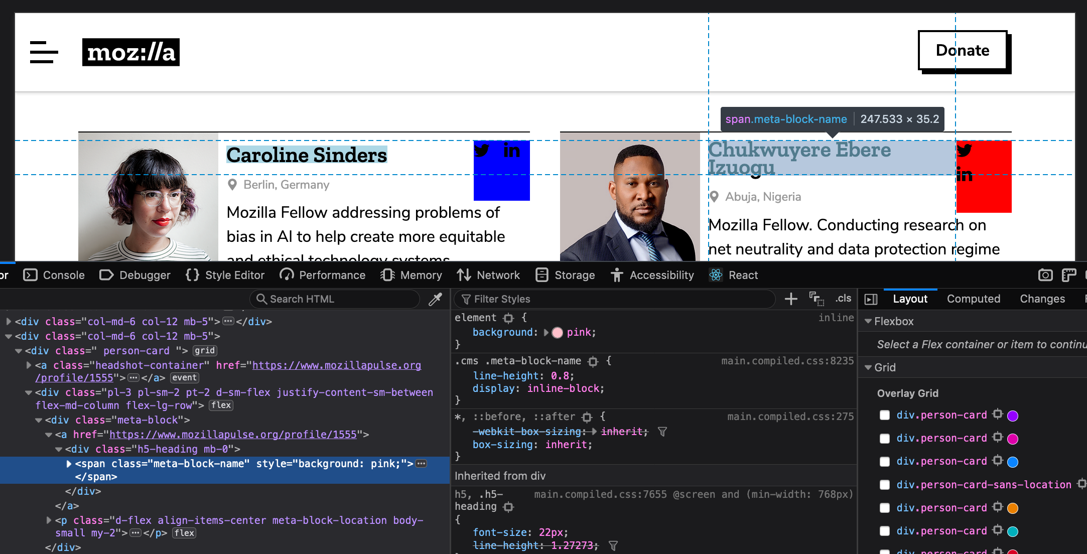
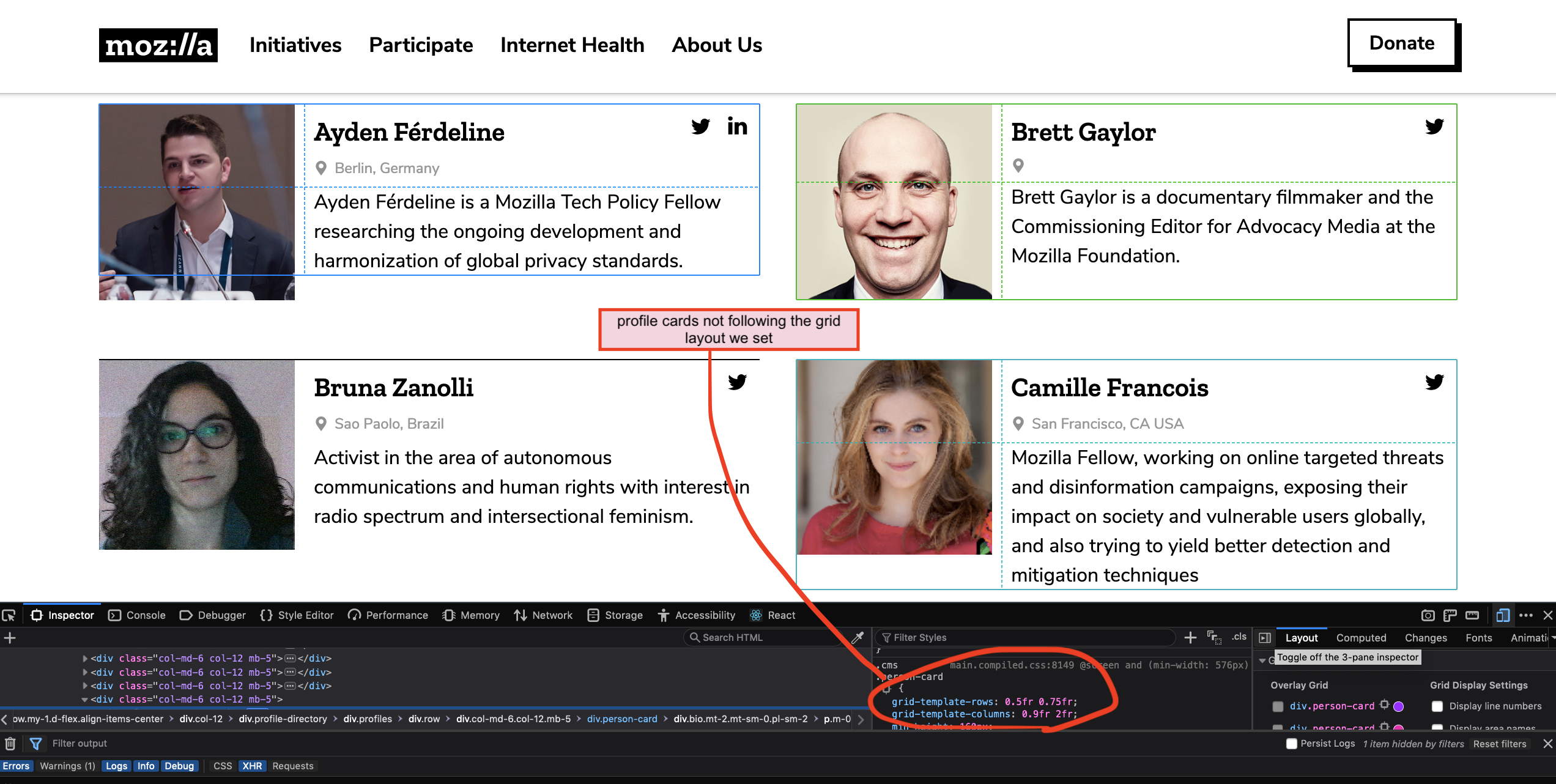
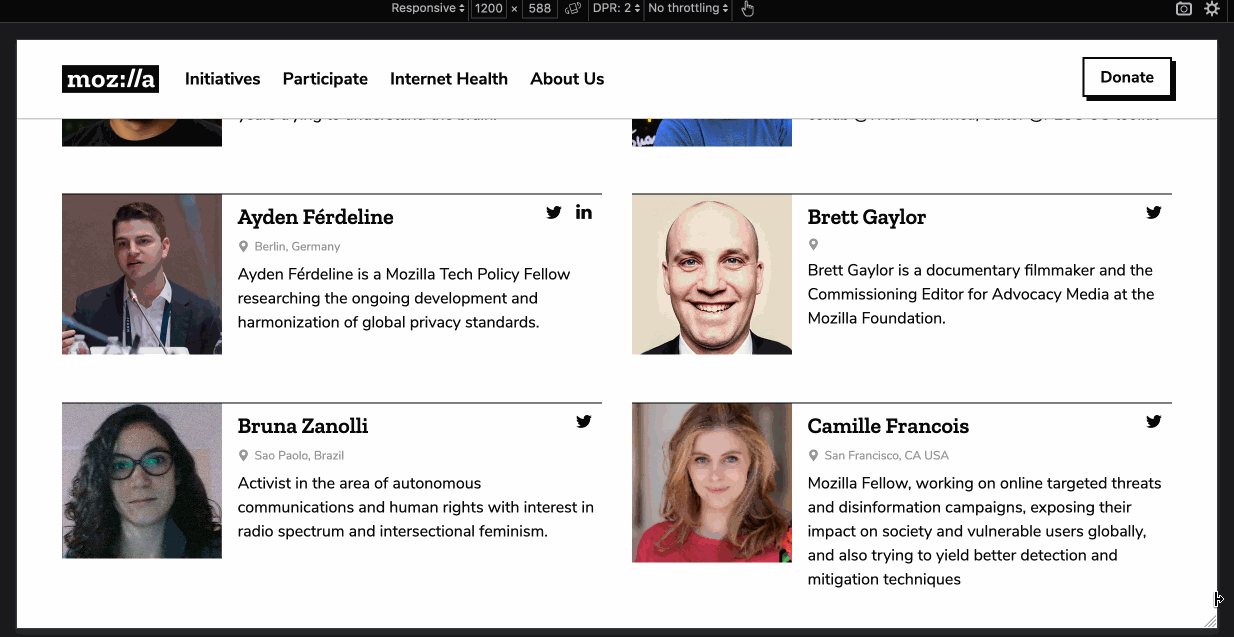
Few examples (screencap taken on production):
- The two name sections have different width, height, and spacing to top border of the card. (Expected: name section should have same width and spacing/margin across all cards.)
- The two social media sections have different width and height. (Expected: dimension of this section should stay the same across all cards)
 mmmavis
All 9 comments
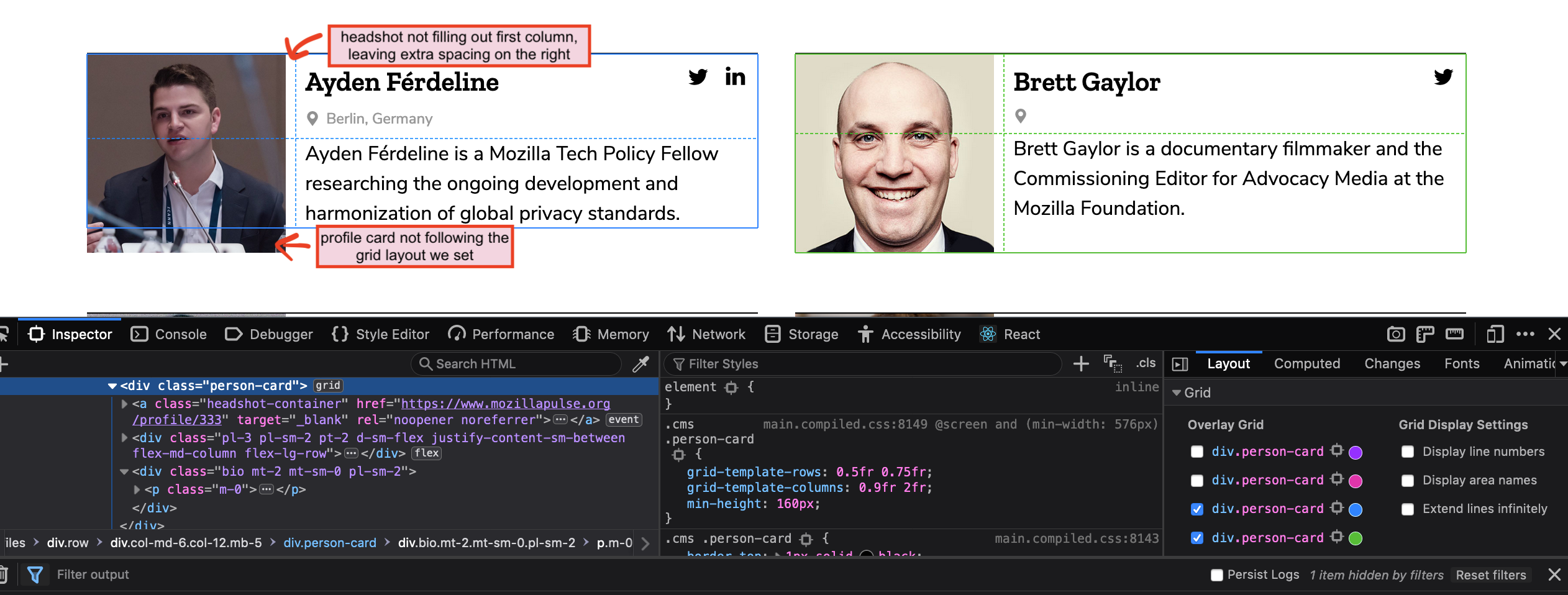
This specific container you're mentioning _is_ using Flexbox. CSS Grid is only being used here to compartmentalize each card which you'll see is basically equal on each card depending on the content that's within it. In addition, the primary reason I went with the grid is because it allowed us to easily move the bio content below the image at mobile which couldn't easily be done with flexbox. Off the top of my head, the best solution here could be to set a min-width for the social media container, to avoid this issue with longer names between 991px - 1200px(where the issue is present).
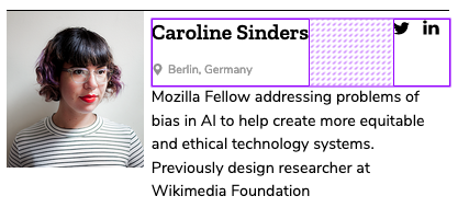
Below, you'll see the dashed lines that represent where the grid is actually being used. Also, the grid isn't necessarily forcing the same cell height as much as it's reserving a certain amount of space for the content to reside, but of course expands depending on the amount of content ( see Caroline Sanders' card):

Whereas, here you'll see where flexbox is being used

I'm open to other suggestions including how to better implement flexbox here to fix the issue—let me know.
 youriwims
on 11 Apr 2019
youriwims
on 11 Apr 2019
Thanks for the detailed explanation and screencaps. Those were very helpful! @youriwims 👍
I don't wanna propose for huge implementation changes. So I guess my main questions are - with the current CSS grid + Flexbox implementation that we have in place, is it possible that we can polish things up so that
- width and spacing of each mini section in each card are consistent across all cards (height should grow to fit content)
- we can avoid using arbitrary numbers in the
profiles.scssfile, especially
``SCSS
// (Not 100% sure if this is howfr` is calculated)
// is this equivalent to allocating 40% of the free space to first row and 60% to the last row?
grid-template-rows: 0.5fr 0.75fr;
// is this equivalent to allocating 31.03448276% of the free space to first column and 68.96551724% to the last column?
grid-template-columns: 0.9fr 2fr;
...
// is this equivalent to allocating 25.92592593% of the free space to first row and 74.07407407% to the last row?
grid-template-rows: 0.35fr 1fr;
// is this equivalent to allocating 31.0344827586% of the free space to first column and 68.9655172414% to the last column?
grid-template-columns: 0.9fr 2fr;
mmmavis
on 11 Apr 2019
For the wrapping social icons issue, you can probably fix it by simply adding flex: 1; to .meta-block. Ideally we want to avoid setting min/max/fixed width/height where we can so things can just resize and flow on their own based on the scenario. (vs requiring us to manually update that value when content in that section changes. e.g., if we decide to change the size of the icons or if we decide to add another icon to it)
Disclaimer: I didn't test my code suggestion locally so I could be wrong. 😂
mmmavis
on 11 Apr 2019
I don't wanna propose for huge implementation changes. So I guess my main questions are - with the current CSS grid + Flexbox implementation that we have in place, is it possible that we can polish things up so that
- width and spacing of each mini section in each card are consistent across all cards (height should grow to fit content)
The width and spacing of each mini section _is_ currently consistent and grows to fit the content. (See my initial example that shows the grid expanding to:
- fit Caroline's longer bio content in comparison to Chukwuyere's bio that's visibly shorter
- Row 1, Column 2 block expanding since Chukwuyere's name is on 2 lines)
It's doing this all while maintaining the overall layout specified by Bootstrap.
- we can avoid using arbitrary numbers in the
profiles.scssfile, especially
I don't want to get cheesy 🧀 , but this this is literally the magic ✨ of css grid and why it's so useful in creating and achieving very specific and/or complex layouts. The fr unit means a fraction or part of the available space, but also takes into account many other things that you can read more about here 😊 . For generally simpler layouts, most use values like 0.5fr,1fr, and2fr but the more comfortable you get with css grid, you can start using more unique/exact fr values like the ones I've used. Here you can inspect the grid in the dev tools and see how they've used unique values to create this complex grid layout which in a sense is how I looked at creating the directory cards to compartmentalize the content within it.
I definitely recommend checking out Jen Simmons' website; she has a lot of cool examples and approaches to using the grid to your advantage for creating layouts or doing things that may be out of the scope of flexbox and bootstrap. This helped me understand css grid when I first started learning it 👍 .
_Btw_ flex:1 on .meta-block worked great—thanks!
youriwims
on 12 Apr 2019
@youriwims I know just the basics of CSS grid. Thanks for the links though - they are helpful! I noticed there were/are some small bugs here and there so I thought they might be CSS grid related. To be honest I'm a little lost now but if everything works as expected design wise let's just stick with the existing system.
I know with CSS grid we will have to deal with interesting numbers. Would it be possible if we can change the numbers used for fellowship directory to something easier for other devs to follow? Or at least come up with a convention system so in the future we can ensure numbers used in CSS grid don't seem as magic and arbitrary?
I'm curious how the numbers in profiles.scss were picked, for example
grid-template-rows: 0.5fr 0.75fris essentially the same as50fr 75fr,2fr 3fr,1fr 1.5fr, ... etc. Is fraction number representation more conventional?grid-template-rows: 0.35fr 1fr;andgrid-template-columns: 0.9fr 2fr;... Was there a particular reason why we used0.35fr 1fr(and not its equivalent0.7fr 2fr) and0.9fr 2fr(and not its equivalent0.45fr 1fr)?Were these numbers chosen based on design specs? e.g., for
grid-template-columns: 0.9fr 2fr;-- we specifically want the first column to always have 9/29 of the free space and the 2nd column have 20/29 of the free space?
mmmavis
on 15 Apr 2019
I think numbers in CSS Grid will unfortunately always seem 'magical/arbitrary' because one of its primary purposes is to build very specific, exact layouts 😕 For example, anything else we decide to build using css grid will have varying fr measurements to reflect the design specs and the syntax could look completely different from this and not follow any _set_ convention. Regardless, I can do some digging to make sure I'm using grid best practices and look over the styles again to see if there's anything I can clean up.
grid-template-rows: 0.5fr 0.75fr is essentially the same as 50fr 75fr, 2fr 3fr, 1fr 1.5fr, ... etc. Is fraction number representation more conventional?
not sure what you mean by that question, but yes those are all equivalent 😸 However, it tends to be the norm in CSS Grid to use smaller fr units i.e. 4fr and below. (note: you can also use percentages and pixels with fr units if you choose--I tend to just stick with fr).
grid-template-rows: 0.35fr 1fr; and grid-template-columns: 0.9fr 2fr;... Was there a particular reason why we used 0.35fr 1fr(and not its equivalent 0.7fr 2fr) and 0.9fr 2fr(and not its equivalent 0.45fr 1fr)?
there's no particular reason why I picked 0.35fr vs 0.7fr as in this case, they're exactly the same. like i said previously ☝️, css grid tends to use smaller numbers, so I always go with the fraction reduced to its lowest terms _in a sense_ without making the number too ridiculous...tbh this sort of thing is devs' preference...truthfully, there's nothing wrong with either option,again, it just comes down to preference.
Were these numbers chosen based on design specs? e.g., for grid-template-columns: 0.9fr 2fr; -- we specifically want the first column to always have 9/29 of the free space and the 2nd column have 20/29 of the free space?
Not too sure how you came up with these fractions, but if I'm understanding correctly yes, I built the grid according to the design specs and explicitly told each element which cells I want it occupy and when.
I'm free to hop on a call to talk about this btw! 😊
youriwims
on 17 Apr 2019
Here's my lengthy reply 😅 . We can chat on Vidyo if you have more questions.
there's no particular reason why I picked 0.35fr vs 0.7fr as in this case, they're exactly the same. like i said previously ☝️, css grid tends to use smaller numbers, so I always go with the fraction reduced to its lowest terms in a sense without making the number too ridiculous...tbh this sort of thing is devs' preference...truthfully, there's nothing wrong with either option,again, it just comes down to preference.
I understand devs have their own preference. But since we are working on a collaborative project we would want to prioritize "making the code easier for other people to understand" than personal preference. Reducing numbers to their lowest terms is cool but there are already inconsistency happening in your code. Like what I pointed out in my previous comment - in one line you used 0.35fr 1fr and another you used 0.9fr 2fr (which should've been reduced to 0.45fr 1fr to avoid inconsistency). That's why in my previous comment I suggested setting up a "convention/system" that everyone can and should follow, rather than making numbers look pretty for the sake of making them pretty.
Not too sure how you came up with these fractions
These numbers came from your Profile card updates sans location PR. The reason why I keep mentioning numbers being magical/arbitrary is because these number combos generate odd ratios that are unlikely "by design".
Taking grid-template-columns: 0.9fr 2fr; from the PR as one example, this means
- dividing all the available space into (0.9+2=2.9) fractions
- making the 1st column take 0.9/2.9 = 31.03448276% (which is the same as 9/29, as noted in my previous comment) of the available space
- and making the 2nd column take 2/2.9 = 68.96551724% (which is the same as 20/29, as noted in my previous comment) of the available space
It's almost impossible that designers would want a 31.03448276%-to-68.96551724% 2-column layout. That's why I was curious to know how you chose these numbers. If these numbers were not chosen based on design specs, then we are doing something wrong here as _we are just picking random numbers that seem to work_. Combining with flexbox this results unexpected things like the following
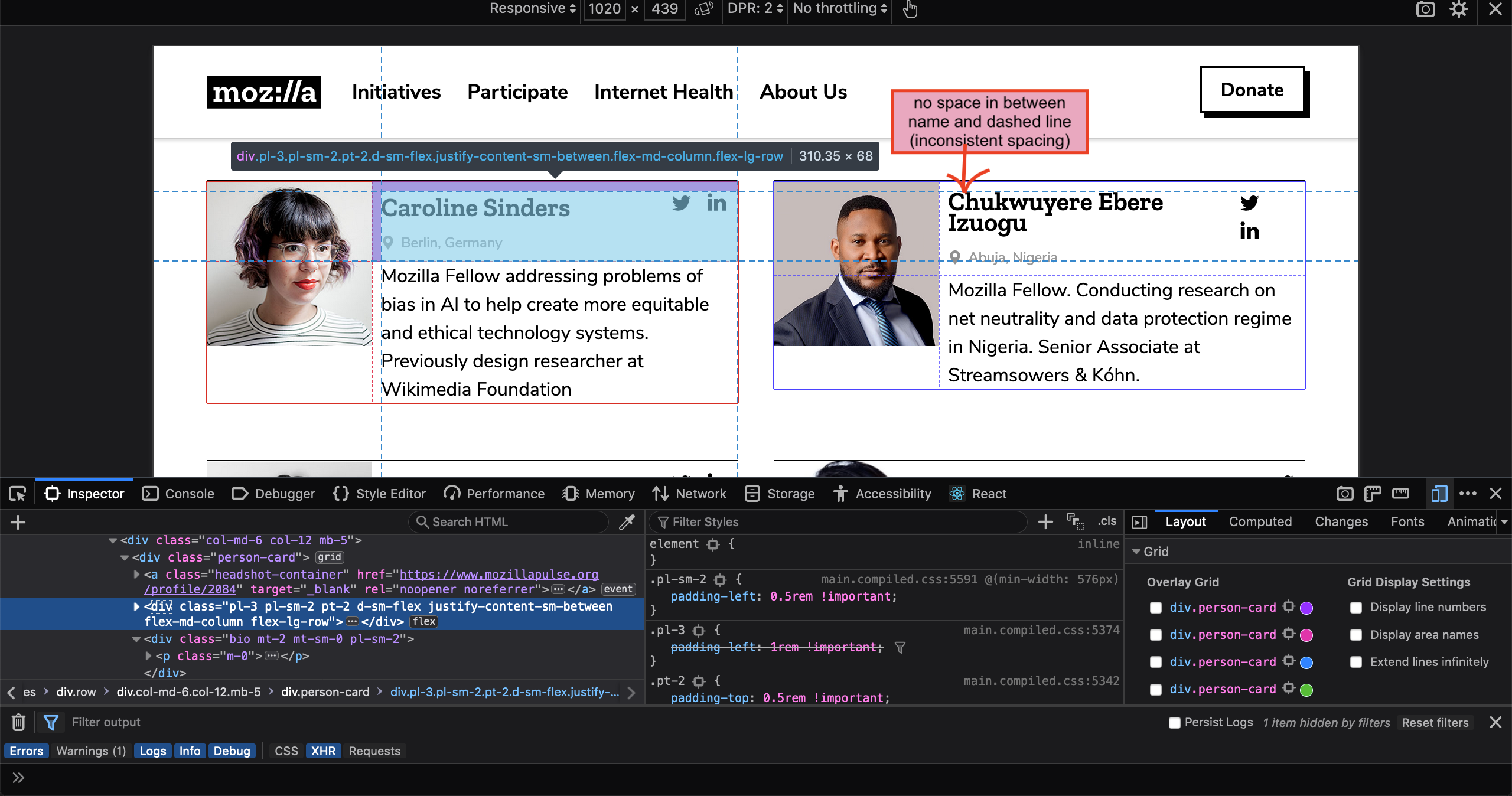
As screen is shrinking from desktop to mobile, profile layout jumps from desktop layout -> tablet/mobile layout -> desktop layout -> tablet/mobile layout.
For MoFo websites, it's very unlikely that designers would design layout using special % (for page layout maybe, but for anything else it's very very unlikely). If you aren't sure how to get design specs from Sketch file, I can give you a walk through and hopefully that can resolve some misunderstanding there might have been.
Back to my original CSS grid vs flexbox question.
I gave a few CSS grid articles a thorough read last week so I think I know the gists of it. After taking a closer look of the mockups today I think neither is a good solution for building our profile card layout.
- CSS grid: Card layout isn't designed based on percentage system. Each profile has different content so we shouldn't force them to all follow the same grid.
- Flexbox: You can't really shuffle things around to the 2 different layouts we want (mobile/tablet & desktop).
I would suggest using a cleaner solution as the following
- mobile and tablet: use
floatfor headshot (this is the classic legit use case for using float) - desktop: use
absolutepositioning for headshot
You can check out my approach here: https://github.com/mozilla/foundation.mozilla.org/pull/3034
mmmavis
on 18 Apr 2019
As a small note on fr, you generally don't want to work with "Fractional fractions", so the smallest value you want to see is just 1fr - the 0.9fr 2fr dimensions are a bit odd, 1:2 would certainly feel more in line with what a designer would request. The fr units are great for expressing the whole "multiples of one" ratio that makes grid design pleasant =)
On the profile card point, it's also important to remember that using CSS grid for the major layout does not mean everything inside cells has to be CSS grid, too. While each profile has different content, that content can be broken down into several blocks: each of those blocks feels like a perfectly fine candidate for being a CSS grid cell, with the content _of_ that cell being regular content (e.g. if someone doesn't have social information fill in, then the CSS grid cell may be there, but it'll be empty, the same way it is now).
The one thing I _do_ worry about when it comes to CSS grid is responsive design. The combination of cell start/end values paired with grid template naming leads to a lot of code in mobile overrides, using a syntax that is pretty alien compared to all the CSS that has come before it. I'm not going to reject it off hand, but it does feel like an important consideration. I've gone through the css-tricks guide, but there were no indicators on how to deal with content reorganisation across breakpoints, and I'd like to understand what we're getting into there.
 Pomax
on 24 Apr 2019
Pomax
on 24 Apr 2019
⬆️ Moved to enhancement ✨ implementation ticket ⬆️ .
youriwims
on 25 Apr 2019
Related issues
 taisdesouzalessa
·
5Comments
taisdesouzalessa
·
5Comments
 hannahkane
·
3Comments
hannahkane
·
3Comments
 kristinashu
·
5Comments
mmmavis
·
4Comments
taisdesouzalessa
·
5Comments
kristinashu
·
5Comments
mmmavis
·
4Comments
taisdesouzalessa
·
5Comments
Most helpful comment
For the wrapping social icons issue, you can probably fix it by simply adding
flex: 1;to.meta-block. Ideally we want to avoid setting min/max/fixed width/height where we can so things can just resize and flow on their own based on the scenario. (vs requiring us to manually update that value when content in that section changes. e.g., if we decide to change the size of the icons or if we decide to add another icon to it)Disclaimer: I didn't test my code suggestion locally so I could be wrong. 😂