Foundation.mozilla.org: Testing & tracking newsletter signups and donations in nav
Related tickets: #2994 & #2948
We need a plan to track and test these updates and other possible variations.
Things to consider:
- track analytics to see how it affects donates (does is suppress donations?) (will need help from Will)
- track analytics to see if people signup (google analytic event & actually sign up numbers)
- can devs can set up A/B testing for this?
- should we some test on usertesting.com?
Other possible test could include more movement-y copy options: benchmarks here
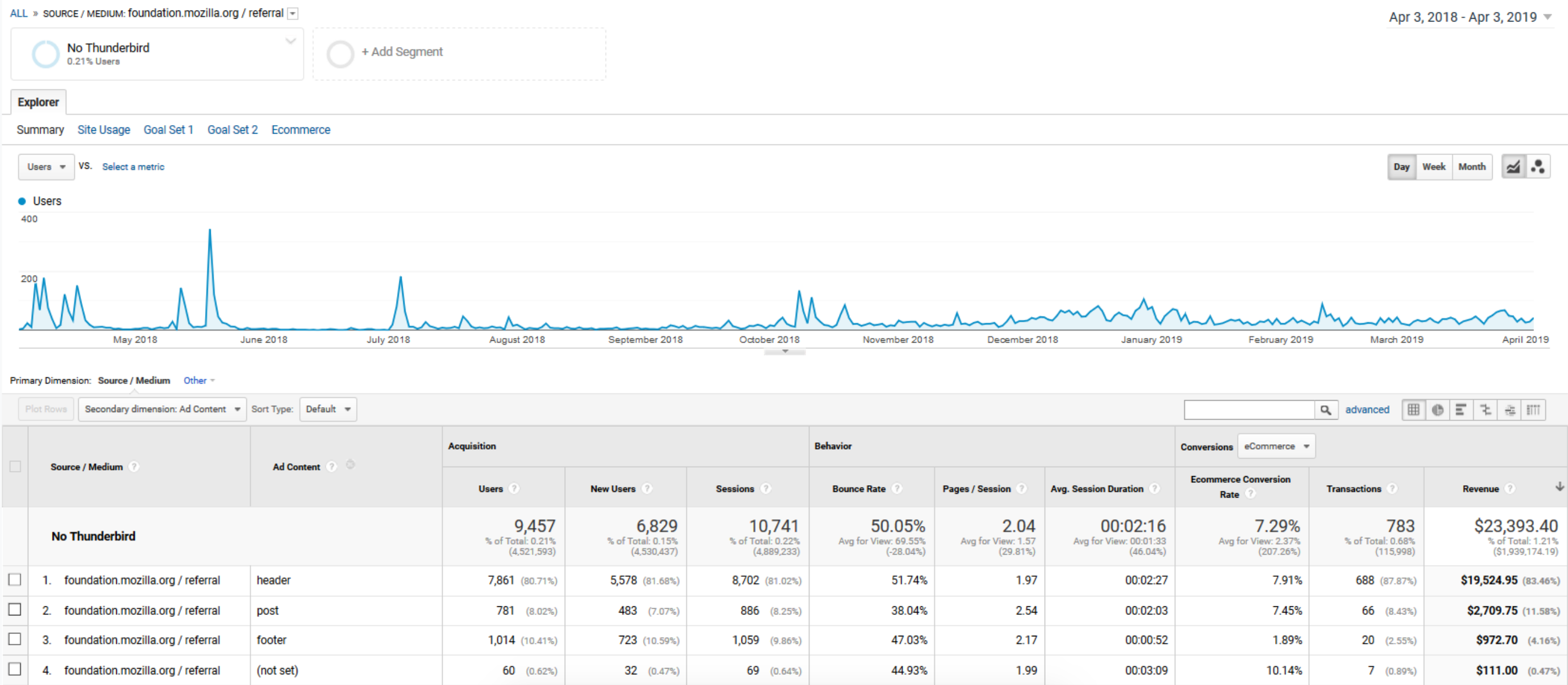
Note Donate numbers from Will for the last year: 688 donations for $19,525
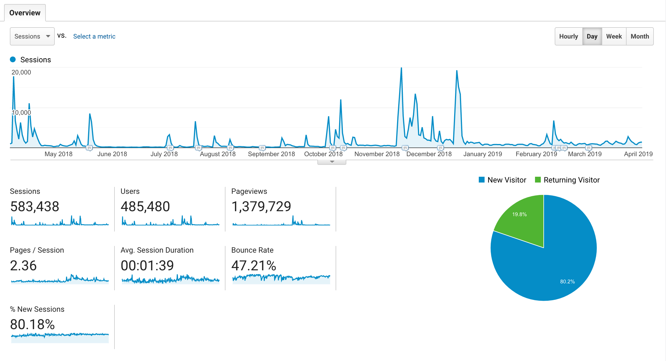
Compared to visits:
cc @beccaklam @xmatthewx
 kristinashu
All 19 comments
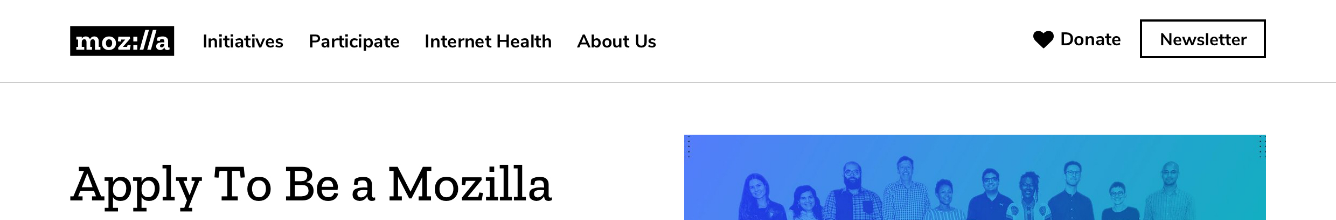
Hi @WillatMozFdn! Tagging you in this ticket. Some context: we are updating the nav to include a newsletter sign up button. It will be next to our donate button:
We want to set up tracking so we can see whether or not this design suppresses donations (compared to last year? or is there another control we could test against?). What would be the best way to do this?
 beccaklam
on 12 Apr 2019
beccaklam
on 12 Apr 2019
@kristinashu not sure if we shoulld do A/B testing for this. My reservation is do we want to lose 50% of potential traffic? Or we time it for a specific period of time where we know we'll have high traffic to do a quick test? Alternatively, we A/B test for a longer period when it's slower so we don't lose out on potential sign ups during a high traffic period.
The other thing is that using last year's donate/newsletter sign up results against our new design is already sort of an A/B test in itself? @WillatMozFdn @stephaniemcv any thoughts here? Tagging you both for your testing knowledge but let me know if there's someone else I should talk to. @anilkanji Do you have thoughts about A/B testing and not showing the signup button to 50% of traffic?
beccaklam
on 12 Apr 2019
Unfortunately I don't think this is reliably test-able, at all. Last year's overall conditions, site content, and traffic patterns were not the exact same as this year's will be, so, that's not a valid control. In theory, without our lean data policies, we could show the newsletter signup to 50% of our visitors, set cookies on whether or not they saw it, and then read back and record those cookies as they donate ... but our policies don't support that type of thing and we also don't have the infrastructure to implement it.
 WillatMozFdn
on 12 Apr 2019
WillatMozFdn
on 12 Apr 2019
Also not sure about the use of usertesting.com. The UX/UI seems straightforward enough, and the above tests may be able to tell us enough about whether the design is effective. I can do some quick in person tests though and see how people do. Will go through analytics later today to see how most people end up on our landing page to think of possible user journeys.
Possible scenarios:
- "You sign a campaign and want to learn more about the company behind the petition. Where do you go? Peruse their site. Now you want to stay up to date with what this company does. What do you do?"
beccaklam
on 12 Apr 2019
Unfortunately I don't think this is reliably test-able, at all. Last year's overall conditions, site content, and traffic patterns were not the exact same as this year's will be, so, that's not a valid control. In theory, without our lean data policies, we could show the newsletter signup to 50% of our visitors, set cookies on whether or not they saw it, and then read back and record those cookies as they donate ... but our policies don't support that type of thing and we also don't have the infrastructure to implement it.
@WillatMozFdn Could we do a plain A/B test then? And see if donations are higher for one version?
beccaklam
on 12 Apr 2019
@WillatMozFdn The other question here is that the newsletter button could suppress donations a bit but in the long term does it actually get us more donations. Not sure how we would measure that?
beccaklam
on 12 Apr 2019
@WillatMozFdn Could we compare total number of donations that came through email this year compared to last year? That may tell us if the newsletter button is working? Increased list growth + increased engagement + increased donations?
beccaklam
on 12 Apr 2019
We could do:
Condition A is only the donate button up there, and we count the # of donations
Condition B is donate button plus newsletter signup up there, and we count the # of donations plus number of newsletter signups. (Assuming everything is tracked correctly.)
Caveats:
- We're only tracking (via Google Analytics) about 25% of our donations these days (thanks to privacy blockers) ... and overall conversion-to-donate rates are pretty low. (Just the nature of the beast.) So in order to get statistical significance, we might need to let this test run for several months. (As noted above, it took us a year to get 688 trackable donations.)
- We don't have an accurate average value (in terms of future donations) for a signup to our mailing list. Last research I saw on this (from Vojtech) showed that it varied quite considerably depending on what we were able to get them to do afterwards (i.e. sign more petitions.) So unfortunately I can't give you a hard number on this, which means we'd be guessing as to the comparative value of a newsletter signup to an immediate donation.
WillatMozFdn
on 12 Apr 2019
More context and caveats: we don't actually have the ability to A/B test this right now so I was hoping we could launch the newsletter signup to everyone and see if it made a significant drop in donations. Significant could mean lower than any other month in the last year??? Would this be bad to do?
@beccaklam I was thinking A/B and usertesting.com would be more for testing the movement-y copy in the future but in-person test could work instead of usertesting.com.
kristinashu
on 12 Apr 2019
@kristinashu Oh I see! lol I totally took this in the wrong direction then. Sorry about that. @WillatMozFdn does ^ sound good to do?
beccaklam
on 12 Apr 2019
Hi @WillatMozFdn, just following up with my previous comment. Looks like all we want to do is after we build the newsletter we want to compare last year's donations (month by month? or however long it takes to get statistical significance) to see if the newsletter button causes a significant drop in donations on the landing page. Would that be possible to do?
@kristinashu Oh so the A/B testing is for the copy just to confirm? I think we could do some usertesting.com for that.
beccaklam
on 15 Apr 2019
Hey Becca - we won't ever get statistical significance on this, because it's not a well-controlled test. Sure, we'll be able to see if donations are up or down from a similar time period last year, but apart from the change to the nav there are numerous other factors that could drive movement in donations one way or the other. 1) Overall site traffic; 2) mix of content on the home page; 3) general changes in the outside environment (economy, US tax law, more competition from other nonprofits & political campaigns, etc) 4) Different mix & cadence of Mozilla emails (including fundraising asks) going out this year vs. last. So if we think this is a good idea, we need to just do it based on gut instinct -- as currently constructed we really cannot make a test out of it.
WillatMozFdn
on 15 Apr 2019
So after chatting with @WillatMozFdn, we've decided that we'll do a check-in at 6 months to see how the newsletter and donate buttons are performing and if the newsletter button is 'helping' or 'hurting' us overall. Helping being defined as newsletter sign ups are up and donations are ok, and hurting being defined as newsletter sign ups are not up and donations are down. Correct me if I'm wrong Will! Will also mentioned that we will need to add an source tag to on the newsletter sign up in order to gather this data.
beccaklam
on 15 Apr 2019
Test Copy doc here: https://docs.google.com/document/d/1IlPX7GRa0xGqX5B2f276xi9ADX1WPUPFLZoH2mo9CS0/edit#
Usertesting.com test built here: https://www.usertesting.com/st/te-7QL5XQ6Jz2yM-85PC
After getting feedback from designers will launch next week!
beccaklam
on 26 Apr 2019
Usertesting.com Results
We ran four tests, the user settings we selected were:
- Age: 25-55
- Employment: Full-Time
- Countries: UK, Canada, US, India
- Web Expertise: High (2), Any (4)
- Language: English
Overall Winner
Users preferred the 'movement' copy vs our control copy for all six users: This was mainly because of two things:
- The 'movement' copy felt empowering and clear. Users felt like they were joining something bigger (one user used the word 'movement'), "a fight, a cause, a campaign". Users said it made them feel important, or like 'Internet Freedom Warriors'. Others noted it was more direct about the kind of information they would get in their inbox. One user was really impressed how this language changed his mind about joining our email list.
- The control message was described as too ambiguous, vague and potentially spammy. Users were not sure what to expect in their inbox. In one case a user found it offensive as it seemed to 'make them feel stupid'. Two users noted they already felt smart/savvy about their online life. There was one user who did prefer the control copy for its general nature, but only when presented with two choices. Two users disliked the word 'newsletter' as it connoted getting spammed.
- To Consider: Two users mentioned they were looking for a 'Subscribe' button when we asked them what they would do if they wanted to stay informed with Mozilla
Other General Learnings:
- 4/6 Users click the top right corner to stay informed
- 3/6 users went to the footer to sign up to stay informed
- 2/6 users looked for a 'subscription' button when asked where they would click to 'stay informed'
- Most users were able to gauge from our homepage that the Foundation is an organization that centers on Internet issues
- Users note that most of the content on our homepage are articles
- The older users were confused about the Internet Health "cup image", whereas the younger users liked it or were indifferent to it
Specific Learnings:
Users with little knowledge of our issues/Mozilla felt:
- Our issues did not resonate with their daily life and that our language was outside the realm of the usual buzz words/turn of phrase used by the public to describe the Internet. They mentioned that if 'data' or 'child protection' were mentioned they'd be more inclined to sign up (note: the user works in finance, specifically insurance)
- Our site was a 'jumble of information about the internet' with no links to actual software that can make a difference to their life (wonder if there's an opportunity here to structure our page more for users who are new to the concept of internet-health)
- Regarding the Pulse section, one user was confused that you could 'add a project' [to the page]
Users with a high knowledge of our issues/Mozilla:
- Wanted a more general interest newsletter to receive all kinds of information from Mozilla, not just pertaining to one cause
- Prefers manual access to information but wants to get involved with a cause they believe in
- Two users mentioned open-source and how that's important to them
Memorable Quotes:
_"[Regarding the Internet] I didn't know it needed protecting! Is there a risk of it getting shut down?"_
_"I don't want piles of information 'cause that means I have to read through it and pick out what I want, you know. You kinda need a clearer message of what's the point of this."_
_"Why is my internet use unhealthy? I didn't know it was unhealthy."_
_"[Regarding IHR cup image] What the heck is _that_ on the landing page? [...] It looks like a meme gone wrong. [...] I don't know why that would be first thing [on the page]."_
_"[Regarding the home page] It screams millennial to me."_ (Note: Funny enough, the millennials who saw this page either didn't mind the cup image or liked it)
_"I'm actually really impressed that it [the movement text] changed my opinion [previously against signing up for email lists]. It's much more appealing to me."_
Recommendations:
- We should move forward with more 'movement' centric copy and make sure we are being clear and direct about what users will be receiving in their inbox
- We should consider changing the button CTA to 'Subscribe' as users are used to seeing that language when wanting to stay informed with an orgnaization
- We should consider users who don't know our issues/Mozilla well and think about how to onboard them on our homepage if we ever want to grow our audience
- We should be aware of two types of audience -- those who know our cause or are internet-savvy and those who don't know us or are not internet-savvy. We don't want to talk down to people who feel that they already know their stuff.
beccaklam
on 9 May 2019
This is so awesome @beccaklam. Thanks for the excellent, succinct report on your findings.
- Want to bring this to demos?
- We should make mofo _"screams millennial to me"_ t-shirts 😆
- Knowing that this is a very small sample size, we might proceed with the movement option, establish a baseline of stats, and then A/B test an improved alternative based on these insights. It could still prove to be a valuable message for engagement.
- Let's find a way to make sure we don't ever put weird cups in the hero again. And, @kristinashu - should we file an airtable project for site header cause statement?
 xmatthewx
on 10 May 2019
xmatthewx
on 10 May 2019
Awesome summary and test! Sooo interesting to see.
Here are a few possible next steps:
- [x] run this test two more time to get a wider sample size, if results are similar then
- [x] confirm copy with Anil
- [x] update all our sketch files with new copy
- [x] open an implementation ticket for devs to update the copy
I will open new tickets for:
- adding a cause statement to the homepage
- a more general test around our content and IA
kristinashu
on 10 May 2019
I updated the report with the findings from the last two users. Results were starting to repeat so I think we're good on findings. Slacked Anil to confirm copy. Also! @xmatthewx @kristinashu About the cup image -- millennials did prefer it/indifferent to it. We should talk more about audience types. Older, younger, internet savvy, not internet savvy.
beccaklam
on 13 May 2019
Anil confirmed copy (sticking with what we tested). Implementation ticket opened here: #3161
beccaklam
on 15 May 2019
Related issues
 taisdesouzalessa
·
3Comments
taisdesouzalessa
·
3Comments
 hannahkane
·
3Comments
kristinashu
·
5Comments
hannahkane
·
3Comments
kristinashu
·
5Comments
 alanmoo
·
3Comments
xmatthewx
·
3Comments
alanmoo
·
3Comments
xmatthewx
·
3Comments
Most helpful comment
This is so awesome @beccaklam. Thanks for the excellent, succinct report on your findings.