Foundation.mozilla.org: Increase shares after voting
A lot of people are voting but very few are sharing.
Currently we have about 29k creepiness votes in analytics and only about 29 vote shares, that’s 0.1%. Let’s try and get 5 out of 100 voters to share!
We might be able to test different options if Pomax is done setting that up in time.
Ideas
- remove link to comments
- make share title larger and say something like
Share!orInvite your friends to vote! - make icons bigger?? -
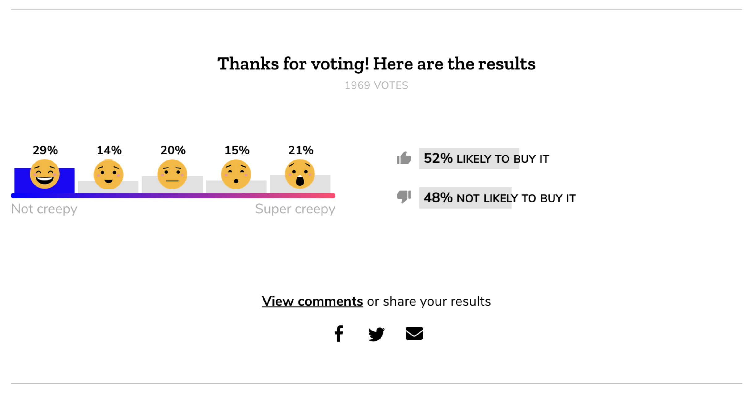
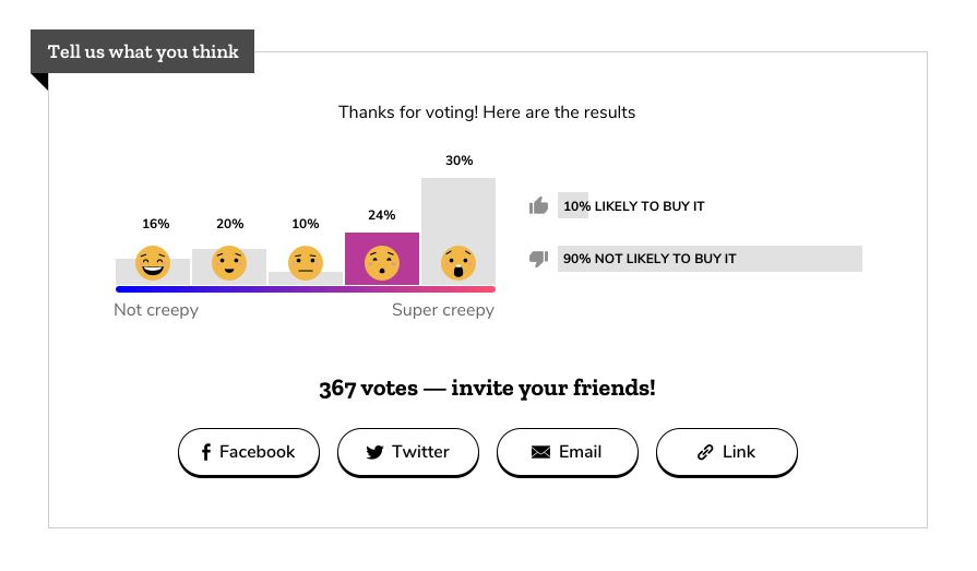
Current state
cc @xmatthewx
 kristinashu
All 19 comments
Excellent. Design-wise, let's try and land on 2 options: one bolder, one super bold. Will be fun to test!
 xmatthewx
on 14 Jan 2019
xmatthewx
on 14 Jan 2019
@kristinashu @xmatthewx Here are two quick ideas: https://redpen.io/p/utee9e897aa82628cd
Let me know what you think!
 beccaklam
on 15 Jan 2019
beccaklam
on 15 Jan 2019
@xmatthewx
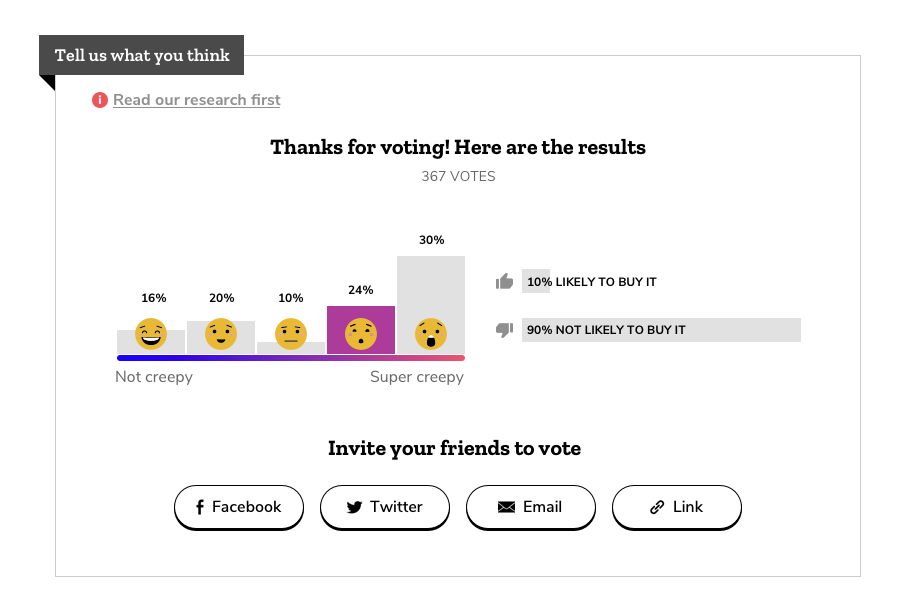
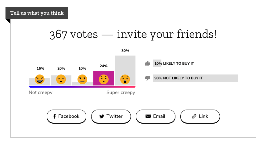
Bold Option:
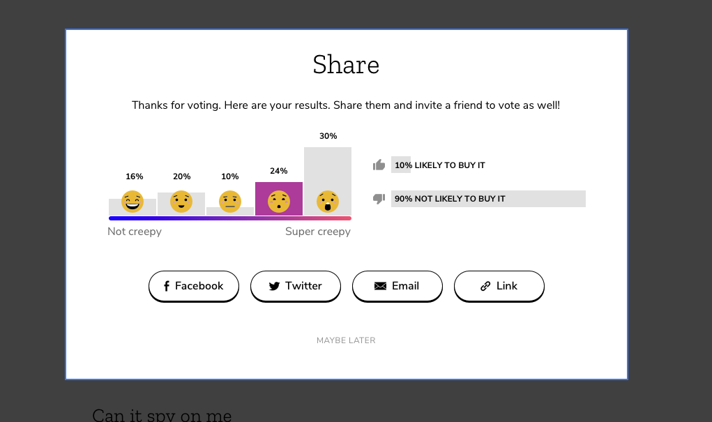
Bolder Option
Kristina already pointed out this is probably too much and the UX for this coupled with the donation ask would be a bad experience. Probably going to nix it, was just trying out ideas
Post-vote pop-up:
After user closes pop up:
beccaklam
on 15 Jan 2019
Cool, cool. Looking great! Yep, pop up is probably too much to tackle.
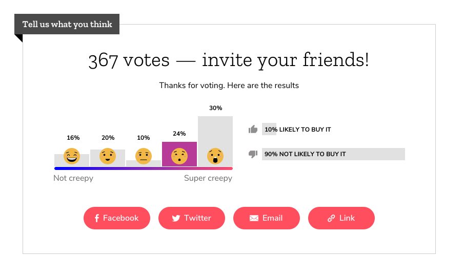
One idea: move 367 votes from the top to your new heading: 367 Votes. Invite your friends! I'm thinking that people like to share stuff that's validated by other people's engagement.
xmatthewx
on 15 Jan 2019
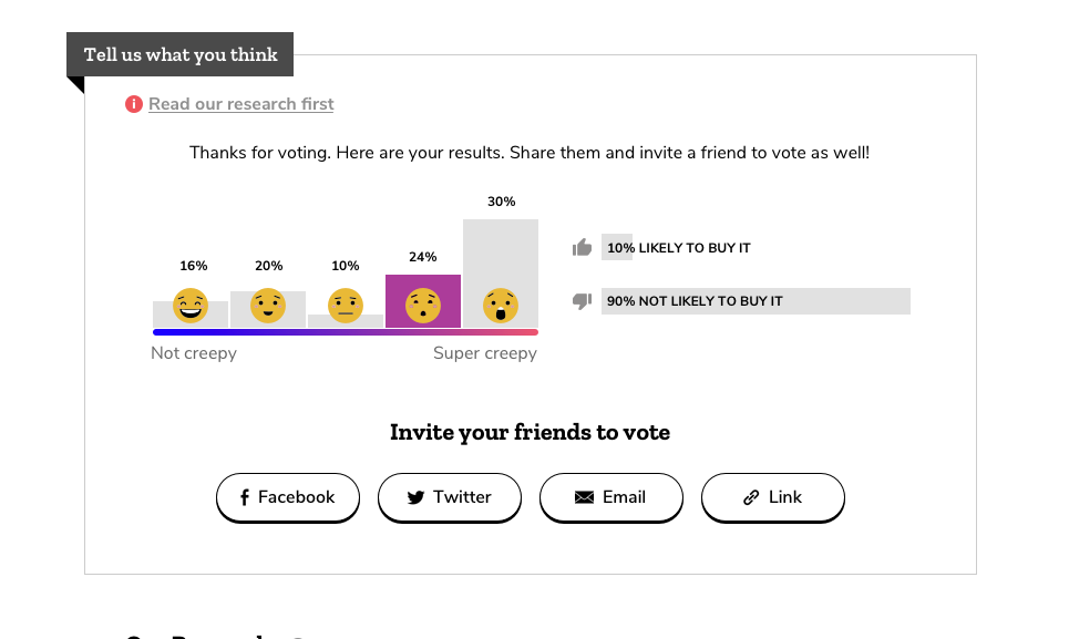
Thanks for the feedback! Here are two new options: @kristinashu @xmatthewx
https://redpen.io/p/utee9e897aa82628cd
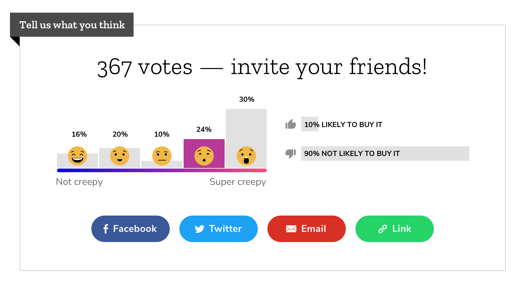
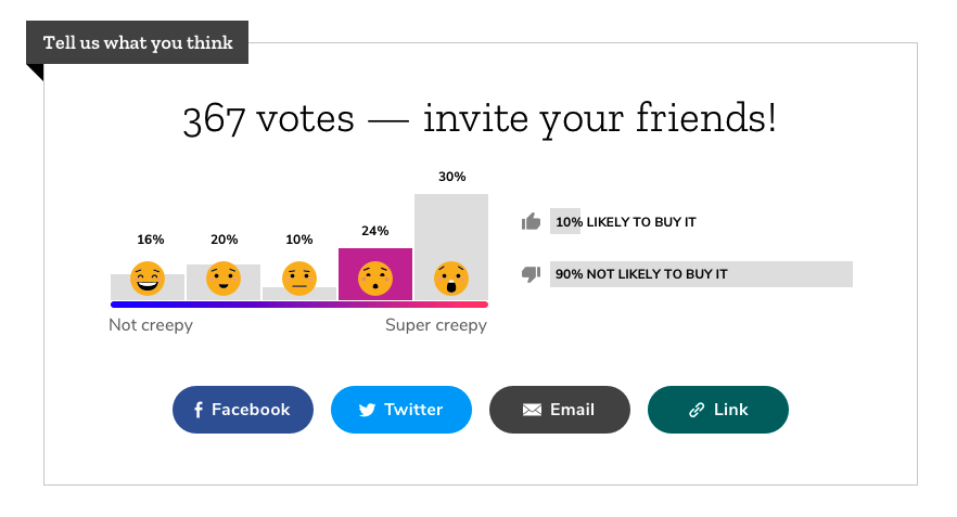
Bold:
(Mainly just switching the size of the headers and making the buttons larger)
Bolder:
(Really upping the size of the header and making the buttons larger and changing the colour to have more contrast)
beccaklam
on 17 Jan 2019
Excellent.
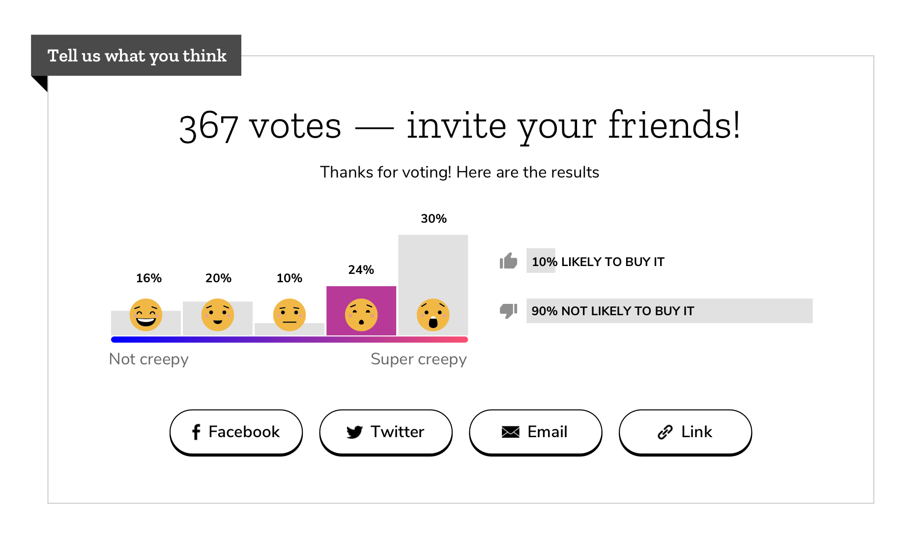
- The top headline in option 2 (bolder) is very effective. Great idea. We could remove the line of text "Thanks for ... results" and make this box all very clean and simple. I think results infographic speaks for itself. If you disagree we could just label it "results".
- I'll step back now and let you and Kristina decide button color and make the final call on all of this.
- I'm very _very_ curious to see if we this helps dial up engagement!
xmatthewx
on 17 Jan 2019
@kristinashu @xmatthewx
Feedback based on crit and matthew's comments -- Bold option remains the same, some updates to Bolder option:
- eliminated sub header line
- changed colour of buttons to reflect social platform brand (when applicable)
 beccaklam
on 17 Jan 2019
beccaklam
on 17 Jan 2019
I think you could group the titles in the bold option, like you had on the bolder option. It makes for better hierarchy and feels less clustered.
kristinashu
on 18 Jan 2019
I really like it with no subhead. If you make them both the same with button color as the only variable, then an A/B test will give us unambiguous info on why one performs better than the other.
xmatthewx
on 18 Jan 2019
May be one could have the number of votes in the large text and the other with the smaller text?
kristinashu
on 18 Jan 2019
I worry a little about 2 things:
- info overload - this little space has so much text, numbers, buttons competing for attention. I think it's better without subhead.
- test results - if test A does better than test B, we won't know if it's because of button color or the headline.
Implementation
- When you file implementation, please ask dev to make sure we keep GA Event on share buttons.
- If we do A/B test, ask dev to "prepend
GA Event Labelwithtest A:andtest B:" - I'm super excited!
(I'm going to unsubscribe from this thread now 😉 )
xmatthewx
on 18 Jan 2019
Oh sorry, I misunderstood! I thought you didn't want buttons to be the only variable between A and B. But yes, I think they should be the same (except for buttons)!
kristinashu
on 18 Jan 2019
Edits after above feedback, I think we're close!
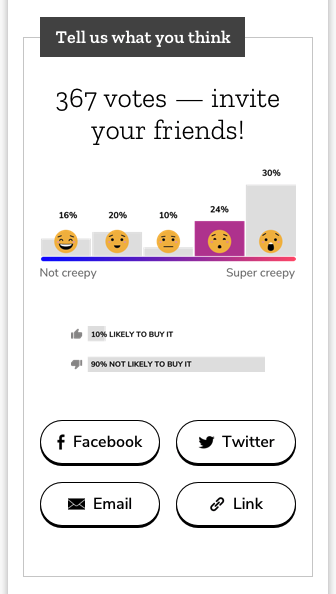
Variant A (Black and white buttons)
Variant B (Colourful buttons)
@kristinashu @xmatthewx
beccaklam
on 21 Jan 2019
Looks good to me!
@xmatthewx is the idea that once pomax has implemented A/B testing on the site, will can test these live?!
kristinashu
on 21 Jan 2019
I think we should go ahead and implement one of them for v-day. you pick. we should have enough traffic to compare new version against holiday version. If a/b testing does land, we can go further and test color vs b&w buttons, but let's not wait for that.
xmatthewx
on 22 Jan 2019
That sounds good to me. My vote would be Variant A, it follows button styles we've already introduced on the page and the colour combination is the most accessible. @kristinashu do you have a preference?
beccaklam
on 22 Jan 2019
Yes, Variant A please!
kristinashu
on 22 Jan 2019
Could you do a mobile version, show hover state, clean up the file, make sure we're using our existing styles, and then open up an implementation ticket?
kristinashu
on 22 Jan 2019
Here's the mobile version for Variant A. Closing this ticket for now, implementation ticket opened: #2510
@kristinashu @xmatthewx
beccaklam
on 23 Jan 2019
Related issues
kristinashu
·
5Comments
kristinashu
·
4Comments
kristinashu
·
5Comments
xmatthewx
·
4Comments
 hannahkane
·
3Comments
hannahkane
·
3Comments