Fomantic-ui: Mixing grid and container (vs nested usage) results in differing container width
Bug Report
At a cursory glance, it appears there was a move away from negative margins on grid containers in a recent update. The result of this is that when mixing grid and container the resulting width of that container is different from what we'd get if we just nested a grid inside a container. This resulted in a visual change for me when upgrading from Semantic-UI to Fomantic-UI.
Steps to reproduce
- Create both of these:
<div class="ui three column grid container">
   <div class="column"></div>
</div>
<div class="ui container">
   <div class="ui three column grid">
      <div class="column"></div>
   </div>
</div>
Expected result
Both versions should have the same width.
Actual result
When viewed with Semantic UI v2.4.1 they will both have the same overall width. When viewed with Fomantic UI v2.7.8 the combined version will have a lesser width (2rem from what I can tell reading the CSS).
Version
2.7.8
 brendon
All 6 comments
Following this up, it appears related to this commit: https://github.com/fomantic/Fomantic-UI/commit/e3a6bc33005fdd9e4ba3c92863a051e94fb1417e#diff-19a0f29cbd9dd7f8b8b6490361863667R91
Specifically, the specificity of the rest of those selectors in that block needs to match the first (so they should all start with .ui.ui.ui to retain the expected original behaviour. In my case I need:
.ui.ui.grid.container {}
to trump:
.ui.ui.ui.container:not(.fluid) {}
brendon
on 10 Sep 2019
@brendon Please have a look at the following jsfiddles i prepared according to your mentioned code
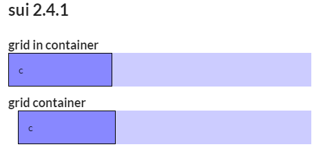
SUI 2.4.1
https://jsfiddle.net/4npfjxhL/
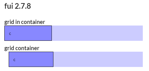
FUI 2.7.8
https://jsfiddle.net/4npfjxhL/1/
I have to admit the grid container version has a slightly different margin, but they (.container .grid vs .grid.container) definately do not match the same overall width as you expected, not even in SUI.
Regarding the mentioned specificity:
I will test this, if adding a third .ui will result in the desired difference, but i have to prepare some test cases first (based on the ones i provided above)
 lubber-de
on 11 Sep 2019
lubber-de
on 11 Sep 2019
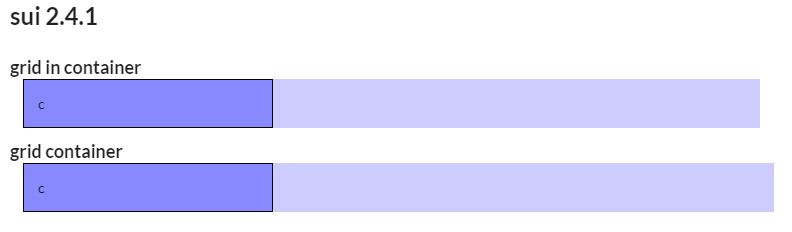
Sorry my example omitted the ui from the seperate container. See: https://jsfiddle.net/97k5emrj/ for the proper result.
brendon
on 11 Sep 2019
Ah ... now it makes sense. Sorry, i should have detected the missing ui by myself 🙄
Anyway: They still do not completely match even in SUI. There is always a different left/right margin.
Funny thing: On small devices FUI matches SUI again... See
Small device/width
Wide device/width
lubber-de
on 11 Sep 2019
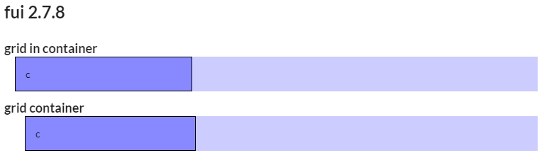
Sorry, I missed even more detail in replicating. The column needs to be full-width to trigger it:
SUI: https://jsfiddle.net/4npfjxhL/
FUI: https://jsfiddle.net/neuf05s2/
🤦♂
brendon
on 11 Sep 2019
@brendon
Thanks for reporting. Indeed the specificity had to be adjusted as you stated
Fixed by #1011
See https://jsfiddle.net/xr324Lkg/
lubber-de
on 11 Sep 2019
Related issues
 hammy2899
·
5Comments
hammy2899
·
5Comments
 dutrieux
·
3Comments
dutrieux
·
3Comments
 ocharles
·
4Comments
ocharles
·
4Comments
 renato
·
4Comments
renato
·
4Comments
 davekc
·
4Comments
davekc
·
4Comments