Focus-android: Show information about SSL certificate
To fix this bug implement the mocks that @brampitoyo provides. See https://github.com/mozilla-mobile/focus-android/issues/454#issuecomment-304553461 and later comments.
Please note this is slated for v5.0 and will need to be completed by mid-Februrary, according to the current calendar.
From feedback:
Seems like I cannot view SSL cert info. Pressing the lock icon in Fennec Android shows some info.

 pocmo
pocmo
All 28 comments
Here's a V1, I've just followed the fennec design for now.

I'm wondering if we should we just use the default material icon (we can use that in the toolbar too?): https://material.io/icons/#ic_lock
AFAICT we can't access EV certificate information when using WebView, at least not without some horrible hacks...
https://developer.android.com/reference/android/net/http/SslCertificate.html
We can get the underlying cert using:
http://stackoverflow.com/a/35858045
And then AFAUI we'd need to manually parse the X509 cert to get EV information.
(It looks like even Chrome doesn't bother with showing EV status on Android, Firefox however does show EV status.)
 ahunt
on 11 May 2017
ahunt
on 11 May 2017
Here's another screenshot if we don't show the doorhanger over the lock button (which is non-materialy, but probably better in this case?):

I don't know if showing the issued to "CName" is the right thing for the doorhanger, it looks like Firefox shows the site hostname instead (the CName could be a different host, e.g. when sumo was running on lithium the cert/CName was for something.lithium.com, and support.mozilla.org was one of the alternate domains in the cert).
@antlam: do you have any ideas/designs for the site security doorhanger?
ahunt
on 12 May 2017
This is not v1 and not nice-to-have though! :)
pocmo
on 12 May 2017
I guess my main concern is that in most browsers, we're trying to teach users to check when sites are encrypted by using the green lock icon, but in focus we're breaking that expecation. (I wonder whether it would be considered good UX to also show a broken padlock for http sites? And should we be using a green padlock to be consistent with most other browsers.) Either way, that's for product/UX to decide!
See e.g. https://support.mozilla.org/en-US/kb/how-do-i-tell-if-my-connection-is-secure for what I think users might expect.
(I don't know if it's even possible for us to check for mixed content with WebView, so we probably can't even do that part...).
ahunt
on 13 May 2017
I agree with your sentiment in general - however we have triaged this before and decided to not pick it up for v1. Feel free to flag it for triage and we can re-discuss though!
pocmo
on 13 May 2017
Not V1, but I'll push my branch somewhere for whenever we want to build this.
ahunt
on 16 May 2017
(My branch is at https://github.com/mozilla-mobile/focus-android/tree/ahunt/sslui - it still needs contentDescriptions added and UX feedback)
ahunt
on 26 May 2017
@brampitoyo thoughts? (not for V1 :) )
 antlam
on 26 May 2017
antlam
on 26 May 2017
Hey! This is an area that matches my expertise :-)
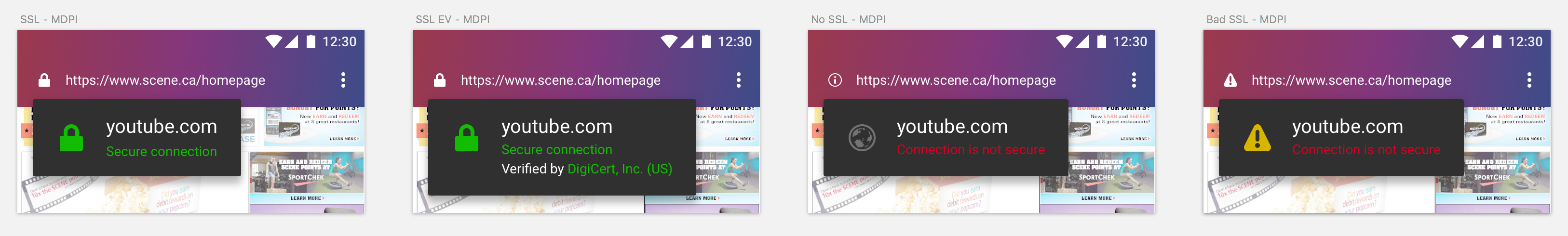
There are 4 different site states that we’ll need to design for. Here they are, along with accompanying info text:
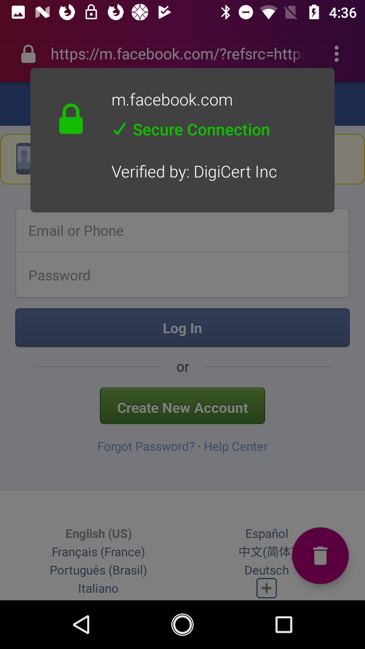
Secure HTTPS (icon: green lock)
A. SSL
domainname.net
<green>Secure Connection</green>
B. SSL EV
domainname.net
<green>Secure Connection</green>
Verified by: Cert Authority, Inc. (US)
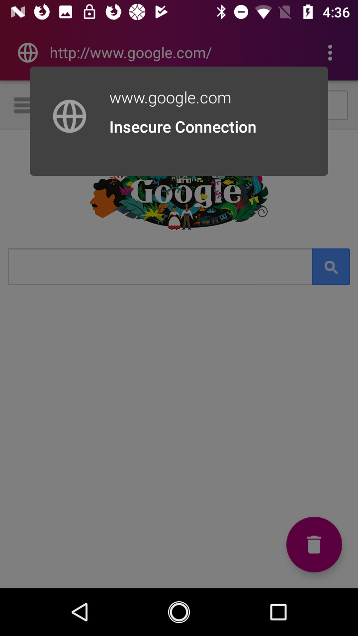
No HTTPS – in other words, HTTP (icon: none, or grey globe)
domainname.net
<red>Connection is Not Secure</red>
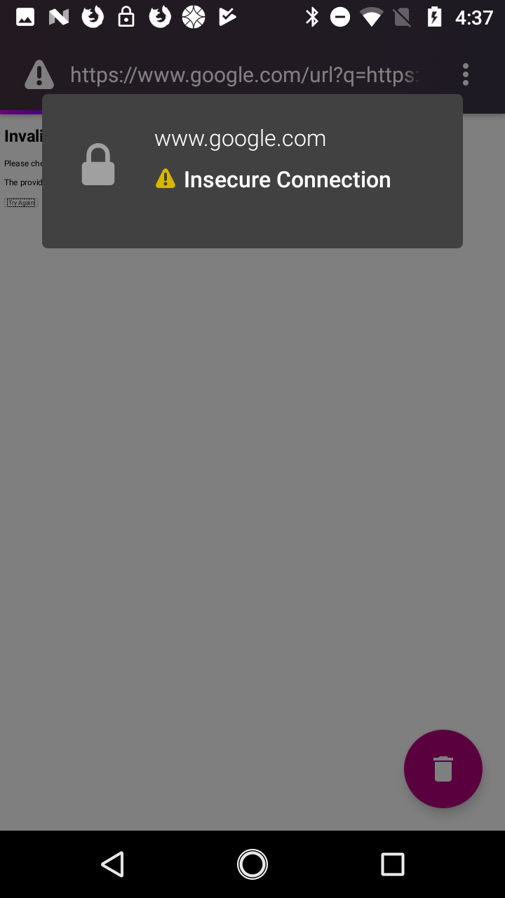
Bad HTTPS (icon: crossed out grey lock)
domainname.net
<red>Connection is Not Secure</red>
We can consider adding explanatory captions like “You should not reveal your personal information (like passwords or credit cards) on this site, because it can be stolen.” later. For now, designing for these states with helpful info texts is what’s important.
 brampitoyo
on 29 May 2017
brampitoyo
on 29 May 2017
Doorhangers

URL bar icons
I feel conflicted about adding any colour to the URL bar icon, because it’s visually distracting. My proposed solution is to make all the site status icons white. When you tap on it to get more info, then we’ll show some colours, as above.

Thoughts?
brampitoyo
on 29 May 2017
nice! I like where this is going. We should look to align with Photon iconography as well when we get to this.
antlam
on 29 May 2017
Photon site info icons

Replaced the lock icon with the one used on desktop Photon.
The yellow warning sign was also directly taken off desktop Photon.
I wasn’t able to find a Photon take on the globe icon, so I had to recreate it by combining the Photon circle with the old continent shapes. It doesn’t look as good as the other ones. We’ll think of something else.
brampitoyo
on 30 May 2017
Overall this looks pretty good to me. :)
(I'm a bit hesitant to think too much about non v1 issues this close to release now - there's no clear roadmap yet)
pocmo
on 30 May 2017
Sounds good, @pocmo. I’ve tagged this issue post-v1, so we don’t have to worry about it now. Let’s continue to refine it when necessary.
brampitoyo
on 31 May 2017
@brampitoyo Are the UX mocks in this bug final? I wonder if we can get this to our contributors.
 mcomella
on 26 Oct 2017
mcomella
on 26 Oct 2017
The interaction is final, but the visual design – specifically, colour values – need to be tweaked ever so slightly, to conform to Photon.
The green value we use for the icon and text is green-60 #12bc00, and the icon is called Identity Secure. Unfortunately, the icon you find on the Photon Icon Library is outdated, but Firefox for Desktop already uses the new green lock SVG, with slightly different proportion. Use this one instead.
The red value for the text is red-60 #d70022, and the world icon is called Identity Not Secure. The icon is outdated, but it’s all we have at the library, so let’s use it for the time being.
And the yellow value for the warning icon is yellow-60 #d7b600, and the icon is called warning-16.
Hope this helps!
brampitoyo
on 26 Oct 2017
Happy to take this on since this bugs me occasionally.
IIRC WebView doesn't actually provide data for EV certificates, but I'll check that again - perhaps that's been fixed in more recent WebView (and/or we can try adding it directly ourselves : ) ).
ahunt
on 5 Dec 2017
Hi @ahunt , did you end up starting work on this, or should I take it over?
 ekager
on 27 Feb 2018
ekager
on 27 Feb 2018
@brampitoyo wondering if any of these icons need updating from previously specified from the Photon library, etc?
ekager
on 27 Feb 2018
@ekager As far as I’m aware, our icon situation is still the same as October. Maybe it will help to have a look at the icons that Firefox for Android uses, and use them for our own design?
brampitoyo
on 27 Feb 2018
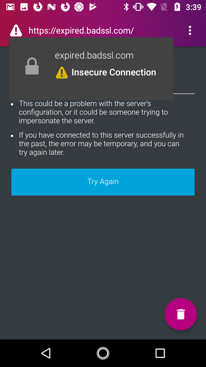
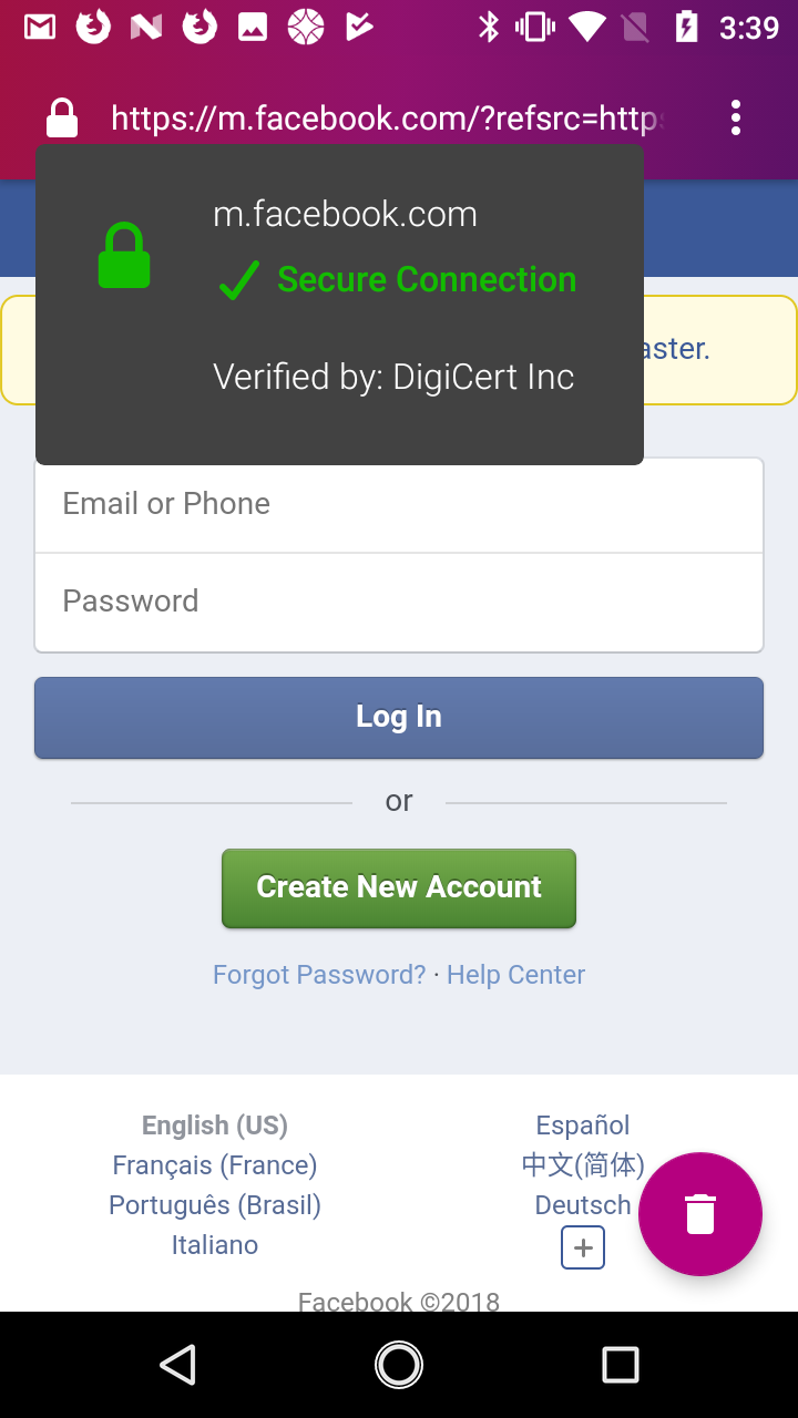
After talking with @ekager, we’ve decided to follow Fennec’s SSL info modal design instead of implementing our own (circa October 2017).
When we started this project, Fennec didn’t have a Photonised design. We wanted to look forward, so have came up with the designs above. Since then, Fennec had been redesigned from the ground up. This included the SSL info modal. For consistency and simplicity, we should follow it.
The only thing we will do differently is to use a dark background for the modal (Fennec uses light). Everything else (icons, spacing, copy, etc.) should follow Fennec.
brampitoyo
on 28 Feb 2018
Hi @ahunt , did you end up starting work on this, or should I take it over?
With out current timeline I guess it's pretty safe to take this over. There are two commits linked above. Maybe they are helpful: 4776404eb2d1ee682075ab49569bdb8cbe0eeb41 4955a361c4476ab6bdd5e9cb717cc58a75a57a8f.
I wonder if we can get everything we need for this dialog from WebView. On IRC snorp mentioned that onSecurityChange() should provide this data in GeckoView.
@ekager As far as I’m aware, our icon situation is still the same as October. Maybe it will help to have a look at the icons that Firefox for Android uses, and use them for our own design?
Do we have vector images for those? Afaik in Fennec we still use PNGs mostly (Maybe this changed with the redesign though).
pocmo
on 28 Feb 2018
Do we have vector images for those? Afaik in Fennec we still use PNGs mostly (Maybe this changed with the redesign though).
Yes, we do. I’ve given the link to our Fennec SVG folder to @ekager in a DM.
brampitoyo
on 1 Mar 2018
Tagging @brampitoyo for quick review of the three states
ekager
on 3 Mar 2018
Hi Emily, you’re on the right track! Just a few items to note, so we can match Fennec’s style a bit more:
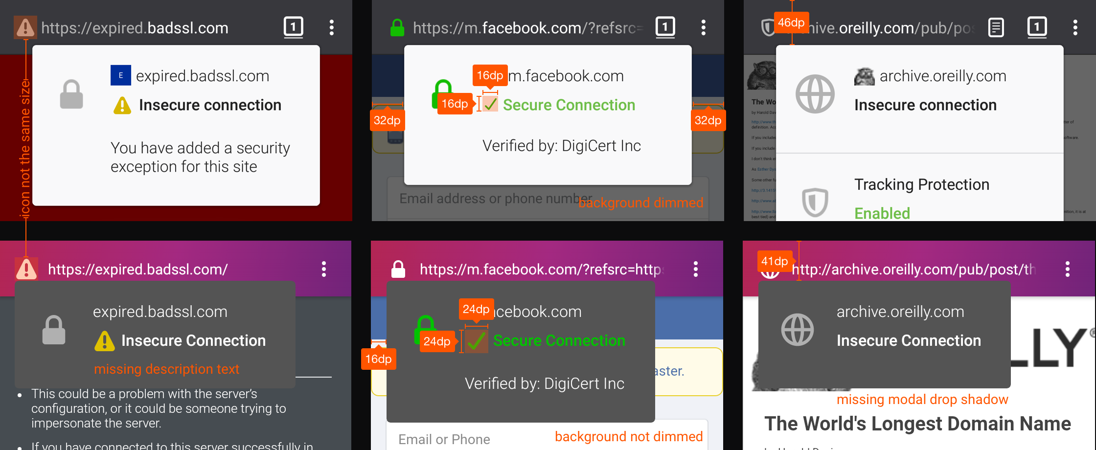
- Fennec’s warning icon on the toolbar is slightly smaller than ours.
- After adding exception, our SSL modal seems to be missing a text that says “You have added a security exception…”. But last week, you wrote that Focus doesn’t yet have an ability to add an exception – perhaps I’m misunderstanding.
- Our warning and checkbox icons inside the SSL modal seems to have a 24dp dimension. Fennec’s icon: 16dp.
- Fennec’s SSL modal has a fixed width with equal 32dp side margins. We have a flexible width with 16dp left margin.
- Fennec’s SSL modal has more top margin (I measured 46dp, but could be wrong) than ours (41dp)
- When Fennec’s SSL modal is opened, the website background is dimmed with a transparent grey overlay. Ours aren’t dimmed.
Hope these changes aren’t tricky to make!
brampitoyo
on 4 Mar 2018
Hi @brampitoyo , I've made some changes to the popup.
The warning icon may look bigger but the ImageView is set to 24dp x 24dp so I'm not sure why it would be bigger... It may just be a more square icon so looks bigger, but I could add a bit of padding when this icon is displayed if this is not acceptable?
In terms of the shadow I'm using 4dp elevation that follows the style of the popup menu.
You cannot add a security exception for sites with insecure connections. The page will just not load and you will get an error. So there is no exception text?
ekager
on 7 Mar 2018
The warning icon may look bigger but the ImageView is set to 24dp x 24dp so I'm not sure why it would be bigger...
Thanks a lot for looking into this! Maybe it’s possible that the SVG used on Fennec has a bigger margin? Anyway, we shouldn’t change anything from our end. Let’s keep the dimension that’s already in use today.
In terms of the shadow I'm using 4dp elevation that follows the style of the popup menu.
I hope it’s not just my sights, but I still can’t see the shadow. I reckon this may just be the quirk of the simulator, and the end result would look alright.
You cannot add a security exception for sites with insecure connections.
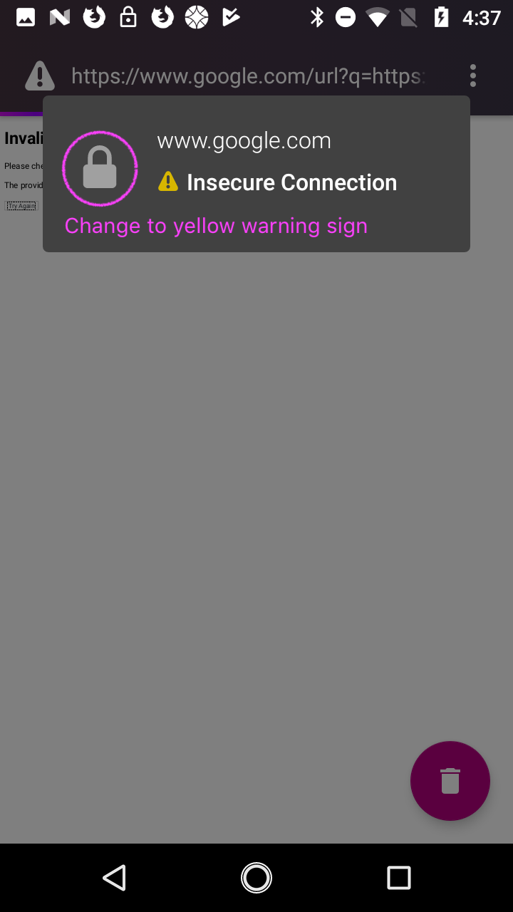
Right. So then, on this particular scenario, let’s change the grey lock icon on the left-hand side of the modal to a yellow warning sign.
Everything else looks really good!
brampitoyo
on 7 Mar 2018
Thanks @brampitoyo ! Made that change and I also figured out the shadow issue. :)
ekager
on 7 Mar 2018
Related issues
 facyber
·
4Comments
facyber
·
4Comments
 runboy93
·
5Comments
runboy93
·
5Comments
 jonalmeida
·
7Comments
pocmo
·
7Comments
jonalmeida
·
6Comments
jonalmeida
·
7Comments
pocmo
·
7Comments
jonalmeida
·
6Comments
Most helpful comment
Happy to take this on since this bugs me occasionally.
IIRC WebView doesn't actually provide data for EV certificates, but I'll check that again - perhaps that's been fixed in more recent WebView (and/or we can try adding it directly ourselves : ) ).