Flex-layout: new directive fxLayoutGutter
Proposal
What is the summary of the proposal?
<md-card-content>
  <div fxLayout="row wrap" fxLayoutGap="24px">
    <md-input-container fxFlex="25%">
      <input mdInput placeholder="Name">
    </md-input-container>
    <md-input-container fxFlex="25%">
      <input mdInput placeholder="Occupation">
    </md-input-container>
    <md-input-container fxFlex="50%">
      <input mdInput placeholder="Company">
    </md-input-container>
  </div>
</md-card-content>
fxLayoutGap adds this style:
margin-right: 24px;
In this case there will be a transition to a new line, but I would not like
Using css calc is not convenient fxFlex="calc(50% - 24px)"
What is the proposal?
Create new directive fxLayoutGutter ~or update fxLayoutGap~
If set to fxLayoutGutter="24px" apply a style padding:
padding-left: 12px;
padding-right: 12px;
We divide the value of fxLayoutGutter / 2 and insert padding in the style
Is there anything else we should know?
This implementation is in ng-zorro grid
 4val0v
All 13 comments
Have you tried using fxLayoutGap="24px grid"?
 CaerusKaru
on 16 Jul 2019
CaerusKaru
on 16 Jul 2019
@CaerusKaru yes, padding is added to the right and bottom padding: 0px 24px 24px 0px;
4val0v
on 16 Jul 2019
I'll discuss this with @ThomasBurleson, but my direct impression is that we won't be adding a new directive for this in the near future. If you'd like to add the functionality yourself, you can add a StyleBuilder for fxLayoutGap that, for instance allows you to add gutter to a value for this.
E.g. fxLayoutGap="24px gutter"
CaerusKaru
on 17 Jul 2019
as an option, reconsider the implementation fxLayoutGap="64px grid"
currently, padding is added to the _right_ and _bottom_, as a result, the content is not quite centered
_Demo:_ stackblitz
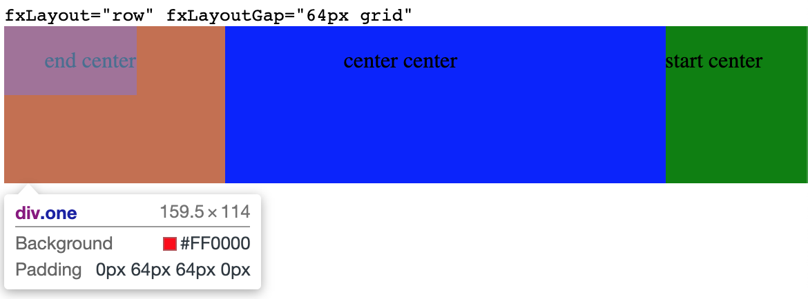
_I see the solution as follows:_
fxLayout="row" fxLayoutGap="64px grid" apply style padding: 0 32px;
fxLayout="column" fxLayoutGap="64px grid" apply style padding: 32px 0;
fxLayout="row wrap" fxLayoutGap="64px grid" apply style padding: 32px;
4val0v
on 19 Jul 2019
I completely understand your concern here, but there is a major concern here, which is that the grid functionality for fxLayoutGap has been established over several versions now. To break it would be a breaking change for users who are already adapting to these styles. Again, I'll discuss with @ThomasBurleson, but I'm not sure this is the type of change we'll get in in the near-term.
CaerusKaru
on 19 Jul 2019
I also do not understand the logic of adding padding only on the right side.
Alternative solution:
_Margin:_
fxLayoutGap="12px 0" => margin: 12px 0;
_Padding:_
fxLayoutGutter="8px" => padding: 8px;
fxLayoutGutter="32px 0px" => padding: 32px 0px;
_Example using:_
<div class="content">
  <div fxLayout="row wrap" fxLayoutGap="0 12px" fxLayoutGutter="4px 8px">
    <p>1</p>
    <p>2</p>
    <p>3</p>
  </div>
</div>

_Generated style:_
{
    margin: 0 12px;
    padding: 4px 8px;
}
 sergepomme
on 19 Jul 2019
sergepomme
on 19 Jul 2019
To break it would be a breaking change for users who are already adapting to these styles.
@CaerusKaru, This can be realized smoothly in this case
This will be a new repository, and we will write instructions for users on migration and changes 😉
If you look at the implementation option above, it can be implemented and old users will not have to edit their projects/styles
4val0v
on 19 Jul 2019
I'm also think fxLayoutGutter is necessary.
 nzbin
on 4 Sep 2019
nzbin
on 4 Sep 2019
What I'd like to see is a grid system where you explicitly set number of columns (or rows) - and then when adding padding it's trivial to figure out where to put it based on a super simple algorithm:
eg.
<div fxLayout="row wrap" fxLayoutGap="1em" fxLayoutColumns="3">
   <div>A1</div>
   <div>A2</div>
   <div>A3</div>
   <div>B1</div>
   <div>B2</div>
   <div>B3</div>
</div>
Then that generates this (flex layout knows how many items it is laying out):
   <!-- row 1: margin on right and bottom, but no right margin on 3rd item -->
   <div style="margin: 0 1em 1em 0">A1</div>
   <div style="margin: 0 1em 1em 0">A2</div>
   <div style="margin: 0 0 1em 0">A3</div>

   <!-- row 2: margin on right, and no right margin on 3rd item -->
   <div style="margin: 0 1em 0 0">B1</div>
   <div style="margin: 0 1em 0 0">B2</div>
   <div style="margin: 0 0 0 0">B3</div>
Simple - problem solved :-)
Most of the time I have a grid I know how many columns or rows it is. Yes you'd still have to be sure to correctly set item widths (not shown here), but all this negative margin stuff is no fun especially if you're adding padding to a component that already has its own padding.
 simeyla
on 11 Feb 2020
simeyla
on 11 Feb 2020
@simeyla That looks like an entirely different feature request (an interesting one!). Can you open a new ticket so we can track it there?
CaerusKaru
on 11 Feb 2020
@CaerusKaru sure - I already implemented it a while ago as a simple proof of concept based on flexLayoutGap and quite liked the way it worked, but my example code only went so far!
simeyla
on 11 Feb 2020
Closing this with new functionality where you can specify the padding/margin for both X and Y directions in grid mode. Feel free to try this out in latest nightly builds.
CaerusKaru
on 10 May 2020
This issue has been automatically locked due to inactivity.
Please file a new issue if you are encountering a similar or related problem.
Read more about our automatic conversation locking policy.
_This action has been performed automatically by a bot._
![angular-automatic-lock-bot[bot] picture](https://avatars.githubusercontent.com/in/40213?v=4&s=40) angular-automatic-lock-bot[bot]
on 10 Jun 2020
angular-automatic-lock-bot[bot]
on 10 Jun 2020
Related issues
 mhosman
·
3Comments
mhosman
·
3Comments
mhosman
·
3Comments
mhosman
·
3Comments
 JadedEric
·
4Comments
JadedEric
·
4Comments
 jcoronel94
·
4Comments
jcoronel94
·
4Comments
 Splaktar
·
4Comments
Splaktar
·
4Comments
Most helpful comment
I'm also think
fxLayoutGutteris necessary.