Files: Packed icons on sidebar in File Chooser
Prerequisites
- [x] I have searched open and closed issues for duplicates.
Describe the bug
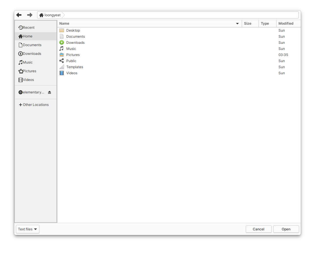
Spacing between icon and text on sidebar is too small in file chooser.
To Reproduce
Steps to reproduce the behavior:
- Anything that opens FileChooser
Expected behavior
Screenshots or screen recordings
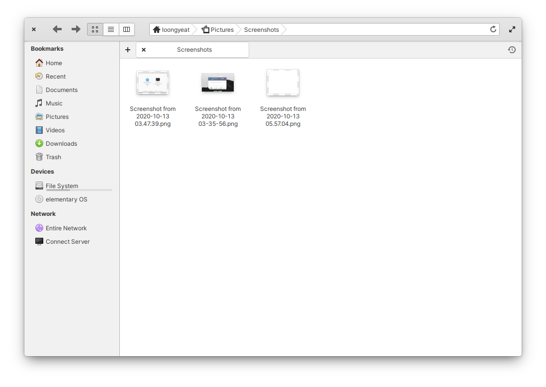
In comparison to the sidebar in Files for instance
The spacing between the icon and text in FileChooser is a little too tight. The margin around the breadcrumb is also very small, though I'm not sure if this is a design decision or not.
Logs
Platform Information
- [ ] I'm using the latest version from git that I've manually compiled
- [ ] I'm using the latest released stable version
Additional context
 pongloongyeat
👍1
All 2 comments
Depends on https://github.com/elementary/files/pull/1417
and probably also https://github.com/elementary/files/pull/1453
 danrabbit
on 13 Oct 2020
danrabbit
on 13 Oct 2020
The current Filechooser is basically the Gtk.FileChooser with the pathbar replaced by the Files one. Once the NativeFileChooser portal is implemented then we will be able to provide a completely redesigned FileChooser that will match the FileManager UI.
 jeremypw
on 13 Oct 2020
jeremypw
on 13 Oct 2020
👍3
Was this page helpful?
0 / 5 - 0 ratings
Related issues
 cassidyjames
·
6Comments
cassidyjames
·
6Comments
 Gabriel-p
·
6Comments
Gabriel-p
·
6Comments
 marbetschar
·
6Comments
danrabbit
·
3Comments
marbetschar
·
6Comments
danrabbit
·
3Comments
 CodingSpiderFox
·
5Comments
CodingSpiderFox
·
5Comments
Most helpful comment
The current Filechooser is basically the Gtk.FileChooser with the pathbar replaced by the Files one. Once the NativeFileChooser portal is implemented then we will be able to provide a completely redesigned FileChooser that will match the FileManager UI.