Files: UI improvements for title bar / tab bar
Is your feature request related to a problem? Please describe.
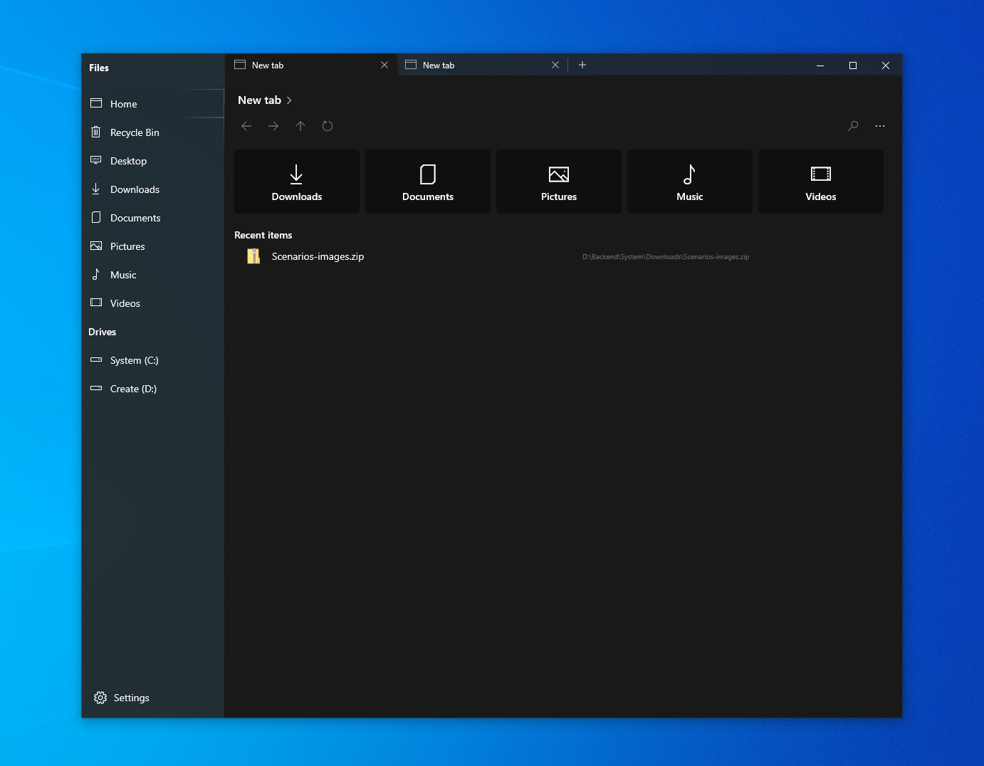
Right now, the app uses tab metaphors similar to Edge Chromium.
In Edge, it can be seen that there is a small gap between tab and top edge of app only when the app is NOT maximized to fullscreen. In other cases, there is no gap.
This is to let the user drag and move the window when it's not fullscreen.
Coming to a similar issue, a gap is left at the top-left corner of Edge Chromium for two reasons:
- The tab has an outward curve in the bottom (this is not the main reason)
- The gap is for the user to drag and move the window even when full-screen


In the above image,
(1) is not required at all
(2) is required only when app is not fullscreen (also let user drag and move in that area)
(3) must support drag and move
With the implementation of (3), (2) can be ignored since Edge Chromium does that only since it doesn't have a space like the sidebar. This will look similar to the actual proposal of Windows Sets, with the modern visual style of Edge Chromium.
Describe the solution you'd like
In Files UWP, I propose a few changes:
- Since there is a sidebar, the top left gap of tabs in Edge chromium need not be replicated.
- The space above the sidebar elements must let the user drag and move the window.
- Once these two are implemented, the top gap above the tabs can be removed when fullscreen.
This will improve the visual layout too, by providing a natural division between sidebar and tabs; right now, the top-left gap is breaking the UI.
 jayasio
All 4 comments
Hiding tabs is nice.
I still think the gaps are creating issues; For example, the gaps and sidebar being both Acrylic, it feels like the sidebar is independent of the tabs, and the explorer (tabs and explorer look like they're placed above the Acrylic), but it's actually not.
664 is something I'm referring to as a better solution, with respect to tabs alone.
The sidebar is not actually an independent part of the UI, it is closely related to the tab that's shown. Switching the tab changes the highlighted option in the sidebar, and so technically the metaphor is that the sidebar belongs to the tab. See how the highlight on "Home" overlaps with the tab bar? So the separation between sidebar and explorer must be a hard line; now that I look at it, the area (3) must be fully blank to match the height tab bar.
There's a clash of metaphor in the UI.
EDIT: Also, I think the URL bar can be compared to the navigation bar and the webview can be compared to the file browser view.
Speaking of metaphors, Firefox with favorites sidebar matches one to one to Files UWP's older design.
The new design shortens the tab bar and navigation bar to match the file browser view's width, thereby letting the sidebar fill the whole vertical space.
(I want to discuss the smaller side of the UI since I appreciate the project and my contributions can only be from the UI/UX side; I hope it's okay since it's not as big as a code issue/feature.)
jayasio
on 22 Jun 2020
Roughly, this creates an invisible line on the title bar, including the title ('Files'). The 'Files', tabs, and minimise, maximise, close controls fall into a single title bar. The sidebar is an extension of the tab content. In a high contrast theme or transparency disabled, the separation will be much prominent.
jayasio
on 22 Jun 2020
I feel strongly that @jayasio is correct on this one.
There are two notable problems with our current layout which may cause subconscious confusion among users:
- Being extended to the top region of the app, the sidebar is independent of its adjacent content because the TabView is placed next to it. This is incorrect.
- The sidebar also shares the same material as the titlebar background which implies they are on the same footing.
We are working on allowing users to hide the TabView altogether, which requires decoupling of the content page from the TabView. With that said, users who love multitasking with tabs, we hear you loud and clear!
These users opting to use the TabView will have a slightly different experience compared to what is available today. We're hoping to not only correct the broken design metaphor existing in the app, but also provide genuine improvements to the TabView where needed. While we have no concrete release date, we're hoping to improve:
- Personality: How much information does each open tab reveal? What makes each tab different besides an icon and text?
- Multi-tasking: How difficult is it to work between tabs?
- Consumption: In what ways can we reduce clutter and bring focus to the relevant content itself.
We'll post screenshots of the new implementation as they're ready.
 duke7553
on 1 Jul 2020
duke7553
on 1 Jul 2020
Thank you for creating this feedback item. A solution to this issue is currently resolved in one of our active development branches and will be shipped after we've validated that everything works properly via code review.
We will notify you when this feature is in a PR
duke7553
on 14 Jul 2020
Related issues
 szaimen
·
4Comments
szaimen
·
4Comments
 alialix2
·
3Comments
alialix2
·
3Comments
 xpirad
·
3Comments
xpirad
·
3Comments
 ChenShihuan
·
3Comments
ChenShihuan
·
3Comments
 crashmit
·
3Comments
crashmit
·
3Comments