If you haven't already, check out https://github.com/duke7553/files-uwp/pull/96 for a sneak-peak at the new designs for Files UWP. Your feedback and concerns are welcome! Please discuss high-level, conceptual ideas here and lower-level, code-related ideas on the PR itself.
Thanks everybody,
Luke Blevins
Developer of Files UWP
 duke7553
All 10 comments
Just a thought, you might want to implement rounded corners around the app as that seems to be the current things in Windows.
 yaichenbaum
on 9 May 2019
yaichenbaum
on 9 May 2019
@yaichenbaum Perfect timing. I just issued a commit ~5 minutes ago that starts this process. Also, instance tabs are nearing completion unless I run into a bug. I'll update the picture on the PR to reflect these design changes so far.
duke7553
on 9 May 2019
@yaichenbaum Not done yet... ;) In case you were wondering, the ribbon item selection indicator, Favorites item cards, and PathBar are now rounded. Drop shadow will come back eventually to the Ribbon pane.
duke7553
on 9 May 2019
Looking really nice!
yaichenbaum
on 9 May 2019
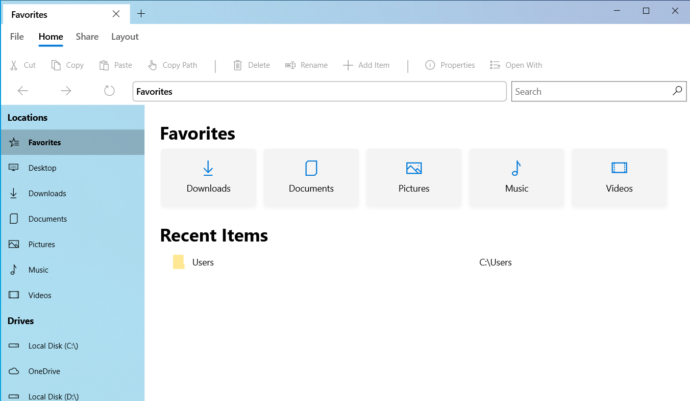
First newui snapshot is now available.
duke7553
on 14 May 2019
I think the sidebar should be less transparent. Maybe like the Settings app.
 fauzie811
on 15 May 2019
fauzie811
on 15 May 2019
newui has been completely merged into master now that it's stable.
duke7553
on 1 Jun 2019
A few settings I'd like to see implemented:
- Disable "Recent Items"
- Show file extensions in folders
- Ability to pick date format for the "Modified" column
- Ability to calculate folder size and show it in the "Size" column (Not sure how hard this would be)
 Nanorithm
on 6 Jun 2019
Nanorithm
on 6 Jun 2019
Hello @UltimateSky,
Please open an issue report for ideas 1-3. Idea 4 would not be practical because going through a folder and its sub-items is computationally intensive, and would slow down the loading of larger directories. This will, however, come to the properties dialog.
Thanks!
duke7553
on 8 Jun 2019
Closing this - since the first phase of the newui has shipped.
duke7553
on 8 Jun 2019
Related issues
 eraychumak
·
3Comments
eraychumak
·
3Comments
 xpirad
·
3Comments
xpirad
·
3Comments
 szaimen
·
4Comments
szaimen
·
4Comments
 xmha97
·
3Comments
xmha97
·
3Comments
 Cyberdroid1
·
3Comments
Cyberdroid1
·
3Comments
Most helpful comment
First newui snapshot is now available.