Files: White / Light File-Thumbnails are Invisible
Images that are mostly white, especially icons, aren't visible unless selected. This creates a very broken-looking, inconvenient user experience:
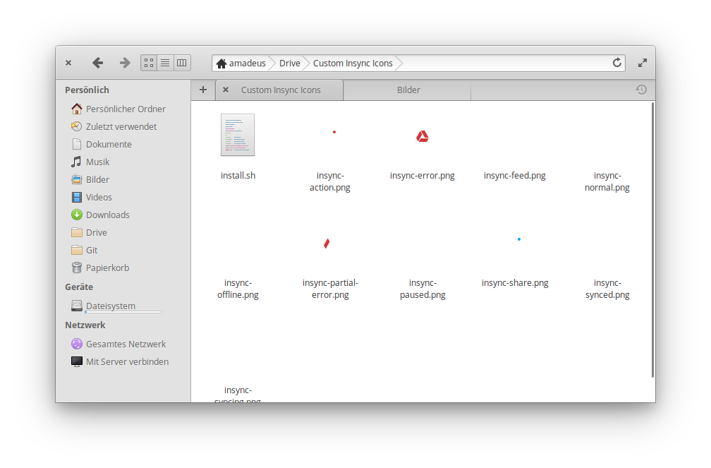
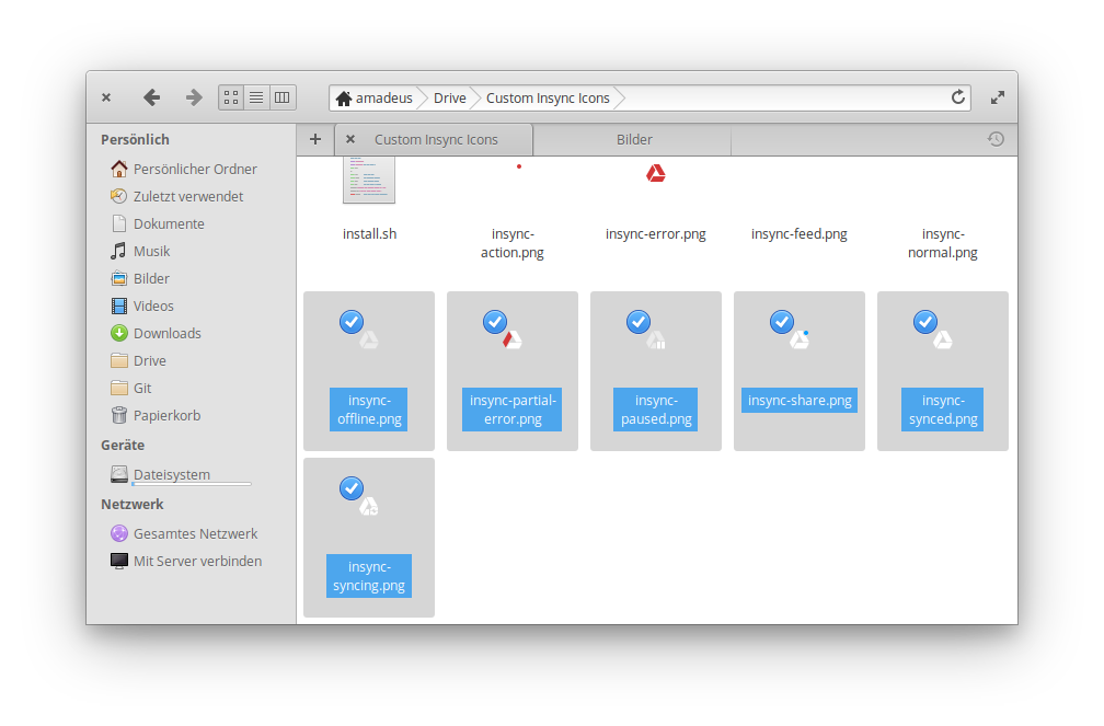
Perhaps in cases like this there should be some sort of border around the thumbnail? Or a darkened background color? It's a tricky thing to fix, but I believe it would be greatly beneficial if a solution could be found.
Keep up the great work!
Want to back this issue? Post a bounty on it! We accept bounties via Bountysource.
 amxmln
All 34 comments
I guess an off-white background might be acceptable (perhaps as an option like in Code) but needs the UX-team to alter the style sheet. Icons that are mostly the same color as the background (whatever it is) are always going to be hard to see, especially if small. There used to be a setting to force icons to be scaled to the zoom setting of the view but that was removed as it resulted in blurry icons.
I doubt a border would be acceptable.
 jeremypw
on 28 Oct 2018
jeremypw
on 28 Oct 2018
If a border is truly not an option (why not?), then an off-white background is probably going to be the best solution, I think there's much more pure-white out there than, say, a light grey.
amxmln
on 29 Oct 2018
You are welcome to submit a mockup of how a border would look in the case shown above.
jeremypw
on 29 Oct 2018
In Windows and MacOS, they chose to use a border shadow:
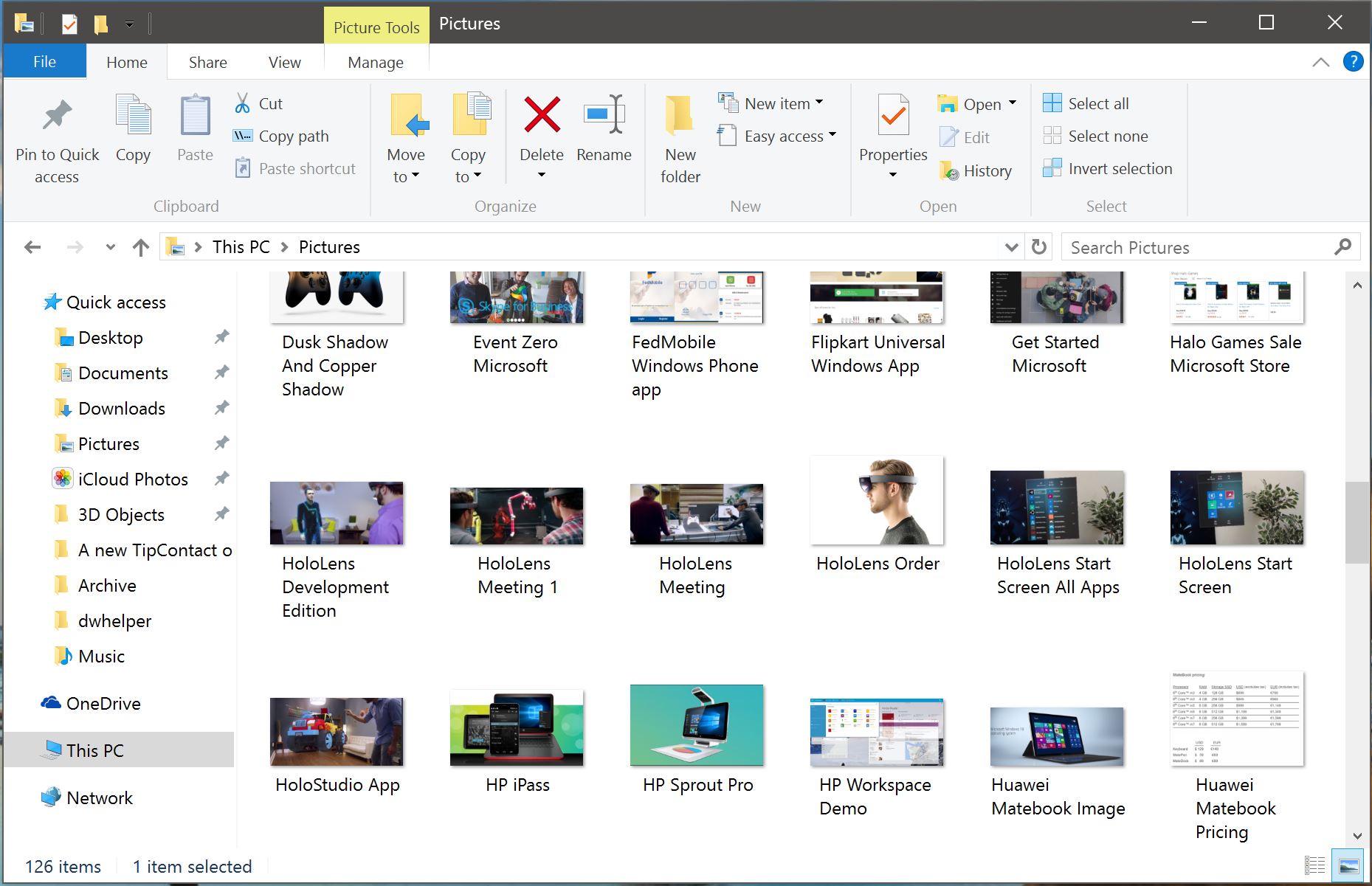
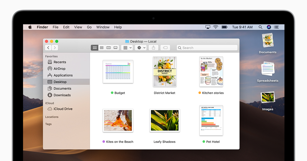
(Note the additional inner padding)
Gnome went with a border and inner padding:

IMO the best looking solution is border-shadow + inner padding
 Akryum
on 3 Jan 2019
Akryum
on 3 Jan 2019
@elementary/ux Any opinion on this?
jeremypw
on 3 Jan 2019
I would not be terribly opposed to looking a subtle border + shadow or something on thumbnails (but not other icons, obviously). However, I don't see how that would actually fix the issue here. White on white is always going to look weird. Instead, we could add the .checkerboard class to thumbnails and see what that looks like?
 cassidyjames
on 3 Jan 2019
cassidyjames
on 3 Jan 2019
The border makes it clear it's a thumbnail with a transparent or white image, and also where you can click with the mouse to open it.
Akryum
on 3 Jan 2019
Maybe some smart logic could be applied, if the thumbnail is mostly transparent or white, add a checkerboard. 😸
Akryum
on 3 Jan 2019
@Akryum that sounds like spooky magic that would come off as unpredictable. Instead I think we'd want to apply the same logic to all thumbnails.
cassidyjames
on 3 Jan 2019
Files code is carrying around a (now empty) file called "thumbnail_frame.png" but this has not been used for many years. There also used to be a function GOF.File.thumbnail_can_frame which stopped icons in certain directory being framed. Presumably this was discontinued for design reasons. So we need to make sure the frame/border/shadow is sufficiently subtle to be acceptable for general use.
jeremypw
on 4 Jan 2019
But imo it should be visible enough to be useful and make the thumbnail more accessible. 👁
Akryum
on 4 Jan 2019
Nemo uses a drop shadow which looks good to me:
Nemo:
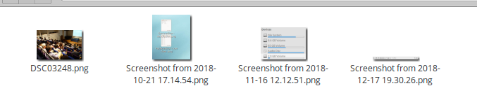
for comparison Files:
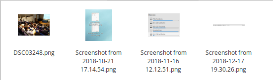
jeremypw
on 4 Jan 2019
The problem with pale thumbnails is also exacerbated by the fact that Files lightens the items the cursor is hovering. Perhaps this can be tweaked so pale items are not lightened so much. Or another way of highlighting is used.
jeremypw
on 4 Jan 2019
I notice that Nemo does not use the shadow in icon folders so the original problem (with folder "Custom Insync Icons") would not necessarily be fixed. I do not know whether MacOS or Windows treats icon folders differently this way. Is it desirable?
jeremypw
on 4 Jan 2019
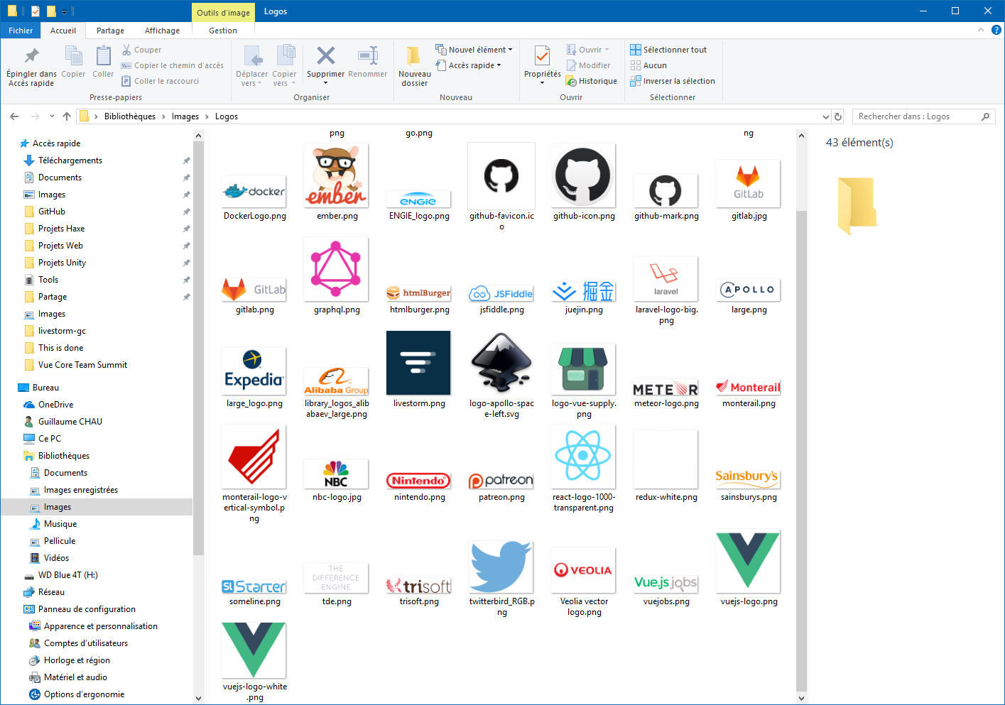
Here is a screenshot of a folder containing logos in Windows 10:
Akryum
on 4 Jan 2019
OK, thanks. It looks like Windows always uses the frame then. I must admit was never sure of what the rationale was of treating icon folders differently.
jeremypw
on 4 Jan 2019
I think every thumbnail should have it. Gnome files doesn't do it for PDF files (see the screenshot in previous posts), which shows the same issue Files currently has.
Akryum
on 4 Jan 2019
@jeremypw The issue is still relevant. Any idea how to solve this elegantly?
 4jNsY6fCVqZv
on 31 Jul 2019
4jNsY6fCVqZv
on 31 Jul 2019
Looks like the design team has not decided on a solution yet. I'll ask what they would prefer.
jeremypw
on 31 Jul 2019
In Photos we add the checkerboard and card style classes. I think we could do the same here to resolve the issue.

 danrabbit
on 31 Jul 2019
danrabbit
on 31 Jul 2019
I suspect Photos uses widgets to display the thumbnails which are easier to style. May not work so easily with a CellRenderer - but I'll see what can be done.
jeremypw
on 31 Jul 2019
I agree stylistically with @danrabbit; if we can add the style classes themselves then let's do that, otherwise let's try something that looks similar.
cassidyjames
on 31 Jul 2019
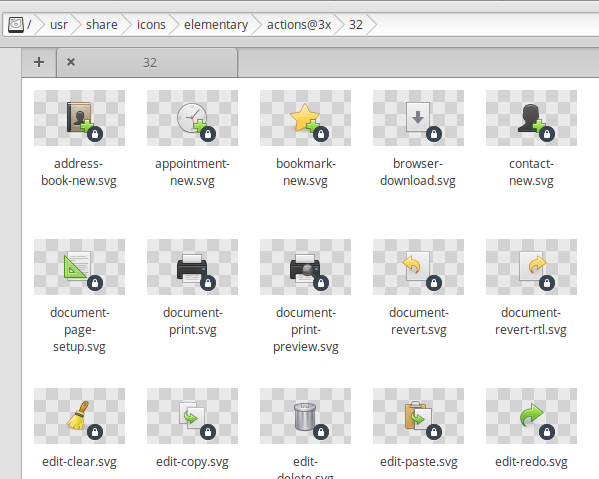
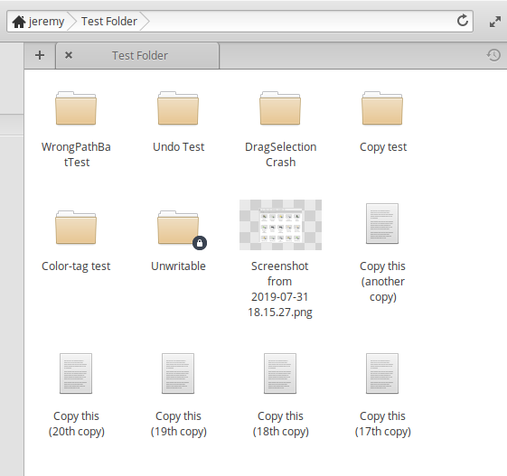
This is what you get when adding those style classes and (re)rendering the background of the cell area before rendering the icon:
jeremypw
on 31 Jul 2019
Looks like the card class isn't really showing up but I think that checkerboard looks sane to me :)
danrabbit
on 31 Jul 2019
Mixed items:
jeremypw
on 31 Jul 2019
Cool, but i agree they will look nicer with .card class (i don't know if this is possible) so that they will look like actual images in a grid instead of floating checkerboard.
 fabiozaramella
on 31 Jul 2019
fabiozaramella
on 31 Jul 2019
CARD class may only work for containers. I tried using render_frame after adding that class to the style context but nothing was visible.
jeremypw
on 31 Jul 2019
Thanks for working on this! And for your ideas.
I wonder: What will your solutions for PDF's or Open Document file formats look like?
4jNsY6fCVqZv
on 1 Aug 2019
@4jNsY6fCVqZv At the moment, the checkerboard background is only applied to image files (mimetype "image/*") but that could be extended. I want to add a shadow as well but haven't worked out how yet.
jeremypw
on 1 Aug 2019
@jeremypw That would be wonderful, if checkerboard or card class can be extended in the sense of these file types!
Why does a shadow make sense when displaying thumbnails? That only applies to images, right?
4jNsY6fCVqZv
on 1 Aug 2019
@4jNsY6fCVqZv Whether and to which file types to apply a checkerboard background or shadow or frame etc open for discussion in the PR #1001. Its just a proof of principle at the moment. I am making progress on being able to add a frame or shadow if required.
jeremypw
on 1 Aug 2019
@jeremypw Thank you for working on a PR and for opening a discussion! For me the problem with PDF and Open Document files is intensified by the fact that the whitening effect is intensified again when hoovering over the image preview. Maybe you can also discuss this behavior in the PR as well?
4jNsY6fCVqZv
on 1 Aug 2019
Its probably best to leave that for a different PR. We need to decide what other visual feedback is appropriate for indicating the hovered file and cursor position. There is already another issue raised about this (#846).
jeremypw
on 1 Aug 2019
This has now been solved, or at least ameliorated by PR #1003 which was just merged.
jeremypw
on 1 Aug 2019
Related issues
 GammaGames
·
3Comments
GammaGames
·
3Comments
 a-tokarev
·
4Comments
danrabbit
·
3Comments
cassidyjames
·
6Comments
a-tokarev
·
4Comments
danrabbit
·
3Comments
cassidyjames
·
6Comments
 Djaler
·
5Comments
Djaler
·
5Comments
Most helpful comment
Looks like the card class isn't really showing up but I think that checkerboard looks sane to me :)