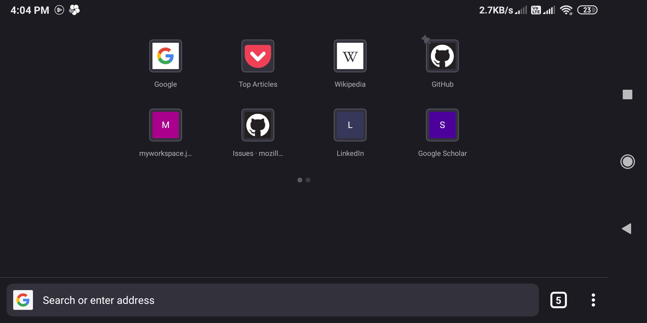
Fenix: Allow more than 4 top sites columns in landscape mode/ tablet
What is the user problem or growth opportunity you want to see solved?
Currently the topsites looks like this when I use the landscape mode.

While it certainly does not look as bad as it did before, it's clear that it can fit more sites easily (at least 2). I think it's best that we do not have a hard cap of how many top sites on one screen and let it adjust according to the screen size.
How do you know that this problem exists today? Why is this important?
Landscape mode feels very empty. Those using tablets will probably have an even worse experience
Who will benefit from it?
Tablet users mostly, and people who are using landscape mode for whatever reason
All 6 comments
I really wish they bring back unlimited topsites fenix is getting worse and worse.
Number of columns, rows and pages for top sites should be configurable. I don't understand when they reduced it how they failed to understand they will have a lot of users asking for that. Especially when on the issue to change it to only 4 sites and 2 pages it was pointed out. :-/
yes please we want more top sites, even on phone, not just tablets.
Not only in landscape mode. This is a Pixel C:

Not only in landscape mode. This is a Pixel C:
The Pixel C is a tablet and the title and the description of this issue already mention that tablets are affected as well. It's no surprise since tablets are much larger than smartphones. 😉
@cadeyrn Well, yes, obviously. I posted that screenshot to emphasise that the layout on some tablets is much worse than the screenshot in the OP suggests. Maybe some of the UX people have never seen a big Android tablet.
As you can see it's not just the number of items, it's the typeface too - they're almost unreadable.
Can or should this be added to #14921?
Most helpful comment
I really wish they bring back unlimited topsites fenix is getting worse and worse.