Fenix: Top sites are more prominent on the homescreen
Based on a large number of user feedback, a lot of our users are finding it read the title of top sites as they are too small. Especially when a user have 2 links saved from the same domain (similar favicon) they find it difficult to distinguish between the two. Users have also expressed that the top site icons are too small for something that is supposed to help them get to where they need faster, whereas the "collections" CTA/placeholder is much larger in proportion.
User Story
- As a user, I want my top sites to look more prominent on my homescreen so they are more useful to me.
Acceptance Criteria
- I can easily read the title of a top sites and distinguish between two top sites from the same domain.
- The size of the top site icons are larger and more prominent than the collections CTA/placeholder.
UX
- Specs for the top sites section, and for the updated favicon below
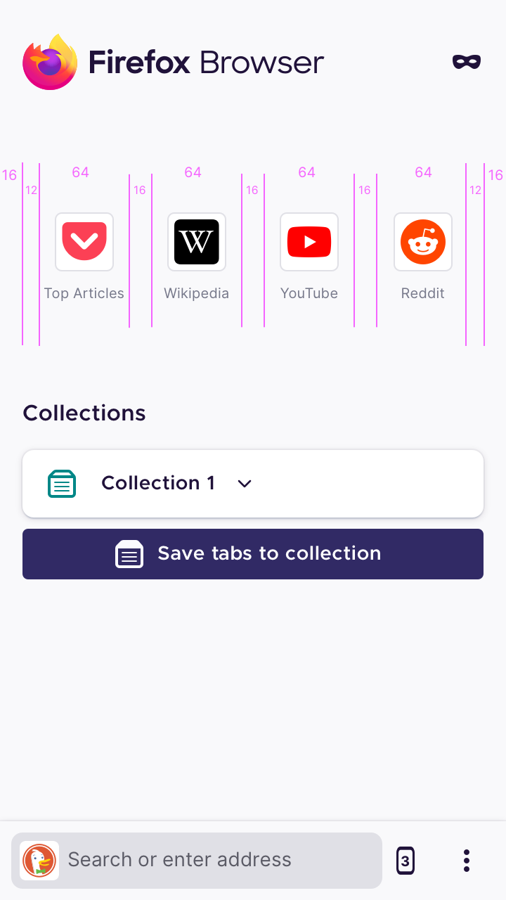
- The Top Sites section should have 4 top sites in a row. This should also allow the full 'Top Articles' text to be visible for the default Pocket top site.
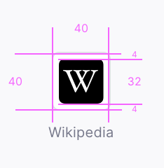
- The favicon size should be increased to 32x32px, leaving 4px of padding inside the favicon container
Top Sites
Top Site Favicon
 vesta0
All 35 comments
@apbitner will add specs for what these should be for making Top Sites more prominent.
 liuche
on 13 Aug 2020
liuche
on 13 Aug 2020
UX specs have been added to comment zero. Please let me know if any additional specs are needed.
 apbitner
on 18 Aug 2020
apbitner
on 18 Aug 2020
hey @apbitner not sure if I can see the changes to comment zero - should they be dimens or an abstract link?
liuche
on 18 Aug 2020
@liuche Whoops, forgot to hit 'update comment' 🤦🏻♂️
apbitner
on 18 Aug 2020
Could the text under the favicon be black? The gray is hard to read (old eyes).
 Cheap-Skate
on 18 Aug 2020
Cheap-Skate
on 18 Aug 2020
@Cheap-Skate We have some auditing to do of font colors for accessibility so we'll definitely be taking a look at this.
apbitner
on 20 Aug 2020
Hi all,
Is that 4 icons per row fixed regardless of resolution or variable?
Why so much space between the icons? I know that you want to make the home page look nice and airy but you could maintain 4 sites on the top row and make those icons even bigger.
Also, what's the spec for space between icon and its text, and between each row of icons? It would be helpful to see a full homescreen mockup of this (state the resolution please).
Thanks 🙂
 madb1lly
on 20 Aug 2020
madb1lly
on 20 Aug 2020
How text will be displayed ? If it's still one row then it is no enough (even if there is more length) => it makes it impossible to differentiate top sites from github for example.
IMHO it's the main problem and I think it would be good to have an additional row for text.
Besides I feel having only 4 in 1 row would be perceived as a regression. I agree with @madb1lly resolution should be considered and it would be nice to have a before / after mockup.
On my mobile (OnePlus 7) I have 6 top sites fitting in 1 row and there is room for them taking more space and keeping them on the same row. I have no problem to identify icons, they are small but recognizable.
 Matth7878
on 20 Aug 2020
Matth7878
on 20 Aug 2020
My two cents as a visually impaired user:
- Contrast should be as high as possible => black font on white background
- icons should be as large as possible => no 4px or whatever amount of padding, rather fill all the available space
- because of the large icons, at least two rows, even better: make it fully configurable including empowering the user to get rid of Collections to make more room for more (large) top sites icons
The way the top sites looked on FF mobile pre-79 are a reference starting point, but actual _improvements_ are welcome (o;
Btw. neither my mom nor I can read any of the text under the icons on a tablet as the icons plus text are even smaller there than on a mobile phone.
 lineinthesand
on 20 Aug 2020
lineinthesand
on 20 Aug 2020
For whomever, works on this. Please build this on top of the PR for #8312, which moves the top sites limit to 16 (2 pages x 8 top sites in a 4 column grid).

 gabrielluong
on 24 Aug 2020
gabrielluong
on 24 Aug 2020
@gabrielluong The white border round the favicon looks larger in your recent mock up than in comment zero? Particularly noticeable with Wikipedia...
Comment zero, small borders

Mock up just now, large borders

Probably an oversight but I thought I'd point it out just in case (I very much prefer the small border comment 0 design)
Cheap-Skate
on 24 Aug 2020
@gabrielluong The white border round the favicon looks larger in your recent mock up than in comment zero? Particularly noticeable with Wikipedia...
Comment zero, small borders
Mock up just now, large borders
Probably an oversight but I thought I'd point it out just in case (I very much prefer the small border comment 0 design)
Totally understandable. The only takeaway from my mockup is the page indicator, 4 column x 2 row grid layout limiting to 8 top sites per page (max 2 pages). We should still work on making the icons and spacing appear as comment 0.
gabrielluong
on 24 Aug 2020
@Mugurell this is the critical for top sites bug that we pulled in from SPK - if you can build on top of the existing top sites work in #8312 from @gabrielluong there won't be as much trouble rebasing.
Let me know if you think that's something that fits into the remaining day of this sprint.
liuche
on 25 Aug 2020
Hi all,
The new layout is a terrible waste of space.
- I now have only 8 top sites on the screen at once, I have to scroll for the single top site which is on the other pane whereas before it was right in front of me
- Collections are pushed further down the page and I now have to scroll to access some of them
I already reported in #11694 that I have space for 6 icons in a row, and sadly this new UI wastes even more space.
I think that somehow the UI manages to use more space for the same number of top site links than Fennec does, whilst making the icons 1/4 of the size. This is a rough approximation but it's not far off true.
In short, please remove this improvement, it's a usability regression.
Cheers 🙂
madb1lly
on 26 Aug 2020
I can fit 12 columns in the same space, so it's even worse for me😔
 s-ankur
on 26 Aug 2020
s-ankur
on 26 Aug 2020
@madb1lly we are increasing the size of top site icons, that's why the change. However, our design should take different screen sizes + landscape mode into consideration. Thoughts @apbitner ?
vesta0
on 26 Aug 2020
The latest changes were not from this ticket so we still plan on improving the size of the icons. However, I don't believe we have plans to change showing 8 at a time, with the ability to swipe to view up to 8 more, for a total of 16.
apbitner
on 26 Aug 2020
Probably another issue but it would help customisation to be able to choose / change number of rows / columns / pages.
Matth7878
on 27 Aug 2020
After seeing the screenshots in #14278 - it looks good in the portrait mode but really bad in the landscape mode because of the large gaps. Maybe it's possible to give the "container" a maximum width and to center it? So that it is still flexible to a certain degree but to prevent too large gaps?
 cadeyrn
on 27 Aug 2020
cadeyrn
on 27 Aug 2020
@cadeyrn It can be done, with some work, but it might still look odd on a large tablet with high pixel density. I'm unsure what the best solution would be.
 codrut-topliceanu
on 27 Aug 2020
codrut-topliceanu
on 27 Aug 2020
FWIW in Chrome the width is limited. I don't have a tablet to test it but at least in the landscape mode of a smartphone it looks better with the limit in my opinion.
cadeyrn
on 27 Aug 2020
Hi @vesta0,
Ah, maybe I gave feedback on the wrong issue... so what you're saying is that the change to the 4x2 grid x2 pages has happened before the icon resizing, have I understood correctly? In which case the icons should get larger soon and it will look better.
About the size: why is it being defined in terms of pixels and not absolute dimensions, i.e. mm or inches? Some very high dpi screens make these icons look very small and the whole set is offset to the left (may not be a related issue, but I mention it here for completeness). Similarly, there might be some low resolution screens that can't actually fit that many icons across? What is the smallest resolution screen you're designing for?
So, can't the icons be sized according to screen dimensions, rather than resolution? That would allow larger screens to perhaps have more icons per row, maybe a 5x2 grid or even 6x2, and smaller screens could have 3x2 maybe (if any are that small). Personally I think I could easily use 5x2 or 6x2 on my screen (with the current icon size I could actually manage 7 or 8!).
I know that this would require some additional flexibility to be built into the homescreen layout code, however I'm sure it's not impossible. After all, Fennec must do something similar, because that is fixed 4x2 (I think) but occupies the whole screen width regardless of resolution (I know Fennec doesn't therefore display icons in absolute dimensions, but it still seems more adaptable than the current Fenix homescreen).
This additional flexibility would also allow different icon sizes to be selected by the user, e.g. for accessibility reasons.
Cheers 🙂
madb1lly
on 27 Aug 2020
@madb1lly While it's true that the measurements on the specs are in pixels, in practice we use dip (density independent pixels) when implementing those measurements inside the layout files for android. This ensures a similar look across screen sizes.
codrut-topliceanu
on 31 Aug 2020
Hi @codrut-topliceanu,
That's good to know.
Cheers 🙂
madb1lly
on 31 Aug 2020
Verified as fixed on Nightly 9/1.
Devices: Pixel 4 & Nexus 5 phones, Nexus 9 tablet
 sv-ohorvath
on 1 Sep 2020
sv-ohorvath
on 1 Sep 2020
Took a look at the latest version of this.
- The pins seem to be missing (the AC was pretty vague and didn't mention this, but it was present in the mockup here https://github.com/mozilla-mobile/fenix/issues/13765#issuecomment-679272439)
- the labels are really small (at least on my device) and are hard to read. See https://github.com/mozilla-mobile/fenix/issues/13850
- The borders still seem superfluous to me, especially since other browsers seem to handle this well. See https://github.com/mozilla-mobile/fenix/issues/11743
 yoasif
on 2 Sep 2020
yoasif
on 2 Sep 2020
2. the labels are really small (at least on my device) and are hard to read. See #13850

3. The borders still seem superfluous to me, especially since other browsers seem to handle this well. See #11743
I agree
Nit: Top Sites favicon border width no longer matches the long-press Back button History favicon border width, #14627
General moan, I dislike the favicon borders throughout Fenix,
- visibility - it makes the favicons smaller than necessary particularly History & Bookmarks, but also Top Sites and
- aesthetics - it doesn't look very Material Design
My eyesight is not great and it's hard for me to distinguish eg BBC News red square favicon from CNN red square favicon.
(This is almost a meta issue, @yoasif has linked to some of the other similar issues)
Cheap-Skate
on 2 Sep 2020
Took a look at the latest version of this.
- The pins seem to be missing (the AC was pretty vague and didn't mention this, but it was present in the mockup here #13765 (comment))
14145 will address the icon in the mockup.
- the labels are really small (at least on my device) and are hard to read. See #13850
- The borders still seem superfluous to me, especially since other browsers seem to handle this well. See #11743
gabrielluong
on 2 Sep 2020
@vesta0 Could you please state what the new requirements are? Or will the new comments be addressed in another issue?
codrut-topliceanu
on 3 Sep 2020
@apbitner we chatted about increasing the icon sizes but I can't remember where we landed. Can you please add your final recommendation here?
vesta0
on 10 Sep 2020
As part of this work we reduced the padding inside the rounded-rectangle frame to make the favicon inside larger. We did not change the size of the frame itself as this frame size is used in other places in the app where we show favicons and we want to remain consistent. The font color of the labels will be changed as part of app-wide accessibility improvements which will improve visibility of the top sites.
apbitner
on 10 Sep 2020
@apbitner It is confusing what you mean by frame - yours is the first usage of the term in this bug. :wink:
I think the issue initially asked that the icon size be increased - is that occurring or has it occurred? Personally, I don't care so much about the frame (I assume you mean the decoration/borders around the favicon) - I had previously filed https://github.com/mozilla-mobile/fenix/issues/11743 to eliminate it.
Some clarification here would be appreciated.
yoasif
on 10 Sep 2020
I think we should file a new issue for this new work.
gabrielluong
on 10 Sep 2020
@yoasif By frame, I mean the border around the icon with the white background. That has remained the same, but the icon within it has increased in size. However, we don't have control over the actual favicon being used, so some may be smaller or bigger than others. Related, we will be taking a look at favicon sizes used through the app in #14931
apbitner
on 10 Sep 2020
@apbitner thank you for the explanation!
yoasif
on 11 Sep 2020
Related issues
 andreicristianpetcu
·
3Comments
andreicristianpetcu
·
3Comments
 robsmith11
·
3Comments
robsmith11
·
3Comments
 AndiAJ
·
3Comments
AndiAJ
·
3Comments
 topotropic
·
3Comments
topotropic
·
3Comments
 abodea
·
3Comments
abodea
·
3Comments
Most helpful comment
Hi @vesta0,
Ah, maybe I gave feedback on the wrong issue... so what you're saying is that the change to the 4x2 grid x2 pages has happened before the icon resizing, have I understood correctly? In which case the icons should get larger soon and it will look better.
About the size: why is it being defined in terms of pixels and not absolute dimensions, i.e. mm or inches? Some very high dpi screens make these icons look very small and the whole set is offset to the left (may not be a related issue, but I mention it here for completeness). Similarly, there might be some low resolution screens that can't actually fit that many icons across? What is the smallest resolution screen you're designing for?
So, can't the icons be sized according to screen dimensions, rather than resolution? That would allow larger screens to perhaps have more icons per row, maybe a 5x2 grid or even 6x2, and smaller screens could have 3x2 maybe (if any are that small). Personally I think I could easily use 5x2 or 6x2 on my screen (with the current icon size I could actually manage 7 or 8!).
I know that this would require some additional flexibility to be built into the homescreen layout code, however I'm sure it's not impossible. After all, Fennec must do something similar, because that is fixed 4x2 (I think) but occupies the whole screen width regardless of resolution (I know Fennec doesn't therefore display icons in absolute dimensions, but it still seems more adaptable than the current Fenix homescreen).
This additional flexibility would also allow different icon sizes to be selected by the user, e.g. for accessibility reasons.
Cheers 🙂