Fenix: FNX2-15638 ⁃ When manually opened, the New Tab Page should be ready for quick search
Current
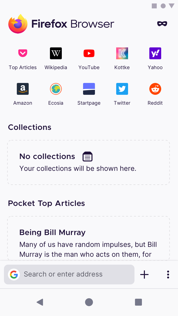
When the New Tab Page is opened from the tab tray, the address bar is not selected, and the keyboard does not come up.
Additionally, when the address bar is selected, the toolbar always “jumps” to the top of the screen, no matter where your toolbar has been positioned in Settings.
Proposal
When manually opened, the New Tab Page should be ready for quick search. And “the rest of the New Tab Page” should look more selectable.
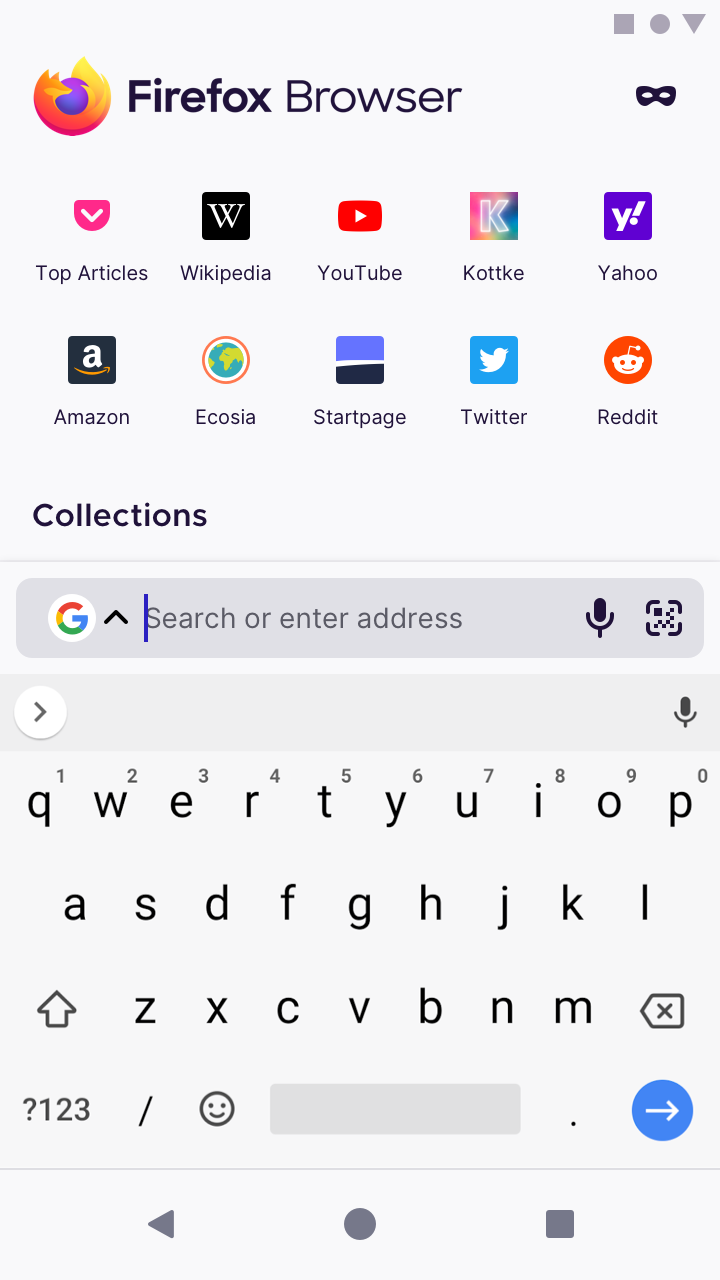
When the New Tab Page is opened from the tab tray, select the address bar automatically and pop up the keyboard so that people can instantly start a new search.
The position of the toolbar now depends on whether it’s set to bottom or top:
- Toolbar on
bottom: it “jumps halfway” above the keyboard. This will go a long way towards smoothing out abrupt motion. - Toolbar on
top: same as current behaviour. When selected, it should still stay where it is, on top of the screen.
The rest of the content on the New Tab Page – like Top sites – should be selectable. The area above the keyboard shouldn’t be covered by a scrim.
| Tab tray | New Tab Page with keyboard up |
|----|----|
| |
| |
|
 brampitoyo
All 23 comments
@brampitoyo one question: should the long press on tab count -> new tab shortcut also have this behavior?
 s-ankur
on 29 Jul 2020
s-ankur
on 29 Jul 2020
@s-ankur Yes. We should consider long-pressing on the tab count icon as identical to tapping the “+” button. It should still pop the keyboard open.
brampitoyo
on 30 Jul 2020
I also agree here, when you open a new tab the input field & keyboard should get auto focus so can start typing right away.
 XxAcielxX
on 30 Jul 2020
XxAcielxX
on 30 Jul 2020
This would be fantastic.
And if every time I tapped the URL bar (even if I didn't open a new tab) I saw exactly the same (Top Sites, Scan, Shortcuts, text input field, keyboard) it would be utterly fantastic.
 Cheap-Skate
on 31 Jul 2020
Cheap-Skate
on 31 Jul 2020
The mockup of the New Tab Page with keyboard up in comment 0 has a lot of elements which could make it more difficult for users to understand and navigate correctly.
So, inspired by #12619, I thought that it might be possible to remove the button pointing to search engines (because that functionality would then already be available by clicking the search engine icon/arrow, which I find much more intuitive anyway). In addition, if one moves the "Scan" button to the address bar, the bar containing the buttons could be removed entirely, leaving more space for the information that the users wants to see.
Quick mock-up of what I mean:

For the purpose of the mock-up, I left the additional space empty, but one could probably see the available Collections, more top sites or other things in the future (see #12941, for example).
As for the lost visibility of the "Scan" button:
- I don't think that it is _very_ frequently used, I believe most users use their built-in camera or dedicated QR scanner app to scan the QR code and then follow the link in-app. Especially because it isn't always clear that there is a URL behind a QR code (it might be contact information or countless other things instead).
- As was shown in https://github.com/mozilla-mobile/fenix/issues/12657#issue-658866454, apps like WhatsApp place two icons in their text boxes, so users have a fair degree of familiarity with this.
In total, I think this could result in way more space available to the user and less cognitive overload from menu elements, while keeping feature discoverability intact.
 dglttr
on 6 Aug 2020
dglttr
on 6 Aug 2020
Seeing the two microphone buttons directly below each other leads me to thinking that the extra microphone icon could maybe be disabled if a keyboard supporting voice input is detected. Though that's probably for a different issue.
dglttr
on 6 Aug 2020
@amkcpu
I really like this. Space efficient, logical. The Google logo with up caret will be familar to Samsung Internet users at least. Much better than the current solution- I think using a whole screen row just for Scan & Search Engines is very wasteful.
The blank space might get filled up with Pocket suggestions or "News from Mozilla" like on Firefox Desktop. Or, as you say, more Top Sites.
Cheap-Skate
on 6 Aug 2020
Will we have multi line recommandations like FF Lite?

 andreicristianpetcu
on 7 Aug 2020
andreicristianpetcu
on 7 Aug 2020
This is really good, thanks! Although the search engine and scan buttons aren't there, but I assume they're coming later.
A few small things:
- When tapping on the search bar, then switching to the home screen or another app and then back to Firefox, the search bar is still in a 'focused' state even though the keyboard is no longer open
- It seems like there's a slight delay between the search bar going into the focused state and the keyboard showing up, this makes it feel a bit odd because when opening a new tab, you have to wait a few hundred milliseconds for the keyboard to show up. It feels more like "I open a new tab, once the new tab is open then the search bar automatically opens" rather than "I open a new tab with the search bar already opened" from a UX point of view if that makes any sense. I'm not sure how much you can do to remove the delay or if it's an android issue. But making the keyboard pop up with the same speed that it does when clicking on the android widget would be good. Idk, it might be something to do with the animation speeds as well. Also, this isn't a major issue, and it's possible I could be imagining it.
- When pressing the return/go key on the keyboard with an empty search, the keyboard closes but the search bar stays in the focused state
 Booligoosh
on 8 Aug 2020
Booligoosh
on 8 Aug 2020
This is really good, thanks! Although the search engine and scan buttons aren't there, but I assume they're coming later.
Shall we open a separate issue for the search engine/scan buttons?
(and yes, this is a tremendous enhancement to the search experience, thank you :) )
 klint
on 9 Aug 2020
klint
on 9 Aug 2020
@amkcpu @Cheap-Skate @Booligoosh @klint Yes. I agree that removing the bar above the keyboard is a logical follow-up to keyboard up on the New Tab Page.
We’ve thought of it ourselves for a good couple of weeks. In fact, the mockup I’ve designed looks identical to @amkcpu’s:
| Keyboard down | Keyboard up |
| --- | --- |
|  |
|  |
|
| Type something into the address bar |
| --- |
|  |
|
However, we swant to limit the scope of this issue, to putting the keyboard up when a New Tab Page is created and selecting items underneath the scrim.
We can discuss removing the bar above the keyboard and repositioning Search Shortcuts and Scan button on #13473.
brampitoyo
on 11 Aug 2020
Couple of nits on the animations
- when tapping on a real URL (eg mozilla.org) sometimes (but not always) the cursor flashes to the far left (to the left of the search engine favicon) and the gray "Search or enter address" text flashes _very_ briefly before the text entry field moves up & the URL appears in gray, it's just a few frames.
- the gray version of the "Search or enter address" text (when the text entry cursor is visible) is displaced slightly to the left of the black version of the same text. If you open a new tab and then tap a Top Site you can see the text moving horizontally as the URL transitions back to its "black" state.
(the new search experience is going to look really nice, I'm excited having seen @brampitoyo's mockups.)
Cheap-Skate
on 11 Aug 2020
Toolbar on top: same as current behaviour – it should still “jump” to the top of the screen.
What does "jump" mean here? The toolbar stays exactly where it is, which is what is supposed to happen, anyway.
 opusforlife2
on 11 Aug 2020
opusforlife2
on 11 Aug 2020
@Cheap-Skate Thanks for pointing out the text displacement problem. We’re aware of this, and will address it.
@opusforlife2 Yes – I meant to say that the toolbar on top should stay exactly where it is. Let me fix the wording. Thanks!
brampitoyo
on 13 Aug 2020
@brampitoyo I think in the new search experience, search suggestions should go from bottom to top because when I'm typing into the address bar looking down and if the search suggestions end up at the top of the display this will feel very disconnected as the user has to scan through from the top to bottom and the user will have to stop typing and look at the suggestions at the top of the screen and then come back again to continue typing in the address bar, this takes a lot of visual effort I think and it also doesn't match with user intuitions.
When the address bar is at the top:
The user is looking at the top and scanning through suggestions by looking downwards in a top to bottom fashion and if the first search suggestion matches then the user clicks on it to make a search.
When the address bar is at the bottom:
The user types something into the address bar and the user is looking at the bottom and scanning through the search suggestions in a direction of bottom to top fashion so the user types something and gets a suggestion and if the first suggestion matches up then the user click it and makes a search.
But if the search suggestion appear at the top then I think the user would get puzzled which is the search engine suggestion and which is the typed word. In my opinion the search suggestions should be just above the address bar as the user is looking at it in that moment, not at the top where the user isn't looking.
I'd have filed an issue for this but I thought I'd get some thoughts from you before that.
Edit: Filed an issue https://github.com/mozilla-mobile/fenix/issues/14017.
 ghost
on 20 Aug 2020
ghost
on 20 Aug 2020
Hi. The New Search Experience is still not activated in the 2 following cases. Shall I open separate tickets? :)
when creating a new tab by clicking on the search widget (but maybe that is on purpose, actually?)
when creating a new tab by long pressing on the tab count in a specific scenario : click on the app icon in the launcher (whether it was in the background or not running at all does not matter), long press on the tab count once the app is opened, then choose to open a new tab (either private or not): new tab page opens but the keyboard is not displayed, which is not what was expected.
klint
on 26 Aug 2020
@klint we looked into those 2 cases and agree that the new search experience should be extended to those - thanks for raising them!
 vesta0
on 26 Aug 2020
vesta0
on 26 Aug 2020
Verified as fixed on Nightly 200827 07:01 (Build #2015760377) GV 81.0a1 from 8/27 with the following devices:
- Google Pixel 2 (Android 9);
- Samsung Galaxy Tab S3 (Android 8);
- Nexus 5 (Android 6.0.1).
New related issues:
https://github.com/mozilla-mobile/fenix/issues/14280;
https://github.com/mozilla-mobile/fenix/issues/14282;
https://github.com/mozilla-mobile/fenix/issues/14283;
https://github.com/mozilla-mobile/fenix/issues/14288
I will remove the qa:needed label and close this issue.
 ebalazs-sv
on 27 Aug 2020
ebalazs-sv
on 27 Aug 2020
Additional related issues:
14279
14321
14246
 hwinnemoe
on 27 Aug 2020
hwinnemoe
on 27 Aug 2020
@boek it looks like these are the new issues that have been filed by QA after testing the search feature - could you pull any of them that need to be fixed into the current sprint? or close ones that are working as expected.
 liuche
on 29 Aug 2020
liuche
on 29 Aug 2020
Hello, could you please add option in the settings to disable or enable behaviour of the keyboard when is New Tab opened? For example I mostly use Top Sites and automatically opened keyboard is annoying. Now I have to tap on the icon with bookmark twice - first tap - keyboard disappear, second tap opens bookmark.
Behaviour with automatic keyboard with New Tab.zip
 OUTDOOOR
on 31 Aug 2020
OUTDOOOR
on 31 Aug 2020
And if every time I tapped the URL bar (even if I didn't open a new tab) I saw exactly the same (Top Sites, Scan, Shortcuts, text input field, keyboard) it would be utterly fantastic.
Yes it would.
 rusegithub
on 9 Sep 2020
rusegithub
on 9 Sep 2020
@OUTDOOOR We hear you. When the keyboard is up, we still want Top Sites to be selectable without an extra tap.
We will solve this problem when we fix #14288. Stay tuned.
brampitoyo
on 9 Sep 2020
Related issues
vesta0
·
3Comments
 abodea
·
3Comments
abodea
·
3Comments
 softvision-miralobontiu
·
3Comments
andreicristianpetcu
·
3Comments
abodea
·
3Comments
softvision-miralobontiu
·
3Comments
andreicristianpetcu
·
3Comments
abodea
·
3Comments
Most helpful comment
The mockup of the New Tab Page with keyboard up in comment 0 has a lot of elements which could make it more difficult for users to understand and navigate correctly.
So, inspired by #12619, I thought that it might be possible to remove the button pointing to search engines (because that functionality would then already be available by clicking the search engine icon/arrow, which I find much more intuitive anyway). In addition, if one moves the "Scan" button to the address bar, the bar containing the buttons could be removed entirely, leaving more space for the information that the users wants to see.
Quick mock-up of what I mean:
For the purpose of the mock-up, I left the additional space empty, but one could probably see the available Collections, more top sites or other things in the future (see #12941, for example).
As for the lost visibility of the "Scan" button:
In total, I think this could result in way more space available to the user and less cognitive overload from menu elements, while keeping feature discoverability intact.