Fenix: FNX2-15298 ⁃ [Design] Align add ons view section titles
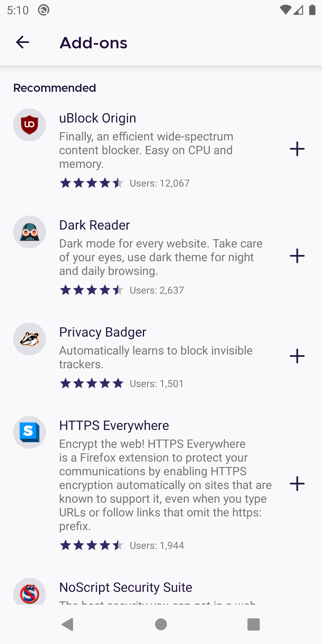
Currently add ons view "recommended", "enabled", "disabled" titles not aligned to top bar.
Looks like we need ac changes for this.
@brampitoyo Is this something we want?
If yes, how should we proceed? Just change padding start to 72dp in this view?
 UNITO-UNDERSCORE!1594649434!
 hakkikaancaliskan
All 6 comments
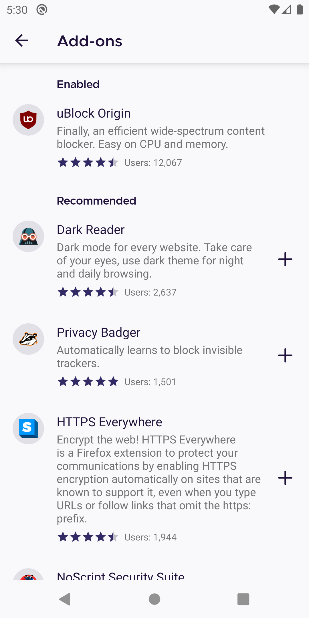
Here is the result if I change padding start to 72 dp in this view.
hakkikaancaliskan
on 13 Jul 2020
@hakkikaancaliskan Yes. I haven’t had time to go through every single Settings screen – it’s on my radar – but we do want to align the text under “Add-ons”, too.
The value that you use, 72dp, is correct.
I have checked the individual add-on’s main and sub-pages (Details & Permissions), and these pages are all aligned correctly.
Thanks for proactively proposing these changes!
 brampitoyo
on 14 Jul 2020
brampitoyo
on 14 Jul 2020
@hakkikaancaliskan If I could propose one additional change for consistency (feel free to file this in another issue if you think that it’s more appropriate):
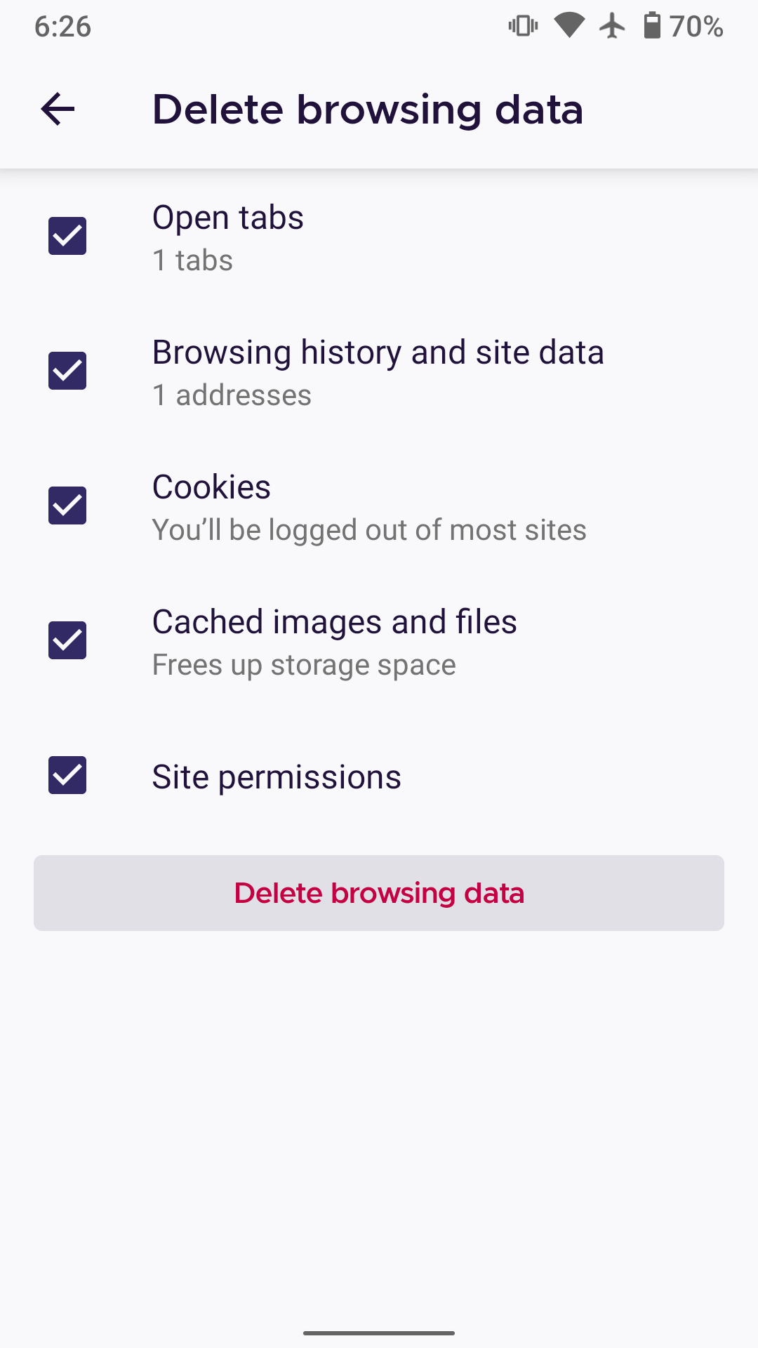
Under the individual add-on’s main page, there’s a button labelled “Remove”.
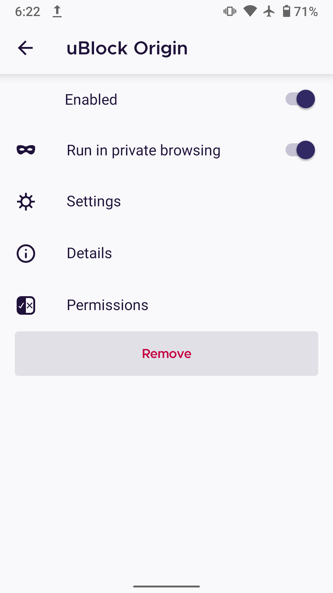
Everything about this button is correct, except the height of the button (48dp). It should be the same height as every other button used on Fenix (36dp).
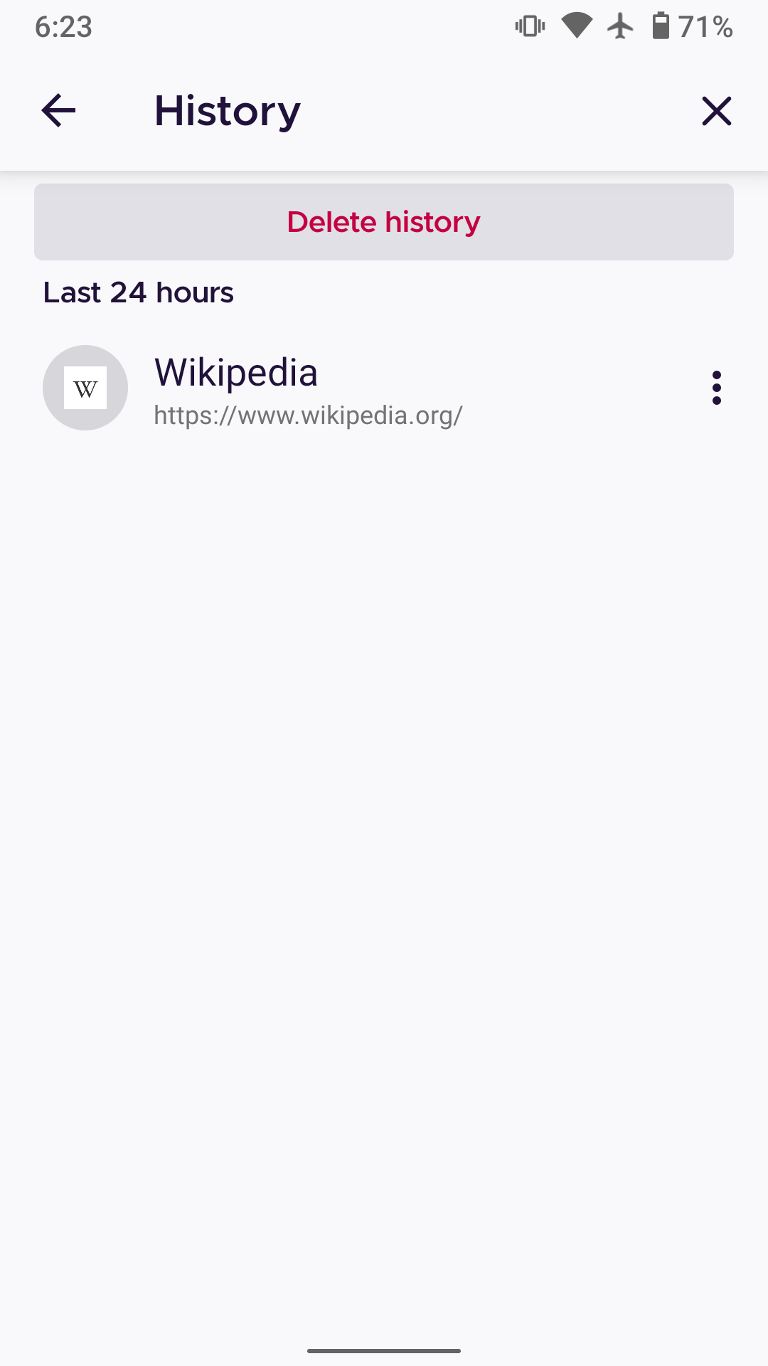
Visually, it should look identical to the “Delete history” and “Delete browsing history” buttons below:
brampitoyo
on 14 Jul 2020
@NotWoods needs qa verify
Edit: oh no :( #12537 not landed, after that lands, we can verify both of them
hakkikaancaliskan
on 16 Jul 2020
For qa verifier: There is 2 thing to check in this issue.
- Section title item aligment
- Add-on "remove" button height should match "delete history" and "delete browsing data" height.
hakkikaancaliskan
on 16 Jul 2020
Verified as fixed on Nightly 200720 (Build #22020611) GV 80.0a1 from 7/20 with Motorola Moto G6 (Android 8) and Pixel 2 (Android 9).
✔️ The add-ons view section titles are aligned under the "Add-ons" title;
✔️ The "Remove" button height from Add-ons matches the "Delete history" button and "Delete browsing data" button height.
I will remove the qa:needed label.
 ebalazs-sv
on 20 Jul 2020
ebalazs-sv
on 20 Jul 2020
Related issues
 andreicristianpetcu
·
3Comments
andreicristianpetcu
·
3Comments
 csadilek
·
3Comments
csadilek
·
3Comments
 softvision-miralobontiu
·
3Comments
softvision-miralobontiu
·
3Comments
 abodea
·
3Comments
abodea
·
3Comments
 topotropic
·
3Comments
topotropic
·
3Comments