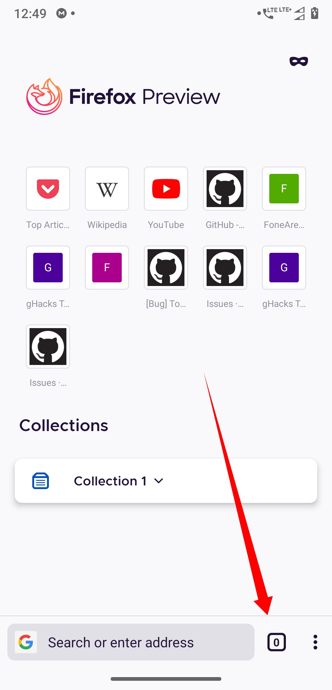
Fenix: Display the numbers of tabs as "1" by default and remove the "0", it confuses a lot.
It is really really confusing if you ask me. No browser does this, is it intentional? if so make it something like Chrome browser and other browsers do it.
 UNITO-UNDERSCORE!20200616!UNITO-UNDERSCORE!124935!
 ghost
ghost
All 17 comments
I guess we could just hide the tab counter when that is 0 and allow the url area to expand up until the three dot menu.
 Mugurell
on 16 Jun 2020
Mugurell
on 16 Jun 2020
I guess we could just hide the tab counter when that is 0 and allow the url area to expand up until the three dot menu.
Then how will I be able to open a new tab? Pushing the new tab button to the three-dot menu doesn't sound like a good idea to me.
ghost
on 16 Jun 2020
I guess we could just hide the tab counter when that is 0 and allow the url area to expand up until the three dot menu.
Then how will I be able to open a new tab? Pushing the new tab button to the three-dot menu doesn't sound like a good idea to me.
Just writing an address in the url bar.
Mugurell
on 16 Jun 2020
Yes! It's a great solution. And thanks for the clarification!
ghost
on 16 Jun 2020
How about when there is no tab open it will show + button instead of tab counter
 sheikh-azharuddin
on 16 Jun 2020
sheikh-azharuddin
on 16 Jun 2020
@sheikh-azharuddin No, I think what Mugurell proposed is a really good solution, I never really thought about it but do we really need a tab button in the homescreen if I can just type in the website address in the address bar and it'll open the site, there's no need of a tab button there!
ghost
on 16 Jun 2020
@sheikh-azharuddin No, I think what Mugurell proposed is a really good solution, I never really thought about it but do we really need a tab button in the homescreen if I can just type in the website address in the address bar and it'll open the site, there's no need of a tab button there!
But if we remove it the address bar will be long which is good but after you add a tab it will come back again...UI will look inconsistent...no benefit of removing... Instead a plus button like in old tab tray will make make it look good and consistent
sheikh-azharuddin
on 16 Jun 2020
Assigned to @topotropic for review.
 AmyYLee
on 24 Jun 2020
AmyYLee
on 24 Jun 2020
@sheikh-azharuddin No, I think what Mugurell proposed is a really good solution, I never really thought about it but do we really need a tab button in the homescreen if I can just type in the website address in the address bar and it'll open the site, there's no need of a tab button there!
But if we remove it the address bar will be long which is good but after you add a tab it will come back again...UI will look inconsistent...no benefit of removing... Instead a plus button like in old tab tray will make make it look good and consistent
Yeah, it'll definitely introduce some inconsistencies and it may very well be confusing to lots of users as no browser I have come across acts like this. On a second thought removing the tabs counter from the homescreen may not be that much of a good idea!
And what if there are already opened tabs from the previous session; the number of tabs should have to be displayed at that time and if we make the tab counter appear and disappear lots of times then I think this _will_ definitely annoy everyone!
Instead a plus button like in old tab tray will make make it look good and consistent
I'm against adding a+button. It has always felt out of context to me. How will users know that there exists a tab feature and you can access the tabs stack by clicking on the+button on the homescreen to access it when there's no icon that indicated its existence in other browsers but not in Fenix. it'll definitely confuse new users.
And also both Chrome and Firefox have that tab icon. And when old Firefox is migrated to the new Fenix codebase then users will expect the tab counter on the homescreen just as they did in Fennec.
I think we should just leave it as it is and display "1" by default instead of "0".
@sheikh-azharuddin Thanks for giving your point of view!
ghost
on 24 Jun 2020
It makes no sense to show 1 tab when you don't have any tab
 B0pol
on 24 Jun 2020
B0pol
on 24 Jun 2020
It makes no sense to show 1 tab when you don't have any tab
You are already on a open tab when on the homescreen of Fenix. And it is replaced by the whatever website you visit first. This is how Chrome browser and other act so changing the behavior will definitely confuse new users as well as the existing users who are using other browsers in parallel with Fenix.
ghost
on 24 Jun 2020
You are already on a open tab when on the homescreen of Fenix.
No.
I don't have any tab opened here.
On fennec, it's shown 1 because I _have_ a tab, about:home or your home page
On chrome same, because the homepage is newtab one or your homepage.
Fenix doesn't have any home tab, it's just the home page and it doesn't count as a tab (see the tab tray) then it makes no sense to show 1 tab.
B0pol
on 24 Jun 2020
I'm against adding a + button. It has always felt out of context to me. How will users know that there exists a tab feature and you can access the tabs stack by clicking on the + button on the homescreen to access it when there's no icon that indicated its existence in other browsers but not in Fenix. it'll definitely confuse new users.
Both Chrome and Firefox have that tab icon. And when old Firefox is migrated to the new Fenix codebase then users _will_ expect the tabs counter on the homescreen just as they did in Fennec or any other browsers they used.
ghost
on 24 Jun 2020
Hi, I'm the reporter of this issue. Please let me know if you need more information.
Thanks! :)
ghost
on 16 Jul 2020
Thanks for the feedback everyone!
Currently, the app initiates a new tab when you enter a URL/search term (that's why you see the 0) and doesn't use the concept of "New tab" that Fennec uses. And, unfortunately it's not a simple task to change the architecture here.
I agree with the arguments above that extending the location bar or adding a plus is not ideal since it's based on a logic (show + when you don't have open tabs) that probably not everyone understands immediately and that can be confusing.
We are looking into popping up the keyboard when you tap on the + in the tab tray so that people can quickly enter a URL/search term. With that we would hide the bottom app bar with the 0 tab indicator.
As a quick fix we could hide the number completely but I guess that's also not ideal and doesn't really solve the initial issue.
 topotropic
on 16 Jul 2020
topotropic
on 16 Jul 2020
Currently, the app initiates a new tab when you enter a URL/search term (that's why you see the 0) and doesn't use the concept of "New tab" that
We are looking into popping up the keyboard when you tap on the + in the tab tray so that people can quickly enter a URL/search term. With that we would hide the bottom app bar with the 0 tab indicator.
Okay, @topotropic I referenced those issues but I'm having a bit of hard time understanding them for some reason. Maybe a screenrecord or a detailed step-by-step explanation would help me understand that.
My question is that why are you even bothering going roundabout ways to handle this issue. Isn't this straightforward; make the behaviour like Chrome browser and right now Fenix does try to emulate it, just replace the the "0" with "1" this is how most browsers handle it and I think it would be better if Fenix did the same thing (I somewhat understand the new tab architecture thing you are talking about, and Fenix's behaviour is indeed different from what Fennec and Chrome behave). And Fenix also did this same thing a while back. And if you change the UX flows for it too much it'll introduce _a lot_ of confusions to end users who are used to using Chrome browser or other browsers which handle the tabs counter and tray like Chrome browser. I'm making Chrome browser as an example because that's what I think is the best UX flow for users and to be really frank I really like it and I want Fenix to behave in the same way.
And if you hide the "0" with the bottom navigation bar then how am I supposed to open the tabs tray itself? 🤔
With other issues you mentioned how am I supposed to go to homescreen if everytime Fenix ends up focusing the address bar. It'll introduce more taps to go back to homescreen and homescreen is _the most_ used part of Fenix if ask me, it may feel trivial but it's definitely not like at least for me. And it'll also hide homescreen elements such as Top Sites and others features such as collections from being accessed easily and I have to go back to homescreen by who knows how you're going handle the UX flow for it. Just imagine this, each morning I open some websites I added as a Top sites and imagine the situation if Fenix ends focusing on the address bar each time I tab the + button in the Tabs Tray. You might say that you may end up adding Top Sites in the area below the adress bar when I tap the + button but that won't work as I have _a lot_ of Top Sites and you may also suggest to use the collections to instead of Top Sites if I'm opening several sites each morning but that also won't work as the collections feature opens all of the sites stored in it; I'll lose the flexibility to open only the sites I want.
Can you please explain me the UX flow of what you are talking about a bit more clearly and if possible in an easy way because I'm not used to imagining the UX flows and understanding them unless I firsthand use them in the real world; that's the only way I'm used to suggest UX changes all this time.
Thanks! :)
ghost
on 17 Jul 2020
12774
 Poopooracoocoo
on 28 Sep 2020
Poopooracoocoo
on 28 Sep 2020
Related issues
 ekager
·
3Comments
ekager
·
3Comments
 Chris01277
·
3Comments
Chris01277
·
3Comments
 abodea
·
3Comments
abodea
·
3Comments
 AndiAJ
·
3Comments
topotropic
·
3Comments
AndiAJ
·
3Comments
topotropic
·
3Comments
Most helpful comment
I guess we could just hide the tab counter when that is 0 and allow the url area to expand up until the three dot menu.