Fenix: FNX-5035 ⁃ [Bug] there is no consistent icon style
Steps to reproduce
- open settings
Expected behavior
all icons have a consistent style
Actual behavior
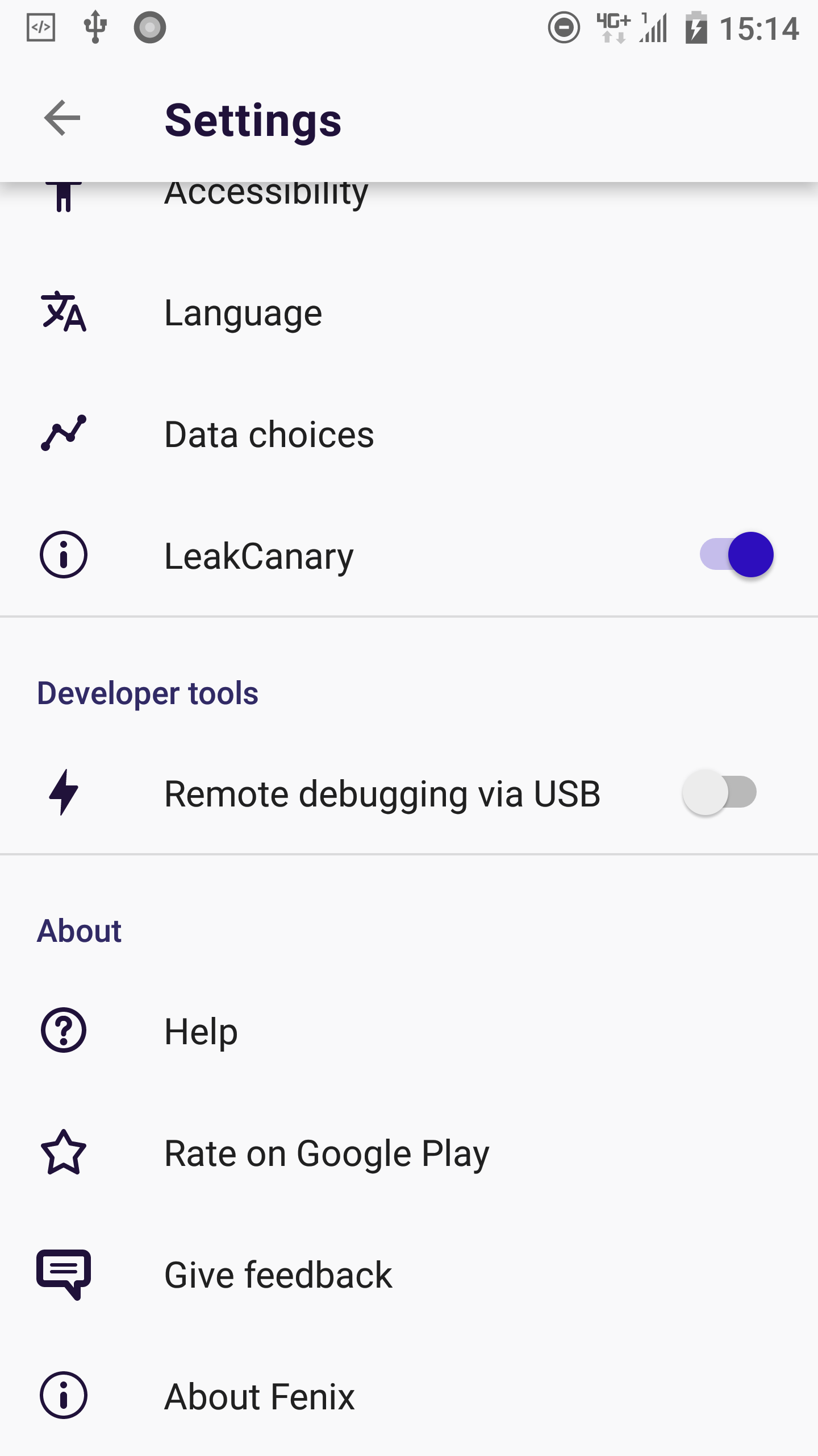
The icon for the "Give feedback" menu item looks out of place because it has a totally different stroke width than the other icons.
There are also other inconsistencies. For example the "Help" and the "About Fenix" icon - both have the circle around them and both looks different.
But the icon of the "Give feedback" menu item is the most striking example because it doesn't fit at all.
 UNITO-UNDERSCORE!20190406-151443!
Device information
- Android device: HTC U11 / Android 8.0
- Fenix version: Fenix revision d43e902b4433348da285a2978918ccfefc389014
 cadeyrn
All 9 comments
No, it's not a bug. Fenix is a mozzila project and uses mozzila's icon style. The icons are separated into two parts (mobile and desktop). Desktop has wider icons while mobile icons are slimmer but there is less of them. The icons you are talking about haven't been designed yet. They will probably update it in the future. They are awere of this and I hope it is enaugh to close this issue.
 DoggoOfSpeed
on 6 Apr 2019
DoggoOfSpeed
on 6 Apr 2019
No, it's not a bug.
It doesn't matter if we call it bug or not. It's only labeled as bug because I used the GitHub template "Bug" to report this issue and I used this template because the sections make sense for reporting such an issue.
and I hope it is enaugh to close this issue.
Why do you hope that an issue get closed if it's not solved? 😳 This is an issues tracker. In issues trackers issues will be closed if they are resolved / tracked in another way / won't be fixed / another good reason. Maybe these are not the final icons and maybe it's already known to someone but I can't find any other ticket about this. If that's the case then someone from Mozilla will tell this. But your comment is not very constructive.
cadeyrn
on 6 Apr 2019
K. But make sure this isn't a dublicate
DoggoOfSpeed
on 6 Apr 2019
The cause is that Fenix is using a mixture of Desktop and Android style icons.
See: https://design.firefox.com/icons/viewer/#
The platform toggle is on the top-right.
 nt1m
on 7 Apr 2019
nt1m
on 7 Apr 2019
FWIW, the mockups use different icons: https://mozilla.invisionapp.com/share/8ZQVRNUJW3H#/screens/350752852 that are more consistent
nt1m
on 7 Apr 2019
The invision link is password protected.
But good to know that there are already mockups with more consistent icons. :)
cadeyrn
on 7 Apr 2019
nt1m
on 7 Apr 2019
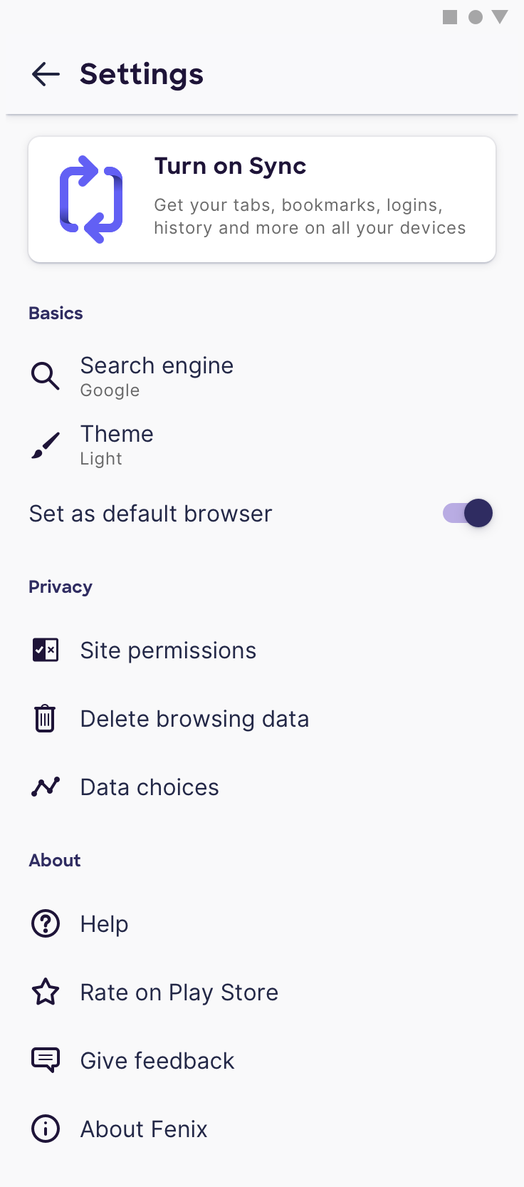
I pulled some newer vector icons in from the design docs. Closing but let us know if you see any other icons out of place! Thanks!
 ekager
on 9 Apr 2019
ekager
on 9 Apr 2019
It's much better now, thanks!
cadeyrn
on 9 Apr 2019
Related issues
 lindongbin
·
3Comments
lindongbin
·
3Comments
 abodea
·
3Comments
abodea
·
3Comments
 vesta0
·
3Comments
vesta0
·
3Comments
 csadilek
·
3Comments
csadilek
·
3Comments
 topotropic
·
3Comments
topotropic
·
3Comments